

Recommended
More Related Content
What's hot
What's hot (20)
Similar to Magazine anaylsis's
Similar to Magazine anaylsis's (20)
More from Adam Grundy
More from Adam Grundy (20)
Recently uploaded
Recently uploaded (20)
Magazine anaylsis's
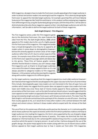
- 1. Withmagazines,designershave tomake the frontcovervisuallyappealingtotheirtargetaudience in order to attract and anchor readersinto wantingtoread the magazine.Thisisdone by designingthe front cover to appeal the intended target audience, for example upcoming films will most likely be featuredonfilmmagazineslike Total FilmandEmpire.InthisanalysisIwillbe analysingtwomagazines from differentgenresbyusingthe Guttenbergdesignprinciple,withthe helpof this I will be able to distinctivelydescribe why these magazines appeal to their intendedtarget audience and with this information, I will be able to define the target audience for both of these magazines. Dark Knight (Empire) – Film Magazine The first magazine comes under the film magazine genre due to the distinctive front cover, the cover features the Joker from the film, The Dark Knight (Nolan, 2008) which appeals to film readers due to the use of a highly popular filmforfrontcoverof the magazine.Filmmagazinestendto have a broad demographic since they try to appeal to all readers when it comes down to demographics however I believe this directly appeals to certain areas of the target audience rather than all of it due to certain aspects of the poster, for example most of the films which are promoted on the front cover appeal toyoungeradultsand above due to the genres. These films all feature graphic content, whether that be blood or violence, you can’t always assign film magazines such as Empire to broad target audiences since every film doesn’t always appeal to them so it is not always possible to categorise readers to film magazines. However,inthisanalysisIwilljustbecoveringthismagazine along with another magazine of a different genre. For the target audience,Iwouldsay that thismagazine appealsto a much olderaudience howeverI don’tbelieve thatmagazinelikethiswouldappeal tothe upperclassdue tothe formof contentthese films include. Stereotypically upper class readers are not interested in the likes of super hero and zombies which makes me suggest that this poster does not appeal to upper class readers but more lower and middle class since these style of movies mostly appeal to these audiences. With the presentationof the frontcover,such as the dark formatbut vibrantcolours I wouldsuggestthatthis coverappealstomale readersasopposedtothe femalereadersdue tofemale readersstereotypically being interestedby bright and colour front covers with female centred content, The Joker from The Dark Knightis not female centreddue tothe portrayal of this character on and off screen. One thing that visually appeals to me, as it would do to many other readers is the contrast between the dark colours and vibrant colours I believe it shows readers what to expect with the release of the Dark Knight. The use of font on this posterwas effectivelyusedtoportray the character as it is stylisedasgraffiti whichshowsaudiencesthe aspectof anarchy withinthe filmwhichsymbolisesviolence andhelpsto target audiences into reading the magazine, this font is also supported by the use of graphic design which in my opinion helps support the theme of anarchy. This makes me think that the font has adopted an informal look due to the cartoon/graffiti styled writing since this is usually symbolised anarchism which the poster is trying to present. As well as that, I believe along with the use of the graphic design, the poster helps appeal to the readers along with the use of vibrant colours which I believe appeals to their target audience due to how it stands out from other film magazines.
- 2. Magazinestry and get theirfront coverto stand out, whetherthisbe somethingthatis easilyvisible or attracts the reader due to the creative aspect, all magazines use different ways of luring in audiences and I believe this was an effective way of luring in readers on empires behalf. One thing designerswouldneedtotake note of howeverisif the fontiseasytoreadbecause therewouldbe no point using a font which looks nice but the audience cannot understand. All but the “He’s a cold blooded,massmurderingclown”standoutperfectlywiththisfontbeingslightlydifficulttoread. On the subject of colours however, there are always magazines which effectively choose colours which suit the front cover with this magazine being a prime example. The use of vibrant and dark colours workeffectivelyinmakingthe magazineenjoyabletolookat,readersdon’twanttolookatmagazines which disgust them due to the design and fortunately this is not an example, there is a wide use of coloursrangingfrom the Dark Redof the EMPIRE logoto the colourpalletusedto portraythe Jokers character. These together come together to create an interesting blend of colours which help this poster stand out though what I would change about this poster is balance out the bright and dark colours as the dark background overpowers the bright overlay in my opinion. The GuttenbergDiagramsuggestshow readersinterpretcreativedesignswiththe use of the reading gravity, how we start from the primary optical area (Top Left) and terminate at the terminal area (BottomRight) asourmindssweepthroughtheposterinordertofindimportantdetailswhichappeal to the reader, I will now apply this theory to the my chosen poster. Primary Optical Area Startingwiththe mainfocusof the design,the Guttenbergdesignsuggestsreadersstartfromhere as the readinggravitymovesthe audience’sattentionfurtherdownthe page,thissectioniswhatwould include keyrevealinginformationwhichwouldappealtoaudiences. Itisa way of understandinghow culturesreadfromlefttorightdue tothe visual navigation.Inthiscase,we have the filmsnamealong withthe logo whichisin the centre of thisand the strongfallow area(Top Right) whichhelpsignifies what franchise the filmisa part of since the Batman logo is well recognisedwithinthe filmindustry. Soinordertoattract readers,choosingtoincludethe logowhere readersare mostlikelygoingtostart is an effective way in establishing your audience, this is also supportedby the filmsname as well as antagonist on the front cover which shows audiences what to expect with the film. Lastly, as many readersmay not be aware of the filmor what theyshouldexpectwiththe film, Ibelieve the filmhas managedtocoverthisjustwiththe Primaryopticalareabyincludingthe picture of the antagonistand the name “Joker”alongwiththe“He’sacoldblooded,massmurderingclown”whichshowsaudiences whattoexpect.Inchoice of design,Ibelieve alltheseelementsblendtogethertocreate aninteresting sector of the poster which keeps audiences engaged and wanting to read more. Strong Fallow Area The strong fallow area on the other hand is different as it features enough content to keep the audience engagedhowevernotincomparisontothe mainfocal points,thesefocal pointsincludekey details which keep the audience engaged however the strong fallow area uses the assistance of the readinggravitytokeepthe audienceoccupiedastheynavigatethroughthe page,forexamplethe use of the words“World Exclusive”keepaudiencesengagedastheywouldnotbe able to findthisin any other magazine making it exclusive to Empire which in the long run would grab the audience’s attention and keep them interested, at first glance readers wouldnot be able to notice the website beingpublicizedhoweverif readersare stillreadingtheywouldbeabletonoticeitthereforeattracting userstothe website.Ibelievethatthiswouldonlystandouttothosereaderswhoare keenonreading more of the magazines, therefore making them overall readers of the magazine and not just this specific one.
- 3. Weak Fallow Area The weak fallow area on the other hand is where audiencesare presumed to not take interest as stated with the reading gravity from left to right. This poster can be seenas a prime example of this since no informationhasbeenincludedinthissector,justthe barcode.It can also be statedthat this sectionof the posteriswhat featuresthe leastamountof detail,asthe posteronlyincludesasection of the floor and the characters foot which is not appealing to readers. Terminal Area The terminal area is where the audience stops reading, whether this be overall or just to look inside the magazine so this is the section which has to grab the audience’s attention and highlight the magazinescontentswhichcan be seenhere as new releasesare brieflynoted.This showsaudiences what to expect with the magazine which in the long run would either attract or draw away the audience’sattentionsoitisessential formagazinestogetthisright.The reasonIbelieve ithasworked in favour of this magazine by choosing magazines of the same genre, or similar to that of the Dark Knight. Another keydetail to note is the use of the word “First Look” which targets the audience by suggesting that the content which is available in this magazine is exclusive to just this magazine meaning they wouldn’t find it anywhere else, I believe that is the effective way of grabbing the audience’s attention to make them want to read more. There are codesandconventionswhichaudiencescome toexpectwhenlookingatthrillermagazines, by analysingthe codesandconventionsIwill be able to match themto thisposterto see whetheror not the poster follows these codes and conventions. Firstlyis the use of colour, usually with thriller magazines audiences come to expect the use of dark colours however this poster varies as it as a contrast of bothwhichcould signifythe battle betweengoodandevil withinthe film.The picture on the other hand is different, usually with posters they feature a main character whether this be the main antagonist or the main protagonist however it can vary with different issues since one poster may feature the mainprotagonistforthe firstpartandthe mainantagonistforthe secondpartwhich I believe is an effective way of attracting readers by encouraging them to read both parts. Low-key lighting on the other hand is used to symbolise the mysterious and tense atmosphere in which audiencesshouldexpect,thisiscommonwithinthrillersandthisposteris no exceptionas,it is used to create enigma codes in order to make audience question what happens in the plot, for example how did the antagonist get arrested? In conclusion, I believe that this posters designis effective in drawinginaudiencesfromthe use of contrastbetweencoloursandthe keywordsinordertodrawin the audience’s attention. Deadmau5 (Vibe) Music Magazine
- 4. My secondmagazine onthe otherhandcomesinthe formof a music magazine knownasVibe whichisanAmericanmusicand entertainmentmagazine whichprovidescoverageof urbanmusic and electronicgadgetswhobesttofeature thanelectronicmusicstar Deadmau5as he iswell renownedforhisuse of gadgetsandhis signature mau5head.Since the musicmagazine isbasedinAmerica that givesreadersanunderstandingof the intendeddemographic and a clue on whatsort of contenttheyshouldbe expectinghowever regardingthe socio-demographicIbelievethisaimstowardsthe middle tolowerclassdue tothe headline “ChrisBrown’sEx tellsher side”whichsuggestscelebritynewswhichdoesnotappeal toupper classreaders.Since the magazine isrenownedforbeingcategorised underthe urban genre Iwouldpresume thatthismagazine isaone off to coverthe worldof electronicmusicsince itmentions“Ultra Music Festival”whichisahighlypopularelectronicmusicfestival,alongwithdeadmau5whois featuredonthe frontcover.Thoughthismagazine doesn’tsingleouttheirintendedtargetaudience by includingcontentwhichappealstothemsuchas promotingthe risingband “Fun.”Asthe new kingsof pop. Startingwiththe fontwhichwas chosenforthismagazine cover,Inmy opinionIbelieve its minimalisticandsleekdesignworkseffectivelyinanchoringthe audience due tohow simple and easyit isto read. The representsthe magazineinaformal perspectivedue topresentationof the font,whichwouldsuggestthata magazine like thisappealstomiddle classreadershoweverwhat contradictsthisisthe title “ChrisBrown’sEx tellsherside”makesme thinkthatthisisjustanother celebritymagazinelikeOK. There isnopointincludingafontinwhichviewerswouldn’tbe able to read,the choice of colouron the otherhand couldhave beenimprovedasitis far toosimilartothe back groundwhichmeansreaderswithpooreye sightmaynot be able to distinguishthe fontfrom the backgroundwhichmay be a problemhoweverthisdoesnotapplytoeverywordon the page since the title clearly standsoutdue toboth the size andthe colour.I thinkthat usingthe colour yellowonagrey backgroundworkseffectivelyandjustblendsinwell,itdoesn’tmake the font appearto be outof place. One thingthatI thinkworkseffectivelyisthe colour scheme andhow they useditto portray the urban genre,since urbanmusicisrenownedforbeingstreetmusicyouwould associate thiswithurbansocietyhoweverthisisjustinmyopinion. Primary Optical Area The primaryoptical area iswhichaudience’s firstlookwhenglancingata magazine soyouhave to include contentwhichwouldgrabthe audience’sattentionandadesignwhichisstunningtolook whichI believe thismagazinehasaccomplishedeffectively.Whatcaughtmy attentionwasthe use of one of myfavourite artists,Deadmau5andI believe thatwouldbe akeypointformany other readerswhentheysee theirfavourite musiciansonthe frontcover. The designappealedmyself due to howwell the coloursblendedinwell together,whenitcomesdown todesigningamagazine you wantto make a frontcoverwhichis stunningtolookat and appealstoreaderwhichIbelieve they have done,anotherkeypointisthe fact theyhave managedtomake title boldandstandout whereasmanyothermagazinesjustsimplifyitorsometimeshideitbehindcharacterslike Empire for example.Lastlyisthe use of the headline whichdistinctlyvariesfromthe restbyusinga different colourfor the fontso it standsoutmore to theirreaders
- 5. Strong Fallow Area Similartothe previous,the strongfallow areaincludescontentwhichisusedtograbthe audience’s attention.The use of “Fun.The newkingsof pop”anchors the audience intowantingtoreading more whetherthisbe ina positive ornegative outlooksince readers maytake offensesince Michael Jacksonwas referredtoas“King of Pop” thoughthisisjusta matterof opinionhoweveritdoes attract readersintowantingto knowmore. The designstaysthe same byappearingsymmetrical fromthe otherhalf whichIthink is an effective ideaasitstays true to the original designwithout goingof course. WeakFallow Area The weakfallowareaisthe areaof the magazine withthe leastinformationandwhere the readeris leastlikelytobe interestedinlookingwhenitcomestothe Guttenbergdesigndue tothe reading gravitywhichcan be seenonthisposterdue to the fact thatthere isnot much inform of designor information,there isthe textwhichstates“The reignwon’tletupQueenMary”whichmaynot appeal toreaderssince theymaynot be aware of what thismeanstothem. Terminal Area Thissectionisa make or breakareafor the magazine,thisiswhere eitherthe audience isinterested or theyare turnedawayso inorder to appeal toaudiencesthe magazine must include content whichgrabs andanchors the audience’sattentionliketheyhave done here since theyhave included headlinesonwhatthe magazinesinorderto keepthe readersengaged.Readerswouldbe able to make a judgementwhetherornottheywant to keepreadingif the magazine appealstothem, thisis whymagazinesusuallywaittillthe terminalareatoinclude keyheadlinesforwithinthe magazines as theyknowthe readingterminateswithinthisareaandtheywantto keepthe readerinterestedso theywantmore.However,inchoice of designIdon’tthinkthisworkas effectivelyastheywould have hopedsince the backgroundjustfeaturesthe starscoat alongwithtextwithsimilarcolours (excludingthe yellowone)sootherthanthat,I thinkthe terminal areawasusedeffectivelytokeep audiencesengaged. In conclusion,Ithinkthe magazine helpsappeal totheirtargetaudience byusingstarsandkey nameswhichbestrepresentthe genre aswell astheiraudience,the designcouldhave been improvedhoweverthisdoesn’timpactthe view of the magazine overall.