SlideShare a Scribd company logo
1 of 11
The print magazine I had chosen to analysis is Kerrang magazine…
Purpose:
The purpose of Kerrang magazine is to entertain and inform. This is due to what features in the rock magazine.
From the style of the magazine, just by reading whats on the front cover, I can infer that the genre of this music magazine is rock. this is
because of the way the images are presented of the people in the pictures and there body language. For example, on this front cover, he
is holding a skate board and is dressed quite casual, from this you can picture that it isn't going to exactly be a magazine based on
classical music. I can also tell this is a rock magazine by the way the language is presented. This is seen on the double page spread
analysis. The language is very informal, which allows me to infer the age group of the target audience. Judging by the front cover and
the informality of the language, I can tell that the age group would be adolescents, from maybe 14 up two maybe early 20’s. in
following this , I think the income the target audience is quite low, this helps me to determine their social grade. I think that the social
grade would be an E as of the age and their interests, the target audience will be causal, and some could depend on welfare state for
their income. I know the target audience is of this category as ,I myself, am a reader of that magazine, that the social grade ‘E’ links well ,
where casual is concerned as the band on the front is dressed casually. Katz and Blumler theory of uses and gratification is involved in
this magazine as it includes a sense of personal identity. The price of the magazine is £2.50, which also allows us to work out that the
social grade is an’ E’.
Here is a random front cover from a fairly recent issue, I chose
this one at random as all the kerrang magazines show this
theory.
You can see personal identity has been used here as it shows
their full body in a long shot- they could have potentially done
his to show off their fashion and encourage young adolescents
to aspire to dress like them. This is more likely too work as of
the age of the target audience being low. surveillance has also
been used on this front cover , this is also shown by how they
dress , it suggests they are just casual people.
Technical opportunities, considerations and limitations of print and digital magazines.
both print and digital magazines have their pros and cons- they are both trying to maintain and build and audience as well as producing content that is engaging
and relevant.
Reading from print magazines offers a much more memorable and leisury experience and the key is establishing where, when and who you are reaching as well as
designed packaged print content still creates a premium, unique feel that digital content will always lack. Print magazines provide a more tactical human
experience , where the reader can sit back and read the magazine ,without being invaded by ads that are based on your browser history. A benefit print will always
have over digital magazines is once its purchased, its yours forever and its simple to read-there is no need for a good internet connection, you don’t have to worry
about battery life and its more simple to read whereas for a digital magazine, you might have to enlarge the magazine to be able to read it.
However print magazines are suffering as publishes are losing jobs due to shifting to digital magazines. As newspapers and magazine circulation continues to shift
from print to digital, growth is not yet in uniform: the print circulation fell 4% year on year in the UK. Most of the print companies have moved to digital publishing.
Print magazines are often read once and forgotten about somewhere, or thrown away – this causes environmental problems s it isn't environmental friendly.
In addition to this digital magazines are more of a satisfactory impact on the reader now, this is because digital magazines make it very easy to share content and
your favourite articles to potentially spark discussions on social networks- this builds up a relationship and appeals to the audience as it expands on their social
skills due to their age. As of this , it creates a much larger reader engagement and helps build a community. For digital magazines, the users age has become more
important, as publishers are competing for audiences attention.-although the digital platform is relatively a new concept, some versions are not picking up the
slack for the decline of print circulation. Digital provides more realistic benefits –the clearest benefit is the feedback that you get to help optomise your products
and content. Digital magazine editions national readership survey (2016) demonstrates the consumption of mobile and online adds a further 107% audience reach
individual news brands and 68% of magazines.
Issues that occur with print and digital distribution , print in particular- the specific target audience may not be reached due to where the magazines can be
purchased; places such as the newsagents . This would be an issue as not many people of the age group my magazine is aimed at ,for example, would voluntarily
go to a newsagents . So as of this, magazines could be losing their audience. However, print music magazines can still be found in music shops, where the audience
may purchase it. A major issue that digital magazines face is that audiences are unaware of where to find the digital magazine, it can also be expensive to subscribe
to. If you wanted to make a magazine , for instant with amazon , you would have to use Mobe to create your magazine- this has a downfall on the digital magazine
as it stifles the creativity and as of this, it creates a negative impact on the target audiences appeal.
Another overall issue with print magazine , is that the colour may not come out at vibrant and fitting towards the magazine ,whereas it may process better through
digital publishing. However, people could ague that print publishing is more beneficial as it is easier to read than digital as the lighting from the screen may hurt
your eye after a while.
The size of a good print magazine should always be A5 or A4 and the publishers have to think carefully about formatting text and considering the
style of fonts to be used. A problem print publishers face with bleedlines is that sometimes they get cut off, once the magazine is made, as of this,
the writing may not make sense and it will make the magazine look unprofessional.
The masthead consists of the bold colours, red and white. This
can resemble how the genre of the magazine its based on, is
quite bold. On the title of the magazine there is almost like a
dint like appearance- this links to the dominant image as its got
that sticker affect, some skaters stick stickers on their
skateboards so it keeps that constant coordination towards the
dominant image.
The name of the magazine has an exclamation point, which
connotes shouting, like before , this is also representing the
genre of music in which the magazine is based on. This is
because people associate rock genres as screaming and
shouting.
An alternative idea from this is so it engages their target
audience when they walk past the magazine, creating the aim
to get them stop and buy the magazine- this could be because
of the bold fonts being used, and the exclamation point at the
end… as if its almost shouting at them.
The bold fonts used also help to represet how much that genre
stands out from mainstream music.
The dominant image used is the front singer of a
band Neck Deep, Ben Barlow. By creating him as the
dominant image for that weeks magazine cover,
helps attract more of KERRANG!’s audience build and
buy the magazine, as a result of fans of that particular
band or just himself will see it and be automatically
intrigued. His facial expression is shocked, which links
to the subtitle quote “he worlds most wanted”
creating a sense of mystery, curiosity, drawing the
audience in, this is a use of Barthes's ‘enigma code’
theory. Here Kerrang had used the hermeneutic
code.
Ben appears of the front cover as dominating over
the masthead, this is because the magazine company
want to show off their popularity- they are doing this
cleverly by having some of the title missing, this is to
represent that their company is that big, they don’t
need to have there name visible, because of maybe
their bold choice in colours, they are well
remembered.
He appears to hold a skate board which shows his
causal part in life, allowing many other people from
that audience to relate in interests and will be
engaged by that. Its also sponsoring their band in a
senses they have there name on the skate board. It
also once again allows Neck deeps fan base to by the
magazine and become familiar with the company.
Everything kerrang does on their front page, in my
opinion is always helping them build up their target
audience , luring them in with big top name brands .
Kerrang has put the rest of the band as sub images, this
shows how the front singer is presented as the important
one and almost represents a hierarchy . Kerrang also shows
a sense of direct mode of address. This is shown when the
sub images are looking directly at the camera, as if they are
looking at us personally- by doing this is attracts us to the
images which is the magazines constant aim
Here they show another sub image but
of the same person that is in the
dominant image. Only this time it is with
a dog. This is to draw the attention,
possibly to female audiences because ,
nothing wins a girls heart like an animal
lover. It enhances the audience once
more.
Kerrang keeps a constant colour scheme throughout their front
cover, and as part of their target audience I know that that
constant colour scheme is shown throughout the magazine. The
use of the white on red is eye catching. The use of the colour red is
a use of semiology as it can suggest negative , evil, devilish beings.
Theoretically speaking, I think this is clever as rock music r centuries
has been portrayed as “the devils music” , so it’s a bold and risky
colour to use, but kerrang , adding the bold font, use this and
embrace it.(this is a use of the enigma code theory, using the
semantic code!) The conative meaning for this, potentially maybe
that even though all these stereotypes of the music is represented,
you should still listen to the music, and be bold about it , to wear
what you want with pride and listen to what you want, by doing
this it creates the use of subject positon .
PRINT
Here the creaters of kerrang magazine use a
different colour and font scheme to draw
away from the main topic of that weeks
magazine, allowing the audience to know
that even if they didn't like or listen to that
band there is still much much more in that
magazine about a big chunk of well known
bands. The bands names are written in a
different colour font, the use of the orange
has a massive impact as it stands out greatly
from the black background, the use of
capitalized letter also help to engage the
audience towards buying the magazine
because it personifies that the magazine and
the information's shouting directly at you to
buy the magazine - yet another ruse of direct
mode of address. ( ever magazine company's
aim is to make their magazine cover as
persuading as possible to get people to buy it
!)
Here the background of the magazine is a
collage of the band , this shows that they
are going to be a he part of the
magazine. Also, the sell line, “form skater
kids to the worlds most wanted” emerge
with the background because its almost
like it’s a wanted poster, multiple photos
to give that sense of emergency to find
them. The front cover shows a constant
theme .
The photos also shows how casual their
life is , walking around the streets . This is
showing a sense of Katz and Blumler
theory, it shows surveillance as it shows
there day to day normal life , which
allows us to relate to the band members.
Kerrang uses different band names to
draw more people in , they do this by
their skyline, as shown at the top of the
magazine. The name of the bands , again
are in a orange font, with bold
capitalized letters… again this is to over
egzadurate how much is in that
magazine.
Here the essential information Is at the
bottom right, quite large to be clear to the
audience.
The price is 2 pound 50p, which allows us to
evaluate on the age group of the target
audience. It also allows us to infer their social
grade
This double page spread was taken from another
kerrang magazine..
Here kerrang has used a running head in a noticeable
place to grab the attention to the reader. By putting it
near the dominant image, its hard to miss.
The font and the colours are bold. They resemble
kerrang’s bold red masthead and it is what the
company is remembered by the background of the
running head is black, which using bathes theory, is
just normal , but using the conational meaning, it
could also link to how black is seen as a stereotypical
colours for this genre of music, the colours black
resembles everything evil , and darkness. So using
these colours, really match perfectly to what the
magazine is about and the genre of music. The same
method applies for the red that has been used. It also
jumps out massively from the black background,
which also resembles how people see the music as
screaming .
The heading on the double page spread is to create a sense of
comedy. I know this with being apart of the audience for this
magazine.
It also creates a sense of mystery. it shows you me at six singer
Josh Franceshi and bring me the horizons singer Oliver Skyes..
By replacing the six and writing Sykes, so as a result of this
terrible pun, it allows the reader to be curious as to why Oliver
is with him.
The colour scheme still is repeated and Sykes is red to show the
different name of the band and to create that shocked and
almost confused reaction when you read it.
The layout of this double page spread is simple, which makes it
very effective for the reader as it almost cuts straight to the
point, as it doesn't’t drag on. It appeals o the audience in this
sense because there target audience is many adolescents, they
aren't going to read two pages worth of information, they will
lose interest .- so by doing this, kerrang allows the audience to
still be engaged but they cleverly don't go over bard with there
information.
The use of the drop cap, also known as a kicker, helps
set the rest of the article, its shows the introduction of
the article. Yet again, kerrang uses there iconic red bold
font to engage the reader onto reading that article.
Here the 2 band members are dressed quite casually. Which suggests that they quite laidback and comfortable in their own skin. This shows , to an extent Hall and receptions theory , as it
could potentially be a hidden message, that you should dress the way you want, be the way you want and you should be comfortable with how you are , the decode of this would be so the
audience feels like that’s the way they have to be, they might then aspire to be like those two. The informality of how Josh and Oli is dressed and positioned fits well with genre of music,
because it would look outplaced and the magazines theme wouldn't’t run smoothly if they were dressed formally as if they were going o an award ceremony. They way they are positioned
suggest a personal relationship, in this case, being friendship-this is also as Oli makes a love heart with his hands.
Due to this, it could make the audience curious and raise questions like are the going to do a collaboration ? Or are they touring together? Kerrang keeps the audience engaged constantly by
revealing information but all of it and the reason for things . The body language represented shows a friendly atmosphere, this could potentially be an encode(theoretically speaking) , and
the hidden message could be that you should treat everybody with love and in a friendly manner, the reader will realize this and some of the audience will aspire to be like them so by
presenting these men in a friendly manner , will help encourage people to become nicer people.
In terms of mise en scene, the lighting used on the two men is pointing directly on them, this shows that they are the main focus on this page, and that they are the important information. It
also creates a sense of dominance over everything else on this page. The company used cinematography and used a 2 shot to help show more information on the page because if someone
was not familiar with the bands, but recognized there appearance or face, it will help them realize.
the way the writer has written the article is informal,
this is because of who the magazine is aimed at,
adolescents who read this wont be intrigued or
possibly understand it if its wrote formally, like a
newspaper, also it links to the genre of music again.
Again kerrang is keeping the constant colour theme
throughout the magazine.
I decided to look at terrorizer’s digital magazine as it shows contrast and similarities towards Kerrang’s magazine
Purpose:
Terrorizers digital magazine has a purpose to inform but to entertain also. They achieve this by including interviews and articles with bands and competitions. They
also include information on CD releases and tour dates-this will appeal to their target audience as it allows them to be aware of the things that would interest them.
By doing these things , it also allows them to build a greater audience group. Judging by the magazine front cover and the double page spread I am about to analysis I
can infer from this that the genre is rock and heavy metal music or any music from the alternative genre. This is because of the way things are presented in the
magazine, for example:
the font used on the dominant images band helps to create that ghoulish gothic feel, its something people find intimidating and scary like the
gothic culture.
Here the devils music allol ows the audience to know what music the magazine is about because
of the well known stereotype of rock music being the devils music. This can also be seen as
humorous towards their target audience as they are taking advantage of that
This shows that to an extent, this magazine shows aspects of humor, so another purpose for this
magazine is to humor.
The subscription to purchase this magazine is £6.99 . Terroizer publishes 13 issues . Judging by the price , the target audience may potentially
be from age 15 onwards. Looking at psychographics , the audience would be a mixture of explorers –this could be because they are at that point
in life in which they are to seek individualism, strugglers- a large amount of the target audience would buy alcohol and reformers- the audience
may also seek enlightment and freedom. All of this can be supported by their age estimation.
As a result the social grade I personally think for this audience , I more than likely a grade D or a E.
DIGITAL
Here is the Terrorizer digital magazine that shares the
same genre of Kerrang .
Terrorizer magazine present the words 'devils music’ in a much
larger font than the rest of the magazine. This could be to
resemble the power and audience rock and heavy metal have
grown.
Again on this magazine, the sell line is capitalized – this
indicates that the information is shouting into the audiences
face.
As part of this audience, I have seen this familiar technique
used over a wide range of rock magazines.
The choice of the colour used for the sell line is bright red . This
is a use of semiology as it can suggest danger, evil and devilish
things. Using this colour, terrorizer wants to take advantage of
the stereotype that is around the rock music genre so they
cleverly embrace and live up to the stereotype. The font style
is quite gothic, which again is the constant link to the genre of
music the magazine is based upon.
The creator of the magazine shot this dominant image using a
mid shot- the use of this camera angle helps emphasise the
seriousness on the band members face. This image is a use
direct mode of address, visually, as the band member is staring
directly at the camera, as if he is looking directly at you –this
engages the audience as its almost persuading them to pick up
the magazine , without actually saying it.
His body language is also coming across as serious and almost
angry – this could be because of the make up on his face. This
is deliberate as they want to evaluate on that gothic stereotype
to appeal to their target audience. The facial expression on his
face is quite intimidating , for some people. Others look at him
and think he looks sad, this is a use of subject position. Two
people think of different imagery in their head of the same
thing.
Terrorizer uses a skyline to give more information on what's
inside the magazine, this allows the audience to be aware of
what else is inside the magazine and people who are unfamiliar
with the dominant image , but are familiar with ,say coven for
example, will pick up the magazine still because they know of
the band.
Another thing about the skyline- the font on the names of the
band are much different than the rest, this can be to emphasise
their role in the magazine, potentially to get the reader to think
there's a large section specifically on that band. It also can
emphasise the bands fame. Personally, I find the use of
colours used on this sky line quite eye catching as the rest of
the magazine is dark and red, so the contrast of the white ,
really brings peoples attention to the bands names. Terrorizer
has done this , again, to engage the target audience into buying
the magazine. Theoretically speaking , this could be linked to
the stereotype of the music being evil. The white font could
represent the good , show it shoes the contrast between good
and evil. This would also link to the theme of the magazine.
The use of the sibilance ‘sound of Satan’ has a serpent like
imagery in my head personally, but can mean something
different to another. People fear a serpent, so with the
use of this sibilance with the term Satan , can represent
all things people could fear, and terrorizer makes this
constant connection with the stereotype based around
this genre , all the creepy things , they creator places
them on the front cover of the magazine and takes
advantage of that stereotype. 75 is wrote bold and with a
blood red colour- this could represent again, the devilish
behavior and links to the word ‘Satan’.
It also emphasises how many albums that are in the
magazine.
The splash allows the reader to know more
information about what's inside the magazine
The title of the bands name has its own font , a font that
stands out massively from the front cover. The band
‘Ghost’ has their name right underneath the dominant
image and the font has this Smokey, ghoulish effect, which
terrorizer has done , cleverly to link to the dominant
image.
Looking back at the dominant image, it shows katz
and blumler’s theory of uses and gratification- this
magazine has a use of personal identity and
personal relationships. People who have this
gothic culture , especially those of a younger
generation , will aspire to be more spooky .
The dominant image of this women is
the singer form the band this double
page spread Is about. The fact that
she is larger than everything else on
this double page spread.
The way she is presented on this
page, she comes across quite serious-
this is shown by her body language.
The seriousness on her face shows a
use of direct mode address, this could
be done deliberately to engage the
reader to read that article.
Hypothetically speaking, the
seriousness on her face could
foreshadow the information in the
article.
The background presented here is
very gothic- this magazine keeps this
constant elegant gothic theme, but
use =s different colours.
The choice in colour creates this
femininity feel to the article. This
could indicate the target audience
for this particular band . The use of
the red can indicate danger, death
(this is a strong use of semiotics.)
again, this links to the gothic theme.
‘the high priestess’ is wrote in
purple font- this also comes
across as elegant and almost of
the romantic goth culture. This
appeals to the audience as they
will be attracted towards this
article.
The font is wrote in quite a
church like , gothic font. This
helps set that spooky theme that
terrorizer was aiming for.
Here, terrorizer has used a drop cap and a kicker to start off the article. The size of this kicker,
suggests the audiences ages- this is because people of a young age, wouldn't be particular intrigued
by a large amount of text. . It suggests that this magazine could be for a much more older and
mature audience. However, the layout is kept simple , which does indicate the audience could
potentially be adolescents .
The writing for this double page
spread seems to be on a scroll. This
gives the article a more architectural
gothic feel.
This links to the skull that the woman
in the dominant image, is holding.
Again, there is a constant link to
death. This is also a link to the genre
of music the magazine is about and
peoples popular opinion on the
gothic culture.
This long shot of this women in this sub image shown , is presented in a camera shot where you can see her outfit to swill aspire to dress like
them.how the use of katz and bulmler theory of uses and gratification. It shows personal relationships-this is because some of the target
audience is of the adolescent stage of development, which means they will think they should be dressing like how that band member is. It
also shows a sense of survillience, it shows elegance and that they are just normal people also,
Another sub image is presented at the bottom and
it looks like the man has blood all over his face, this
gives it that scary affect and links to the whole
death theme.
In conclusion, Kerrang magazine and Terrorizer share some similarities and have some differences.
It was visible that that both magazine companies had a solid picture of their target audiences and had their interests in mind. this
was shown by the layout and context. Both magazines thought thoroughly about the technical considerations. For print
magazines, they made sure the text was visible and clear to read. The magazine publishers also thought about where they were
going to sell their product as it needs to be accessible for their target audience. The print magazine also made sure that the
target audience can purchase the issue due to costs. They need to make the overall price of the magazine appropriate so by
doing this they needed to take their audiences age group into consideration to work out the best possible price but also a price
that will benefit them as a company.
Digital printing has to make sure there digital magazines appeal to their audience even with the automatic design changes it
creates. This changes consist of the font the publishers use, it has to be clear to read but also link to the theme of the magazine,
and interactive links and buttons that are in the digital magazine. Terrorizer came up with a way their magazine would create an
enjoyable reading experience by making sure digital magazines had a better impact on their reading experience. Just like Kerrang,
Terrorizer also thought about the size of the text , with It being a digital magazine, the wrong size may interfere with your reading
experience. This can cause the audience to have to zoom into the articles and read it that way. This is an important part of
publishing a magazine.
Statistics show that the younger audience are more likely to purchase and subscribe to Terroizer and other digital magazines.
Research also shows that print magazines are becoming less and less popular as many print companies are converting to digital
publishing. With Kerrang being a print magazine, it is more expensive to create than Terrorizer.

More Related Content

What's hot

Evaluation
EvaluationEvaluation
EvaluationAdella1
 
Unit 14 digital magazine production
Unit 14 digital magazine production Unit 14 digital magazine production
Unit 14 digital magazine production Kirstyhurlock
 
Drafting textual analysis
Drafting textual analysisDrafting textual analysis
Drafting textual analysischloecotterill1
 
Textual analysis student work
Textual analysis student work Textual analysis student work
Textual analysis student work chloecotterill1
 
Digital magazine production
Digital magazine production Digital magazine production
Digital magazine production stephburdess
 
Music Magazine Evaluaion
Music Magazine EvaluaionMusic Magazine Evaluaion
Music Magazine Evaluaioncharleyboxmedia
 
Unit 14 digital magazine production.
Unit 14 digital magazine production.Unit 14 digital magazine production.
Unit 14 digital magazine production.holliejoice
 
Drafting Textual Analysis
Drafting Textual AnalysisDrafting Textual Analysis
Drafting Textual Analysischloecotterill1
 
Music Magazine Analysis Research
Music Magazine Analysis ResearchMusic Magazine Analysis Research
Music Magazine Analysis Researchsianmartin94
 
Magazine examples
Magazine examplesMagazine examples
Magazine exampleschlozfox
 
Market research
Market researchMarket research
Market researchKaris Hays
 

What's hot (20)

Evaluation
EvaluationEvaluation
Evaluation
 
Front cover
Front coverFront cover
Front cover
 
Unit 14 digital magazine production
Unit 14 digital magazine production Unit 14 digital magazine production
Unit 14 digital magazine production
 
textual analysis
textual analysis textual analysis
textual analysis
 
textual analysis
textual analysis textual analysis
textual analysis
 
Drafting textual analysis
Drafting textual analysisDrafting textual analysis
Drafting textual analysis
 
Evaluation question 2
Evaluation question 2Evaluation question 2
Evaluation question 2
 
Textual analysis student work
Textual analysis student work Textual analysis student work
Textual analysis student work
 
My evaluation
My evaluationMy evaluation
My evaluation
 
Digital magazine production
Digital magazine production Digital magazine production
Digital magazine production
 
Music Magazine Evaluaion
Music Magazine EvaluaionMusic Magazine Evaluaion
Music Magazine Evaluaion
 
Unit 14 digital magazine production.
Unit 14 digital magazine production.Unit 14 digital magazine production.
Unit 14 digital magazine production.
 
Evaluation.
Evaluation.Evaluation.
Evaluation.
 
Media Evaluation
Media EvaluationMedia Evaluation
Media Evaluation
 
Drafting Textual Analysis
Drafting Textual AnalysisDrafting Textual Analysis
Drafting Textual Analysis
 
Magazine
MagazineMagazine
Magazine
 
Music Magazine Analysis Research
Music Magazine Analysis ResearchMusic Magazine Analysis Research
Music Magazine Analysis Research
 
Magazine examples
Magazine examplesMagazine examples
Magazine examples
 
Q1
Q1Q1
Q1
 
Market research
Market researchMarket research
Market research
 

Similar to Kerrang Magazine Analysis: Understanding its Target Audience

Magazine Research
Magazine ResearchMagazine Research
Magazine Researchkdhcsgo
 
As media studies evaluation
As media studies evaluationAs media studies evaluation
As media studies evaluationftallett03
 
College Media Evaluation
College Media EvaluationCollege Media Evaluation
College Media Evaluationgueste0c63f
 
Amy Media Production Evaluation
Amy Media Production EvaluationAmy Media Production Evaluation
Amy Media Production Evaluationablizz
 
Aaron Liffen AS Media evaluation
Aaron Liffen AS Media evaluationAaron Liffen AS Media evaluation
Aaron Liffen AS Media evaluationAnne Horne
 
Music Magazine Evaluation
Music Magazine EvaluationMusic Magazine Evaluation
Music Magazine EvaluationAmisha Patel
 
Media evaluation jack kay
Media evaluation jack kayMedia evaluation jack kay
Media evaluation jack kayjackkaymedia
 
Evaulation For Coursework
Evaulation For CourseworkEvaulation For Coursework
Evaulation For Courseworkrachaelyoung
 
Evaulation To My Coursework
Evaulation To My CourseworkEvaulation To My Coursework
Evaulation To My Courseworkrachaelyoung
 
Evaluation
EvaluationEvaluation
EvaluationLeanne94
 
AS Media Final Evaluation
AS Media  Final EvaluationAS Media  Final Evaluation
AS Media Final EvaluationNav Man
 
Music magazine – the evaluation final
Music magazine – the evaluation finalMusic magazine – the evaluation final
Music magazine – the evaluation finalRach7
 
Media evaluation
Media evaluationMedia evaluation
Media evaluationLeanne94
 
Evaluation draft answers
Evaluation draft answersEvaluation draft answers
Evaluation draft answers14150934
 

Similar to Kerrang Magazine Analysis: Understanding its Target Audience (20)

Magazine Research
Magazine ResearchMagazine Research
Magazine Research
 
As media studies evaluation
As media studies evaluationAs media studies evaluation
As media studies evaluation
 
College Media Evaluation
College Media EvaluationCollege Media Evaluation
College Media Evaluation
 
Amy Media Production Evaluation
Amy Media Production EvaluationAmy Media Production Evaluation
Amy Media Production Evaluation
 
Aaron Liffen AS Media evaluation
Aaron Liffen AS Media evaluationAaron Liffen AS Media evaluation
Aaron Liffen AS Media evaluation
 
Media evaluation
Media evaluationMedia evaluation
Media evaluation
 
Music Magazine Evaluation
Music Magazine EvaluationMusic Magazine Evaluation
Music Magazine Evaluation
 
Evaluation
EvaluationEvaluation
Evaluation
 
Evaluation
EvaluationEvaluation
Evaluation
 
Evaluation
EvaluationEvaluation
Evaluation
 
Media evaluation jack kay
Media evaluation jack kayMedia evaluation jack kay
Media evaluation jack kay
 
Evaulation For Coursework
Evaulation For CourseworkEvaulation For Coursework
Evaulation For Coursework
 
Evaulation To My Coursework
Evaulation To My CourseworkEvaulation To My Coursework
Evaulation To My Coursework
 
Evaluation
EvaluationEvaluation
Evaluation
 
AS Media Final Evaluation
AS Media  Final EvaluationAS Media  Final Evaluation
AS Media Final Evaluation
 
Music magazine – the evaluation final
Music magazine – the evaluation finalMusic magazine – the evaluation final
Music magazine – the evaluation final
 
Media evaluation
Media evaluationMedia evaluation
Media evaluation
 
Evaluation
EvaluationEvaluation
Evaluation
 
Evaluation draft answers
Evaluation draft answersEvaluation draft answers
Evaluation draft answers
 
Media magazine cover
Media magazine coverMedia magazine cover
Media magazine cover
 

More from emilyduggan182

More from emilyduggan182 (6)

L a b
L a b L a b
L a b
 
2 pre
2 pre2 pre
2 pre
 
Film assignment final
Film assignment finalFilm assignment final
Film assignment final
 
Neck deep kerrang analysis
Neck deep kerrang analysisNeck deep kerrang analysis
Neck deep kerrang analysis
 
Evaluation
EvaluationEvaluation
Evaluation
 
Neck deep kerrang analysis
Neck deep kerrang analysisNeck deep kerrang analysis
Neck deep kerrang analysis
 

Recently uploaded

Turn Lock Take Key Storyboard Daniel Johnson
Turn Lock Take Key Storyboard Daniel JohnsonTurn Lock Take Key Storyboard Daniel Johnson
Turn Lock Take Key Storyboard Daniel Johnsonthephillipta
 
FULL ENJOY - 9953040155 Call Girls in Burari | Delhi
FULL ENJOY - 9953040155 Call Girls in Burari | DelhiFULL ENJOY - 9953040155 Call Girls in Burari | Delhi
FULL ENJOY - 9953040155 Call Girls in Burari | DelhiMalviyaNagarCallGirl
 
Lucknow 💋 Escorts Service Lucknow Phone No 8923113531 Elite Escort Service Av...
Lucknow 💋 Escorts Service Lucknow Phone No 8923113531 Elite Escort Service Av...Lucknow 💋 Escorts Service Lucknow Phone No 8923113531 Elite Escort Service Av...
Lucknow 💋 Escorts Service Lucknow Phone No 8923113531 Elite Escort Service Av...anilsa9823
 
Lucknow 💋 Cheap Call Girls In Lucknow Finest Escorts Service 8923113531 Avail...
Lucknow 💋 Cheap Call Girls In Lucknow Finest Escorts Service 8923113531 Avail...Lucknow 💋 Cheap Call Girls In Lucknow Finest Escorts Service 8923113531 Avail...
Lucknow 💋 Cheap Call Girls In Lucknow Finest Escorts Service 8923113531 Avail...anilsa9823
 
Charbagh / best call girls in Lucknow - Book 🥤 8923113531 🪗 Call Girls Availa...
Charbagh / best call girls in Lucknow - Book 🥤 8923113531 🪗 Call Girls Availa...Charbagh / best call girls in Lucknow - Book 🥤 8923113531 🪗 Call Girls Availa...
Charbagh / best call girls in Lucknow - Book 🥤 8923113531 🪗 Call Girls Availa...gurkirankumar98700
 
Authentic # 00971556872006 # Hot Call Girls Service in Dubai By International...
Authentic # 00971556872006 # Hot Call Girls Service in Dubai By International...Authentic # 00971556872006 # Hot Call Girls Service in Dubai By International...
Authentic # 00971556872006 # Hot Call Girls Service in Dubai By International...home
 
Indira Nagar Lucknow #Call Girls Lucknow ₹7.5k Pick Up & Drop With Cash Payme...
Indira Nagar Lucknow #Call Girls Lucknow ₹7.5k Pick Up & Drop With Cash Payme...Indira Nagar Lucknow #Call Girls Lucknow ₹7.5k Pick Up & Drop With Cash Payme...
Indira Nagar Lucknow #Call Girls Lucknow ₹7.5k Pick Up & Drop With Cash Payme...akbard9823
 
Islamabad Call Girls # 03091665556 # Call Girls in Islamabad | Islamabad Escorts
Islamabad Call Girls # 03091665556 # Call Girls in Islamabad | Islamabad EscortsIslamabad Call Girls # 03091665556 # Call Girls in Islamabad | Islamabad Escorts
Islamabad Call Girls # 03091665556 # Call Girls in Islamabad | Islamabad Escortswdefrd
 
FULL ENJOY - 9953040155 Call Girls in Indirapuram | Delhi
FULL ENJOY - 9953040155 Call Girls in Indirapuram | DelhiFULL ENJOY - 9953040155 Call Girls in Indirapuram | Delhi
FULL ENJOY - 9953040155 Call Girls in Indirapuram | DelhiMalviyaNagarCallGirl
 
Akola Call Girls #9907093804 Contact Number Escorts Service Akola
Akola Call Girls #9907093804 Contact Number Escorts Service AkolaAkola Call Girls #9907093804 Contact Number Escorts Service Akola
Akola Call Girls #9907093804 Contact Number Escorts Service Akolasrsj9000
 
Roadrunner Lodge, Motel/Residence, Tucumcari NM
Roadrunner Lodge, Motel/Residence, Tucumcari NMRoadrunner Lodge, Motel/Residence, Tucumcari NM
Roadrunner Lodge, Motel/Residence, Tucumcari NMroute66connected
 
Lucknow 💋 Call Girls in Lucknow ₹7.5k Pick Up & Drop With Cash Payment 892311...
Lucknow 💋 Call Girls in Lucknow ₹7.5k Pick Up & Drop With Cash Payment 892311...Lucknow 💋 Call Girls in Lucknow ₹7.5k Pick Up & Drop With Cash Payment 892311...
Lucknow 💋 Call Girls in Lucknow ₹7.5k Pick Up & Drop With Cash Payment 892311...anilsa9823
 
Call girls in Kanpur - 9761072362 with room service
Call girls in Kanpur - 9761072362 with room serviceCall girls in Kanpur - 9761072362 with room service
Call girls in Kanpur - 9761072362 with room servicediscovermytutordmt
 
Islamabad Escorts # 03080115551 # Escorts in Islamabad || Call Girls in Islam...
Islamabad Escorts # 03080115551 # Escorts in Islamabad || Call Girls in Islam...Islamabad Escorts # 03080115551 # Escorts in Islamabad || Call Girls in Islam...
Islamabad Escorts # 03080115551 # Escorts in Islamabad || Call Girls in Islam...wdefrd
 
Lucknow 💋 Call Girl in Lucknow Phone No 8923113531 Elite Escort Service Avail...
Lucknow 💋 Call Girl in Lucknow Phone No 8923113531 Elite Escort Service Avail...Lucknow 💋 Call Girl in Lucknow Phone No 8923113531 Elite Escort Service Avail...
Lucknow 💋 Call Girl in Lucknow Phone No 8923113531 Elite Escort Service Avail...anilsa9823
 
Patrakarpuram ) Cheap Call Girls In Lucknow (Adult Only) 🧈 8923113531 𓀓 Esco...
Patrakarpuram ) Cheap Call Girls In Lucknow  (Adult Only) 🧈 8923113531 𓀓 Esco...Patrakarpuram ) Cheap Call Girls In Lucknow  (Adult Only) 🧈 8923113531 𓀓 Esco...
Patrakarpuram ) Cheap Call Girls In Lucknow (Adult Only) 🧈 8923113531 𓀓 Esco...akbard9823
 
Lucknow 💋 Call Girls in Lucknow | Service-oriented sexy call girls 8923113531...
Lucknow 💋 Call Girls in Lucknow | Service-oriented sexy call girls 8923113531...Lucknow 💋 Call Girls in Lucknow | Service-oriented sexy call girls 8923113531...
Lucknow 💋 Call Girls in Lucknow | Service-oriented sexy call girls 8923113531...anilsa9823
 
Bridge Fight Board by Daniel Johnson dtjohnsonart.com
Bridge Fight Board by Daniel Johnson dtjohnsonart.comBridge Fight Board by Daniel Johnson dtjohnsonart.com
Bridge Fight Board by Daniel Johnson dtjohnsonart.comthephillipta
 

Recently uploaded (20)

Turn Lock Take Key Storyboard Daniel Johnson
Turn Lock Take Key Storyboard Daniel JohnsonTurn Lock Take Key Storyboard Daniel Johnson
Turn Lock Take Key Storyboard Daniel Johnson
 
FULL ENJOY - 9953040155 Call Girls in Burari | Delhi
FULL ENJOY - 9953040155 Call Girls in Burari | DelhiFULL ENJOY - 9953040155 Call Girls in Burari | Delhi
FULL ENJOY - 9953040155 Call Girls in Burari | Delhi
 
Lucknow 💋 Escorts Service Lucknow Phone No 8923113531 Elite Escort Service Av...
Lucknow 💋 Escorts Service Lucknow Phone No 8923113531 Elite Escort Service Av...Lucknow 💋 Escorts Service Lucknow Phone No 8923113531 Elite Escort Service Av...
Lucknow 💋 Escorts Service Lucknow Phone No 8923113531 Elite Escort Service Av...
 
Lucknow 💋 Cheap Call Girls In Lucknow Finest Escorts Service 8923113531 Avail...
Lucknow 💋 Cheap Call Girls In Lucknow Finest Escorts Service 8923113531 Avail...Lucknow 💋 Cheap Call Girls In Lucknow Finest Escorts Service 8923113531 Avail...
Lucknow 💋 Cheap Call Girls In Lucknow Finest Escorts Service 8923113531 Avail...
 
Dxb Call Girls # +971529501107 # Call Girls In Dxb Dubai || (UAE)
Dxb Call Girls # +971529501107 # Call Girls In Dxb Dubai || (UAE)Dxb Call Girls # +971529501107 # Call Girls In Dxb Dubai || (UAE)
Dxb Call Girls # +971529501107 # Call Girls In Dxb Dubai || (UAE)
 
Charbagh / best call girls in Lucknow - Book 🥤 8923113531 🪗 Call Girls Availa...
Charbagh / best call girls in Lucknow - Book 🥤 8923113531 🪗 Call Girls Availa...Charbagh / best call girls in Lucknow - Book 🥤 8923113531 🪗 Call Girls Availa...
Charbagh / best call girls in Lucknow - Book 🥤 8923113531 🪗 Call Girls Availa...
 
Authentic # 00971556872006 # Hot Call Girls Service in Dubai By International...
Authentic # 00971556872006 # Hot Call Girls Service in Dubai By International...Authentic # 00971556872006 # Hot Call Girls Service in Dubai By International...
Authentic # 00971556872006 # Hot Call Girls Service in Dubai By International...
 
Indian Deira Call Girls # 0522916705 # Indian Call Girls In Deira Dubai || (UAE)
Indian Deira Call Girls # 0522916705 # Indian Call Girls In Deira Dubai || (UAE)Indian Deira Call Girls # 0522916705 # Indian Call Girls In Deira Dubai || (UAE)
Indian Deira Call Girls # 0522916705 # Indian Call Girls In Deira Dubai || (UAE)
 
Indira Nagar Lucknow #Call Girls Lucknow ₹7.5k Pick Up & Drop With Cash Payme...
Indira Nagar Lucknow #Call Girls Lucknow ₹7.5k Pick Up & Drop With Cash Payme...Indira Nagar Lucknow #Call Girls Lucknow ₹7.5k Pick Up & Drop With Cash Payme...
Indira Nagar Lucknow #Call Girls Lucknow ₹7.5k Pick Up & Drop With Cash Payme...
 
Islamabad Call Girls # 03091665556 # Call Girls in Islamabad | Islamabad Escorts
Islamabad Call Girls # 03091665556 # Call Girls in Islamabad | Islamabad EscortsIslamabad Call Girls # 03091665556 # Call Girls in Islamabad | Islamabad Escorts
Islamabad Call Girls # 03091665556 # Call Girls in Islamabad | Islamabad Escorts
 
FULL ENJOY - 9953040155 Call Girls in Indirapuram | Delhi
FULL ENJOY - 9953040155 Call Girls in Indirapuram | DelhiFULL ENJOY - 9953040155 Call Girls in Indirapuram | Delhi
FULL ENJOY - 9953040155 Call Girls in Indirapuram | Delhi
 
Akola Call Girls #9907093804 Contact Number Escorts Service Akola
Akola Call Girls #9907093804 Contact Number Escorts Service AkolaAkola Call Girls #9907093804 Contact Number Escorts Service Akola
Akola Call Girls #9907093804 Contact Number Escorts Service Akola
 
Roadrunner Lodge, Motel/Residence, Tucumcari NM
Roadrunner Lodge, Motel/Residence, Tucumcari NMRoadrunner Lodge, Motel/Residence, Tucumcari NM
Roadrunner Lodge, Motel/Residence, Tucumcari NM
 
Lucknow 💋 Call Girls in Lucknow ₹7.5k Pick Up & Drop With Cash Payment 892311...
Lucknow 💋 Call Girls in Lucknow ₹7.5k Pick Up & Drop With Cash Payment 892311...Lucknow 💋 Call Girls in Lucknow ₹7.5k Pick Up & Drop With Cash Payment 892311...
Lucknow 💋 Call Girls in Lucknow ₹7.5k Pick Up & Drop With Cash Payment 892311...
 
Call girls in Kanpur - 9761072362 with room service
Call girls in Kanpur - 9761072362 with room serviceCall girls in Kanpur - 9761072362 with room service
Call girls in Kanpur - 9761072362 with room service
 
Islamabad Escorts # 03080115551 # Escorts in Islamabad || Call Girls in Islam...
Islamabad Escorts # 03080115551 # Escorts in Islamabad || Call Girls in Islam...Islamabad Escorts # 03080115551 # Escorts in Islamabad || Call Girls in Islam...
Islamabad Escorts # 03080115551 # Escorts in Islamabad || Call Girls in Islam...
 
Lucknow 💋 Call Girl in Lucknow Phone No 8923113531 Elite Escort Service Avail...
Lucknow 💋 Call Girl in Lucknow Phone No 8923113531 Elite Escort Service Avail...Lucknow 💋 Call Girl in Lucknow Phone No 8923113531 Elite Escort Service Avail...
Lucknow 💋 Call Girl in Lucknow Phone No 8923113531 Elite Escort Service Avail...
 
Patrakarpuram ) Cheap Call Girls In Lucknow (Adult Only) 🧈 8923113531 𓀓 Esco...
Patrakarpuram ) Cheap Call Girls In Lucknow  (Adult Only) 🧈 8923113531 𓀓 Esco...Patrakarpuram ) Cheap Call Girls In Lucknow  (Adult Only) 🧈 8923113531 𓀓 Esco...
Patrakarpuram ) Cheap Call Girls In Lucknow (Adult Only) 🧈 8923113531 𓀓 Esco...
 
Lucknow 💋 Call Girls in Lucknow | Service-oriented sexy call girls 8923113531...
Lucknow 💋 Call Girls in Lucknow | Service-oriented sexy call girls 8923113531...Lucknow 💋 Call Girls in Lucknow | Service-oriented sexy call girls 8923113531...
Lucknow 💋 Call Girls in Lucknow | Service-oriented sexy call girls 8923113531...
 
Bridge Fight Board by Daniel Johnson dtjohnsonart.com
Bridge Fight Board by Daniel Johnson dtjohnsonart.comBridge Fight Board by Daniel Johnson dtjohnsonart.com
Bridge Fight Board by Daniel Johnson dtjohnsonart.com
 

Kerrang Magazine Analysis: Understanding its Target Audience

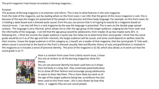
  • 1. The print magazine I had chosen to analysis is Kerrang magazine… Purpose: The purpose of Kerrang magazine is to entertain and inform. This is due to what features in the rock magazine. From the style of the magazine, just by reading whats on the front cover, I can infer that the genre of this music magazine is rock. this is because of the way the images are presented of the people in the pictures and there body language. For example, on this front cover, he is holding a skate board and is dressed quite casual, from this you can picture that it isn't going to exactly be a magazine based on classical music. I can also tell this is a rock magazine by the way the language is presented. This is seen on the double page spread analysis. The language is very informal, which allows me to infer the age group of the target audience. Judging by the front cover and the informality of the language, I can tell that the age group would be adolescents, from maybe 14 up two maybe early 20’s. in following this , I think the income the target audience is quite low, this helps me to determine their social grade. I think that the social grade would be an E as of the age and their interests, the target audience will be causal, and some could depend on welfare state for their income. I know the target audience is of this category as ,I myself, am a reader of that magazine, that the social grade ‘E’ links well , where casual is concerned as the band on the front is dressed casually. Katz and Blumler theory of uses and gratification is involved in this magazine as it includes a sense of personal identity. The price of the magazine is £2.50, which also allows us to work out that the social grade is an’ E’. Here is a random front cover from a fairly recent issue, I chose this one at random as all the kerrang magazines show this theory. You can see personal identity has been used here as it shows their full body in a long shot- they could have potentially done his to show off their fashion and encourage young adolescents to aspire to dress like them. This is more likely too work as of the age of the target audience being low. surveillance has also been used on this front cover , this is also shown by how they dress , it suggests they are just casual people.
  • 2. Technical opportunities, considerations and limitations of print and digital magazines. both print and digital magazines have their pros and cons- they are both trying to maintain and build and audience as well as producing content that is engaging and relevant. Reading from print magazines offers a much more memorable and leisury experience and the key is establishing where, when and who you are reaching as well as designed packaged print content still creates a premium, unique feel that digital content will always lack. Print magazines provide a more tactical human experience , where the reader can sit back and read the magazine ,without being invaded by ads that are based on your browser history. A benefit print will always have over digital magazines is once its purchased, its yours forever and its simple to read-there is no need for a good internet connection, you don’t have to worry about battery life and its more simple to read whereas for a digital magazine, you might have to enlarge the magazine to be able to read it. However print magazines are suffering as publishes are losing jobs due to shifting to digital magazines. As newspapers and magazine circulation continues to shift from print to digital, growth is not yet in uniform: the print circulation fell 4% year on year in the UK. Most of the print companies have moved to digital publishing. Print magazines are often read once and forgotten about somewhere, or thrown away – this causes environmental problems s it isn't environmental friendly. In addition to this digital magazines are more of a satisfactory impact on the reader now, this is because digital magazines make it very easy to share content and your favourite articles to potentially spark discussions on social networks- this builds up a relationship and appeals to the audience as it expands on their social skills due to their age. As of this , it creates a much larger reader engagement and helps build a community. For digital magazines, the users age has become more important, as publishers are competing for audiences attention.-although the digital platform is relatively a new concept, some versions are not picking up the slack for the decline of print circulation. Digital provides more realistic benefits –the clearest benefit is the feedback that you get to help optomise your products and content. Digital magazine editions national readership survey (2016) demonstrates the consumption of mobile and online adds a further 107% audience reach individual news brands and 68% of magazines. Issues that occur with print and digital distribution , print in particular- the specific target audience may not be reached due to where the magazines can be purchased; places such as the newsagents . This would be an issue as not many people of the age group my magazine is aimed at ,for example, would voluntarily go to a newsagents . So as of this, magazines could be losing their audience. However, print music magazines can still be found in music shops, where the audience may purchase it. A major issue that digital magazines face is that audiences are unaware of where to find the digital magazine, it can also be expensive to subscribe to. If you wanted to make a magazine , for instant with amazon , you would have to use Mobe to create your magazine- this has a downfall on the digital magazine as it stifles the creativity and as of this, it creates a negative impact on the target audiences appeal. Another overall issue with print magazine , is that the colour may not come out at vibrant and fitting towards the magazine ,whereas it may process better through digital publishing. However, people could ague that print publishing is more beneficial as it is easier to read than digital as the lighting from the screen may hurt your eye after a while.
  • 3. The size of a good print magazine should always be A5 or A4 and the publishers have to think carefully about formatting text and considering the style of fonts to be used. A problem print publishers face with bleedlines is that sometimes they get cut off, once the magazine is made, as of this, the writing may not make sense and it will make the magazine look unprofessional.
  • 4. The masthead consists of the bold colours, red and white. This can resemble how the genre of the magazine its based on, is quite bold. On the title of the magazine there is almost like a dint like appearance- this links to the dominant image as its got that sticker affect, some skaters stick stickers on their skateboards so it keeps that constant coordination towards the dominant image. The name of the magazine has an exclamation point, which connotes shouting, like before , this is also representing the genre of music in which the magazine is based on. This is because people associate rock genres as screaming and shouting. An alternative idea from this is so it engages their target audience when they walk past the magazine, creating the aim to get them stop and buy the magazine- this could be because of the bold fonts being used, and the exclamation point at the end… as if its almost shouting at them. The bold fonts used also help to represet how much that genre stands out from mainstream music. The dominant image used is the front singer of a band Neck Deep, Ben Barlow. By creating him as the dominant image for that weeks magazine cover, helps attract more of KERRANG!’s audience build and buy the magazine, as a result of fans of that particular band or just himself will see it and be automatically intrigued. His facial expression is shocked, which links to the subtitle quote “he worlds most wanted” creating a sense of mystery, curiosity, drawing the audience in, this is a use of Barthes's ‘enigma code’ theory. Here Kerrang had used the hermeneutic code. Ben appears of the front cover as dominating over the masthead, this is because the magazine company want to show off their popularity- they are doing this cleverly by having some of the title missing, this is to represent that their company is that big, they don’t need to have there name visible, because of maybe their bold choice in colours, they are well remembered. He appears to hold a skate board which shows his causal part in life, allowing many other people from that audience to relate in interests and will be engaged by that. Its also sponsoring their band in a senses they have there name on the skate board. It also once again allows Neck deeps fan base to by the magazine and become familiar with the company. Everything kerrang does on their front page, in my opinion is always helping them build up their target audience , luring them in with big top name brands . Kerrang has put the rest of the band as sub images, this shows how the front singer is presented as the important one and almost represents a hierarchy . Kerrang also shows a sense of direct mode of address. This is shown when the sub images are looking directly at the camera, as if they are looking at us personally- by doing this is attracts us to the images which is the magazines constant aim Here they show another sub image but of the same person that is in the dominant image. Only this time it is with a dog. This is to draw the attention, possibly to female audiences because , nothing wins a girls heart like an animal lover. It enhances the audience once more. Kerrang keeps a constant colour scheme throughout their front cover, and as part of their target audience I know that that constant colour scheme is shown throughout the magazine. The use of the white on red is eye catching. The use of the colour red is a use of semiology as it can suggest negative , evil, devilish beings. Theoretically speaking, I think this is clever as rock music r centuries has been portrayed as “the devils music” , so it’s a bold and risky colour to use, but kerrang , adding the bold font, use this and embrace it.(this is a use of the enigma code theory, using the semantic code!) The conative meaning for this, potentially maybe that even though all these stereotypes of the music is represented, you should still listen to the music, and be bold about it , to wear what you want with pride and listen to what you want, by doing this it creates the use of subject positon . PRINT
  • 5. Here the creaters of kerrang magazine use a different colour and font scheme to draw away from the main topic of that weeks magazine, allowing the audience to know that even if they didn't like or listen to that band there is still much much more in that magazine about a big chunk of well known bands. The bands names are written in a different colour font, the use of the orange has a massive impact as it stands out greatly from the black background, the use of capitalized letter also help to engage the audience towards buying the magazine because it personifies that the magazine and the information's shouting directly at you to buy the magazine - yet another ruse of direct mode of address. ( ever magazine company's aim is to make their magazine cover as persuading as possible to get people to buy it !) Here the background of the magazine is a collage of the band , this shows that they are going to be a he part of the magazine. Also, the sell line, “form skater kids to the worlds most wanted” emerge with the background because its almost like it’s a wanted poster, multiple photos to give that sense of emergency to find them. The front cover shows a constant theme . The photos also shows how casual their life is , walking around the streets . This is showing a sense of Katz and Blumler theory, it shows surveillance as it shows there day to day normal life , which allows us to relate to the band members. Kerrang uses different band names to draw more people in , they do this by their skyline, as shown at the top of the magazine. The name of the bands , again are in a orange font, with bold capitalized letters… again this is to over egzadurate how much is in that magazine. Here the essential information Is at the bottom right, quite large to be clear to the audience. The price is 2 pound 50p, which allows us to evaluate on the age group of the target audience. It also allows us to infer their social grade
  • 6. This double page spread was taken from another kerrang magazine.. Here kerrang has used a running head in a noticeable place to grab the attention to the reader. By putting it near the dominant image, its hard to miss. The font and the colours are bold. They resemble kerrang’s bold red masthead and it is what the company is remembered by the background of the running head is black, which using bathes theory, is just normal , but using the conational meaning, it could also link to how black is seen as a stereotypical colours for this genre of music, the colours black resembles everything evil , and darkness. So using these colours, really match perfectly to what the magazine is about and the genre of music. The same method applies for the red that has been used. It also jumps out massively from the black background, which also resembles how people see the music as screaming . The heading on the double page spread is to create a sense of comedy. I know this with being apart of the audience for this magazine. It also creates a sense of mystery. it shows you me at six singer Josh Franceshi and bring me the horizons singer Oliver Skyes.. By replacing the six and writing Sykes, so as a result of this terrible pun, it allows the reader to be curious as to why Oliver is with him. The colour scheme still is repeated and Sykes is red to show the different name of the band and to create that shocked and almost confused reaction when you read it. The layout of this double page spread is simple, which makes it very effective for the reader as it almost cuts straight to the point, as it doesn't’t drag on. It appeals o the audience in this sense because there target audience is many adolescents, they aren't going to read two pages worth of information, they will lose interest .- so by doing this, kerrang allows the audience to still be engaged but they cleverly don't go over bard with there information. The use of the drop cap, also known as a kicker, helps set the rest of the article, its shows the introduction of the article. Yet again, kerrang uses there iconic red bold font to engage the reader onto reading that article. Here the 2 band members are dressed quite casually. Which suggests that they quite laidback and comfortable in their own skin. This shows , to an extent Hall and receptions theory , as it could potentially be a hidden message, that you should dress the way you want, be the way you want and you should be comfortable with how you are , the decode of this would be so the audience feels like that’s the way they have to be, they might then aspire to be like those two. The informality of how Josh and Oli is dressed and positioned fits well with genre of music, because it would look outplaced and the magazines theme wouldn't’t run smoothly if they were dressed formally as if they were going o an award ceremony. They way they are positioned suggest a personal relationship, in this case, being friendship-this is also as Oli makes a love heart with his hands. Due to this, it could make the audience curious and raise questions like are the going to do a collaboration ? Or are they touring together? Kerrang keeps the audience engaged constantly by revealing information but all of it and the reason for things . The body language represented shows a friendly atmosphere, this could potentially be an encode(theoretically speaking) , and the hidden message could be that you should treat everybody with love and in a friendly manner, the reader will realize this and some of the audience will aspire to be like them so by presenting these men in a friendly manner , will help encourage people to become nicer people. In terms of mise en scene, the lighting used on the two men is pointing directly on them, this shows that they are the main focus on this page, and that they are the important information. It also creates a sense of dominance over everything else on this page. The company used cinematography and used a 2 shot to help show more information on the page because if someone was not familiar with the bands, but recognized there appearance or face, it will help them realize. the way the writer has written the article is informal, this is because of who the magazine is aimed at, adolescents who read this wont be intrigued or possibly understand it if its wrote formally, like a newspaper, also it links to the genre of music again. Again kerrang is keeping the constant colour theme throughout the magazine.
  • 7. I decided to look at terrorizer’s digital magazine as it shows contrast and similarities towards Kerrang’s magazine Purpose: Terrorizers digital magazine has a purpose to inform but to entertain also. They achieve this by including interviews and articles with bands and competitions. They also include information on CD releases and tour dates-this will appeal to their target audience as it allows them to be aware of the things that would interest them. By doing these things , it also allows them to build a greater audience group. Judging by the magazine front cover and the double page spread I am about to analysis I can infer from this that the genre is rock and heavy metal music or any music from the alternative genre. This is because of the way things are presented in the magazine, for example: the font used on the dominant images band helps to create that ghoulish gothic feel, its something people find intimidating and scary like the gothic culture. Here the devils music allol ows the audience to know what music the magazine is about because of the well known stereotype of rock music being the devils music. This can also be seen as humorous towards their target audience as they are taking advantage of that This shows that to an extent, this magazine shows aspects of humor, so another purpose for this magazine is to humor. The subscription to purchase this magazine is £6.99 . Terroizer publishes 13 issues . Judging by the price , the target audience may potentially be from age 15 onwards. Looking at psychographics , the audience would be a mixture of explorers –this could be because they are at that point in life in which they are to seek individualism, strugglers- a large amount of the target audience would buy alcohol and reformers- the audience may also seek enlightment and freedom. All of this can be supported by their age estimation. As a result the social grade I personally think for this audience , I more than likely a grade D or a E.
  • 8. DIGITAL Here is the Terrorizer digital magazine that shares the same genre of Kerrang . Terrorizer magazine present the words 'devils music’ in a much larger font than the rest of the magazine. This could be to resemble the power and audience rock and heavy metal have grown. Again on this magazine, the sell line is capitalized – this indicates that the information is shouting into the audiences face. As part of this audience, I have seen this familiar technique used over a wide range of rock magazines. The choice of the colour used for the sell line is bright red . This is a use of semiology as it can suggest danger, evil and devilish things. Using this colour, terrorizer wants to take advantage of the stereotype that is around the rock music genre so they cleverly embrace and live up to the stereotype. The font style is quite gothic, which again is the constant link to the genre of music the magazine is based upon. The creator of the magazine shot this dominant image using a mid shot- the use of this camera angle helps emphasise the seriousness on the band members face. This image is a use direct mode of address, visually, as the band member is staring directly at the camera, as if he is looking directly at you –this engages the audience as its almost persuading them to pick up the magazine , without actually saying it. His body language is also coming across as serious and almost angry – this could be because of the make up on his face. This is deliberate as they want to evaluate on that gothic stereotype to appeal to their target audience. The facial expression on his face is quite intimidating , for some people. Others look at him and think he looks sad, this is a use of subject position. Two people think of different imagery in their head of the same thing. Terrorizer uses a skyline to give more information on what's inside the magazine, this allows the audience to be aware of what else is inside the magazine and people who are unfamiliar with the dominant image , but are familiar with ,say coven for example, will pick up the magazine still because they know of the band. Another thing about the skyline- the font on the names of the band are much different than the rest, this can be to emphasise their role in the magazine, potentially to get the reader to think there's a large section specifically on that band. It also can emphasise the bands fame. Personally, I find the use of colours used on this sky line quite eye catching as the rest of the magazine is dark and red, so the contrast of the white , really brings peoples attention to the bands names. Terrorizer has done this , again, to engage the target audience into buying the magazine. Theoretically speaking , this could be linked to the stereotype of the music being evil. The white font could represent the good , show it shoes the contrast between good and evil. This would also link to the theme of the magazine. The use of the sibilance ‘sound of Satan’ has a serpent like imagery in my head personally, but can mean something different to another. People fear a serpent, so with the use of this sibilance with the term Satan , can represent all things people could fear, and terrorizer makes this constant connection with the stereotype based around this genre , all the creepy things , they creator places them on the front cover of the magazine and takes advantage of that stereotype. 75 is wrote bold and with a blood red colour- this could represent again, the devilish behavior and links to the word ‘Satan’. It also emphasises how many albums that are in the magazine. The splash allows the reader to know more information about what's inside the magazine
  • 9. The title of the bands name has its own font , a font that stands out massively from the front cover. The band ‘Ghost’ has their name right underneath the dominant image and the font has this Smokey, ghoulish effect, which terrorizer has done , cleverly to link to the dominant image. Looking back at the dominant image, it shows katz and blumler’s theory of uses and gratification- this magazine has a use of personal identity and personal relationships. People who have this gothic culture , especially those of a younger generation , will aspire to be more spooky .
  • 10. The dominant image of this women is the singer form the band this double page spread Is about. The fact that she is larger than everything else on this double page spread. The way she is presented on this page, she comes across quite serious- this is shown by her body language. The seriousness on her face shows a use of direct mode address, this could be done deliberately to engage the reader to read that article. Hypothetically speaking, the seriousness on her face could foreshadow the information in the article. The background presented here is very gothic- this magazine keeps this constant elegant gothic theme, but use =s different colours. The choice in colour creates this femininity feel to the article. This could indicate the target audience for this particular band . The use of the red can indicate danger, death (this is a strong use of semiotics.) again, this links to the gothic theme. ‘the high priestess’ is wrote in purple font- this also comes across as elegant and almost of the romantic goth culture. This appeals to the audience as they will be attracted towards this article. The font is wrote in quite a church like , gothic font. This helps set that spooky theme that terrorizer was aiming for. Here, terrorizer has used a drop cap and a kicker to start off the article. The size of this kicker, suggests the audiences ages- this is because people of a young age, wouldn't be particular intrigued by a large amount of text. . It suggests that this magazine could be for a much more older and mature audience. However, the layout is kept simple , which does indicate the audience could potentially be adolescents . The writing for this double page spread seems to be on a scroll. This gives the article a more architectural gothic feel. This links to the skull that the woman in the dominant image, is holding. Again, there is a constant link to death. This is also a link to the genre of music the magazine is about and peoples popular opinion on the gothic culture. This long shot of this women in this sub image shown , is presented in a camera shot where you can see her outfit to swill aspire to dress like them.how the use of katz and bulmler theory of uses and gratification. It shows personal relationships-this is because some of the target audience is of the adolescent stage of development, which means they will think they should be dressing like how that band member is. It also shows a sense of survillience, it shows elegance and that they are just normal people also, Another sub image is presented at the bottom and it looks like the man has blood all over his face, this gives it that scary affect and links to the whole death theme.
  • 11. In conclusion, Kerrang magazine and Terrorizer share some similarities and have some differences. It was visible that that both magazine companies had a solid picture of their target audiences and had their interests in mind. this was shown by the layout and context. Both magazines thought thoroughly about the technical considerations. For print magazines, they made sure the text was visible and clear to read. The magazine publishers also thought about where they were going to sell their product as it needs to be accessible for their target audience. The print magazine also made sure that the target audience can purchase the issue due to costs. They need to make the overall price of the magazine appropriate so by doing this they needed to take their audiences age group into consideration to work out the best possible price but also a price that will benefit them as a company. Digital printing has to make sure there digital magazines appeal to their audience even with the automatic design changes it creates. This changes consist of the font the publishers use, it has to be clear to read but also link to the theme of the magazine, and interactive links and buttons that are in the digital magazine. Terrorizer came up with a way their magazine would create an enjoyable reading experience by making sure digital magazines had a better impact on their reading experience. Just like Kerrang, Terrorizer also thought about the size of the text , with It being a digital magazine, the wrong size may interfere with your reading experience. This can cause the audience to have to zoom into the articles and read it that way. This is an important part of publishing a magazine. Statistics show that the younger audience are more likely to purchase and subscribe to Terroizer and other digital magazines. Research also shows that print magazines are becoming less and less popular as many print companies are converting to digital publishing. With Kerrang being a print magazine, it is more expensive to create than Terrorizer.