1. This is a report for my as media project. I have chosen to design a magazine cover, contents page
and a double page spread for a hip-hop genre music magazine. In order to do this, I had to some
research first in to this genre of magazine. This is called similar product research, and without it I
would be unable the produce the right kind of design. The reasons for this are that there are certain
rules in producing printed materials and these are called conventions for instance, the image,
typography, the locations, styling, photography (camera shots). Depending on the genre, these
conventions can be different. Specifically in hip-hop there are some very common conventions that
most hip-hop magazine seems to follow. I will demonstrate these conventions by showing you a few
examples of the key magazines I researched (see below).
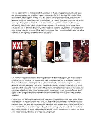
The common things noticed about these magazines are that within this genre, the mastheads are
very bold and eye catching. The photographic style is mainly simple and all focus is on the artist.
There are often some dark backgrounds or graduated tones, however some magazine use plain
white backgrounds. Type wise, the colours used in magazines are mainly primary colours in simple
typefaces which are easy to read. In terms of how males are represented in cover or interviews, it is
very powerful and masculine. We often see muscles, tattoos and a strong fashion influence which
appeal to the young hip-hop consumer who will admire and follow their favourite artist and how
they look.
I then started out planning my own magazine cover, contents page and double page spread. I have
followed some of the conventions that I have just described (such as the bold masthead within the
magazine cover, and quite a creative layout for my double page spread).Where I have constructed a
more individual/less conventional approach is where the photography is more location based and
more about the artist recording his sound within a music studio? There is more of focus of the music
artist creative his sound instead of being a muscular pin up!
2. PRE-PRODUCTION
In mock up 1, I was trying to do something more original in terms of format. In my opinion, I believe I
have gone against the conventions by going into a landscape format. As mentioned before, I have
made the photography of the artist more studio based. My colour choices also are different from the
hip-hop magazines that I have researched. By this, I mean the colours chosen for the typography.
Rather then being bold and blocky, my typefaces are curved and I used some more interesting
colours which made the text stand out. For the background, I have played with the lighting by
placing an edited gradient from the bottom towards the top with a rasberry tint which contrast
naicely with the tan typeface.
In mock up two, I have stuck with the conventions of a A4 magazine cover. I am still doing something
different then the norm by using the curvy typefaces and less bright colours for the mastheads and
other texts on the magazine cover. For the photography, I have placed a tilted blur using Photoshop
and gradient tools which allows the artist to be the main focus of the cover. There are a few things
that are yet to be added on to my final outcome such as the date of publication and the barcode plus
some more info to draw the consumer in.
Following the creation of the two mock ups, I needed to decide which design to go forward with for
my final task. I have printed off both of the two cover and asked several members of my target
audience of what they thought of them in terms of which one had the most impact and looked the
most authentic. The general feedback was that I should go with the mock up 2 design because of the
format mainly, which is the more conventional of the two. In terms of the typefaces and colours,
these are quite different to the magazine covers that I have researched. The artist being represented
in the studio recording is what I mainly want to stick with for the final design.
I now need to look at the other essential part of my research towards the final task. This is called
audience research, and without it, a magazine of this type could potientially fail if it didn’t to the
right consumer.
Mock up 2 A4 portrait format
Mock up 1 A3 landscape format
3. Audience
audience research is always essential when contructing any kind of product, and in this case a media
product. In order for a product to be successful in business terms, I will need to recognise my target
audience. A target audience is a specific group of people that could be catagoried by their age,
region, interest, wealth and their culture. In the case of my magazine, it is a very niche type of
publication which I will need find out more information about in terms of consumer. The next stage
therefore, is to get information as to who my target audience is and how to attract them. This is
done in sereval ways like the primary research I have done on similar product research. The primary
research for my audience will be done quantitively through an online questionnarie (‘Survey
Monkey’) where there will be a selection of open and closed questions aimed towards the specific
group of people who are interested in the hip-hop genre (many if my peers)
two questions from my survey are particularly interesting in creating my product. These are whether
the reader was male or female and which publications they read the most and why. I have been
planing to do a magazine that appeals to both men and women, plus learning about the appeal of
other successful magazine in this genre will help me get my design right.
From these set of result, I have come to the conclusion that females are dominant in this area due to
them having the largest percentage within this survey that I have posted online also women are
normally on the internet more then men. This will influenced me when it comes to constructing the
magazine cover in terms of colours used and the codes/conventions that are neede to apeal to that
audience more.
from these set of results, I have
come to a conclusion that the
audience will mostly appeal to
a magazine in terms of colour
and the photography. Since the
participates of this survey are
mostly women, my magazine cover will include colours that appeal to the women over men. For
instance colours like red and pink however, I will need to follow the codes/conventions of a hip-hop
magazine so I will have include a few symbols that represent masculinity.
41%
58%
1%
What sex are
you?
Male
Female
Other
15%
40%
30%
5%
what is the first thing you
look at when you see a
magazine?
Headline
Photography
Colours
4. These are the well recognised brands
magazine brands provide the public with
music genre based brands. This is very
beneficial that most people now
purchase the vibe magazine so now I
can do similar product research on one
or two of their magazines.
I have done some qualitative research also which I know to be useful in the form of a focus group. By
doing this I was able to gather more detailed information and feedback on my two magazine mock
ups and ideas. I have put together a few leading questions to gain further information about what
my niche consumers will like to see. The best piece of information I got from this focus group was
that the format that I was have used was interesting and very appealing due to the colours used.
In my evaluation, I am reviewing and reflecting on my whole creative process in this project with a
focus on the main task. I am doing this by looking at several aspects of my work. I have placed my 3
designs alongside the research images from that I have analysed in my similar product research. In
doing so I intend to consider how effective my pieces are and how much ‘verisimilitude’ has been
achieved. In doing this, I am reflecting on how much experience I have gained about the convections
of printed media tests of this genre. I am also considering how successful my project designs have
been.
15%
25%
30%
10%
10%
10%
Whats your favorite magazine
brand within the music genre?
Billboard
GQ
Vibe
Rollingstone
NME
Others
5. Evaluation: comparison
Subtle colours
Stylish use of typography
A4 format
Lighting being considered from different directions
Masthead eye catching but not to colourful
Different typefaces but are not so sharp
Both include dates
Different articles involved specified on the magazine
camera shots: mid shot
Fits the codes and convections of a contents pages
(articles, external images, upcoming tours, dates)
Page Numbers
Links with the magazine covers in terms of colour
themes
Information of articles on contents page
Gutters
Headlines
Main articles
Captions
Main image on the left or right
Drop cap
The design relates to each other due to
the letter behind the text
6. Strengths and weaknesses
My Photoshop techniques have improved whilst gaining experiences on the course. Photoshop is a
simple program when it comes to designing a product due to its tools that are presented. An
example of a convention that my magazine cover contains is the Mast head (Urban sounds). It is
noticeable to an extent in terms of the type face and colours used.
My magazine cover has followed a particular colour theme with soft colours, makingthe project
unique and authentic to its genre. I believe that my magazine contents page has a unique style. This
is because the typefaces that I have used are unique and the different scales in size gives an impact
towards the target audience.
However there are weaknesses present within my magazine project in the photography mostly. I
believe the quality of my photos could be improved and that images that I have taken doesn’t
contain a variety in terms of camera angles. There was a limitation when it came to selecting an
image for different parts of my project because most of my photos were similar. In terms of mise-en-
scene, I haven’t really taken that into consideration which I believe is another weakness. The
location of the image is the only factor that I concentrated on.