
Recommended
More Related Content
What's hot
What's hot (18)
Viewers also liked
Viewers also liked (15)
Similar to Media Evaluation
Similar to Media Evaluation (20)
Recently uploaded
Recently uploaded (20)
Media Evaluation
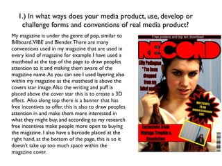
- 1. 1.) In what ways does your media product, use, develop or challenge forms and conventions of real media product? My magazine is under the genre of pop, similar to Billboard,VIBE and Blender. There are many conventions used in my magazine that are used in every kind of magazine for example I have used a masthead at the top of the page to draw peoples attention to it and making them aware of the magazine name. As you can see I used layering also within my magazine as the masthead is above the covers star image. Also the writing and puff is placed above the cover star this is to create a 3D effect. Also along top there is a banner that has free incentives to offer, this is also to draw peoples attention in and make them more interested in what they might buy, and according to my research free incentives make people more open to buying the magazine. I also have a barcode placed at the right hand, at the bottom of the page, this is so it doesn’t take up too much space within the magazine cover.
- 2. 1.) In what ways does your media product, use, develop or challenge forms and conventions of real media product? For my contents page I wanted the reader to be able to understand the page numbers and articles easily therefore I separated each page number with a white line so the reader would not be confused. The large image on the page indicates to the audience that this person plays an important part within the magazine also the image is very bright which also makes my contents page look busy which is what I wanted. Also I used made the two album covers because it would be a good idea for advertising again trying to draw readers in. I still tried to keep the colour scheme from the front cover the same. Underneath the page numbers and the title of the page, there is a brief summary of what is on that page, the language I used was informal as though I was addressing the audience I would in everyday life. This makes it look aesthetically pleasing and also makes it easier for the audiences mind digest it. This is similar to Blender and Vibe. Also the letters at the top which read THIS WEEK, clearly indicating to the reader that what is in this magazine is all new and the events that have occurred throughout ‘this week’ Also there is a brief summary in white writing inside a black box to make it stand out a little bit more.
- 3. 1.) In what ways does your media product, use, develop or challenge forms and conventions of real media product? The main image on this page like most magazine take up all the left hand side and slightly the right hand side too. It is a large image of the person the article will be about ‘lily Paddington’ which was advertised on my front cover page. I did not edit this image as I liked the steal barrier as a background but the image wouldn’t fit the whole page so I had to put a dark blue background onto the right hand side. The two images at the bottom I cropped to fit the page. On both images I used the polygon lasso tool as this tool gave me the best result I did this to the images to give them a 3D as one is overlapping the other. The colours that I have used are slightly different as there is no blue in the colour scheme on the first two pages, but I still managed to stick to it as the pull quote title is in yellow with a black stroke to make it stand out more. Also in the top left hand corner there is a box with NEW! World exclusive This is in red and black to keep the colour scheme. Also I did this to make the reader aware that the article has never been seen before or used by another magazine. The main body text has been spilt into three columns to make it easy for the readers mind to digest the article, I had to shape a bit of the text, so none of the text overlapped the image at the bottom. A drop cap is used at the beginning of my article, to make the reader aware that, that place is where my article starts. The kicker used is to give the reader a little preview as to what is in the article making them a little bit more anxious.
- 4. 2.) How does your media product represent particular social groups? In my product different people are represented, doing this because I wanted a wide range of audiences, hence the reason I chose pop music as it is mainstream and it what more people take most interest in, therefore it could increase the profit. For example my cover star gives the image of a pop star as, her stance and facial expression is very diva and her clothes worn are the up to date fashion and look expensive. In my article on my double page spread I have in fact made this star out to be a diva as she’s the reason the girl band have broken up, again showing that this magazine is a pop magazine as nowadays all the headlines are about pop stars and the pop stars are the ones know for causing dramatic headlines. The age range for my magazine may be 16+ as this is the age range that seems to take interest into what is going on the pop world.
- 5. 3.) What kind of media institution might distribute your media product and why? Supermarkets would be the best distributor for my magazine as these are the most popular with people The media institution that may distribute my media product would be profit based organisation that would be good for advertising my product. Also they need to include information services. I would like the main form of distribution to be physical, this meaning I’d want it to sold on a shelf in high street supermarkets such as ASDA or TESCO. Also local shops for local areas as these are easy to access than the supermarkets and also sometimes a lot cheaper. My magazine will be sold at around £2.50 retail price an issue a figure that I came up with, as in my research this was the most popular price.
- 6. 4.) Who would the audience be for your media product? With my magazine being all about females I would say it is evident that my magazine is aimed more at females than males but I wouldn’t like to put a label on it, as I feel it would get more reception if it was aimed at either sex. Going back to my research I asked as many females as I did males for their opinion their music tastes and pretty much got the same response. The genre of music was chosen from my research as everybody I did ask seemed to prefer well known mainstream pop acts such as Ed Sheeran, so this made it easier for my to make my decision on what genre my magazine was going to be. The colour scheme that I did choose was chosen because all the colours are very neutral colours they are associated with either genders, so my magazine would be aimed at either, therefore making my magazine that little bit more popular because it isn’t aimed at particular sexes, it only seems to be aimed at people who like the mainstream pop, which I believe is good for the sales of my magazine as this is the genre which most people are interested in nowadays.
- 7. 5.) How did you attract or address your audience? Attracting my audience in many different ways, one being a large masthead placed at the top of my front cover with the title on would be a very good way of letting the readers know what the magazine is called. Cover stars are also a very good way of drawing readers in, as magazine’s such a billboard have had Miley Cyrus on the front a well known star and these images get people interested as to why Miley Cyrus would be on the front of the cover. The free incentives inside the banner on my front page is also a good way to attracting audience as this is what some people looks for in a magazine and according to my research free incentives make a lot of people more open to buying a magazine. The bold colours of my magazine are also outstanding like the red and the black and also the yellow attracts peoples eyes. The pull quote from the article inside also draws people in and gets the interested in the article so therefore they might buy it. Offering competitions also like I have done to win tickets to concerts is another way I drew the audience in. I addressed my audience in an informal manner as this makes it easier for the mind to digest therefor the reader taking more of shine to it.
- 8. 6.) What have you learnt about technologies from the process of constructing this product? I have learnt a range of different things when it comes to technologies whilst doing this product. I used a wide range of hardware such as a computer, camera, transfer cable ect. I was confident with using all these things before doing this product, however whilst doing this product I have improved my skills, as now I know how to zoom and film amongst other skills. However my knowledge on using software has improves massively as before this product I had never used photoshop, quark or blogger before and I would know say I’m experienced and confident with using this kind of software. I believe that I could use this software without any assistance now and maybe even teach others how to use this software. At first I didn’t quite understand how to use photoshop but once I got the grasp of it, it was fairly easy and now would say I’m very confident at understanding it. On the other hand blogger and da font, online website where very easy to use and I instantly understood how to use these websites as they seem easy to use and I could teach others how to use these kind of programmes.
- 9. 7.) Looking back at your preliminary task, what do you feel you have learnt in the progression from it to the full product? Looking back on my preliminarily task, I feel I have learnt a lot of different things to do with my product. I feel as though my knowledge on software has defiantly improved by far, for example I learnt how to use the software “quark” which I used to import my article into Photoshop. This helped me put gutters into the article and also shape the text around images so the writing didn’t overlap. I became more comfortable with using the pologono lasso tool, as in my prelim task I stuck to using the ‘magic wand tool’ which gives the image a much cleaner cut. I also now know how to add strokes to texts and us blends on a rough edge cut out image. I also feel I have learnt a lot about the planning process and the researching side of making a magazine whereas before hand I just thought they went into making it, with researching anything, and I think it is for the best that the research is taken place as then you get an idea to what is the best way to construct a magazine and who the best target audience would be. I can now take a lot of cleaner images instead of blurry ones. In conclusion I feel now that I’d be comfortable with using all the software and hardware myself and if I had to do this task independently i feel that I could take part in that, therefore I think I’ve improve massively from my prelim task.
Editor's Notes
- \n
- \n
- \n
- \n
- \n
- \n
- \n
- \n
- \n