FULL ENJOY - 9953040155 Call Girls in Shaheen Bagh | Delhi
Typography double page spread examplers
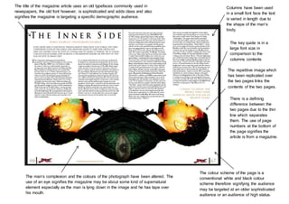
1. Columns have been used
in a small font face the text
is varied in length due to
the shape of the man’s
body.
The repetitive image which
has been replicated over
the two pages links the
contents of the two pages.
There is a defining
difference between the
two pages due to the thin
line which separates
them. The use of page
numbers at the bottom of
the page signifies the
article is from a magazine.
The man’s complexion and the colours of the photograph have been altered. The
use of an eye signifies the magazine may be about some kind of supernatural
element especially as the man is lying down in the image and he has tape over
his mouth.
The colour scheme of the page is a
conventional white and black colour
scheme therefore signifying the audience
may be targeted at an older sophisticated
audience or an audience of high status.
The title of the magazine article uses an old typefaces commonly used in
newspapers, the old font however, is sophisticated and adds class and also
signifies the magazine is targeting a specific demographic audience.
The key quote is in a
large font size in
comparison to the
columns contents
2. The large image on the first page is rather glamorous the
images lighting has been edited enhancing the white
lights and making the woman look angelic
The ‘S’ typeface has been
enlarged and links to the
image to the column of text
which shadows the end of
the large ‘S’. The ‘S’ symbol
can link to women in the way
that they use to wear corset
and achieve an ‘S’ shape
figure.
The women’s name has been linked
at the top of the page
The size of the columns
typeface has been changed
the first column is larger
therefore trying to grab the
audience’s attention. The
typeface style stays the
same as the large ‘S’
throughout the magazine.
There is also a large ‘A’ at
the bottom of the page
signifying a summary of the
article or an important
quote.
The magazine article is
predominantly targeted at a
female demographic aged 15-
30 as the text has been
written in a biography style.
The magazine is well known
and the page layout is very
elegant.
At the footer of the page there are links to the magazine’s website,
surprisingly however there are no page numbers.
3. A large photo of the man’s face is very striking and
makes you feel uncomfortable and sad as he looks
upset therefore you want to read about the article.
A conventional use of
columns when writing the text
The titles font size and
shape is unusual
changing in size
suggesting some of the
letters in the words are
jumping out at you to
attract your attention.
Speech marks and
ellipses are used to
show the story is very
interesting / subject
matter.
The black and teal
colour pallet reflect
the man’s clothing
therefore signifying
there is a link between
the two pages
Magazine brand tang line
Tagline gives a
general description
of the article
Page number
The bold letter (G) signifies this paragraph
is key conventionally a bold letter like this
would be used at the beginning or an article
to signify the beginning of the text
4. The use of pink banners appeals to a female demographic,
presumably women from 15-30 as the protagonist is a
young celebrity. The black and white
skinny trousers link to
the conventional
symbol of prison bars.
This representation
can link to the title in
which the key words
‘parents blamed’ is
used signifying that
some parent
disapprove of the girls
actions therefore she
should be locked in
prison.
The use of a camera
implies the celebrity is
playing with the
representation of the
media to her advantage
and demonstrating she is
aware that she is being
surveillance.
Price banner at the top of the page
The page number has been added on the left side of the page, a link can be found at the
footer of the page next to the page number so that the audience can find out more about the
story.
The title has been written in a slanted italic type font the use of quotation marks would shock
the audience reading the article. The use of black and pink in the title signifies there are two
sides to the issue. The slanted nature of the text implies that the contents of the article could
change your perception of the celebrity.
The article has conformed
to the conventional use of
columns; however some
key elements of the article
have been highlighted
yellow and pink to
highlighting differences in
points of view.
A small image has
been added in the
second column to
signify a connection
to the texts contents.