
Recommended
More Related Content
What's hot
What's hot (18)
Similar to Cover and contents page analysis
Similar to Cover and contents page analysis (20)
Recently uploaded
Recently uploaded (20)
Cover and contents page analysis
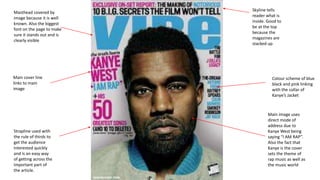
- 1. Masthead covered by image because it is well known. Also the biggest font on the page to make sure it stands out and is clearly visible Main image uses direct mode of address due to Kanye West being saying “I AM RAP”. Also the fact that Kanye is the cover sets the theme of rap music as well as the music world Main cover line links to main image Colour scheme of blue black and pink linking with the collar of Kanye’s Jacket Skyline tells reader what is inside. Good to be at the top because the magazines are stacked up Strapline used with the rule of thirds to get the audience interested quickly and is an easy way of getting across the important part of the article.
- 2. Clear bold titles so you know exactly what you are looking for. The serif writing in bold shows it is clearly a title that will have lots of other articles within that category. The page numbers are in bold and are bigger than the text so people know that they can just go straight to the page and know a little bit about what is on the page. In smaller text is what is on each of the pages so people don’t have to flick through the entire magazine to get to what they actually want to read Another main image of Kanye West links with the running theme of the magazine. The fact that there are no other images shows how important he is and is better than everyone else. The “V” in the background is a key micro code as it is the first letter of the magazine name and is a running theme throughout the magazine. This abstract way of writing the word “Contents” is something that is associated with this specific magazine. The fact it is spread out over three lines and is evenly spaced appeals to the newer generation as it is something not done with any other magazine. Small caption about the image again to tell you what the exclusive is about. The important words are in bold so you are instantly drawn in.
- 3. The main Logo/Masthead is covered by Dave Grohl head because the magazine is well known and by having the main image bigger than anything else, you know exactly wo the magazines biggest article is about The band “The Foo Fighters” are inside the mouth of Dave Grohl because he is the main singer and the head man of the band. The guitars and things like hat are key codes for the genre of rock music The strapline has the word “Foo” as the biggest text size on the page because it puts emphasis on the band name and draws in the audience to that name. The fact that there is some text under the cover line helps the reader know exactly what they will be getting from the magazine The other bands aren’t as big because the articles about them aren’t as big or as important. The colour scheme of red and white with some black and gold is typical of this magazine so everyone knows what magazine it is from a long distance. This Puff with a lure brings in an audience because people want everything for free and if there is something that really appeals to a wide audience then everyone would want to pick a magazine.
- 4. The different articles are divided by a red line with a title and page number in bold text. This makes it clear to see which article is on which page so people can go straight to the page they want. Also the fact that the line is red fits with the colour scheme The main iconic logo is on the page and the contents title is clearly written at the top of the page. It is clear to see with the contract of black on red. The individual images have page numbers on them so sometimes you don’t even need to read what's going on because the images give a clear insight into what the article is. The central image is linking with the cover page which draws in a specific audience because if people picked up the magazine to see Dave Grohl then they will be happy to see him as much as possible. The page number for this image is the biggest text on the page because it is the most important article in the whole magazine
- 5. Clear Masthead so people can clearly see what the magazine is. The twist on the word roots is linked to folk as folk music is the starting point of all music The date is in the top right so people will see the top half of the magazine and can see it is brand new The barcode is out the way on the side of the page to make sure the image isn’t blocked off Articles in green box to stand out on the blue so people are drawn in to what’s in the magazine The main image of Sam Lee in an urban background links to modern folk music to show that folk music is no longer just for the country people. His name at the bottom of the page is the biggest text apart from the masthead so people know exactly who is is Price is the smallest text so people aren’t too put off when they look at the magazine
- 6. Clear Masthead is the biggest text on the page so everyone knows what the magazine is called No barcode or date/price on the front cover. All of these are on the back cover so nothing takes away from the stylistic image Main article in different typeface and different colour to show that this is the main article of the magazine. The text is flipped on one word to link to the folk lifestyle in which there are no rules on how things should be This main image has been edited to make the cover stand out from any other magazine. The colours used are very vibrant which is typical of folk music as everything is lively. The idea of a VW campervan is linked to folk due to its Gipsy following and some parts of folk music originating from this social group Faded words in the background look like they have been written on a scrap piece of lined paper. This links to folk as most of its traditions were written down on parchment and then passed down through generations. Also the idea of re-using paper links to the natural side of the society of folk
- 7. Contents page – RayGun Magazine Contents title is broken up to give more of an abstract style which links to the obscurity of the folk society The page numbers are bold in front of the text so it is clear that these articles on these pages The font is a box styled font and fades at certain points of the letters. The text overlaps to try and show how abstract folk is The main image is over the top of the text but almost looks like she is lying on top of the text to try and engage the audience
- 8. Top stories are shown as a category so the page numbers do not go chronologically. This way people can look for exactly what they want to read and skip through everything else. Also the fact that the top news is a category means people can find the best bits more easily Page numbers are put in brackets so can be easily found when skim reading through text which is usually what people do when looking at a contents page Images link to the text clearly so people don’t even have to read for them to know what's happening on what page Brief description of what is on the first page of very important news. This is so people can read through and get a rough idea of what the article is about. This way people can decide whether or not it is worth reading. The article links to folk as it is about a folk band The title is clear with a date so people can clearly see that this is a contents page. Even though it doesn’t actually say contents page anywhere it clearly has the connotations of a contents page as it is saying in the title, “This is what you will find in this issue of FME”