Escorts Service Nagavara ☎ 7737669865☎ Book Your One night Stand (Bangalore)
Magazine Inner Pages Research 2
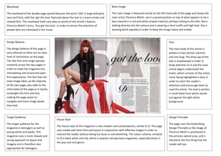
1. Masthead
The masthead of the double page spread features the word ‘USA’ is large bold grey
sans serif font, with the ‘got the love’ featured above the text in a more ornate and
relaxed font. The masthead itself uses play on words of the article’s feature,
Florence Welch’s lyrics, ‘You got the love’, in order to attract the attention of
people who are interested in her music.
Main Image
The main image is featured mainly on the left hand side of the page and shows the
main artist, Florence Welch, sat in a posed position on top of what appears to be a
box covered in a red and white striped material, perhaps linking to the title. She is
looking directly into the camera and is wearing a short outfit and high heel. She is
wearing black arguably in order to keep the image classy and simple.
Design Balance
The design balance of this page is
very informal as there are no clear
lines of restrictions on the page.
The title font and image spreads
unevenly across the two pages in
order to make the magazine less
intimidating and structured upon
first appearance. The fact that the
main image takes up the majority
of the two pages also adds to the
informality of the page as it clearly
outweighs the font and text,
making the page easier to
navigate and more image based
than text.
Text
The main body of the article is
written in two shorter columns
and one long. The drop cap of the
text is emphasized in order to
draw attention to it and the main
article begins underneath the
kicker, which consists of the artists
name being highlighted in blue in
order to catch the reader’s
attention and encourage them to
read the article. The text is written
in small black front which stands
out against the light white
background.
Design Principle
The page uses the Guttenberg
Design Principle as the image of
Florence Welch is positioned in
the primary optical area, and is
therefore the first thing that the
reader will see.
Target Audience
The target audience for the
magazine is teenagers as well as
young adults and adults. This
magazine uses a more relaxed and
young approach to layout and
imagery and is therefore also
appropriate for teenagers.
House Style
The house style of this magazine is also modern and contemporary, similar to Q. The page
uses simple and clean font and layout in conjunction with effective images in order to
interest the reader without being too busy or overwhelming. The colour scheme, similarly
to Q is black white and red, which is popular among many magazines, especially those in
the pop and rock genre.