
Recommended
More Related Content
What's hot
What's hot (19)
Viewers also liked
Viewers also liked (11)
Similar to Double page ajnsjnssan
Similar to Double page ajnsjnssan (20)
More from Harryateccles
Recently uploaded
Recently uploaded (20)
Double page ajnsjnssan
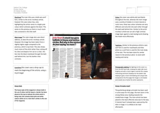
- 1. Salford City College Eccles Centre AS Media Studies Foundation Portfolio Colour the cover uses white pink and blacks throughout the text, whereas the main image uses a variety of shades in a more natural or rustic tone, these two colour schemes are very different and only link into each other through the dark wall behind him. Similar to the arctic monkey’s article we can see a high contrast image layer against a dark background showing the mode more effectively Masthead The main title uses a bolb sans serif font, similar to the arctic monkeys article, however this uses colour less, only highlighting the artists name in a bright pink colour which contrasts against the black. This varies to the previous as there is much more text contained in the title itself. Typefaces Similar to the previous article a sans serif font is used for mastheads and titles where as a serif font is used for the main body of the text. This has been done for similar reason to the previous piece to assist with reading and clarity Main image The main image also uses direct address, as does the arctic monkeys article. However this image has been taken from a slightly higher angle compared to the previous, which is eye level. This also shows much more of the artist rather than cutting off his chest and depicts him sat on a chair, this ties into the black masthead through the dark wall behind him, but the leather chair contrasts. Photography Lighting the lighting on this cover is a from the left hand side, showing his right side more brightly and with a much higher contrast this creates interesting and harsh shadows for the darker side helping to give a more intimidating and unique look. Compared to the first page the image is a lot darker and reveals less of what the artist represents. Coverlines this cover uses a drop cap to mark the beginning of the article, using a much larger Design Principles Used? The guttenburg design principle has been used in some ways for this page, the text starts in the strong fallow area, leading towards the model/main image. The main article has been placed in the least effective area due to the way if interest hasn’t already been captured by the title or image, it is unlikely to be read afterwards. House Style The house style of this magazine is shown both in the use of colour and the layout, a border has been placed at the top to indicate the article which is being read, this contains black pink and white colours which are in a font that’s similar to the rest of the magazine.