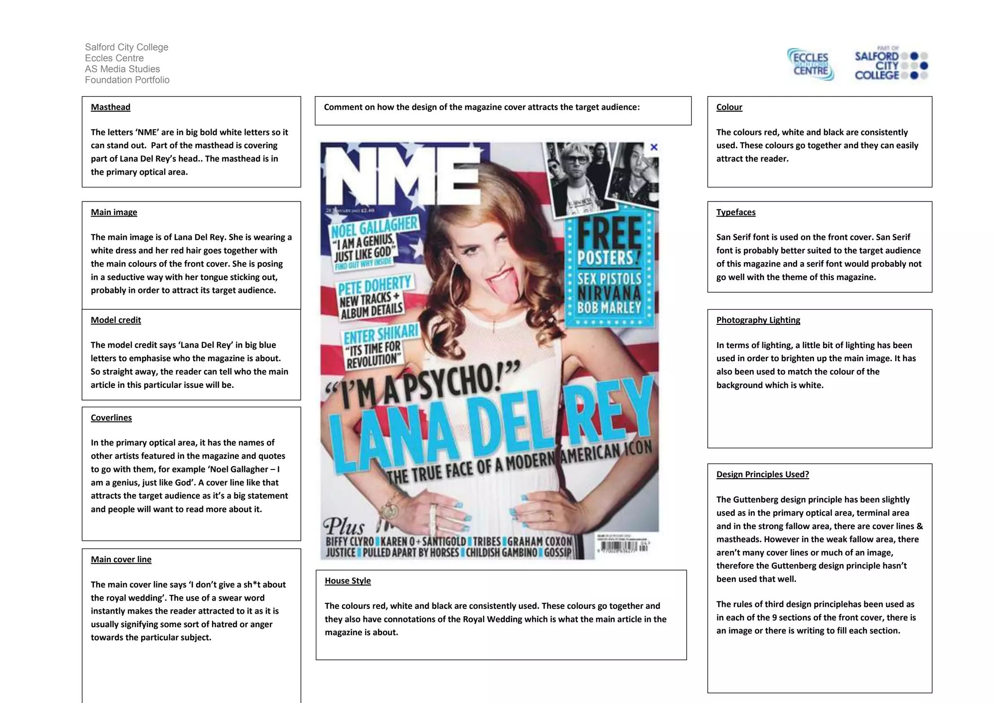
Salford City College
Eccles Centre
AS Media Studies
Foundation Portfolio
Masthead

Comment on how the design of the magazine cover attracts the target audience:

Colour

The letters ‘NME’ are in big bold white letters so it
can stand out. Part of the masthead is covering
part of Lana Del Rey’s head.. The masthead is in
the primary optical area.

The colours red, white and black are consistently
used. These colours go together and they can easily
attract the reader.

Main image

Typefaces

The main image is of Lana Del Rey. She is wearing a
white dress and her red hair goes together with
the main colours of the front cover. She is posing
in a seductive way with her tongue sticking out,
probably in order to attract its target audience.

San Serif font is used on the front cover. San Serif
font is probably better suited to the target audience
of this magazine and a serif font would probably not
go well with the theme of this magazine.

Model credit

Photography Lighting

The model credit says ‘Lana Del Rey’ in big blue
letters to emphasise who the magazine is about.
So straight away, the reader can tell who the main
article in this particular issue will be.

In terms of lighting, a little bit of lighting has been
used in order to brighten up the main image. It has
also been used to match the colour of the
background which is white.

Coverlines
In the primary optical area, it has the names of
other artists featured in the magazine and quotes
to go with them, for example ‘Noel Gallagher – I
am a genius, just like God’. A cover line like that
attracts the target audience as it’s a big statement
and people will want to read more about it.

Design Principles Used?

House Style

The Guttenberg design principle has been slightly
used as in the primary optical area, terminal area
and in the strong fallow area, there are cover lines &
mastheads. However in the weak fallow area, there
aren’t many cover lines or much of an image,
therefore the Guttenberg design principle hasn’t
been used that well.

The colours red, white and black are consistently used. These colours go together and
they also have connotations of the Royal Wedding which is what the main article in the
magazine is about.

The rules of third design principlehas been used as
in each of the 9 sections of the front cover, there is
an image or there is writing to fill each section.

Main cover line
The main cover line says ‘I don’t give a sh*t about
the royal wedding’. The use of a swear word
instantly makes the reader attracted to it as it is
usually signifying some sort of hatred or anger
towards the particular subject.
Salford City College
Eccles Centre
AS Media Studies
Foundation Portfolio

Magazine Cover Analysis 3

  • 1.
    Salford City College EcclesCentre AS Media Studies Foundation Portfolio Masthead Comment on how the design of the magazine cover attracts the target audience: Colour The letters ‘NME’ are in big bold white letters so it can stand out. Part of the masthead is covering part of Lana Del Rey’s head.. The masthead is in the primary optical area. The colours red, white and black are consistently used. These colours go together and they can easily attract the reader. Main image Typefaces The main image is of Lana Del Rey. She is wearing a white dress and her red hair goes together with the main colours of the front cover. She is posing in a seductive way with her tongue sticking out, probably in order to attract its target audience. San Serif font is used on the front cover. San Serif font is probably better suited to the target audience of this magazine and a serif font would probably not go well with the theme of this magazine. Model credit Photography Lighting The model credit says ‘Lana Del Rey’ in big blue letters to emphasise who the magazine is about. So straight away, the reader can tell who the main article in this particular issue will be. In terms of lighting, a little bit of lighting has been used in order to brighten up the main image. It has also been used to match the colour of the background which is white. Coverlines In the primary optical area, it has the names of other artists featured in the magazine and quotes to go with them, for example ‘Noel Gallagher – I am a genius, just like God’. A cover line like that attracts the target audience as it’s a big statement and people will want to read more about it. Design Principles Used? House Style The Guttenberg design principle has been slightly used as in the primary optical area, terminal area and in the strong fallow area, there are cover lines & mastheads. However in the weak fallow area, there aren’t many cover lines or much of an image, therefore the Guttenberg design principle hasn’t been used that well. The colours red, white and black are consistently used. These colours go together and they also have connotations of the Royal Wedding which is what the main article in the magazine is about. The rules of third design principlehas been used as in each of the 9 sections of the front cover, there is an image or there is writing to fill each section. Main cover line The main cover line says ‘I don’t give a sh*t about the royal wedding’. The use of a swear word instantly makes the reader attracted to it as it is usually signifying some sort of hatred or anger towards the particular subject.
  • 2.
    Salford City College EcclesCentre AS Media Studies Foundation Portfolio