Role Of Transgenic Animal In Target Validation-1.pptx
DPS
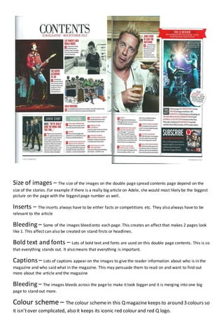
1. Size of images – The size of the images on the double page spread contents page depend on the
size of the stories. For example if there is a really big article on Adele, she would most likely be the biggest
picture on the page with the biggest page number as well.
Inserts – The inserts always have to be either facts or competitions etc. They also always have to be
relevant to the article
Bleeding – Some of the images bleed onto each page. This creates an affect that makes 2 pages look
like 1. This affect can also be created on stand firsts or headlines.
Bold text and fonts – Lots of bold text and fonts are used on this double page contents. This is so
that everything stands out. It also means that everything is important.
Captions – Lots of captions appear on the images to give the reader information about who is in the
magazine and who said what in the magazine. This may persuade them to read on and want to find out
more about the article and the magazine
Bleeding – The images bleeds across the page to make it look bigger and it is merging into one big
page to stand out more.
Colour scheme – The colour schemein this Q magazine keeps to around 3 colours so
it isn’tover complicated, also it keeps its iconic red colour and red Q logo.
2. Colour scheme – The colour schemeon most double page spreads is usually no more
than 3-4 colours. The reason for this is that it keeps it nice and simple and in someways
recognisable. In this caseit is whites, blacks, greys and pinks.
Main image – The main image is usually on a page on its own so that it stands out
more than the text. The main image in a music magazine is usually someonewith and
instrumentor someone juststanding still. They are looking straightdown the camera to
create a personalrelationship with the audience.
Body – The body is where all of the text is and it is called that as it is the main part. The
body is usually written in columns so that it looks good and looks organised. Also it makes it
easier to read and makes it seem shorter so that the audience will be persuaded to read
more of it.
Background – The background on double page spreads is usually bold and not very
complicated so all the focus is back on the main image.
Drop caps – These are used so that it tells us whereto begin reading and where it is
the startof a new sentence / paragraph.