1. Salford City College
Eccles Centre
AS Media Studies
Foundation Portfolio
Masthead:
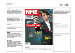
The masthead for this music magazine is NME. This
stands for New Musical Express. The text is in big,
bold white letters which are displayed on a red
background. This stands out to the audience which
could make them buy it. The red represents rock
and danger which links with the genre of magazine.
Comment on how the design of the magazine cover attracts the target audience:
Colour:
The colours used on the magazine cover are mostly red and
white with a greyish background. There is some blue text and
then the image which uses roughly the same colours but with
some bright colours for the paper cranes. These colours work
well and stand out to the audience. There has not been too
many colours used, therefore not overcrowding it.
Main image:
The main image is of David Bowie with brightly
coloured paper cranes floating around him. This
catches the audience’s eye because it’s an
interesting image with quite a lot going on in it. The
image is in the background with ‘David Bowie’
covering part of the image.
Typefaces:
The typeface used is san-serif which indicated that
the magazine is not formal. All the text used Is in bold
to help it stand out.
Model credit:
Photography Lighting:
The lighting of the photograph is brightly lit. It
appears that threes a white glow around David
Bowie. This makes the audience focus on him and
makes it seem as if he’s coming off the page.
The model credit is ‘He’s back… again! And then in large
letters ‘David Bowie’. This suggests to the reader that he
may have a new album out and the inside articles will talk
about his return. By leaving it open like this it could attract
the audience to buying the magazine.
coversine’s
The coversine’s on this magazine cover are in
smaller text than the main coversine and are also in
a blue coloured text. They are located in the weak
fallow area which automatically tells the audience
that it is not as important.
Main cover line:
The main coverline Is in the bottom of the strong
fallow area which is where the audience would
automatically look. The font style is san-serif which
indicated the magazine is not formal. The main
coverline is in white text which again makes it stand
out and easy and clear to read.
Design Principles Used?
The magazine cover uses the Gutenberg design
principles in some aspects. The masthead is in the
primary optical area so the audience can immediately
identify the brand of the magazine. The main cover
line then goes on into the weak fallow area with the
main image in the strong fallow area. This draws
immediate attention to the image stating that it is the
most important thing on the page.
House Style
The house style used is quite simple with not too many colours going on to confuse the
audience. It keeps things simple to allow the audience to see what’s going on on the page.