Call Girls In Mahipalpur O9654467111 Escorts Service
Magazine contents analysis 2
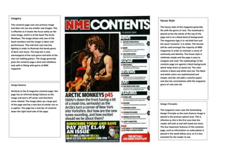
1. Imagery
This contents page uses one primary image
and does not use any smaller sub-images. This
is effective as it leaves the focus solely on the
main image, which is of the band The Arctic
Monkeys. The image shows only two of the
band members and the image is taken mid
performance. This mid-shot uses low key
lighting in order to illustrate the bands genre
of dark rock music. The long hair is also
stereotypical of the rock genre and both of the
men are holding guitars. The image generally
gives the contents page a dark and rebellious
look with is fitting with genre of NME
magazine.
Design Balance
Similarly to the Q magazine contents page, this
page has an informal design balance as the
image and text is off center and therefore
more relaxed. The image takes up a large part
of the page and has a text box of similar size as
a caption. The page has a text bar of contents
down the right hand side of the page.
House Style
The House style of this magazine generally
fits with the genre of rock. The masthead is
placed across the whole of the top of the
page and is on a black band of background.
The magazines logo is in red bold font and
the word ‘contents’ is in white. This format
will be used amongst the majority of NME
magazines in order to maintain a sense of
continuity and identity. The house style is
relatively simple and the page is easy to
navigate and read. The subheadings of the
contents page are against a black background
which helps them to stand out. The color
scheme is black and white and red. The black
and white colors are sophisticated and
simple, and the red adds a colorful aspect
and also has connotations with the magazine
genre of rock and roll.
Design Principles
This magazine cover uses the Guttenberg
Design Principle as the main feature image is
placed in the primary optical area. This is
effective as this is the first area that the
reader will look at and will stand out more.
The less important features of the contents
page, such as information on subscription is
placed in the weak fallow area, as it is less
essential for the reader to see.