HMCS Max Bernays Pre-Deployment Brief (May 2024).pptx
Nme contents analysis
1. Masthead/Heading – The masthead of the contents page covers the centre
and right third of the page. It features the logo of the magazine, to create
branding for the magazine, and also the same colour scheme, as well to
create branding. The word ‘contents’ takes up most of the masthead, in
white , bold font which stands out on the black background. By using
theses colours for these purposes, it creates a stereotypically masculine
feel to it, because its dark and sharp.
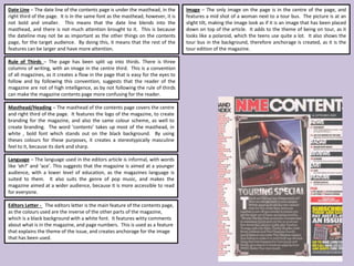
Image – The only image on the page is in the centre of the page, and
features a mid shot of a woman next to a tour bus. The picture is at an
slight tilt, making the image look as if it is an image that has been placed
down on top of the article. It adds to the theme of being on tour, as it
looks like a polaroid, which the teens use quite a lot. It also shows the
tour bus in the background, therefore anchorage is created, as it is the
tour edition of the magazine.
Date Line – The date line of the contents page is under the masthead, in the
right third of the page. It is in the same font as the masthead, however, it is
not bold and smaller. This means that the date line blends into the
masthead, and there is not much attention brought to it. This is because
the dateline may not be as important as the other things on the contents
page, for the target audience. By doing this, it means that the rest of the
features can be larger and have more attention.
Rule of Thirds – The page has been split up into thirds. There is three
columns of writing, with an image in the centre third. This is a convention
of all magazines, as it creates a flow in the page that is easy for the eyes to
follow and by following this convention, suggests that the reader of the
magazine are not of high intelligence, as by not following the rule of thirds
can make the magazine contents page more confusing for the reader.
Editors Letter - The editors letter is the main feature of the contents page,
as the colours used are the inverse of the other parts of the magazine,
which is a black background with a white font. It features witty comments
about what is in the magazine, and page numbers. This is used as a feature
that explains the theme of the issue, and creates anchorage for the image
that has been used.
Language – The language used in the editors article is informal, with words
like ‘eh?’ and ‘ace’. This suggests that the magazine is aimed at a younger
audience, with a lower level of education, as the magazines language is
suited to them. It also suits the genre of pop music, and makes the
magazine aimed at a wider audience, because it is more accessible to read
for everyone.