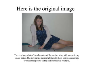
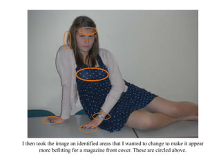
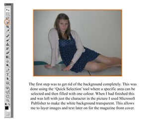
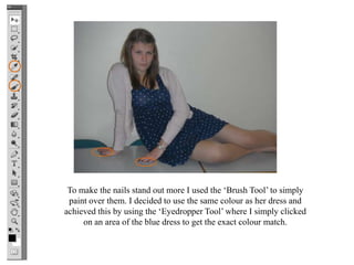
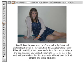
Photoshop

By Lucy Burden
This is a presentation to show how
I edited the image for my magazine
  front cover using Photoshop so it
     looked more professional.
Here is the original image


This is a long shot of the character of the mother who will appear in my
teaser trailer. She is wearing normal clothes to show she is an ordinary
            woman that people in the audience could relate to.
I then took the image an identified areas that I wanted to change to make it appear
        more befitting for a magazine front cover. These are circled above.
The first step was to get rid of the background completely. This was
 done using the ‘Quick Selection’ tool where a specific area can be
 selected and then filled with one colour. When I had finished this
 and was left with just the character in the picture I used Microsoft
 Publisher to make the white background transparent. This allows
 me to layer images and text later on for the magazine front cover.
To make the nails stand out more I used the ‘Brush Tool’ to simply
 paint over them. I decided to use the same colour as her dress and
achieved this by using the ‘Eyedropper Tool’ where I simply clicked
     on an area of the blue dress to get the exact colour match.
I decided that I wanted to get rid of the watch in the image and
lengthen the sleeve on the cardigan. I did this using the ‘Clone Stamp’.
 This works by clicking an area you would like to be repeated and then
  drawing it in where you want it. I was able to choose the size of the
brush and how soft/hard the edges were so I could make sure that it all
                    joined up and looked believable.

Photoshop1

  • 1.
  • 2.
    This is apresentation to show how I edited the image for my magazine front cover using Photoshop so it looked more professional.
  • 3.
    Here is theoriginal image This is a long shot of the character of the mother who will appear in my teaser trailer. She is wearing normal clothes to show she is an ordinary woman that people in the audience could relate to.
  • 4.
    I then tookthe image an identified areas that I wanted to change to make it appear more befitting for a magazine front cover. These are circled above.
  • 5.
    The first stepwas to get rid of the background completely. This was done using the ‘Quick Selection’ tool where a specific area can be selected and then filled with one colour. When I had finished this and was left with just the character in the picture I used Microsoft Publisher to make the white background transparent. This allows me to layer images and text later on for the magazine front cover.
  • 6.
    To make thenails stand out more I used the ‘Brush Tool’ to simply paint over them. I decided to use the same colour as her dress and achieved this by using the ‘Eyedropper Tool’ where I simply clicked on an area of the blue dress to get the exact colour match.
  • 7.
    I decided thatI wanted to get rid of the watch in the image and lengthen the sleeve on the cardigan. I did this using the ‘Clone Stamp’. This works by clicking an area you would like to be repeated and then drawing it in where you want it. I was able to choose the size of the brush and how soft/hard the edges were so I could make sure that it all joined up and looked believable.