1. Evidence and Explanation of Work
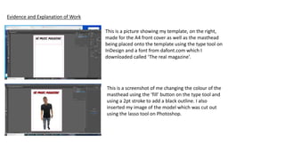
This is a picture showing my template, on the right,
made for the A4 front cover as well as the masthead
being placed onto the template using the type tool on
InDesign and a font from dafont.com which I
downloaded called ‘The real magazine’.
This is a screenshot of me changing the colour of the
masthead using the ‘fill’ button on the type tool and
using a 2pt stroke to add a black outline. I also
inserted my image of the model which was cut out
using the lasso tool on Photoshop.
2. This is a screenshot of me using the adjustment tool on Photoshop in
order to change my image to black and white to match my background.
I also used the paintbrush tool to make the bottom of my models legs
covered in a black layer in order to match the audience from the
background image I had used.
Here I pasted the image cut-out of my model onto the background image I
am using for the front cover. I then saved this image as a png at 72dpi.
This is a screenshot of me using ‘Place’ to insert my Photoshop image onto my InDesign
template as the background layer.
3. I then went round the image with the eraser tool in order to tidy up
the picture and get rid of any white spaces that I didn’t cut out with
the lasso tool. This made the image look sharper and more realistic on
the background.
Here I unlocked the layer with my typography so that the masthead would be
shown in front of the image of my model and background.
4. For this step, I found an image of a barcode off google which was copyright free.
I also used a shape tool to make a circle which I made red using the fill button
and outlined with a black outline using the outline option. This circle is going to
be used as a price sticker.
I then used the type tool on InDesign to add all of my typography
(in front) such as the headline, the pull quote, information about
the content of the magazine, when the magazine is issued and
the price tag on the red circle. I did all of this on the same layer
using the type tool.
This is the final product for my front cover.
5. This is me opening my image on Photoshop and using
the crop tool to decrease the unneeded space around
the image I am about to cut out.
Here I used the lasso tool in order to cut out the image of
my model which I then pasted onto a blank template.
6. Then I hid and deleted the white ‘background layer’ so I
got the so that the background was transparent and I
could open my image up as a cutout.
I then opened up an image of my background of a stage
on Photoshop which I will be using for my background
image for the double page spread.
7. The next thing I did was open the image of my model
onto the new document of my background image and
used the free transform tool to resize the image of my
model to fit the background how I needed it to.
I then used the adjustment tool on Photoshop to change the
saturation of the image so that the models skin and clothes
would be a slightly darker colour to match the more black
and white background of the background image.
8. Using the eraser tool, I went around the image of my model
erasing any white outlines or spots that I failed to cut out on
Photoshop in order to make the image more smooth and
realistic.
Here I resized the image of my model using free transform on
Photoshop so that the image fit my template a bit better. I
then used the Opacity option to tone down the opacity of
the background in order to make the black text, on my
double page spread template, more visible.
9. This is the final version of my double paged spread.
In order to get here, I saved the Photoshop
document and made an image frame tool so I could
place (using the place option) the background image
onto the template.
Once I had done that I used the type tool to paste
my body copy, page number and pull
quote/headline onto the page and resized the text
as well as change the font.