
Recommended
More Related Content
What's hot
Viewers also liked
Viewers also liked (20)
Similar to Magazine feedback first draft
Similar to Magazine feedback first draft (20)
Recently uploaded
Recently uploaded (20)
Magazine feedback first draft
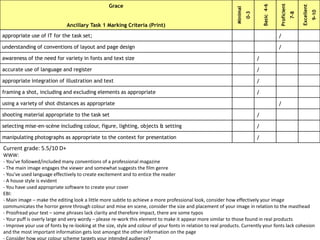
- 1. Grace Ancillary Task 1 Marking Criteria (Print) Minimal 0-3 Basic4-6 Proficient 7-8 Excellent 9-10 appropriate use of IT for the task set; / understanding of conventions of layout and page design / awareness of the need for variety in fonts and text size / accurate use of language and register / appropriate integration of illustration and text / framing a shot, including and excluding elements as appropriate / using a variety of shot distances as appropriate / shooting material appropriate to the task set / selecting mise-en-scène including colour, figure, lighting, objects & setting / manipulating photographs as appropriate to the context for presentation / Current grade: 5.5/10 D+ WWW: - You’ve followed/included many conventions of a professional magazine - The main image engages the viewer and somewhat suggests the film genre - You’ve used language effectively to create excitement and to entice the reader - A house style is evident - You have used appropriate software to create your cover EBI: - Main image – make the editing look a little more subtle to achieve a more professional look, consider how effectively your image communicates the horror genre through colour and mise en scene, consider the size and placement of your image in relation to the masthead - Proofread your text – some phrases lack clarity and therefore impact, there are some typos - Your puff is overly large and very wordy – please re-work this element to make it appear more similar to those found in real products - Improve your use of fonts by re-looking at the size, style and colour of your fonts in relation to real products. Currently your fonts lack cohesion and the most important information gets lost amongst the other information on the page