3. Learning progression
• I have made many changes and improvements from my
preliminary task through to my final production.
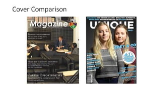
• The lighting and framing used in my shot on my
preliminary cover is very poor, with the shot being
unfocused and badly lit. The lighting in my production is
far better. High-key lighting is used to allow the model to
be well-visible and the shot is a mid-shot to allow the shot
to draw the right amount of attention without taking up
too much or too little of the page.
• My contents page preliminary used slim, small point fonts
for category headers, making them difficult to read. I
corrected this in my final production, using bold,
contrasting colours and sans-serif fonts to allow letters to
stand out more. The article sub-headings also suffered the
same problem, so in my production they were shortened
and made larger to draw more attention to themselves.
4. Learning progression
• I altered the layout of my front page
substantially from the preliminary. The
preliminary uses a very basic block layout
and only features three headlines, whereas
the final production uses a complex layout
and features many headline listings, with a
slanted theme throughout.
• My magazine’s title banner was another
element that improved dramatically over
time. My original banner wasn’t fully
capitalised and was smaller than my
production’s banner. The newer banner used
in my production is larger and uses a bolder,
more apparent font which draws more
reader attention and in turn, might
encourage more sales.
6. Creation of double page spread
• The skills I had learnt from the creation of my preliminary through to my final
production allowed me to create a very high quality double page spread.
• I used the skills I learned while producing my model image for my production
cover page in the creation of my double page spread’s model image. My double
page spread’s model image follows the same conventions also, with it using high-
key lighting and being a medium-close shot. This allows the image to blend well
with the white background.
• Looking at my codes and conventions allowed me to create a double page spread
with a flowing-text 3-column layout that reads well.
• Experimenting with fonts in my earlier production work allowed me to know
which fonts worked well as heading fonts and what colours would be suitable for
headings. This is evidenced in the use of black, bold fonts for the article heading
and smaller, house-colour-blue fonts in subheadings. The use of correct fonts
allows for the direction of reader attention across the page in the desired way.
7. In conclusion…
• The quality of my final production was raised significantly due the
skills I acquired through the work I did creating my production from
my preliminary. I also made use of online tutorials to learn how to
best operate the equipment I used, such as the DSLR camera. My
research in to audience and codes and conventions played a big part
in allowing me to know how other magazines best reached their
target audiences. Without these things, my production quality would
have been no higher than that of my preliminary task.