
Recommended
More Related Content
What's hot
What's hot (20)
Viewers also liked
Similar to Double Page Spread Analysis
Similar to Double Page Spread Analysis (20)
More from KatieThomas17
Recently uploaded
Recently uploaded (20)
Double Page Spread Analysis
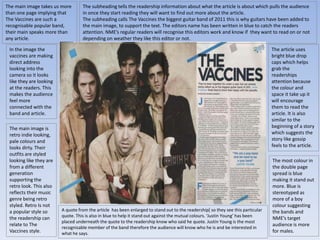
- 1. The main image takes us more than one page implying that The Vaccines are such a recognisable popular band, their main speaks more than any article. In the image the vaccines are making direct address looking into the camera so it looks like they are looking at the readers. This makes the audience feel more connected with the band and article. The main image is retro indie looking, pale colours and looks dirty. Their outfits are styled looking like they are from a different generation supporting the retro look. This also reflects their music genre being retro styled. Retro Is not a popular style so the readership can relate to The Vaccines style. The subheading tells the readership information about what the article is about which pulls the audience in once they start reading they will want to find out more about the article. The subheading calls The Vaccines the biggest guitar band of 2011 this is why guitars have been added to the main image, to support the text. The editors name has been written in blue to catch the readers attention. NME’s regular readers will recognise this editors work and know if they want to read on or not depending on weather they like this editor or not. The article uses bright blue drop caps which helps grab the readerships attention because the colour and space it take up it will encourage them to read the article. It is also similar to the beginning of a story which suggests the story like gossip feels to the article. The most colour in the double page spread is blue making it stand out more. Blue is stereotyped as more of a boy colour suggesting the bands and NME’s target audience is more for males. A quote from the article has been enlarged to stand out to the readership[ so they see this particular quote. This is also in blue to help it stand out against the mutual colours. ‘Justin Young’ has been placed underneath the quote to the readership know who said he quote. Justin Young is the most recognisable member of the band therefore the audience will know who he is and be interested in what he says.
- 2. NME uses a simple sans serif font for the title of the article ‘The Vaccines’ which gives the article a simple straight forward feel. Which is appealing for NME’s and The Vaccines target audience. The heading is in large font to it stands out to the readership as it is the only large writing on the double page spread. Furthermore The Vaccines being the only large font on the page suggests that is all the attention need as they are so known and popular. In the main image the lead singer is placed at the front of the band. He is the lead singer making him the most recognisable and appealing to their target audience. It makes the article more obvious who it is about. The article cant be too long because the target audience of both NME and The Vaccines are more interested in the images than the text
- 3. This double page spread inside NME follows general conventions of a double page spread making the layout similar to other magazines double page spreads. The header of the page ‘RADAR’ is in a blue box with white writing to grab the reader attention and show it is not just a boring article. The main headline of the double page spread is in bold display fonts. The black against the blue box makes it easier and clear for the readers to see it. It tells the readership what the article is about and the fans of ‘The Teenagers’ will be eager to read the article. The font of the headline isn’t plain and boring and this is more attractive for the readership to get their attention. NME has used drop caps for their double page spread article. The drop caps attract the readerships attention and will encourage them to read the article. Including the ‘NME loves’ starburst will encourage other readers that aren’t already fans of the band to give them a chance to like them after reading the article. It tells them that if NME loves them then the readers will The boxed text includes information that the fans of the band would enjoy or information that readers finding out about this band for the first time would find helpful and would appreciate. The main image takes up one page out of the double page spread. The image is simple yet effective. It is very simple ‘The Teenagers’ band are lying in bed looking into the camera. Behind the boys there are lots of pictures and posters you would typically find in a teenagers bedroom. They are mostly teenage girls or women showing flesh. This related to the article and the pull quote saying ‘of course we’re a sexual band’. The typical teenagers posters in the background behind the boys links to the name of the band and headline of the article. The band is a typical indie band suitable for the magazines genre. The smaller related Images within the text shows a member of ‘The Teenagers’ performing on stage. This iconography of the performance relates to the indie genre of the music magazine. The image is placed within the text to show how they link together and relate. The smaller related images along the side show the bands that ‘Everyone’s talking about’ letting the readership know who to look out for. These images simply show who the band or artists are.
- 4. The main colour that stands out on the double page spread is blue. This could emphasise the target audience being mostly boys. Also blue stands out from the other colours black and white. Blue grabs the readerships attention. Along the side of the contents page it includes more information underneath the title radar. It is showing the readership more upcoming artists and indie bands that they might enjoy and become a fan of. It reveals a little information about each artist. It even has the review from Alex Turner, the lead singer of Arctic Monkeys, sharing with the readership what his favourite band. This helps influence the target audiences opinions of the band also. The main article on the double page spread is an article about information about the band and the bands style of music. This is also shown trough the pull quote within the article saying they are a sexual band suggesting their music is too. The main article is based on how the indie band has been accused of being sex orientated and the band is admitting this and it is natural. This attracts the target audience of NME as they are the age of relating to the article. Because the audience feel they can relate to the band and their music they would find the music appealing to them and interested to read more. The stand first underneath the headline also relates to the article. ‘young, dumb and full of filthy tunes’. The standfirst and pull quote together easily give away the main theme of the article which is how the band are sex based. The main image is placed on the first page taking up the whole page is because they need to be noticed. It is placed this way in every issue. This is because the double page spread is mainly about that band therefore attention needs to be on them. The main text is placed on the second page next to the main image because they should clearly be recognised to the readers that they are linked and related to each other.