SlideShare a Scribd company logo
1 of 6
Inspirations
Inspiration is who I am inspired by when it come to my own work and my own designs, this involves the way I put make up on my models as well
as the way I dress them up in there costume as this is important when it comes to the theme of the magazine (music) I will also need to give
commands to my model so that they pull appropriate facial expressions on top of all that however that ties in with all of them is the colour
scheme as a will have to decided the range of colours what I want my magazine to have, for the likes of masthead and different founts I will have
to look at other magazines to get an idea of what style is appropriate for the music style genre another thing which I will need to look at is how I
can do my magazine better than other music magazines I can do this by studying the techniques used by music magazines what there faults are
and how I can not do them faults and succeed from them as this will make my magazine more of a challenging competition this way, I will
however need to look at what the audience of music magazines likes about the magazines so then I have a better idea of how I can target my
audience.
Here I have included three different front covers of music magazines, I have done this to show the variety of design what you can do in a music
magazine at the same time this shows how despite them being the same genre (music magazine) they all look very different from each other at
the same time this shows how they all follow a similar formula of layout showing there is a limit to how much you can do before it doesn't look
like magazine with an audience base.
Collages of founts
When it comes to designing founts for a music magazine it is often smarter to look at the genre of music that is being done as this shows
who your magazine for the time it is out is more pacifically aimed at however this at the same time can be damaging as you want to try
and make your audience big as possible so that it has a higher chance of being picked up, an example of this would be if for example
your magazine was aimed at the “Pop Punk” genre you would expect there to be more of a fun cartoony fount or if it was aimed at
“electronica” genre you could do something fun such as make your fount being electric or make it in the style of neon lights, for my own
magazine I will try to use a variety of founts that suit the style of the artist which I am doing while at the same time make my magazine
look attractive as possible so that it has a higher chance of being picked up by the viewer as that way even if it isn’t there taste or genre
of music they might be attracted by the fount which reads something they are interested in and want to know more about.
On this front cover for example the fount is one of three colours (yellow, white and black) the reason it is only these three colours is
because those are typically the colours of the Emo fashion and at the same time it is the bands signature colour scheme, the fount shape
itself is basic a majority of it is upper case making it seem more important than other things which are going on in the magazine, one
fount that does stand out compared to the rest is the way the name of the band has been done as it has been done in a fount that
makes the name of the band the main attraction of the magazine cover, at the same time the masthead for the magazine company is the
same colour as the band this could be a way of the magazine saying its on the bands side meaning you can add symbolism and meaning
to your founts if you do it right.
Image
Sub image
Masthead
Double page spread
Front cover
To the right I have written
words related to media and
included some fount styles
which I would consider using
for my magazine as I believe
if I use them right I can make
my magazine look official and
I also believe they suit the
style of what I will be doing.
Masthead
The masthead of the magazine is “KERRANG!” the style of the masthead appears to be it is smashed or broken with lines down
it suggesting it is fractured this could at the same time be an inside joke as there is an ! Which suggests it could be something
that was said when something was broken and it could be in upper case because it is shouted as part of the reaction, the
masthead its self is always behind artist on the magazine showing it doesn’t see its self as important as the people on the
magazines front cover, the masthead itself is at the top of the page this is likely due to how read things naturally from top to
bottom meaning we see the masthead before anything else showing that the magazine wants the viewer to know what
company's magazine this is this is also likely due to if the viewer likes this type of magazine then they might consider purchasing
another one.
The masthead is also giving an illusion it is there in the room with the artists as it shows two of the band members behind the
masthead and one in front this could be the magazines way of saying that they are with the band and that they are with them
with whatever they are doing.
For my own audience what I can do is I can give my fount a catch such as the word KERRANG is smashed on there magazine I
could also make that catch something that hasn’t been done before, what I could also do that is better than the other magazine
companies is I can make my masthead more attractive to look at by making it have a fount style and a colour scheme that it will
have for every magazine no matter what the topic is, I could also experiment by making it a short sentence and then go into the
main artist on the pages name.
Colour schemes collages
The colour scheme for this two covers of magazines is completely different to each other being the reason I choose these two, the top one
shows a very bright but at the same time not in your face kind of colour scheme as it shows not much in terms of colour variety but it does
show you a lot of detail in the models and it has been done so everything is clear and basic as the magazine itself only consist of white,
black, grey and yellow but it has been shaded and faded out to make the magazine look clean and presentable, this at the same time could
be the magazines way of saying it wants you to focus on the artist and just them as it is only them on the front cover there isn’t anything
else to look at that has a high level of detail, at the same time could the magazine be so polished because of the people on it almost as if
the magazine needs to look good enough for them, the magazine also appears to cleverly use colours to advertise almost as at the top of
the magazine it has in bright yellow “2 FREE GIFTS” we often associate the colour yellow with the likes of gold therefore this could be the
magazines way of saying how good the gifts are, however due to the low amount of colour this could also say that the magazine is aimed at
a more grown up mature audience as that is often what we associate low colours with meaning for my own magazine what I could do is I
could work out what my audience age range is so that I know how I should present my magazine more to that audience than any other.
On the other hand the magazine bellow by the Rolling Stone is different as it is bright and colourful making it the opposite of the top
magazine cover, the magazine cover itself consist of the colours purple, red, green, yellow and pink the likely reason being is that the artist
on the cover of the magazine is Jimmy Hendrix who was successful in the 1960s a time were pop culture and fashion consisted of these
bright colours one thing that however makes the front cover interesting is how they have done the artist grey and wrote beside “The LAST
DAYS” this therefore shows how the magazine has used to the colour grey to symbolise the artist death however what this could also be
saying is that is that his mark is still alive (colours of his style and fashion) but he himself isn’t, showing he is gone but his legacy lives on,
what I could therefore do for my own magazine is I could use colours that are appropriate and connected to the artist but at the same time
do it in a way that adds meaning to it, however what I could do to make it better than what other magazines are doing is I could make it so
that there isn’t just a reference to the artist or model on the magazine but I could also do it so that you could take it more than one way as
well as so everyone sees it different who reads the magazine for example some who look at it and look through it might see the colours as
being connected to the artist were as some one else might just see bright positive colours or I could make it so that it is the one colour
pattern on every page but the colours themselves on the pattern change.
Facial expression research
The facial expression of the model on this front cover shows the artist looking happy however at the same time it shows a sense of humour
as he is smiling directly at the camera with his guitar below him this could be the photographers way of saying that he is happy to be playing
the guitar or happy to be doing music, this as a result makes the magazines front cover seem a lot light hearted as if the model was pulling a
serious face it would make the magazine seem a lot more serious and less fun this therefor shows the importance of the face of the model as
it can determine a lot about first impression on the magazine front cover and what you think of it, for my own magazine therefore what I
could do is I could make it so that the face of my models is how I want people to see my magazine and at the same time make it so that there
is possibly props that contribute to the way my magazine is saw, for example I could have my model looking serious and at the same time
playing with there hair, the message would be the model is annoyed at there hair.
On the KERRANG! front cover the facial expression is different as it shows Jerad Leto looking directly at the camera looking serious and with
his eye brows slanted to give a more attitude vibe, the result of this is with him being the main image is that the magazine gives off a lot
more of a serious focus as his facial expression is what attracts you to the magazine this as a result makes the magazine look as though it is
targeted at a lot older audience one who wants to know what it is and try to understand what it is that is making him this way, the reason I
say older as well is because it could be a adult topic that a younger audience might not be able to understand, as a result for my own
magazine what I could do is I could decide my audience age range is based on the face that the person on the front cover is pulling at the
same time I could also use this to draw that person in as I could make it so that it is dramatic the person could look really angry or serious
and naturally due to people being attracted to drama there's a higher chance of it being picked up.
Costume hair and make up
• For my costume/hair for my magazine what I can do is look at the fashion of the type of music which I am doing and look at how all
of them regularly dress and what sort of clothes they typically wear as this will give me a better idea as to how I should present my
models and how they should be presented, I can also study what angles are best when they are presented like this and having there
photo taken what I could also do to make mine better than what other companies are doing is I could make it so that my photos
that are taken of the models appear more natural and that the makeup isn’t overdone so that it adds a human vibe about it you
don’t get the idea that they are being fake and that they are themselves, as for the way the hair is done it is dependent on how the
fashion has there hair and how the models can be done to look like the style it is also dependent on what will look more attractive
to the audience what traits in the fashion is it the audience likes, as for when it comes to doing my make up on my models I might
have to do research on what the types of make up they use so that way I can make my magazine be accurate as possible to the
genre and at the same time so it looks like a real magazine with actual models that’s have been done up with makeup, what I could
also do to make my make up on my models better is I can add meaning behind it say for example the model or artist is moody then I
could use a lot of black makeup or say they are feeling creative I could use multi coloured make ups.
• Here I have included an example of an artist/model who wore makeup (David Bowie) I have used this example because it shows
how creative you can be with makeup and how you can almost make someone into some else if you do it right, what I like about the
makeup is that it has been used to instantly catch your eye due to it being unique and different in fact I believe that with this
magazine cover in particular they wanted to make his makeup the main attraction due to how there isn’t anything around him in the
background as it is just him and his face with his makeup to look at.

More Related Content

What's hot

Shannons Evaluation
Shannons EvaluationShannons Evaluation
Shannons Evaluationgranshan06
 
Media evaluation
Media evaluationMedia evaluation
Media evaluationguest278914
 
Media Evaluation Final Copy
Media Evaluation Final CopyMedia Evaluation Final Copy
Media Evaluation Final Copykatyedge
 
Media evaluationnnn
Media evaluationnnnMedia evaluationnnn
Media evaluationnnnParishti1993
 
Evaluation of my music magazine hannah's work
Evaluation of my music magazine hannah's workEvaluation of my music magazine hannah's work
Evaluation of my music magazine hannah's workS0935
 
Evaluation of my music magazine hannah's work
Evaluation of my music magazine hannah's workEvaluation of my music magazine hannah's work
Evaluation of my music magazine hannah's workS0935
 
Music magazine presentation
Music magazine presentationMusic magazine presentation
Music magazine presentationkomal_media1
 
Music magazine presentation
Music magazine presentationMusic magazine presentation
Music magazine presentationkomal_media1
 
Media studies magazine evaluation
Media studies   magazine evaluationMedia studies   magazine evaluation
Media studies magazine evaluationjessiemc
 
Media AS Production Evaluation
Media AS Production EvaluationMedia AS Production Evaluation
Media AS Production EvaluationEmily Mapley
 

What's hot (14)

Shannons Evaluation
Shannons EvaluationShannons Evaluation
Shannons Evaluation
 
My evaluation
My evaluationMy evaluation
My evaluation
 
Media evaluation
Media evaluationMedia evaluation
Media evaluation
 
Media Evaluation Final Copy
Media Evaluation Final CopyMedia Evaluation Final Copy
Media Evaluation Final Copy
 
Media evaluationnnn
Media evaluationnnnMedia evaluationnnn
Media evaluationnnn
 
Evaluation
EvaluationEvaluation
Evaluation
 
Evaluation
EvaluationEvaluation
Evaluation
 
Evaluation of my music magazine hannah's work
Evaluation of my music magazine hannah's workEvaluation of my music magazine hannah's work
Evaluation of my music magazine hannah's work
 
Evaluation of my music magazine hannah's work
Evaluation of my music magazine hannah's workEvaluation of my music magazine hannah's work
Evaluation of my music magazine hannah's work
 
Evaluation
EvaluationEvaluation
Evaluation
 
Music magazine presentation
Music magazine presentationMusic magazine presentation
Music magazine presentation
 
Music magazine presentation
Music magazine presentationMusic magazine presentation
Music magazine presentation
 
Media studies magazine evaluation
Media studies   magazine evaluationMedia studies   magazine evaluation
Media studies magazine evaluation
 
Media AS Production Evaluation
Media AS Production EvaluationMedia AS Production Evaluation
Media AS Production Evaluation
 

Viewers also liked

Viewers also liked (20)

Magazine analysis
Magazine analysisMagazine analysis
Magazine analysis
 
Location scout
Location scoutLocation scout
Location scout
 
Front cover rationales
Front cover rationalesFront cover rationales
Front cover rationales
 
Reader profile
Reader profileReader profile
Reader profile
 
Location scout
Location scoutLocation scout
Location scout
 
Media planning document
Media planning documentMedia planning document
Media planning document
 
Flat plans
Flat plansFlat plans
Flat plans
 
Audience profile
Audience profileAudience profile
Audience profile
 
Final costume, hair and make up.
Final costume, hair and make up.Final costume, hair and make up.
Final costume, hair and make up.
 
Institution research
Institution researchInstitution research
Institution research
 
Double page spread flat plan
Double page spread flat planDouble page spread flat plan
Double page spread flat plan
 
Colour schemes
Colour schemesColour schemes
Colour schemes
 
Deconstruction reserach media
Deconstruction reserach mediaDeconstruction reserach media
Deconstruction reserach media
 
evaluation question 1
evaluation question 1evaluation question 1
evaluation question 1
 
Question 7
Question 7Question 7
Question 7
 
Question 3
Question 3Question 3
Question 3
 
Calander media as
Calander media asCalander media as
Calander media as
 
Calender
CalenderCalender
Calender
 
Question 1
Question 1Question 1
Question 1
 
Draft one feedback improved
Draft one feedback improvedDraft one feedback improved
Draft one feedback improved
 

Similar to Inspirations research media

Media Evaluation Question 1
Media Evaluation Question 1Media Evaluation Question 1
Media Evaluation Question 1bruno2 leal2
 
Evaluation question 1
Evaluation question 1Evaluation question 1
Evaluation question 110afrmal
 
Music magazine evaluation
Music magazine evaluationMusic magazine evaluation
Music magazine evaluationJoewestall28
 
Music magazine evaluation
Music magazine evaluationMusic magazine evaluation
Music magazine evaluationJoewestall28
 
7. evaluation magazine
7. evaluation magazine7. evaluation magazine
7. evaluation magazineLouis Fitton
 
In what ways does your media product use, develop or challenge forms and conv...
In what ways does your media product use, develop or challenge forms and conv...In what ways does your media product use, develop or challenge forms and conv...
In what ways does your media product use, develop or challenge forms and conv...charlotte_abbott
 
Shannons Evaluation
Shannons EvaluationShannons Evaluation
Shannons Evaluationgranshan06
 
Analysis of three magazines (3)
Analysis of three magazines (3)Analysis of three magazines (3)
Analysis of three magazines (3)domingochristal
 
Media as production evaluation
Media as production evaluationMedia as production evaluation
Media as production evaluationEmily Mapley
 
Megan Howarth media AS evaluation
Megan Howarth  media AS evaluationMegan Howarth  media AS evaluation
Megan Howarth media AS evaluationablizz
 
Media studies music mag evaluation
Media studies music mag evaluationMedia studies music mag evaluation
Media studies music mag evaluationJessicaCampbell1994
 

Similar to Inspirations research media (20)

Media Evaluation Question 1
Media Evaluation Question 1Media Evaluation Question 1
Media Evaluation Question 1
 
Question1
Question1Question1
Question1
 
Evaluation
EvaluationEvaluation
Evaluation
 
Evaluation
EvaluationEvaluation
Evaluation
 
Evaluation – question_1
Evaluation – question_1Evaluation – question_1
Evaluation – question_1
 
Evaluation
EvaluationEvaluation
Evaluation
 
Evaluation
EvaluationEvaluation
Evaluation
 
Question 1
Question 1Question 1
Question 1
 
Evaluation question 1
Evaluation question 1Evaluation question 1
Evaluation question 1
 
Music magazine evaluation
Music magazine evaluationMusic magazine evaluation
Music magazine evaluation
 
Music magazine evaluation
Music magazine evaluationMusic magazine evaluation
Music magazine evaluation
 
7. evaluation magazine
7. evaluation magazine7. evaluation magazine
7. evaluation magazine
 
Evaluation 1
Evaluation 1 Evaluation 1
Evaluation 1
 
In what ways does your media product use, develop or challenge forms and conv...
In what ways does your media product use, develop or challenge forms and conv...In what ways does your media product use, develop or challenge forms and conv...
In what ways does your media product use, develop or challenge forms and conv...
 
Shannons Evaluation
Shannons EvaluationShannons Evaluation
Shannons Evaluation
 
Analysis of three magazines (3)
Analysis of three magazines (3)Analysis of three magazines (3)
Analysis of three magazines (3)
 
Media as production evaluation
Media as production evaluationMedia as production evaluation
Media as production evaluation
 
Megan Howarth media AS evaluation
Megan Howarth  media AS evaluationMegan Howarth  media AS evaluation
Megan Howarth media AS evaluation
 
Evaluation
EvaluationEvaluation
Evaluation
 
Media studies music mag evaluation
Media studies music mag evaluationMedia studies music mag evaluation
Media studies music mag evaluation
 

More from SionyTatey

Question 1 of evaluation question slide two complete
Question 1 of evaluation question slide two completeQuestion 1 of evaluation question slide two complete
Question 1 of evaluation question slide two completeSionyTatey
 
Evaluation question 3
Evaluation question 3Evaluation question 3
Evaluation question 3SionyTatey
 
Question 1 of evaluation question slide two complete
Question 1 of evaluation question slide two completeQuestion 1 of evaluation question slide two complete
Question 1 of evaluation question slide two completeSionyTatey
 
Models profiles
Models profilesModels profiles
Models profilesSionyTatey
 
Billboard rationale
Billboard rationaleBillboard rationale
Billboard rationaleSionyTatey
 
Website link page rationale two
Website link page rationale twoWebsite link page rationale two
Website link page rationale twoSionyTatey
 
Website main page rationale
Website main page rationaleWebsite main page rationale
Website main page rationaleSionyTatey
 
Website link page one
Website link page oneWebsite link page one
Website link page oneSionyTatey
 
Article rationale
Article rationaleArticle rationale
Article rationaleSionyTatey
 
Advert rationale
Advert rationaleAdvert rationale
Advert rationaleSionyTatey
 
Content page rationale
Content page rationaleContent page rationale
Content page rationaleSionyTatey
 
Front cover rationale
Front cover rationaleFront cover rationale
Front cover rationaleSionyTatey
 
Rationals media one
Rationals media oneRationals media one
Rationals media oneSionyTatey
 
Magazine deconstruction
Magazine deconstructionMagazine deconstruction
Magazine deconstructionSionyTatey
 
Evaluation question 4
Evaluation question 4Evaluation question 4
Evaluation question 4SionyTatey
 
Inspirations research media
Inspirations research mediaInspirations research media
Inspirations research mediaSionyTatey
 

More from SionyTatey (18)

Question 1 of evaluation question slide two complete
Question 1 of evaluation question slide two completeQuestion 1 of evaluation question slide two complete
Question 1 of evaluation question slide two complete
 
Evaluation question 3
Evaluation question 3Evaluation question 3
Evaluation question 3
 
Question 1 of evaluation question slide two complete
Question 1 of evaluation question slide two completeQuestion 1 of evaluation question slide two complete
Question 1 of evaluation question slide two complete
 
Calander
CalanderCalander
Calander
 
Calander
CalanderCalander
Calander
 
Models profiles
Models profilesModels profiles
Models profiles
 
Billboard rationale
Billboard rationaleBillboard rationale
Billboard rationale
 
Website link page rationale two
Website link page rationale twoWebsite link page rationale two
Website link page rationale two
 
Website main page rationale
Website main page rationaleWebsite main page rationale
Website main page rationale
 
Website link page one
Website link page oneWebsite link page one
Website link page one
 
Article rationale
Article rationaleArticle rationale
Article rationale
 
Advert rationale
Advert rationaleAdvert rationale
Advert rationale
 
Content page rationale
Content page rationaleContent page rationale
Content page rationale
 
Front cover rationale
Front cover rationaleFront cover rationale
Front cover rationale
 
Rationals media one
Rationals media oneRationals media one
Rationals media one
 
Magazine deconstruction
Magazine deconstructionMagazine deconstruction
Magazine deconstruction
 
Evaluation question 4
Evaluation question 4Evaluation question 4
Evaluation question 4
 
Inspirations research media
Inspirations research mediaInspirations research media
Inspirations research media
 

Recently uploaded

Proudly South Africa powerpoint Thorisha.pptx
Proudly South Africa powerpoint Thorisha.pptxProudly South Africa powerpoint Thorisha.pptx
Proudly South Africa powerpoint Thorisha.pptxthorishapillay1
 
_Math 4-Q4 Week 5.pptx Steps in Collecting Data
_Math 4-Q4 Week 5.pptx Steps in Collecting Data_Math 4-Q4 Week 5.pptx Steps in Collecting Data
_Math 4-Q4 Week 5.pptx Steps in Collecting DataJhengPantaleon
 
internship ppt on smartinternz platform as salesforce developer
internship ppt on smartinternz platform as salesforce developerinternship ppt on smartinternz platform as salesforce developer
internship ppt on smartinternz platform as salesforce developerunnathinaik
 
The Most Excellent Way | 1 Corinthians 13
The Most Excellent Way | 1 Corinthians 13The Most Excellent Way | 1 Corinthians 13
The Most Excellent Way | 1 Corinthians 13Steve Thomason
 
18-04-UA_REPORT_MEDIALITERAСY_INDEX-DM_23-1-final-eng.pdf
18-04-UA_REPORT_MEDIALITERAСY_INDEX-DM_23-1-final-eng.pdf18-04-UA_REPORT_MEDIALITERAСY_INDEX-DM_23-1-final-eng.pdf
18-04-UA_REPORT_MEDIALITERAСY_INDEX-DM_23-1-final-eng.pdfssuser54595a
 
Computed Fields and api Depends in the Odoo 17
Computed Fields and api Depends in the Odoo 17Computed Fields and api Depends in the Odoo 17
Computed Fields and api Depends in the Odoo 17Celine George
 
Solving Puzzles Benefits Everyone (English).pptx
Solving Puzzles Benefits Everyone (English).pptxSolving Puzzles Benefits Everyone (English).pptx
Solving Puzzles Benefits Everyone (English).pptxOH TEIK BIN
 
Class 11 Legal Studies Ch-1 Concept of State .pdf
Class 11 Legal Studies Ch-1 Concept of State .pdfClass 11 Legal Studies Ch-1 Concept of State .pdf
Class 11 Legal Studies Ch-1 Concept of State .pdfakmcokerachita
 
A Critique of the Proposed National Education Policy Reform
A Critique of the Proposed National Education Policy ReformA Critique of the Proposed National Education Policy Reform
A Critique of the Proposed National Education Policy ReformChameera Dedduwage
 
ENGLISH5 QUARTER4 MODULE1 WEEK1-3 How Visual and Multimedia Elements.pptx
ENGLISH5 QUARTER4 MODULE1 WEEK1-3 How Visual and Multimedia Elements.pptxENGLISH5 QUARTER4 MODULE1 WEEK1-3 How Visual and Multimedia Elements.pptx
ENGLISH5 QUARTER4 MODULE1 WEEK1-3 How Visual and Multimedia Elements.pptxAnaBeatriceAblay2
 
Blooming Together_ Growing a Community Garden Worksheet.docx
Blooming Together_ Growing a Community Garden Worksheet.docxBlooming Together_ Growing a Community Garden Worksheet.docx
Blooming Together_ Growing a Community Garden Worksheet.docxUnboundStockton
 
Software Engineering Methodologies (overview)
Software Engineering Methodologies (overview)Software Engineering Methodologies (overview)
Software Engineering Methodologies (overview)eniolaolutunde
 
call girls in Kamla Market (DELHI) 🔝 >༒9953330565🔝 genuine Escort Service 🔝✔️✔️
call girls in Kamla Market (DELHI) 🔝 >༒9953330565🔝 genuine Escort Service 🔝✔️✔️call girls in Kamla Market (DELHI) 🔝 >༒9953330565🔝 genuine Escort Service 🔝✔️✔️
call girls in Kamla Market (DELHI) 🔝 >༒9953330565🔝 genuine Escort Service 🔝✔️✔️9953056974 Low Rate Call Girls In Saket, Delhi NCR
 
Biting mechanism of poisonous snakes.pdf
Biting mechanism of poisonous snakes.pdfBiting mechanism of poisonous snakes.pdf
Biting mechanism of poisonous snakes.pdfadityarao40181
 
भारत-रोम व्यापार.pptx, Indo-Roman Trade,
भारत-रोम व्यापार.pptx, Indo-Roman Trade,भारत-रोम व्यापार.pptx, Indo-Roman Trade,
भारत-रोम व्यापार.pptx, Indo-Roman Trade,Virag Sontakke
 
“Oh GOSH! Reflecting on Hackteria's Collaborative Practices in a Global Do-It...
“Oh GOSH! Reflecting on Hackteria's Collaborative Practices in a Global Do-It...“Oh GOSH! Reflecting on Hackteria's Collaborative Practices in a Global Do-It...
“Oh GOSH! Reflecting on Hackteria's Collaborative Practices in a Global Do-It...Marc Dusseiller Dusjagr
 
BASLIQ CURRENT LOOKBOOK LOOKBOOK(1) (1).pdf
BASLIQ CURRENT LOOKBOOK  LOOKBOOK(1) (1).pdfBASLIQ CURRENT LOOKBOOK  LOOKBOOK(1) (1).pdf
BASLIQ CURRENT LOOKBOOK LOOKBOOK(1) (1).pdfSoniaTolstoy
 
Crayon Activity Handout For the Crayon A
Crayon Activity Handout For the Crayon ACrayon Activity Handout For the Crayon A
Crayon Activity Handout For the Crayon AUnboundStockton
 
History Class XII Ch. 3 Kinship, Caste and Class (1).pptx
History Class XII Ch. 3 Kinship, Caste and Class (1).pptxHistory Class XII Ch. 3 Kinship, Caste and Class (1).pptx
History Class XII Ch. 3 Kinship, Caste and Class (1).pptxsocialsciencegdgrohi
 
ECONOMIC CONTEXT - LONG FORM TV DRAMA - PPT
ECONOMIC CONTEXT - LONG FORM TV DRAMA - PPTECONOMIC CONTEXT - LONG FORM TV DRAMA - PPT
ECONOMIC CONTEXT - LONG FORM TV DRAMA - PPTiammrhaywood
 

Recently uploaded (20)

Proudly South Africa powerpoint Thorisha.pptx
Proudly South Africa powerpoint Thorisha.pptxProudly South Africa powerpoint Thorisha.pptx
Proudly South Africa powerpoint Thorisha.pptx
 
_Math 4-Q4 Week 5.pptx Steps in Collecting Data
_Math 4-Q4 Week 5.pptx Steps in Collecting Data_Math 4-Q4 Week 5.pptx Steps in Collecting Data
_Math 4-Q4 Week 5.pptx Steps in Collecting Data
 
internship ppt on smartinternz platform as salesforce developer
internship ppt on smartinternz platform as salesforce developerinternship ppt on smartinternz platform as salesforce developer
internship ppt on smartinternz platform as salesforce developer
 
The Most Excellent Way | 1 Corinthians 13
The Most Excellent Way | 1 Corinthians 13The Most Excellent Way | 1 Corinthians 13
The Most Excellent Way | 1 Corinthians 13
 
18-04-UA_REPORT_MEDIALITERAСY_INDEX-DM_23-1-final-eng.pdf
18-04-UA_REPORT_MEDIALITERAСY_INDEX-DM_23-1-final-eng.pdf18-04-UA_REPORT_MEDIALITERAСY_INDEX-DM_23-1-final-eng.pdf
18-04-UA_REPORT_MEDIALITERAСY_INDEX-DM_23-1-final-eng.pdf
 
Computed Fields and api Depends in the Odoo 17
Computed Fields and api Depends in the Odoo 17Computed Fields and api Depends in the Odoo 17
Computed Fields and api Depends in the Odoo 17
 
Solving Puzzles Benefits Everyone (English).pptx
Solving Puzzles Benefits Everyone (English).pptxSolving Puzzles Benefits Everyone (English).pptx
Solving Puzzles Benefits Everyone (English).pptx
 
Class 11 Legal Studies Ch-1 Concept of State .pdf
Class 11 Legal Studies Ch-1 Concept of State .pdfClass 11 Legal Studies Ch-1 Concept of State .pdf
Class 11 Legal Studies Ch-1 Concept of State .pdf
 
A Critique of the Proposed National Education Policy Reform
A Critique of the Proposed National Education Policy ReformA Critique of the Proposed National Education Policy Reform
A Critique of the Proposed National Education Policy Reform
 
ENGLISH5 QUARTER4 MODULE1 WEEK1-3 How Visual and Multimedia Elements.pptx
ENGLISH5 QUARTER4 MODULE1 WEEK1-3 How Visual and Multimedia Elements.pptxENGLISH5 QUARTER4 MODULE1 WEEK1-3 How Visual and Multimedia Elements.pptx
ENGLISH5 QUARTER4 MODULE1 WEEK1-3 How Visual and Multimedia Elements.pptx
 
Blooming Together_ Growing a Community Garden Worksheet.docx
Blooming Together_ Growing a Community Garden Worksheet.docxBlooming Together_ Growing a Community Garden Worksheet.docx
Blooming Together_ Growing a Community Garden Worksheet.docx
 
Software Engineering Methodologies (overview)
Software Engineering Methodologies (overview)Software Engineering Methodologies (overview)
Software Engineering Methodologies (overview)
 
call girls in Kamla Market (DELHI) 🔝 >༒9953330565🔝 genuine Escort Service 🔝✔️✔️
call girls in Kamla Market (DELHI) 🔝 >༒9953330565🔝 genuine Escort Service 🔝✔️✔️call girls in Kamla Market (DELHI) 🔝 >༒9953330565🔝 genuine Escort Service 🔝✔️✔️
call girls in Kamla Market (DELHI) 🔝 >༒9953330565🔝 genuine Escort Service 🔝✔️✔️
 
Biting mechanism of poisonous snakes.pdf
Biting mechanism of poisonous snakes.pdfBiting mechanism of poisonous snakes.pdf
Biting mechanism of poisonous snakes.pdf
 
भारत-रोम व्यापार.pptx, Indo-Roman Trade,
भारत-रोम व्यापार.pptx, Indo-Roman Trade,भारत-रोम व्यापार.pptx, Indo-Roman Trade,
भारत-रोम व्यापार.pptx, Indo-Roman Trade,
 
“Oh GOSH! Reflecting on Hackteria's Collaborative Practices in a Global Do-It...
“Oh GOSH! Reflecting on Hackteria's Collaborative Practices in a Global Do-It...“Oh GOSH! Reflecting on Hackteria's Collaborative Practices in a Global Do-It...
“Oh GOSH! Reflecting on Hackteria's Collaborative Practices in a Global Do-It...
 
BASLIQ CURRENT LOOKBOOK LOOKBOOK(1) (1).pdf
BASLIQ CURRENT LOOKBOOK  LOOKBOOK(1) (1).pdfBASLIQ CURRENT LOOKBOOK  LOOKBOOK(1) (1).pdf
BASLIQ CURRENT LOOKBOOK LOOKBOOK(1) (1).pdf
 
Crayon Activity Handout For the Crayon A
Crayon Activity Handout For the Crayon ACrayon Activity Handout For the Crayon A
Crayon Activity Handout For the Crayon A
 
History Class XII Ch. 3 Kinship, Caste and Class (1).pptx
History Class XII Ch. 3 Kinship, Caste and Class (1).pptxHistory Class XII Ch. 3 Kinship, Caste and Class (1).pptx
History Class XII Ch. 3 Kinship, Caste and Class (1).pptx
 
ECONOMIC CONTEXT - LONG FORM TV DRAMA - PPT
ECONOMIC CONTEXT - LONG FORM TV DRAMA - PPTECONOMIC CONTEXT - LONG FORM TV DRAMA - PPT
ECONOMIC CONTEXT - LONG FORM TV DRAMA - PPT
 

Inspirations research media

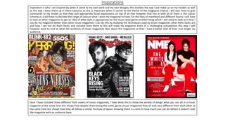
  • 1. Inspirations Inspiration is who I am inspired by when it come to my own work and my own designs, this involves the way I put make up on my models as well as the way I dress them up in there costume as this is important when it comes to the theme of the magazine (music) I will also need to give commands to my model so that they pull appropriate facial expressions on top of all that however that ties in with all of them is the colour scheme as a will have to decided the range of colours what I want my magazine to have, for the likes of masthead and different founts I will have to look at other magazines to get an idea of what style is appropriate for the music style genre another thing which I will need to look at is how I can do my magazine better than other music magazines I can do this by studying the techniques used by music magazines what there faults are and how I can not do them faults and succeed from them as this will make my magazine more of a challenging competition this way, I will however need to look at what the audience of music magazines likes about the magazines so then I have a better idea of how I can target my audience. Here I have included three different front covers of music magazines, I have done this to show the variety of design what you can do in a music magazine at the same time this shows how despite them being the same genre (music magazine) they all look very different from each other at the same time this shows how they all follow a similar formula of layout showing there is a limit to how much you can do before it doesn't look like magazine with an audience base.
  • 2. Collages of founts When it comes to designing founts for a music magazine it is often smarter to look at the genre of music that is being done as this shows who your magazine for the time it is out is more pacifically aimed at however this at the same time can be damaging as you want to try and make your audience big as possible so that it has a higher chance of being picked up, an example of this would be if for example your magazine was aimed at the “Pop Punk” genre you would expect there to be more of a fun cartoony fount or if it was aimed at “electronica” genre you could do something fun such as make your fount being electric or make it in the style of neon lights, for my own magazine I will try to use a variety of founts that suit the style of the artist which I am doing while at the same time make my magazine look attractive as possible so that it has a higher chance of being picked up by the viewer as that way even if it isn’t there taste or genre of music they might be attracted by the fount which reads something they are interested in and want to know more about. On this front cover for example the fount is one of three colours (yellow, white and black) the reason it is only these three colours is because those are typically the colours of the Emo fashion and at the same time it is the bands signature colour scheme, the fount shape itself is basic a majority of it is upper case making it seem more important than other things which are going on in the magazine, one fount that does stand out compared to the rest is the way the name of the band has been done as it has been done in a fount that makes the name of the band the main attraction of the magazine cover, at the same time the masthead for the magazine company is the same colour as the band this could be a way of the magazine saying its on the bands side meaning you can add symbolism and meaning to your founts if you do it right. Image Sub image Masthead Double page spread Front cover To the right I have written words related to media and included some fount styles which I would consider using for my magazine as I believe if I use them right I can make my magazine look official and I also believe they suit the style of what I will be doing.
  • 3. Masthead The masthead of the magazine is “KERRANG!” the style of the masthead appears to be it is smashed or broken with lines down it suggesting it is fractured this could at the same time be an inside joke as there is an ! Which suggests it could be something that was said when something was broken and it could be in upper case because it is shouted as part of the reaction, the masthead its self is always behind artist on the magazine showing it doesn’t see its self as important as the people on the magazines front cover, the masthead itself is at the top of the page this is likely due to how read things naturally from top to bottom meaning we see the masthead before anything else showing that the magazine wants the viewer to know what company's magazine this is this is also likely due to if the viewer likes this type of magazine then they might consider purchasing another one. The masthead is also giving an illusion it is there in the room with the artists as it shows two of the band members behind the masthead and one in front this could be the magazines way of saying that they are with the band and that they are with them with whatever they are doing. For my own audience what I can do is I can give my fount a catch such as the word KERRANG is smashed on there magazine I could also make that catch something that hasn’t been done before, what I could also do that is better than the other magazine companies is I can make my masthead more attractive to look at by making it have a fount style and a colour scheme that it will have for every magazine no matter what the topic is, I could also experiment by making it a short sentence and then go into the main artist on the pages name.
  • 4. Colour schemes collages The colour scheme for this two covers of magazines is completely different to each other being the reason I choose these two, the top one shows a very bright but at the same time not in your face kind of colour scheme as it shows not much in terms of colour variety but it does show you a lot of detail in the models and it has been done so everything is clear and basic as the magazine itself only consist of white, black, grey and yellow but it has been shaded and faded out to make the magazine look clean and presentable, this at the same time could be the magazines way of saying it wants you to focus on the artist and just them as it is only them on the front cover there isn’t anything else to look at that has a high level of detail, at the same time could the magazine be so polished because of the people on it almost as if the magazine needs to look good enough for them, the magazine also appears to cleverly use colours to advertise almost as at the top of the magazine it has in bright yellow “2 FREE GIFTS” we often associate the colour yellow with the likes of gold therefore this could be the magazines way of saying how good the gifts are, however due to the low amount of colour this could also say that the magazine is aimed at a more grown up mature audience as that is often what we associate low colours with meaning for my own magazine what I could do is I could work out what my audience age range is so that I know how I should present my magazine more to that audience than any other. On the other hand the magazine bellow by the Rolling Stone is different as it is bright and colourful making it the opposite of the top magazine cover, the magazine cover itself consist of the colours purple, red, green, yellow and pink the likely reason being is that the artist on the cover of the magazine is Jimmy Hendrix who was successful in the 1960s a time were pop culture and fashion consisted of these bright colours one thing that however makes the front cover interesting is how they have done the artist grey and wrote beside “The LAST DAYS” this therefore shows how the magazine has used to the colour grey to symbolise the artist death however what this could also be saying is that is that his mark is still alive (colours of his style and fashion) but he himself isn’t, showing he is gone but his legacy lives on, what I could therefore do for my own magazine is I could use colours that are appropriate and connected to the artist but at the same time do it in a way that adds meaning to it, however what I could do to make it better than what other magazines are doing is I could make it so that there isn’t just a reference to the artist or model on the magazine but I could also do it so that you could take it more than one way as well as so everyone sees it different who reads the magazine for example some who look at it and look through it might see the colours as being connected to the artist were as some one else might just see bright positive colours or I could make it so that it is the one colour pattern on every page but the colours themselves on the pattern change.
  • 5. Facial expression research The facial expression of the model on this front cover shows the artist looking happy however at the same time it shows a sense of humour as he is smiling directly at the camera with his guitar below him this could be the photographers way of saying that he is happy to be playing the guitar or happy to be doing music, this as a result makes the magazines front cover seem a lot light hearted as if the model was pulling a serious face it would make the magazine seem a lot more serious and less fun this therefor shows the importance of the face of the model as it can determine a lot about first impression on the magazine front cover and what you think of it, for my own magazine therefore what I could do is I could make it so that the face of my models is how I want people to see my magazine and at the same time make it so that there is possibly props that contribute to the way my magazine is saw, for example I could have my model looking serious and at the same time playing with there hair, the message would be the model is annoyed at there hair. On the KERRANG! front cover the facial expression is different as it shows Jerad Leto looking directly at the camera looking serious and with his eye brows slanted to give a more attitude vibe, the result of this is with him being the main image is that the magazine gives off a lot more of a serious focus as his facial expression is what attracts you to the magazine this as a result makes the magazine look as though it is targeted at a lot older audience one who wants to know what it is and try to understand what it is that is making him this way, the reason I say older as well is because it could be a adult topic that a younger audience might not be able to understand, as a result for my own magazine what I could do is I could decide my audience age range is based on the face that the person on the front cover is pulling at the same time I could also use this to draw that person in as I could make it so that it is dramatic the person could look really angry or serious and naturally due to people being attracted to drama there's a higher chance of it being picked up.
  • 6. Costume hair and make up • For my costume/hair for my magazine what I can do is look at the fashion of the type of music which I am doing and look at how all of them regularly dress and what sort of clothes they typically wear as this will give me a better idea as to how I should present my models and how they should be presented, I can also study what angles are best when they are presented like this and having there photo taken what I could also do to make mine better than what other companies are doing is I could make it so that my photos that are taken of the models appear more natural and that the makeup isn’t overdone so that it adds a human vibe about it you don’t get the idea that they are being fake and that they are themselves, as for the way the hair is done it is dependent on how the fashion has there hair and how the models can be done to look like the style it is also dependent on what will look more attractive to the audience what traits in the fashion is it the audience likes, as for when it comes to doing my make up on my models I might have to do research on what the types of make up they use so that way I can make my magazine be accurate as possible to the genre and at the same time so it looks like a real magazine with actual models that’s have been done up with makeup, what I could also do to make my make up on my models better is I can add meaning behind it say for example the model or artist is moody then I could use a lot of black makeup or say they are feeling creative I could use multi coloured make ups. • Here I have included an example of an artist/model who wore makeup (David Bowie) I have used this example because it shows how creative you can be with makeup and how you can almost make someone into some else if you do it right, what I like about the makeup is that it has been used to instantly catch your eye due to it being unique and different in fact I believe that with this magazine cover in particular they wanted to make his makeup the main attraction due to how there isn’t anything around him in the background as it is just him and his face with his makeup to look at.