
Recommended
More Related Content
What's hot
What's hot (20)
Similar to Selena Gomez's Voice
Similar to Selena Gomez's Voice (20)
More from reecemechan
More from reecemechan (20)
Recently uploaded
Recently uploaded (20)
Selena Gomez's Voice
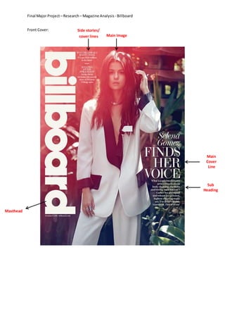
- 1. Final Major Project – Research– Magazine Analysis - Billboard Front Cover: Main Image Main Cover Line Masthead Sub Heading Side stories/ cover lines
- 2. Final Major Project – Research– Magazine Analysis - Billboard Main Image: The main image usedisof artistSelenaGomez;theyhave positioned her to look more mature than people think she is. This is showing the audience that her new music isn’t what you’ll expectfromthe Disneygirl stereotype.She ismakingdirecteye contactsoit makesthe audience get invested into the magazine and buy it. I think that they have put her in a white blazer and pants because she has many young fans so it isn’t seen as so she’s degrading herself for money, another reasonI think they would have dressed her in this outfit is because black and white clothes can be seenasbeingsophisticatedandprofessional whichcouldbe showingusaboutthe place she is in her career. No textispositionedbehindherortouchingthe singerthiscouldshow how serious she isn’t havingdistractions near her or having obstacles in her way within the music industry. The singer is positioned in the centre of the magazine to show that she is the main focus of the magazine. Main Cover Line: The main cover line for this magazine issue is “Selena Gomez Finds Her Voice” whenyouonlyreadthe main coverline you think that she is going to be talking about her personal life andaddressrumours.Bymakingthe maincoverline say this it is making the audience intrigued intowhat she saysso theypickthe magazine upand readthe coverinfurtherdetail. The main cover line hasbeensetina clear,standard font. The magazine has done this because it makes it easier to readso thenpeople don’t have to stand there to read it they can read it whilst just walking past so thenit’s up to the personif they want to stop and read in more detail. Another thing that has been addedto make the maincoverline is that the font has been changed to white. One reason why the magazine haschangedthe colourof the cover line is because it then fits in with the rest of the font on the cover, this could be seen as them trying to create a certain house style. Another reason for changing the font to white is because it’s a bright colour, this is a huge must have for a magazine colour because if they picked a darker colour for this specific cover then it would have been near impossible to read whereas white can be read against almost any background. Masthead: The mastheadforthe magazine has been turned onto its side and has been positioned to go down the side of the magazine cover. The font is big and clear and has been set in a bright colour to grab their readers’ attention and to appeal to the target audience. The font size of the magazine’smastheadisnoticeablybiggerthanthe rest of the font on the cover this is because they wanttheirname to be more noticedandremembered than there cover. Another reason is because they want their magazine to be a household name so everyone knows it. Sub Heading: The sub headingfromthe magazine ispositionedunderneaththe main cover line and it says “what’s a reformed Disney princess to do about body-shaming, the Biebs, and hitting ‘rock bottom’? Gather her girl squad and release her gutsiest, highest-charting music yet ‘I’ve deserved this, I earned it. This is all me.” The sub heading is usually used as a last form of persuasion for the audience topurchase the magazine. The main cover line has generated different ideas about what herinterviewcouldbe aboutandthe subheadinghasmade the audience wantto read it. They have used quotation marks round certain words such as ‘rock bottom’, ‘I’ve deserved this, I earned it’,
- 3. Final Major Project – Research– Magazine Analysis - Billboard and ‘thisis all me’these quoteshave beenreferredtointhe subheadingbecause theyare the most interesting. The first quotation referrers to rock bottom, this will drag the audience in because no magazine haseverreported that she has had any form of trouble which could be referred to as her hitting rock bottom. The second and third quotation about her highest charting music makes her sound like a fighter and like she now knows what she wants. This is a side that has never been releasedtoher fans before so it will appeal to her fan base, which is the purpose of the magazine. Side stories/ cover lines: The side stories/coverlinesare the otherstoriesthat are displayed on the magazines front cover. On this magazine the side stories are in a smaller font size than the rest of the cover.The twostorieswhichmake upthe side stories are why Deadmau5 is making indie music and a story aboutthe weirderside toFrankSinatra.The storiesthe magazine usually chooses to put as the side stories are as a way to help persuade someone to buy the magazine without having to lookat the contentspage.The colour of the side storiesare alsosetin white sopeople lookat them, the magazine also has created a style now for the cover with all the text appearing on the cover being set in white.
- 4. Final Major Project – Research– Magazine Analysis - Billboard Contents page: Chart s Main Image Support Images Title of page Sub headings Date
- 5. Final Major Project – Research– Magazine Analysis - Billboard Main Image: The main image onthe contentsisthe biggestphotoon the page this usually is always the only original image on the page. For this magazine the main image on the contents page is of BrandonFlowers, we know who it is about because at the bottom of his image is the page number 53 this makes you go to number 53 on the contents page to see who it is. The main image on this contents page is positioned on the right side of the page so the text can go round him. Support Images: The support images on the contents page are the images which are smaller than the main image; these images are also not original and would most likely be taken from a google page. These images are usually off the other recognisable faces and are there so you don’t have to read through the contents page to see where in the magazine they are. For example if you look at the photo of Phil Collins you will see that the article about him is on page 20. The numbers of the pagesare differentoneach image in either black or white; they have stuck to only using these two colours because it creates a form of house style. Another reason why the colour was chosen was because of the backgroundinthe three photos,the numbers are either against something white or something black so he numbers stands out from the pictures. Charts: On the contents page it has a separate column on the left. In this column it has all the differentchartsthat will be shown in the magazine with their page number next to it. These charts are splitinto3 sections;albums, songs, and this week on.biz. In the charts column where it has the headingsaying“No1”isin the same fontas the headingof the contentspage.The magazine name is alsoin the charts column.Byputtingthe name of the magazine onthispage it drillsitinto your head so then you will go back out and buy the next issue. Subheadings: The subheadings on the contents page are; upfront, features, music, in every issue, online and events. Billboard Magazine has included subheadings in their contents page because it makes it easier for the reader to find what they are looking for. With the magazine including a separate sectionforthingsthatare ineveryissue ithelpsthe readerknow the magazines content so if theylike somethinginthissectionthentheywill buythe magazine againbecausetheyknow it will be in there again. Date: The date is positioned in the bottom right of the contents page, the date is on the contents page because ithelpspeople getageneral ideaof whenthe magazine is published. For example on the issue used as an example the date it was published was September 16th 2010. Title of page: The title of the page is the biggest piece of text on the whole page this is because it grabs your attention when you look at the page. Another reason the title of the page grabs your attention is because it is a different font to the front cover and a different font to majority of the
- 6. Final Major Project – Research– Magazine Analysis - Billboard page.Thisgrabs people’sattentionbecauseit’sdifferentand itisboldsoit is the first thing you look at on the page.
- 7. Final Major Project – Research– Magazine Analysis - Billboard Double spread page: Introduction Paragraph Leading Quote Main Image Supporting Images Subheading Caption Charting Songs
- 8. Final Major Project – Research– Magazine Analysis - Billboard Introduction Paragraph: The introduction paragraph on the double spread is the bit that draws the audience in to read the article. In most magazines the introduction paragraph is underneath a heading but for this example there isn’t a headline for the page. The first line in the introduction paragraph Leading Quote: Subheading: Supporting Images: Caption: Charting Songs: Main Image: