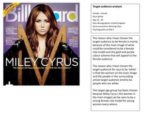
1. Target audience analysis
Gender Female
Race White
Age 16 - 30
Geo-demographics United kingdom
Socio-economics Working Class
Psychographic profile E
The reason why I have chosen the
target audience to be female is mainly
because of the main image of what
could be considered to be a female
role model and the gold and purple
colour scheme that will appeal to the
female audience.
The reason why I have chosen the
target audience for race to be ‘white’
is that the women on the main image
and the people in the surrounding
article target audience tend to be
people who are white.
The target age group has been chosen
because Miley Cyrus ( the women in
the main image) can be seen to be a
strong female role model for young
women every where.
2. Target audience analysis
Gender Male
Race Black
Age 16 - 30
Geo-demographics USA
Socio-economics Working class
Psychographic profile E
Conclusion / Justification
The man on the cover is a well known US R&B and Rap
star. The main group of people who tend to listen this
genre of music tend to be black Americans who are the
between the ages of 16 – 30. The text surrounding the
image are all from celebrities who’s main audience tend
to be those of younger ages. Finally the font of the text is
large and pops out also it is very colourful which appeals
to a younger audience.
Because of the younger age group range that this
magazine is targeting seen through the Bold and vibrant
text we can tell that the psychographic profile that the
this magazine is aimed towards is E because mainly for
students.
The main audience of listeners of Kanye West’s music
tend to be male and as he is placed on the cover of the
magazine we can tell that the target audience for this
magazine are male.
3. Target audience analysis
Gender Male
Race White
Age 30 - 40
Geo-demographics UK, USA, AUS
Socio-economics Working class
Psychographic profile C+ C-
Conclusion / Justification
The Man on the front is Dave Grohl. Being an artists from an
older generation it is more likely that the older ages groups
between 30 + 40 will listen to his music meaning that seeing
his face on the cover will attract them to read the magazine.
The bands mentioned around the picture all fall under the
same genre of music that his band ‘foo fighters’ falls under
which yet again points towards the older age group.
The Bands mentioned on the cover of the magazine aren’t all
from the same country. For example the main feature of the
magazine is about an American band ‘foo fighters’ and some
of the bands surrounding the image in an smaller text like
‘radio head’ or ‘Arctic monkeys’ are both British bands
because of this I have decided to make the geo-demographics
for mostly English speaking countries.
The reason for why I have chosen The group C+ and C- is
because this group of people (The working class) tend to listen
to the genre of music this magazine is presenting while people
in a higher psychographic profile tend to listen to a genre of
music that is softer or calmer.
4. The masthead on the cover of
the magazine is in a white font
which doesn’t stand out or
attract attention of potential
buyers. How ever the font is in
bold writing which does allow
the words to stand out a tad
more then usual. Having the
masthead behind the main
image makes the reader think
that the image is more
important then the magazine
name
The cover lines on this
magazine are slightly more
visible then he normal writing
as they are in a smaller font
but have a different bright
yellow colour.
The fonts use don the cover of
the magazine are very bland and
are mostly in the colour white.
For this magazine it is obvious
that the creators want the main
attention to be focused on the
Miley Cyrus as the main image.
The main colour scheme on
the cover is a mix of the
colours purple white and gold.
These colours tend to be of a
lighter contrast that make the
readers feel fresh. The colour
gold gives the reader a feeling
of royalty along with the
colour purple. The white adds
to atmosphere of freshness.
The main header of the magazine
is normally linked to the image
yet again giving the audience a
basic idea of what the main
article will be about. This is
perfectly shown through how the
main header is the name of the
women used in the main image.
The main image is normally
revolved around what the main
article or story is about within the
magazine, using an image is a
quick and easy way to let the
audience know what the
magazine will mainly be about.
For example in this magazine they
use Miley Cyrus who is a
children's television actress, with
her image placed largely on the
cover of the magazine will attract
the attention of younger
audiences.
The main job of a
barcode/issue number is just
to allow the audience to know
the date of when the
magazine was published, and
to know the issue number.
Usually these are presented in
smaller writing in a less
noticeable font some where
on the front.
5. Yet again the mast head is
placed behind the main image,
how ever this time it is in a
vibrant bright blue colour
which attracts the audience
attention it also in a much
larger font and is in bold. The
masthead is also right behind
the image where the audience
interest is mostly focused on.
The cover lines on this magazine
are slightly more visible then he
normal writing as they are in a
smaller font but have a different
bright yellow colour.
All of the fonts presented on this
magazine cover are all in bold. but
also lets of a Which catches the
audience attention atmosphere
and aura of strength.
The most common colours
used in this magazine cover
are purple and blue, for
starters the purple just pops
out and attracts the audience
attention how ever he bright
blue is also used on the main
image which will greatly catch
the audience attention more
then any other colour could.
The main header of the magazine
is normally linked to the image yet
again giving the audience a basic
idea of what the main article will
be about. This is perfectly shown
through how the main header is
the name of the women used in
the main image.
The main image is normally
revolved around what the main
article or story is about within the
magazine, using an image is a
quick and easy way to let the
audience know what the
magazine will mainly be about for
example. The man on the cover is
a well known US R&B and Rap
star. The main group of people
who tend to listen this genre of
music tend to be black Americans
who are the between the ages of
16 – 30.
The main job of a
barcode/issue number is just
to allow the audience to know
the date of when the
magazine was published, and
to know the issue number.
Usually these are presented in
smaller writing in a less
noticeable font some where
on the front. In this case the
numbers are placed on the
bottom left of the magazine
cover.
6. Unlike the other magazines on
this one the masthead is
placed on the bottom half of
the page. Although this may
not pay attention it makes
sure that the main image
receives the attention the
creatures desire it to receive.
The font of the mast head
varies. In the first word ‘Foo’
the font is large and bold and
attracts the most attention of
every thing on the page, and
although the second word
‘fighters’ is in the same colour
font the size is slightly smaller
and this is because it is a
longer word and ‘foo’ is easier
and quicker to read.
The cover lines on this magazine
are slightly more visible then he
normal writing as they are in a
smaller font but have a different
range of different colours.
Like the other magazines the font
is all in bold and all the colours
used and used particularly used to
let of the aura of a typical rock
atmosphere or song.
The colour scheme of this
magazine is very dark and the
colour red and black is used a
lot. These colours and these
shades let off the tones and
atmospheres associated with
the stereotypical rock aura
that the magazine is trying to
portray.
The main header of the magazine
is normally linked to the image yet
again giving the audience a basic
idea of what the main article will
be about. This is perfectly shown
by the Words foo fighters
underneath the image.
The main image is normally
revolved around what the main
article or story is about within the
magazine, using an image is a
quick and easy way to let the
audience know what the
magazine will mainly be about.
For example on this cover we
have the front man of the band
the foo fighters used to obviously
show us that the main article of
this news paper is either going to
be about him or his band
The main job of a
barcode/issue number is just
to allow the audience to know
the date of when the
magazine was published, and
to know the issue number.
Usually these are presented in
smaller writing in a less
noticeable font some where
on the page.
7. The famous
rapper and soul
singer on the
front of the
magazine cover
tells us that the
magazine has
been intended for
people who listen
to rap or soul
music.
The expression on
his face seems
careless, this
carless attitude
and persona fits
well with the
rapper
stereotype.
The colour scheme
has been on this
magazine matches
the colour of the
clothing the man in
the middle is
wearing. By putting
a majority of the
text in the same
colour as the mans
collar it underlines
his significance in
the magazine.
8. The man on the
front of the
magazine is
screaming this
lets off the
emotion of anger
which is typically
associated with
the rock genre of
music, also the
flames
surrounding the
band members
within his open
mouth also
convey the aura
of anger
associated with
the main genre of
this magazine.
The colour scheme
of this magazine is
very dark and the
colour red and black
is used a lot. These
colours and these
shades let off the
tones and
atmospheres
associated with the
stereotypical rock
aura that the
magazine is trying
to portray.