TỔNG HỢP HƠN 100 ĐỀ THI THỬ TỐT NGHIỆP THPT TOÁN 2024 - TỪ CÁC TRƯỜNG, TRƯỜNG...
Annotation
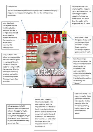
1. Free Poster- Free
thingsare alwayswell
receivedandthose
whomare likelyto
buya magazine,
stereotypically have
postersontheirwalls
Large Masthead –
Thisis generallythe
firstthingthat the
audience will see.It
beingsoboldand red
woulddrawthe
readersattentionto
the magazine as a
whole while
browsingthe
magazine isles.
Female Lookingat
Camera– Humanisesthe
magazinesandallowsan
attachmentto be
createdwiththe
audience andthe
subject.Alsoitmakesthe
magazine seemsmore
friendly/positiveandless
intimidatingand
‘Hardcore’.
Competition
The Inclusionof a competitionmakes peoplefeel excitedaboutbuyinga
magazine andmay specificallychose thisone due tothe sinning
possibilities.
ClearBand Name- This
makesiteasyfor those
specificallyinterested
inthe bandto findthe
magazine.Alsothe
interestingfontmay
invite readerstosee
whatthe bandis
‘about.
Redon Black Textwith
Alternate BandsOn – Not
everyone thatreads the
magazine maylike the cover
band.In retaliationtothis,
the red onblack alone would
draw readersattentionasit
standsout. Thistheninvites
the readerto see whatother
bandsare withinthe
magazine andmay sway
theirinterest.
Allowingpeopletofulfil
dreams– Many people would
relishinthe opportunityto
meettheirfavourite band.
Givingthemthe opportunityto
do so wouldswaythe masses
to purchase and see howthey
can do justthat.
ColourScheme- This
colourscheme wouldbe
the standard throughout
everyissue of ‘Arena’.
Thiswouldallowthe
readerto easilyidentify
the magazine.Alsothe
coloursare relatively
‘positive’andbrighter
than mostmagazines.
Thiswouldagaindraw
attention.
SimplisticNature- The
simplicityof the magazine
layoutwithitsavoidance of
crammingmakesthe
magazine feel neatand
professional.Thiswould
draw the readerto the
magazine asit isso ‘clean’.