
Recommended
More Related Content
What's hot
What's hot (19)
Similar to Double Page Spread Analysis by FATIMA ZAHID [MEDIA STUDIES]
Similar to Double Page Spread Analysis by FATIMA ZAHID [MEDIA STUDIES] (20)
Recently uploaded
Recently uploaded (20)
Double Page Spread Analysis by FATIMA ZAHID [MEDIA STUDIES]
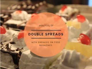
- 1. DOUBLE SPREADS WITH EMPHASIS ON FOOD MAGAZINES ANALYSIS OF
- 2. TYPE 1 This sort of double spread dedicates one page to an image and one to a page of text - one with a headline on what the article is going to be about and a bit of a preface on what this spread is going to deal with. Often, theres a clear colour theme, like in this example where we can see a clear use of monochrome colours and red. A colour theme can communicate what a magazine is about just as well as text and an image can - the tone, how serious the article is, what it is about and so on. This article deals with an analysis of the hit movie V for Vendetta, its creators, production and so on. A dystopian thriller, colours like grey, black, white and red suit it well. From: TIME magazine, designer Fred Lameck (http://cargocollective.com/lameck) The negative spaces in the first page are used well, helping to raise emphasis to the text. As the beginning of an article it helps not to make it so crowded in order to draw attention and then retain it in the later pages with more text. There is the use of a special font for the article name to grab attention. The subject of this photo, and the main character of the film being discussed, seems to be turning his head towards the audience, back turned, and with no eye contact being made. This lends an air of mystery and suspense to the image, once again matching the film's genre as a thriller.
- 3. The use of a large font to emphasize the headline of this article leaves a strong impact and grabs attention instantly, especially paired with the delicious bowl of food on the right. VARIATIONS The use of raw meat and the arrangement of the articles name vertically and a short intro in-between the spaces leads to a creative and unconventional double spread with this same technique. An interesting usage of fonts; not only is the text arranged within a circle, carrying on the circular look of the cherries on the page with the photograph, but the colours used in the articles title 'a taste of summer' are reflective of the crimson colour of the fruit as well. The 'a' in the title fades in the background but is enlarged so it is still recognizable. It carries on its theme well and the use of negative spaces, once again, helps lay emphasis upon the text.
- 4. Sometimes a single page isn't enough. This type of double spread uses both pages to accommodate the photo, often by the photograph bleeding from one page to the other, and often leads to the text being arranged in order to help adjust with the prominent presecne of the image. TYPE 2 In this example the space left in the plate was purposely left empty instead of being filled with food to make space for the article's name - a creative use of photography and editing to lead a better impact. Creativity is valued in cooking magazines as food and cooking is a field where being different and taking risks is appreciated, especially in recent times where people have begun to consider how food can qualify as an art. Designed by Fernanda Didini: https://www.b ehance.net/fdidini
- 6. TYPE 2 Utilizing the room for creativity in the usage of fonts, this type of spread focuses on using typography to leave an impact. This is usually paired with background pictures and added images rather than a complete image to the side, where images tend to bleed into the next page. The geometric arrangement of the images and typography lends to a very modern and neat look. Self project by Erin Lancester:- http://www.erinl ancaster.com The colours and tones in this magazine are very earthy, rich browns, reddish coppers, and black and white. This suits the theme of a cafe, and paired with the modern, neat look I mentioned before, this leads to an impression of the cafe already being built in the consumers minds. A down to earth yet trendy, up-to-date place. The delivering of this message simply through the design is proof of an excellent spread. Enlarged text leaves a strong impression
- 7. VARIATIONS By making the articles headline out of food, especially that related to the neighboring image, it immediately stands out more than the usual. A creative use of typography, where creativity emerges and a sense of individuality shines through
- 8. Other Various Types This style uses the two pages to make it look like a kind of platform, a table, cutting board, or like in this example, a tablecloth and arranges props on it, leaving space for text. The clever use of this in the example provided to the left shows how herbs, ingredients, tags, and teabags are strewn about on a backdrop and text is left to fill in the negative space Designers often choose to emphasize the first letter of an article to leave an impact, but some can take this to another level by integrating as a part of the design, like the two examples on the right. The 'K' from 'Keira' manages to stretch across the entire page, and the curves leave room for more text for an introduction to the article. This can be done in more subtle ways, as seen in the second example, too.
- 9. Various Types Continued The use of a header can help prove space efficient and still manage to spread the colour and style of a photograph through the whole spread. Business and news oriented magazines prefer to be straight, direct, and to the point. Layouts like these which aren't particularly crowded with photographs or distracting can prove very effective in that regard. This can be added to with a limited colour palette and bold, straightforward, plain fonts.