1. 1. In what ways does your media product use, develop or
challenge forms and conventions of real media
products?
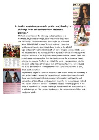
My front cover includes the following real conventions of a
masthead, a typical cover image, cover lines with a large, main
one and finally a colour scheme and house style. My masthead
reads ‘PARAMOUNT’ in large ‘Bodoni’ font and I chose this
font because it’s quite sophisticated and similar to the VOGUE
type fonts which I wanted the look of. My cover image is supposed to be Lana
Del Rey to relate to my main cover line of my feature article and I have put the
image in the centre of my magazine to make her stand out. I have 5 cover lines
including one main cover line that stands out among the rest making it eyecatching for readers. The fonts are not all the same, I have purposely tried to
mix them up to create a front cover that isn’t tedious however I haven’t used
too many different ones and kept to the house style/colour scheme of pink,
blue, black and white.
My contents page has a division into REGULARS, MUSIC and FASHION to keep it
tidy and to make it clear of the content in each section. Most magazines will
have a section for each title in the magazine for readers so I have the real
convention of that. I have one large, main image for my contents page instead
of a couple small ones because I wanted to create a contents page like in the
style of one of VOGUE’s issues. The image also relates to the feature article so
it all links together. The content also keeps to the colour scheme of blue, pink,
white and black.