
Recommended
More Related Content
What's hot
Viewers also liked
Similar to Font and colour testing
Similar to Font and colour testing (20)
Recently uploaded
Recently uploaded (20)
Font and colour testing
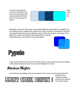
- 1. I’ll will be using mainly the colour blue which symbolizes such things as the sky and oceans which are heavily asociality with travel and that of my chosen genre of tourism. Depending on this tone of the colour it can represent different aspect within my magazine. As I am creating a tourism magazine the a darker tone of blue could have connotations of night this can represent attractions such as nightclubs and bar. Where the opposite can be given with a lighter tone, having connotations of day representing more family friendly attractions such as parks and sea side resorts. I have chosen “Pypats” and as a font for my final product. I will be used to for the main heading to help attract the audience since how clear and noticeable it is to read. As this font has connotations of snow and winter this font can be used for specific part of the article since the magazine is being produced and released in the winter season.
- 2. The use of borders helps to make this font appear more formal a desired effect for my magazine.