SlideShare a Scribd company logo
1 of 11
AS Media Evaluation
1. In what ways does your media product use, develop or challenge forms and conventions of real media products?  The layout of my front cover is based heavily upon conventional components. I believe this helps the reader relate to the magazine better, by feeling much more comfortable in the knowledge of what my magazine  is based on and includes. The layout is very spread out, and overlapping which could connote a laid-back feel – in comparison to a more regimented layout; which is a development in comparison to some magazine genres, but very conventional for a music magazine such as Q , Kerrang or NME. The strapline, plug-in, cover lines and leads are all conventional, therefore it’s apparent that my front cover is influenced by previous issues of music magazines focusing on indie/rock music. The masthead is very bold and takes up a large majority of the page – most mastheads only take up the left hand corner of the page, however my masthead challenges the convention by being much larger; I believe this works as an advantage as the brand is more attention-grabbing and easy to recognise. The use of two colours within the same word is also unconventional, as many mastheads only use one colour for the words, to keep continuity. Also many mastheads on rock/indie magazines have background colour to help the masthead stand out more on a busy page, I felt this wasn’t necessary for min ad overall gives it a much more clean, professional  finish. The feature article image is very conventional as a mid-shot of one musician. The image is the focal point of the front cover, and everything is built around that, for example the colour scheme and the layout of the cover line – which is the opposite to how magazines would usually be designed.  The image itself challenges the conventions as it lacks eye-contact which is usually the main aim of the photograph taken. The colour scheme, uses and adapts the conventions of a rock music magazine. The iconic colours for this genre is red, white and black – as  used by Kerrang and NME – however I chose to incorporate navy blue also – which I believe still maintains the rock genre element whilst adding an exciting, different and less monotonous appearance to the magazine.   The language used is quite relaxed and colloquial , however there is use of specialist terms within the rock/indie industry and scene, as to make the magazine easier to relate to for the target demographic. The colloquial language helps the magazine seem informal and more chatty, so much more entertaining to read – which is the main purpose of the magazine.
The layout of my contents page is much less conventional in comparison to my front cover. The  contents page is very different to others of the rock/indie genre, it’s much more simple, less crowded and easier to navigate around; I believe that either form of layout would work well, however in my magazine I needed something more original and unconventional to make the whole product much more appealing and also to help it fit in more with the genre. The placing of every component is  rather  conventional, however I feel the way in which I have done so is altered in many areas. The contents page was  inspired  by real media products,  including all the usual components, but The finished product is much more  individual; therefore will appeal to the individualists and rebels within  society and my target audience. The fonts used are the same as are used in the other two of my media products, providing continuity throughout and giving a relation between each separate product. This is always seen within real magazines, as it gives off a professional, well planned image to the whole magazine. There are a range of images used within the contents page, one of which is the main focus and much larger than the others. The large image accompanied by the smaller images helps to attract the readers to the feature article as well as add more interest and options to the readers – this is very common and deemed conventional within contents pages which are professionally made. A way in which my contents page hasn’t followed conventions is by the amount of images used. There are usually a large range of images, however mine is much more minimalistic – but I feel this is not a bad thing as there is a balance between image and text  and not only that; but the images I have selected are all completely different, with various subjects, colours, lighting and shots – giving the feeling of quality rather than quantity. The colour scheme is very unconventional for a rock/indie magazine, in the sense that red and black aren’t the prominent colours used, and that blue is the main colour. Red, black and white are all incorporated somehow, but in a much more discrete way; which may be seen as a refreshing take on the genre and put into practice the ideas of the genre “breaking the mould” and “standing out”. The language I used within this product was colloquial and also exclamatory, as I intended to mediate the feeling of informality and friendliness as well as gain interest and add excitement to the articles mentioned, I believe this is very conventional for all entertainment based magazines, as they are trying to attract and entice readership, so need to make the content seem as appealing as possible.
The layout of this double page article is again, conventional in most aspects, and influenced by the conventions in other aspects. The large image on one half and the article on the other is very conventional for an article like this; quite possibly because of the space efficiency it entails and the uncomplicated, simple to read view of it.  The overlapping of the image to the text isn’t original in the sense that it’s never been done before, however when overlapping text and images the background of the image is usually used for the whole article, but in this case the background is non-existent. The language used within the article is both exclamatory and informal/chatty, due to the nature of the article (an interview) so to keep it realistic and interesting the language used and tone conveyed are all included within the article. I think this helps the reader relate more to the article and the musician being interviewed. The language used isn’t unconventional at all for an interview, it all depends on who your audience is and the purpose of your article. The image used is conventional to the rock/indie genre and the topic of the laid-back interview. This style of image where the subject is “unaware” of the photographer is often used to show the musician hard at work and oblivious to the media. However these types of image are often taken from a extra-long-shot or long-shot, whereas mine is much more up close and personal, which is how I wanted the interview and article to come across. The masthead of the whole article  is a quote from within the interview. This is more unconventional than would first appear because quotes are often enlarged within the article, in order to give the reader a taste of what the article is about, however they are hardly used as titles. I think this helps the article generate a lot more interest within and for itself, thus helping the magazine gain a regular readership. The colour scheme used is the same as all the previous products within the issue of the magazine adding to the continuity element of the magazine. In this article you can clearly see the reason behind the colour scheme and the link between it and the image. The image and colour scheme corresponding is a very conventional thing to happen; the feature article often influences the theme, style and colour used throughout the magazine issue.
[object Object]
The Images are central and take up the majority of the page.
The Lead story is in a different colour and stands out against everything else on the page.
The magazine on the right includes more images, and therefore less text.
The magazine on the left isn’t as busy and heard on the eyes.
The subject in the left magazine’s image isn’t making eye contact, directing the focus of both reader and subject to the music/guitar.Vs. ,[object Object]
Both include red and white, two iconic colours relating to rock and indie music.

More Related Content

What's hot

Kerrang!
Kerrang!Kerrang!
Kerrang!J_h45
 
Music Magazine Survey: Analysis of results
Music Magazine Survey: Analysis of resultsMusic Magazine Survey: Analysis of results
Music Magazine Survey: Analysis of resultstashaay27
 
Magazine evaluation
Magazine evaluationMagazine evaluation
Magazine evaluationzoesmall
 
Evaluation 2
Evaluation 2Evaluation 2
Evaluation 2Dragonium
 
Magazine evaluation
Magazine evaluation Magazine evaluation
Magazine evaluation zoesmall
 
How i challenged the norms and conventions of the typical norms of a music ma...
How i challenged the norms and conventions of the typical norms of a music ma...How i challenged the norms and conventions of the typical norms of a music ma...
How i challenged the norms and conventions of the typical norms of a music ma...etaylorchs
 
Media Evaluation
Media EvaluationMedia Evaluation
Media Evaluationfitton92
 
How i challenged the norms and conventions of
How i challenged the norms and conventions ofHow i challenged the norms and conventions of
How i challenged the norms and conventions ofetaylorchs
 

What's hot (17)

Evaluation q1
Evaluation q1Evaluation q1
Evaluation q1
 
Evaluation
EvaluationEvaluation
Evaluation
 
Magazines in the uk
Magazines in the uk Magazines in the uk
Magazines in the uk
 
Kerrang!
Kerrang!Kerrang!
Kerrang!
 
Music Magazine Survey: Analysis of results
Music Magazine Survey: Analysis of resultsMusic Magazine Survey: Analysis of results
Music Magazine Survey: Analysis of results
 
Magazine evaluation
Magazine evaluationMagazine evaluation
Magazine evaluation
 
Evaluation
EvaluationEvaluation
Evaluation
 
Magazine Evaluation
Magazine EvaluationMagazine Evaluation
Magazine Evaluation
 
Evaluation
EvaluationEvaluation
Evaluation
 
Evaluation 2
Evaluation 2Evaluation 2
Evaluation 2
 
Pitch
PitchPitch
Pitch
 
Magazine evaluation
Magazine evaluation Magazine evaluation
Magazine evaluation
 
How i challenged the norms and conventions of the typical norms of a music ma...
How i challenged the norms and conventions of the typical norms of a music ma...How i challenged the norms and conventions of the typical norms of a music ma...
How i challenged the norms and conventions of the typical norms of a music ma...
 
Mine
MineMine
Mine
 
Media Evaluation
Media EvaluationMedia Evaluation
Media Evaluation
 
Unit 30 - LO2
Unit 30 - LO2Unit 30 - LO2
Unit 30 - LO2
 
How i challenged the norms and conventions of
How i challenged the norms and conventions ofHow i challenged the norms and conventions of
How i challenged the norms and conventions of
 

Viewers also liked

BOV October 2010 Ghana Mission
BOV October 2010 Ghana MissionBOV October 2010 Ghana Mission
BOV October 2010 Ghana MissionFrank Myers
 
Jedemi DragonBustR Framework
Jedemi DragonBustR FrameworkJedemi DragonBustR Framework
Jedemi DragonBustR FrameworkAnnie Gladue
 
BOV October 2010 Ghana Mission
BOV October 2010 Ghana MissionBOV October 2010 Ghana Mission
BOV October 2010 Ghana MissionFrank Myers
 
Ponderables for Netflix: Please Protect The Little Prince Movie
Ponderables for Netflix: Please Protect The Little Prince MoviePonderables for Netflix: Please Protect The Little Prince Movie
Ponderables for Netflix: Please Protect The Little Prince MovieAnnie Gladue
 
Jedemi Café & Bliss: The Journey, The Framework, The Chronicles
Jedemi Café & Bliss: The Journey, The Framework, The ChroniclesJedemi Café & Bliss: The Journey, The Framework, The Chronicles
Jedemi Café & Bliss: The Journey, The Framework, The ChroniclesAnnie Gladue
 
Protect this Prince: What's Essential is Invisible to the Eye
Protect this Prince: What's Essential is Invisible to the EyeProtect this Prince: What's Essential is Invisible to the Eye
Protect this Prince: What's Essential is Invisible to the EyeAnnie Gladue
 
Branches of the Vine . . . Ghana, United Kingdom and America Improving the li...
Branches of the Vine . . . Ghana, United Kingdom and America Improving the li...Branches of the Vine . . . Ghana, United Kingdom and America Improving the li...
Branches of the Vine . . . Ghana, United Kingdom and America Improving the li...Frank Myers
 
Irfan'sResume (1)
Irfan'sResume (1)Irfan'sResume (1)
Irfan'sResume (1)Irfan Ali
 
BOV Presentation 4 Rev 3[1] 11.19.09
BOV Presentation 4 Rev 3[1] 11.19.09BOV Presentation 4 Rev 3[1] 11.19.09
BOV Presentation 4 Rev 3[1] 11.19.09Frank Myers
 
AEG - PETER BEHRENS (TÜRKÇE)
AEG - PETER BEHRENS (TÜRKÇE)AEG - PETER BEHRENS (TÜRKÇE)
AEG - PETER BEHRENS (TÜRKÇE)Giray BATITÜRK
 
Directiva 012 simulacros
Directiva 012 simulacrosDirectiva 012 simulacros
Directiva 012 simulacrosGloria Jimenez
 

Viewers also liked (14)

BOV October 2010 Ghana Mission
BOV October 2010 Ghana MissionBOV October 2010 Ghana Mission
BOV October 2010 Ghana Mission
 
Jedemi DragonBustR Framework
Jedemi DragonBustR FrameworkJedemi DragonBustR Framework
Jedemi DragonBustR Framework
 
Nailace products
Nailace productsNailace products
Nailace products
 
BOV October 2010 Ghana Mission
BOV October 2010 Ghana MissionBOV October 2010 Ghana Mission
BOV October 2010 Ghana Mission
 
Ponderables for Netflix: Please Protect The Little Prince Movie
Ponderables for Netflix: Please Protect The Little Prince MoviePonderables for Netflix: Please Protect The Little Prince Movie
Ponderables for Netflix: Please Protect The Little Prince Movie
 
Jedemi Café & Bliss: The Journey, The Framework, The Chronicles
Jedemi Café & Bliss: The Journey, The Framework, The ChroniclesJedemi Café & Bliss: The Journey, The Framework, The Chronicles
Jedemi Café & Bliss: The Journey, The Framework, The Chronicles
 
Protect this Prince: What's Essential is Invisible to the Eye
Protect this Prince: What's Essential is Invisible to the EyeProtect this Prince: What's Essential is Invisible to the Eye
Protect this Prince: What's Essential is Invisible to the Eye
 
Branches of the Vine . . . Ghana, United Kingdom and America Improving the li...
Branches of the Vine . . . Ghana, United Kingdom and America Improving the li...Branches of the Vine . . . Ghana, United Kingdom and America Improving the li...
Branches of the Vine . . . Ghana, United Kingdom and America Improving the li...
 
Ambalaj Tasarımı
Ambalaj TasarımıAmbalaj Tasarımı
Ambalaj Tasarımı
 
Irfan'sResume (1)
Irfan'sResume (1)Irfan'sResume (1)
Irfan'sResume (1)
 
BOV Presentation 4 Rev 3[1] 11.19.09
BOV Presentation 4 Rev 3[1] 11.19.09BOV Presentation 4 Rev 3[1] 11.19.09
BOV Presentation 4 Rev 3[1] 11.19.09
 
AEG - PETER BEHRENS (TÜRKÇE)
AEG - PETER BEHRENS (TÜRKÇE)AEG - PETER BEHRENS (TÜRKÇE)
AEG - PETER BEHRENS (TÜRKÇE)
 
Rd. antartida
Rd. antartidaRd. antartida
Rd. antartida
 
Directiva 012 simulacros
Directiva 012 simulacrosDirectiva 012 simulacros
Directiva 012 simulacros
 

Similar to AS Media Evaluation Covers Forms, Conventions

Uptown evaluation
Uptown   evaluationUptown   evaluation
Uptown evaluationfitton92
 
Music Magazine Evaluation
Music Magazine EvaluationMusic Magazine Evaluation
Music Magazine Evaluationguestd6106aa
 
Anna rockall media evaluation
Anna rockall media evaluationAnna rockall media evaluation
Anna rockall media evaluationarockall
 
College Media Evaluation
College Media EvaluationCollege Media Evaluation
College Media Evaluationgueste0c63f
 
Evaluation
EvaluationEvaluation
EvaluationRach234
 
Evaluation question 5
Evaluation question 5Evaluation question 5
Evaluation question 5asmediae15
 
Media Evaluation Lewis Cooke
Media Evaluation Lewis CookeMedia Evaluation Lewis Cooke
Media Evaluation Lewis Cookeguest8e34681
 
Market research on the pop and rock music genre
Market research on the pop and rock music genreMarket research on the pop and rock music genre
Market research on the pop and rock music genreivelinaemilova
 
Media evaluation
Media evaluationMedia evaluation
Media evaluationkatewray
 
As Media Evaluation 1.25
 As Media Evaluation 1.25 As Media Evaluation 1.25
As Media Evaluation 1.25BaneTMB
 
Evaluation
EvaluationEvaluation
EvaluationLeanne94
 
Evaluation Presentation
Evaluation PresentationEvaluation Presentation
Evaluation Presentationmarthac03
 
Media evaluation
Media evaluationMedia evaluation
Media evaluationguest41903d
 
Media Evaluation
Media EvaluationMedia Evaluation
Media Evaluationgeorgiai
 

Similar to AS Media Evaluation Covers Forms, Conventions (20)

Uptown evaluation
Uptown   evaluationUptown   evaluation
Uptown evaluation
 
Evaluation 1
Evaluation 1 Evaluation 1
Evaluation 1
 
Evaluation q 2 new
Evaluation q 2 newEvaluation q 2 new
Evaluation q 2 new
 
NME ANALYSIS
NME ANALYSISNME ANALYSIS
NME ANALYSIS
 
Music Magazine Evaluation
Music Magazine EvaluationMusic Magazine Evaluation
Music Magazine Evaluation
 
Anna rockall media evaluation
Anna rockall media evaluationAnna rockall media evaluation
Anna rockall media evaluation
 
College Media Evaluation
College Media EvaluationCollege Media Evaluation
College Media Evaluation
 
Evaluation
EvaluationEvaluation
Evaluation
 
Evaluation question 5
Evaluation question 5Evaluation question 5
Evaluation question 5
 
Media Evaluation Lewis Cooke
Media Evaluation Lewis CookeMedia Evaluation Lewis Cooke
Media Evaluation Lewis Cooke
 
Market research
Market researchMarket research
Market research
 
Market research on the pop and rock music genre
Market research on the pop and rock music genreMarket research on the pop and rock music genre
Market research on the pop and rock music genre
 
Media evaluation
Media evaluationMedia evaluation
Media evaluation
 
Evaluation
EvaluationEvaluation
Evaluation
 
As Media Evaluation 1.25
 As Media Evaluation 1.25 As Media Evaluation 1.25
As Media Evaluation 1.25
 
Unit 30 - LO2
Unit 30 - LO2Unit 30 - LO2
Unit 30 - LO2
 
Evaluation
EvaluationEvaluation
Evaluation
 
Evaluation Presentation
Evaluation PresentationEvaluation Presentation
Evaluation Presentation
 
Media evaluation
Media evaluationMedia evaluation
Media evaluation
 
Media Evaluation
Media EvaluationMedia Evaluation
Media Evaluation
 

Recently uploaded

Proudly South Africa powerpoint Thorisha.pptx
Proudly South Africa powerpoint Thorisha.pptxProudly South Africa powerpoint Thorisha.pptx
Proudly South Africa powerpoint Thorisha.pptxthorishapillay1
 
Solving Puzzles Benefits Everyone (English).pptx
Solving Puzzles Benefits Everyone (English).pptxSolving Puzzles Benefits Everyone (English).pptx
Solving Puzzles Benefits Everyone (English).pptxOH TEIK BIN
 
Hierarchy of management that covers different levels of management
Hierarchy of management that covers different levels of managementHierarchy of management that covers different levels of management
Hierarchy of management that covers different levels of managementmkooblal
 
Blooming Together_ Growing a Community Garden Worksheet.docx
Blooming Together_ Growing a Community Garden Worksheet.docxBlooming Together_ Growing a Community Garden Worksheet.docx
Blooming Together_ Growing a Community Garden Worksheet.docxUnboundStockton
 
Alper Gobel In Media Res Media Component
Alper Gobel In Media Res Media ComponentAlper Gobel In Media Res Media Component
Alper Gobel In Media Res Media ComponentInMediaRes1
 
Difference Between Search & Browse Methods in Odoo 17
Difference Between Search & Browse Methods in Odoo 17Difference Between Search & Browse Methods in Odoo 17
Difference Between Search & Browse Methods in Odoo 17Celine George
 
Pharmacognosy Flower 3. Compositae 2023.pdf
Pharmacognosy Flower 3. Compositae 2023.pdfPharmacognosy Flower 3. Compositae 2023.pdf
Pharmacognosy Flower 3. Compositae 2023.pdfMahmoud M. Sallam
 
MICROBIOLOGY biochemical test detailed.pptx
MICROBIOLOGY biochemical test detailed.pptxMICROBIOLOGY biochemical test detailed.pptx
MICROBIOLOGY biochemical test detailed.pptxabhijeetpadhi001
 
Gas measurement O2,Co2,& ph) 04/2024.pptx
Gas measurement O2,Co2,& ph) 04/2024.pptxGas measurement O2,Co2,& ph) 04/2024.pptx
Gas measurement O2,Co2,& ph) 04/2024.pptxDr.Ibrahim Hassaan
 
Full Stack Web Development Course for Beginners
Full Stack Web Development Course  for BeginnersFull Stack Web Development Course  for Beginners
Full Stack Web Development Course for BeginnersSabitha Banu
 
Introduction to AI in Higher Education_draft.pptx
Introduction to AI in Higher Education_draft.pptxIntroduction to AI in Higher Education_draft.pptx
Introduction to AI in Higher Education_draft.pptxpboyjonauth
 
Historical philosophical, theoretical, and legal foundations of special and i...
Historical philosophical, theoretical, and legal foundations of special and i...Historical philosophical, theoretical, and legal foundations of special and i...
Historical philosophical, theoretical, and legal foundations of special and i...jaredbarbolino94
 
Introduction to ArtificiaI Intelligence in Higher Education
Introduction to ArtificiaI Intelligence in Higher EducationIntroduction to ArtificiaI Intelligence in Higher Education
Introduction to ArtificiaI Intelligence in Higher Educationpboyjonauth
 
Procuring digital preservation CAN be quick and painless with our new dynamic...
Procuring digital preservation CAN be quick and painless with our new dynamic...Procuring digital preservation CAN be quick and painless with our new dynamic...
Procuring digital preservation CAN be quick and painless with our new dynamic...Jisc
 
18-04-UA_REPORT_MEDIALITERAСY_INDEX-DM_23-1-final-eng.pdf
18-04-UA_REPORT_MEDIALITERAСY_INDEX-DM_23-1-final-eng.pdf18-04-UA_REPORT_MEDIALITERAСY_INDEX-DM_23-1-final-eng.pdf
18-04-UA_REPORT_MEDIALITERAСY_INDEX-DM_23-1-final-eng.pdfssuser54595a
 
Like-prefer-love -hate+verb+ing & silent letters & citizenship text.pdf
Like-prefer-love -hate+verb+ing & silent letters & citizenship text.pdfLike-prefer-love -hate+verb+ing & silent letters & citizenship text.pdf
Like-prefer-love -hate+verb+ing & silent letters & citizenship text.pdfMr Bounab Samir
 
Employee wellbeing at the workplace.pptx
Employee wellbeing at the workplace.pptxEmployee wellbeing at the workplace.pptx
Employee wellbeing at the workplace.pptxNirmalaLoungPoorunde1
 
Capitol Tech U Doctoral Presentation - April 2024.pptx
Capitol Tech U Doctoral Presentation - April 2024.pptxCapitol Tech U Doctoral Presentation - April 2024.pptx
Capitol Tech U Doctoral Presentation - April 2024.pptxCapitolTechU
 
What is Model Inheritance in Odoo 17 ERP
What is Model Inheritance in Odoo 17 ERPWhat is Model Inheritance in Odoo 17 ERP
What is Model Inheritance in Odoo 17 ERPCeline George
 

Recently uploaded (20)

Proudly South Africa powerpoint Thorisha.pptx
Proudly South Africa powerpoint Thorisha.pptxProudly South Africa powerpoint Thorisha.pptx
Proudly South Africa powerpoint Thorisha.pptx
 
Solving Puzzles Benefits Everyone (English).pptx
Solving Puzzles Benefits Everyone (English).pptxSolving Puzzles Benefits Everyone (English).pptx
Solving Puzzles Benefits Everyone (English).pptx
 
Hierarchy of management that covers different levels of management
Hierarchy of management that covers different levels of managementHierarchy of management that covers different levels of management
Hierarchy of management that covers different levels of management
 
Blooming Together_ Growing a Community Garden Worksheet.docx
Blooming Together_ Growing a Community Garden Worksheet.docxBlooming Together_ Growing a Community Garden Worksheet.docx
Blooming Together_ Growing a Community Garden Worksheet.docx
 
Alper Gobel In Media Res Media Component
Alper Gobel In Media Res Media ComponentAlper Gobel In Media Res Media Component
Alper Gobel In Media Res Media Component
 
Difference Between Search & Browse Methods in Odoo 17
Difference Between Search & Browse Methods in Odoo 17Difference Between Search & Browse Methods in Odoo 17
Difference Between Search & Browse Methods in Odoo 17
 
Model Call Girl in Bikash Puri Delhi reach out to us at 🔝9953056974🔝
Model Call Girl in Bikash Puri  Delhi reach out to us at 🔝9953056974🔝Model Call Girl in Bikash Puri  Delhi reach out to us at 🔝9953056974🔝
Model Call Girl in Bikash Puri Delhi reach out to us at 🔝9953056974🔝
 
Pharmacognosy Flower 3. Compositae 2023.pdf
Pharmacognosy Flower 3. Compositae 2023.pdfPharmacognosy Flower 3. Compositae 2023.pdf
Pharmacognosy Flower 3. Compositae 2023.pdf
 
MICROBIOLOGY biochemical test detailed.pptx
MICROBIOLOGY biochemical test detailed.pptxMICROBIOLOGY biochemical test detailed.pptx
MICROBIOLOGY biochemical test detailed.pptx
 
Gas measurement O2,Co2,& ph) 04/2024.pptx
Gas measurement O2,Co2,& ph) 04/2024.pptxGas measurement O2,Co2,& ph) 04/2024.pptx
Gas measurement O2,Co2,& ph) 04/2024.pptx
 
Full Stack Web Development Course for Beginners
Full Stack Web Development Course  for BeginnersFull Stack Web Development Course  for Beginners
Full Stack Web Development Course for Beginners
 
Introduction to AI in Higher Education_draft.pptx
Introduction to AI in Higher Education_draft.pptxIntroduction to AI in Higher Education_draft.pptx
Introduction to AI in Higher Education_draft.pptx
 
Historical philosophical, theoretical, and legal foundations of special and i...
Historical philosophical, theoretical, and legal foundations of special and i...Historical philosophical, theoretical, and legal foundations of special and i...
Historical philosophical, theoretical, and legal foundations of special and i...
 
Introduction to ArtificiaI Intelligence in Higher Education
Introduction to ArtificiaI Intelligence in Higher EducationIntroduction to ArtificiaI Intelligence in Higher Education
Introduction to ArtificiaI Intelligence in Higher Education
 
Procuring digital preservation CAN be quick and painless with our new dynamic...
Procuring digital preservation CAN be quick and painless with our new dynamic...Procuring digital preservation CAN be quick and painless with our new dynamic...
Procuring digital preservation CAN be quick and painless with our new dynamic...
 
18-04-UA_REPORT_MEDIALITERAСY_INDEX-DM_23-1-final-eng.pdf
18-04-UA_REPORT_MEDIALITERAСY_INDEX-DM_23-1-final-eng.pdf18-04-UA_REPORT_MEDIALITERAСY_INDEX-DM_23-1-final-eng.pdf
18-04-UA_REPORT_MEDIALITERAСY_INDEX-DM_23-1-final-eng.pdf
 
Like-prefer-love -hate+verb+ing & silent letters & citizenship text.pdf
Like-prefer-love -hate+verb+ing & silent letters & citizenship text.pdfLike-prefer-love -hate+verb+ing & silent letters & citizenship text.pdf
Like-prefer-love -hate+verb+ing & silent letters & citizenship text.pdf
 
Employee wellbeing at the workplace.pptx
Employee wellbeing at the workplace.pptxEmployee wellbeing at the workplace.pptx
Employee wellbeing at the workplace.pptx
 
Capitol Tech U Doctoral Presentation - April 2024.pptx
Capitol Tech U Doctoral Presentation - April 2024.pptxCapitol Tech U Doctoral Presentation - April 2024.pptx
Capitol Tech U Doctoral Presentation - April 2024.pptx
 
What is Model Inheritance in Odoo 17 ERP
What is Model Inheritance in Odoo 17 ERPWhat is Model Inheritance in Odoo 17 ERP
What is Model Inheritance in Odoo 17 ERP
 

AS Media Evaluation Covers Forms, Conventions

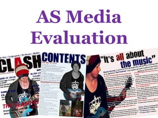
  • 2. 1. In what ways does your media product use, develop or challenge forms and conventions of real media products? The layout of my front cover is based heavily upon conventional components. I believe this helps the reader relate to the magazine better, by feeling much more comfortable in the knowledge of what my magazine is based on and includes. The layout is very spread out, and overlapping which could connote a laid-back feel – in comparison to a more regimented layout; which is a development in comparison to some magazine genres, but very conventional for a music magazine such as Q , Kerrang or NME. The strapline, plug-in, cover lines and leads are all conventional, therefore it’s apparent that my front cover is influenced by previous issues of music magazines focusing on indie/rock music. The masthead is very bold and takes up a large majority of the page – most mastheads only take up the left hand corner of the page, however my masthead challenges the convention by being much larger; I believe this works as an advantage as the brand is more attention-grabbing and easy to recognise. The use of two colours within the same word is also unconventional, as many mastheads only use one colour for the words, to keep continuity. Also many mastheads on rock/indie magazines have background colour to help the masthead stand out more on a busy page, I felt this wasn’t necessary for min ad overall gives it a much more clean, professional finish. The feature article image is very conventional as a mid-shot of one musician. The image is the focal point of the front cover, and everything is built around that, for example the colour scheme and the layout of the cover line – which is the opposite to how magazines would usually be designed. The image itself challenges the conventions as it lacks eye-contact which is usually the main aim of the photograph taken. The colour scheme, uses and adapts the conventions of a rock music magazine. The iconic colours for this genre is red, white and black – as used by Kerrang and NME – however I chose to incorporate navy blue also – which I believe still maintains the rock genre element whilst adding an exciting, different and less monotonous appearance to the magazine. The language used is quite relaxed and colloquial , however there is use of specialist terms within the rock/indie industry and scene, as to make the magazine easier to relate to for the target demographic. The colloquial language helps the magazine seem informal and more chatty, so much more entertaining to read – which is the main purpose of the magazine.
  • 3. The layout of my contents page is much less conventional in comparison to my front cover. The contents page is very different to others of the rock/indie genre, it’s much more simple, less crowded and easier to navigate around; I believe that either form of layout would work well, however in my magazine I needed something more original and unconventional to make the whole product much more appealing and also to help it fit in more with the genre. The placing of every component is rather conventional, however I feel the way in which I have done so is altered in many areas. The contents page was inspired by real media products, including all the usual components, but The finished product is much more individual; therefore will appeal to the individualists and rebels within society and my target audience. The fonts used are the same as are used in the other two of my media products, providing continuity throughout and giving a relation between each separate product. This is always seen within real magazines, as it gives off a professional, well planned image to the whole magazine. There are a range of images used within the contents page, one of which is the main focus and much larger than the others. The large image accompanied by the smaller images helps to attract the readers to the feature article as well as add more interest and options to the readers – this is very common and deemed conventional within contents pages which are professionally made. A way in which my contents page hasn’t followed conventions is by the amount of images used. There are usually a large range of images, however mine is much more minimalistic – but I feel this is not a bad thing as there is a balance between image and text and not only that; but the images I have selected are all completely different, with various subjects, colours, lighting and shots – giving the feeling of quality rather than quantity. The colour scheme is very unconventional for a rock/indie magazine, in the sense that red and black aren’t the prominent colours used, and that blue is the main colour. Red, black and white are all incorporated somehow, but in a much more discrete way; which may be seen as a refreshing take on the genre and put into practice the ideas of the genre “breaking the mould” and “standing out”. The language I used within this product was colloquial and also exclamatory, as I intended to mediate the feeling of informality and friendliness as well as gain interest and add excitement to the articles mentioned, I believe this is very conventional for all entertainment based magazines, as they are trying to attract and entice readership, so need to make the content seem as appealing as possible.
  • 4. The layout of this double page article is again, conventional in most aspects, and influenced by the conventions in other aspects. The large image on one half and the article on the other is very conventional for an article like this; quite possibly because of the space efficiency it entails and the uncomplicated, simple to read view of it. The overlapping of the image to the text isn’t original in the sense that it’s never been done before, however when overlapping text and images the background of the image is usually used for the whole article, but in this case the background is non-existent. The language used within the article is both exclamatory and informal/chatty, due to the nature of the article (an interview) so to keep it realistic and interesting the language used and tone conveyed are all included within the article. I think this helps the reader relate more to the article and the musician being interviewed. The language used isn’t unconventional at all for an interview, it all depends on who your audience is and the purpose of your article. The image used is conventional to the rock/indie genre and the topic of the laid-back interview. This style of image where the subject is “unaware” of the photographer is often used to show the musician hard at work and oblivious to the media. However these types of image are often taken from a extra-long-shot or long-shot, whereas mine is much more up close and personal, which is how I wanted the interview and article to come across. The masthead of the whole article is a quote from within the interview. This is more unconventional than would first appear because quotes are often enlarged within the article, in order to give the reader a taste of what the article is about, however they are hardly used as titles. I think this helps the article generate a lot more interest within and for itself, thus helping the magazine gain a regular readership. The colour scheme used is the same as all the previous products within the issue of the magazine adding to the continuity element of the magazine. In this article you can clearly see the reason behind the colour scheme and the link between it and the image. The image and colour scheme corresponding is a very conventional thing to happen; the feature article often influences the theme, style and colour used throughout the magazine issue.
  • 5.
  • 6. The Images are central and take up the majority of the page.
  • 7. The Lead story is in a different colour and stands out against everything else on the page.
  • 8. The magazine on the right includes more images, and therefore less text.
  • 9. The magazine on the left isn’t as busy and heard on the eyes.
  • 10.
  • 11. Both include red and white, two iconic colours relating to rock and indie music.
  • 12. They include a large image as a focal point and then various smaller sized, less important images.
  • 13. The Banner on the left magazine is much larger, making it more bold and attention-grabbing.
  • 14. The magazine on the right includes a mini article (review) within the contents page.
  • 15.
  • 16. The images are both located to the side of the articles and overlap them slightly.
  • 17. The white backgrounds both act as a neutral shade, on which you can build upon.
  • 18. In the left magazine the text is much larger than the masthead, indicating more importance.
  • 19. The left magazine uses more colour, therefore I find it much more appealing to the eye.Vs.
  • 20. 2. How does your media product represent particular social groups? There is nothing in my final product which would give off negative vibes to any particular social group; however my magazine only intentionally represents the groups which are closely related to rock and indie music, which is a very large range of groups. I feel my magazine would represent younger generations and social groups in comparison to some similar magazines of the same genre. For example Q magazine represents more of young adults and working adults, such as C1 and C2 classes who still maintain the lifestyles of individualists and rebels, to a certain extent. The clothing and overall appearance of the young male musician used for the article would alter and influence which social groups would be interested and represented within my magazine. People who weren’t interested in mainstream shops or people who don’t thrive to be stylish or individual – e.g. “Chavs” and “Emos” – would probably not be inclined to read my magazine. Also nowadays the genre of music chosen for the magazine to focus on heavily influences which social groups would be within the target audience; some would say that when doing a genre-specific music magazine the target audience is highly likely to become niche rather than broad, because of the way music influences people, in particular teenagers – and this is when stereotypes are used, often incorrectly for example; all “Chavs” listen to Hip-Hop and RnB and all “Emos” listen to Screamo and Heavy Metal. I believe my magazine would be aimed more towards students and young adults, mainly because of the language used along with the music genre and bands included. I believe this demographic is very broad, especially nowadays when music interests are very eclectic; so different cultures, ethnicities, upbringings, sexualities, genders and styles can all mix and be enjoyed together rather than being stereotyped alongside a group of certain people in society.
  • 21. 3. What kind of media institution might distribute your media product and why? “IPC Media produces over 60 iconic media brands, with print alone reaching almost two thirds of UK women and 42% of UK men – almost 26 million UK adults – while our websites collectively reach over 14 million users every month.” – IPC Website I intend for my magazine to be easily accessible and on the shelves for sale in the usual magazine distributing shops such as WHSmith and the leading supermarkets. I believe this would be best for my magazine as then it can be reached by the broad audience and the secondary audience, not only that but these shops are all extremely popular, and not only in the UK, almost everyone in the country will be linked to or be a patron of one of the main supermarkets. I also chose Hollister, a clothing shop to distribute my magazine because of it’s influence and status amongst the primary audience of my magazine. The clothing shop, selects some “cool”, “indie” magazines and displays them for sale jus as customers are queuing to pay. If placed in Hollister the magazine may gain more popularity as it could be deemed socially desirable by the primary audience, which is known as the hypodermic syringe theory. “Bauer Media is a division of the Bauer Media Group, Europe’s largest privately owned publishing Group. The Group is a worldwide media empire offering over 300 magazines in 15 countries, as well as online, TV and radio stations.”– Bauer Media Website I think that the two publishing companies above are perfect for my media product, as they both reach a broad audience and are very successful at doing so. IPC controls the publishing of NME magazine and Bauer controls Q and Kerrang magazines – therefore they already support similar genre magazines, meaning there is room in the company and a space on the market for my magazine. One problem may be that they already have magazines attempting to fill the same space as mine, and they just can’t compete with the classic, iconic and nostalgic music magazines.
  • 22. 4. Who would be the audience for your media product? I believe that my audience will consist of aspirers, mainstreamers, individualists and rebels; I think this because all of them are easy to relate to, therefore they can easily relate to my magazine.I intend for the audience to be as broad as possible, however I know that the genres I have chosen will limit this, with certain aspects of my magazine being bias towards a niche audience. I want the magazine to be both a use and gratification to my audience, and by choosing the right audience it will be what I intend it to be. Primary Audience: Teenagers and Young adults, 15-25 year olds, of both genders. I think this because, my magazine will mainly be aimed at people who attend festivals aimed at a younger audience of rock/indie music fans; such as V and Reading and Leeds. Secondary Audience: Adults, 25+, males. I think this because its more common for males to still hold on to their youth through music, whereas women come across as much more sophisticated, with different interests, such as fashion and celebrities. Audience Profiles: Female Male Age: 17 Occupation: Shop Assistant Education: Sixth Form, AS Levels Interests: Music, Shopping, Fashion, Travel, Sports Favourite Artists/Bands: Kings of Leon, Blink-182, Paramore, Bruno Mars Spends Money on: Clothes, Magazines, Dining Out, Cinema, Transport, Phone Contract Age: 21 Occupation: Waiter/Bartender Education: University, Sports Science Interests: Sports, Music, Video Games, Nights Out Favourite Artists/Bands: Lostprophets, Blink-182, Ke$ha Spent Money on: Football Matches, Petrol, Alcohol, Magazines, Phone Contract
  • 23.  5. How did you attract/address your audience? I attracted and addressed my target audience in various ways, some discretely and others blindingly obviously. These ways were: Conventions: I incorporated many conventions of a Rock/Indie magazine into my own magazine in the hopes to make it seem professional and recognisable as a genre specific magazine. I believe following some conventions is a great way of attracting my audience to my magazine, because the conventions act as a sense of security and reassurance that the magazine is of a good standard. Not only that but the conventions that I followed helped the clarity of my magazine and increased how eye-catching it was. Content: The articles and competitions within the magazine have to somehow appeal to both male and female, as my primary target audience isn’t gender specific. I believe that in my magazine including a balanced amount of gender specific articles between male and female will help when attracting the audience – but also non of the articles mentioned are overly aimed at females or males, so reading the articles will go to preference and interests rather than gender. I also included a wide range of articles and reviews within my contents page and on my front cover, which would attract any rock/indie music fan straight away. Language: I wanted to convey an informal, relaxed tone about my magazine and did so through colloquial language and slang when necessary and appropriate. Having a relaxed tone adds more relaxation and entertainment to the whole experience of reading my magazine, it also aims itself more at the primary audience – the younger generations – making them feel comfortable with the language and phrases used within the magazine, so it can be aimed at people of all education levels and abilities. Colour Scheme: The colour scheme used was a mix of the conventional and iconic red, white and black to represent the rock/indie genre magazine, along with a navy blue, which went well with the image and helped neutralise the colour scheme along with making it more original and stand out against all of the other magazines in the same genre, such as NME. The colour scheme and image working together gave the magazine an overall aesthetically pleasing look, which would attract all potential readers to enquire what the magazine is all about. Distributors: Where the magazine is distributed is a major factor in attracting the correct audience – so by using one of the most reputable and successful publishers in the UK/Europe and marketing the magazine in the right shops, the target audience will have easy access and mass exposure to the magazine and hopefully the other factors will help with the final purchase. Bands/Artists: The bands and artists featured within my magazine are all relevant to and a part of the rock/indie genre, so if the target audience sees their favourite band or artist on the cover of my magazine then they will be more inclined to read more. Also band exclusives and debut interviews are always much more interesting to the audience, as they feel a part of something monumental.
  • 24. 6. What have you learnt about technologies from the process of constructing this product? Before constructing this product I had never thought of creating a blog, so from the beginning of the course I have been learning new things about technologies, when we were asked to post all of our work and progress on blogs which we set up on blogspot.com. I’ve grown to like blogging as it feels nice to gradually see your media portfolio building up with all of your hard work and effort being put into something that everyone can appreciate and admire. I’d used Microsoft Publisher previously to create magazine covers at GCSE level, therefore this year I still used publisher but for certain aspects of my magazine I used Photoshop – a program that was alien to me. I’ve learnt that Photoshop is very complicated, however when used correctly is very effective and gives an amazing finish to any task you perform. I used Photoshop to crop and manipulate my images along with an online photo editor on picnik.com, a free and easy way to get a quality finish on an image, from colour to size manipulation. When taking my photographs for my magazine I did a few pilot shots on two different cameras which had different mega pixel amounts – because of this I learnt there was a vast difference in the quality of the images when there was only a small amount more mega pixels. Not only did I learn that it’s good to test out cameras before using them, I also got some high quality images which were easy to work with and extremely clear. However on the negative side I have learnt that you cannot always trust modern technology with your work, as I have had an incident with updating my blog, and then the internet crashing, resulting in me losing work. This taught me to back everything up on a word document, and save as regularly as possible, as you can never tell how unreliable your computer and internet modems may be.
  • 25. 7. Looking back at your preliminary task, what do you feel you have learnt in the progression from it to the full product? I have learnt a great deal over this whole process from timings and deadlines, through to presentation of my products, along with learning many new production related skills including image manipulation and the construction of effective layouts. At the beginning of the preliminary task, I thought I had enough creative flair to create a good front cover and did not realise how large the amount of necessary planning and research actually was in order to make an adequate cover at best. I learnt a lot from my preliminary task; time management was one major lesson. I discovered two easy was in keeping my blog up to date – one of which was blogging every other day or daily, in order to get through the massive work load I had set myself. Another was doping parts of blogs gradually and submitting the finished blogs at the same time. I’ve also learnt about new production methods. Before this media production I hadn’t ever used Photoshop, and quickly discovered and learnt how to use all of the tools available to me, giving my images and front cover a professional, clean cut finish. This was also made easy to me through picnik.com, I used this when I needed to manipulate images at home, as I myself don’t have the program Photoshop. There is a clear difference in my production skills from preliminary task to the final product, which you can see below in the comparison. I believe that the progression I have made is due to the programs and resources available to me – such as DaFont.com, Photoshop and Picnik.com - they made my whole product seem much more professional and easier on the eye in comparison to my preliminary task production. I also believe it’s partly due to the knowledge I had gained through my preliminary task process, I took on board the criticisms and problems that I came across and used the solutions within my main production.