

Recommended
More Related Content
What's hot
What's hot (20)
Viewers also liked
Viewers also liked (18)
Similar to GCSE Graphics gaming promotion
Similar to GCSE Graphics gaming promotion (20)
Recently uploaded
Recently uploaded (20)
GCSE Graphics gaming promotion
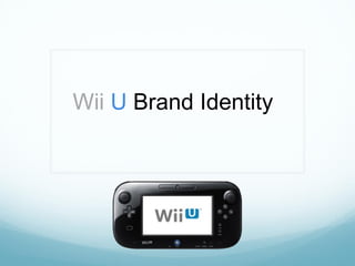
- 1. Wii U Brand Identity
- 2. Contents 3. Problem + Design Brief 4. Analysis of Problem 5. Initial Specification 6-9. Existing Products 10. Materials Research 11. Ergonomics and Anthropometrics 12. User Profile 13. Analysis of Research 14. Design Specification 15. Initial Poster and Game Sleeve Designs 16. Development of Poster – Adobe Photoshop CS6 17. Plan of Making Game Sleeve, CD Sticker and Poster 18. Final A3 Poster 19. Development And Testing of Game Sleeve 20. Development and Testing of Gaming CD Sticker 21. Initial Mug Designs 22. Development of Mug/ Mouse Pad Designs using Photoshop CS6 23. Final Mousepad and Mug Designs 24. Plan of Making Mouse Pad/ Mug 25. Initial T-Shirt Designs 26. Final Designs: T-Shirt 27. Plan of Making: T-Shirt 28. Initial Point of Sale Designs 29. Point of Sale 2D Design 30. PoS Manufacture and Testing 31. Plan of Making PoS 32. Initial Keyring Ideas 33. Plan of Making Keyring 34. Development and Testing of Keyring 35. Final Photos 36. Testing Against Specification 37. Client Evaluation 38. Questionnaire And Results 39. Modifications 40. Materials List
- 3. The Problem The problem I have identified lies with the marketing of the Nintendo Wii U gaming console. The console has/is being poorly marketed, and as a result of it's naming, many people think it is an accessory for the Wii and not a new console. The truth however, is the Wii U is a new, powerful console and was intended to present a new image for Nintendo. Along with a price point $100 lower than it's nearest competitor, it should be flying off shelves. Through use of more aggressive marketing and merchandise, I intend to follow through with the image change originally intended, and bring Nintendo back to being a contender in the home console space. Late last year, Nintendo released an all new gaming console, “Wii U”. Unfortunately, they are facing horrendous sales, likely due to a lack of public awareness. With the new console they were trying to change their image from being a party/family game company to once again being a company that can satisfy core gamers, but this image change failed due to public confusion regarding the name and once again a lack of marketing. I will solve these issues by creating aggressive marketing campaigns for the Wii U, and by creating merchandise/packaging that will reinforce the image change to anyone who sees it. The products must be of an appropriate size and cost that the mainstream public could use them, and shops would be interested in displaying them. I need to make sure I market the console to both kids and adults, as the console is more than suitable for both demographics. The products I make will have to prominently feature the console and again reinforce that this is a new console and not a peripheral for the similarly named Wii. All of the products need to be viable for production using the school’s equipment such as the inkjet printer, sublimation heat press/printing, laser cutter, vinyl plotter and other machinery. This would therefore make all products designed suitable for mass production and industrial processes. Design Brief
- 4. Analysis of Problem Who will the Graphic items be aimed at? The posters, ads, packaging and merchandise will be aimed to at consumers in child, teenager and adult demographics, and will be made to catch their eye and inform them about the Wii U. The point of sale display will be aimed at shops: it must be attractive enough and of an appropriate size to display, and consumers: it must be eye catching and interesting. How will the products function? The Wii U point of sale display will have the function of proudly displaying the Wii U and catching consumer eyes. It will hold the Wii U on a pedestal made of a hard plastic, and will be designed to be intriguing whilst remaining of a size shops will be happy with. The ads and posters will serve the purpose of being eye catching, and making people think the Wii U is cool. They will printed on A3. The merchandise will have the function of being interesting and prominently featuring the Wii U logo. They will be made largely of plastics. Which environments will the products be designed for? The Wii U merchandise I design will be designed for home and urban environments. Thusly, they will not need to be designed to last in harsh conditions, and I can prioritise aesthetics over durability. They cannot be chunky and clumsy, as some of these will need to fit in people’s pockets, etc. The point of sale display will be designed to operate on a shop floor, and because of this it must be able to withstand some wear and tear. Despite this, it only has to last a limited time and so I don’t have to use especially tough materials, however laminated finishes would be needed to protect against humidity and spillages. The ads and posters will be designed for use in shops and outside on walls. They will not be facing any extreme harm, and can be made from A3 paper. How will I consider the environment? I will make sure I am happy with the designs before taking them to production, to avoid unnecessary waste of materials. Wherever possible/viable I will use sustainable materials such as wood and card approved by the FSC. I will be sure in the designing stages to cut down on non sustainable materials as much as possible while retaining the product’s integrity, and products will only be as big as they need to be. All products should be easy to recycle at the end of their life cycle. Which methods will I use for assembly? The point of sale display will be constructed using slot joints and tabs, the posters/ads will be printed on the school printers, and the merchandise will use a wide range of techniques as there are various pieces of merchandise. The mug will use sublimation, key chains will be laser cut and assembled using adhesives such as tensol. How will I consider production in industry? The point of sale display and some of the merchandise will require multiple parts, and as such I will save these different parts as separate files. This way they can be produced on separate assembly lines simultaneously, giving a more efficient production process. I will design and save the ads and posters in such a way they can be easily batch produced in industry. All machinery used in school is of industrial standard and my processes can be replicated easily when mass/batch produced.Will production cost affect the design process? The point of sale displays and posters will be sold largely to shops. They will only need to have a certain lifespan on the shop floor, and I will employ obsolete design to make sure I’m only spending as much as I need to on the displays. The merchandise can’t break immediately but doesn’t have to be super durable. I must find a balance between durability and a cost consumers will be comfortable paying for the products. Which outlet could I see the products being sold through? The PoS displays and posters would be shown in dedicated game stores such as GameStop, GAME, and EB Games, as well as larger supermarkets like Wal-Mart or Asda. The merchandise such as key-rings, shirts, and mugs would be sold in dedicated game stores along with anywhere selling the Wii U including some supermarkets.
- 5. Initial Specification The products must: • Appeal to the demographics in this priority: Older kids/Teens>Adults>Kids. It must appeal to all three but prioritise teens and adults so as to follow through with the change of brand identity. • Effectively advertise to people of all different handicaps, religions and values without excluding anyone or appearing as exclusive to any one group. It must also not offend any of these groups with inappropriate graphics. I will therefore select these carefully. • Fulfill their respective purposes of advertising the Wii U (Posters, billboards, PoS), and of helping spread word of mouth/making fans more dedicated (Merchandise). • Be suitable for their environments. The advertisement products must be designed as cheaply as possible to incentivise shops to buy them, and be designed with their limited lifespan in mind. They will still need to have some kind of lamination to protect from moisture damage. The merchandise should be designed to last longer as it will be used outdoors and indoors by consumers. It should still be designed to be affordable. • Be of an appropriate size for in the shops, in the case of the PoS. Too small and it won’t catch anyone’s eye, too large and shops won’t waste the floor space to display them. The merchandise must all be of an appropriate size to be used by the average consumer in the demographic. • None of the products should feel overtly heavy, especially the advertisement products as they will be shipped en masse, as this will add to both shipping costs and use of fuel for transport. • Have a form factor which is intriguing and attractive to consumers. All of the products should attempt to reinforce brand identity by using a palette of blue, black and white. • Be constructed of appropriate materials: Cheap, light and attractive for the ads; More durable, attractive and affordable for the merchandise. • The advertisement products should ideally be recyclable once they are disposed of as they are not designed to last long. This is less viable for the merchandise but choices benefitting the environment should still be made when possible. • The advertisements will likely be batch produced as more shops order them, and the merchandise will be either batch or mass. Machinery needed will include vinyl plotters, die/laser cutters, sublimation machines and lithographic printers. As the school doesn’t have some of these, I will use more available alternatives such as the school’s A3 printers.
- 6. Existing Products: Posters All of the surrounding posters are designed to promote a game or game console. The poster in the top right tries to promote the Wii by showing a large, colourful collage of various Nintendo characters. It is also reminiscent of posters that used to come with Nintendo’s first console the NES. I really enjoy the color scheme and it would definitely catch the eye in a shop, but what would it do after that? Very little actual advertising is done here, and apart from “Wii” in the bottom right no information is given. A person viewing this poster doesn’t even know a new Nintendo console is out. The two posters in the bottom are for Microsoft’s and Sony’s Xbox 360 and PS3 consoles. The first step in the right direction is that the consoles are featured prominently featured. Microsoft’s even incorporated their slogan “Jump In”, using the console as the “I”, reinforcing brand identity. Prominent imagery of the console and/or the slogan will be important in my design. One issue I have with the Xbox poster is that I don’t think using the console as a letter was a good idea, as it isn’t appealing aesthetically, and appears. I do however like the green glow emanating from the console as this is in keeping with the console’s brand identity and colours. The PS3 poster is appealing to the eye, but doesn’t make it overly clear that is a games console. It wouldn’t be silly to think the PS3 is a blu-ray player or something like that based on this poster. One more good thing about the Xbox poster is all of the great games listed at the top of the page, as one of the best ways to make a console appealing is to show off the games available for it. I would however say that they should have chosen either the “Jump In” or the games typography, having both on the poster is a bit too much. The top left poster aims to advertise New Super Mario Bros. Wii, a Nintendo game. Some captivating and colourful in-game imagery is shown which helps to clarify what the poster is about, and the game’s title is displayed in large text. This poster is perhaps the best and most to the point, but a release date and a tagline/testimony would be useful to enforce a positive image. Besides these two problems, the poster is well designed, in that anyone who saw it would know just what it is advertising: a new Mario game for the Wii. Simple, contrasting colours are used which look crisp and modern on the page. All that is explicitly needed here is contact/website details and a release date, possibly a testimony. All of the posters will have been printed using the lithographic printing method, which is very good for batch production. Lithographic printing produces sharp, strong colours but is not great for the environment as it releases chemicals and fumes during it’s processes. Screen printing or the use of vegetable based inks would help solve this issue.
- 7. Existing Products: PoS Displays A point of sale display’s purpose is double; first to advertise the product and catch the eyes of shoppers, and second to store many of the product for shoppers to pick up right from the stand and buy. The top 2 displays are both for food & drinks products. Because of this, they have been designed to carry a high capacity of units. Cheap snacks and drinks will sell faster than expensive electronics, so I don’t think my unit will have to have an extremely large capacity. As for their designs, the top left display features the big images of the product as part of the structure, which I may take into account when designing my display. Apart from this however, I do not think the design choices made regarding the unit’s size and shape would be appropriate to sell a games console on. It does fine at selling something simple like squash, but I think it would be smarter to make my display more complex as it is for a more complex product. The top right display’s design is closer to the level of complexity that will be appropriate for the Wii U PoS display. I like the 3D sculpted cow’s head and milk buckets, as they associate with Milka’s brand identity, which is all centered around the purple cow. The PoS display I design should be closer to this size than to the size of the top left display, because I am selling bigger products that require a bigger introduction. I like the bottom right display’s giant 3D sculpted shoe, as similarly to the Milka unit, it helps to show some brand identity and in this case magnifies the product they are selling so you would know those are Nike shoes from across the shop floor. The Robinsons display utilizes card and foam board for it’s structure and has it’s imagery printed on art card/glossy paper and stuck to the sides. The Milka display likely uses hard plastic for the cow head and milk buckets, which increases environmental concerns but may be justified if the display is expected to have a longer lifespan. The same issue is present with the Nike display which also seems to use hard plastic.
- 8. Existing Products: Mugs I will design a mug with a design associated with the Wii U brand. Around this page are some mugs which all have designs which associate them with various brands. All but the top left mug have had their design transferred onto the ceramic using sublimation printing. The top left mug is designed to resemble a pipe from the Super Mario games, and definitely achieves this. The actual design printed onto the mug is very simplistic, designed to resemble the mid-80’s “8-bit” graphics. I like the idea of a simple design that references the brand, rather than one that outright advertises it or is just a picture of the product printed onto the mug. Unfortunately I cannot achieve the level of sculpting used in this mug as the school does not have the facilities, and we will be printing onto standard mugs. The mug in the top right is also a simple reference to it’s brand, Batman: Arkham City. I think the design may have looked better if it had a background and not just the plain white of the ceramic. The bottom two mugs have banner images sublimation printed onto them, so that the image wraps all the way around the mug. The left Halo mug looks good with the black background fading onto the black mug, but the right Breaking Bad mug has block yellow printed onto white ceramic, and the result isn’t great looking. I think I should definitely try and keep my background colour in line with or very similar to the colour of my mug.
- 9. Existing Products: T-Shirts These are three printed T-Shirts I found online, and they are also all related to games. I think that right off the bat, the top two are both the most attractive. I think this is largely because of their light coloured backgrounds, and because of this I will make sure to use light backgrounds on the shirt I design. I think the vector based, block colour designs on the top two designs are also helping them a lot, the simple colour schemes look much “classier” than if there just actual pictures printed on the shirts. The bottom left Xbox shirt has a good concept, but I think the XBOX text might be unnecessary and the logo is too small. The use of a wide, gradual colour range instead of a few select simple colours lessens the attractiveness of the shirt in my opinion. All of these t-shirts are made from a cotton-polyester blend as it is comfortable, wearable, breathable and easy to print on. Based on these findings, I will make my shirt have a simple colour scheme, a light background and simple imagery that’s nice to look at and not too obnoxious.
- 10. Materials Research Material Properties Use in my products Acrylic Rigid plastic, can be opaque or translucent, comes in many colours. Could be used to make merchandise like keychains, or could be used in the construction of PoS displays as it is coloured and rigid. Cotton/Polye ster Soft, comfortable to the touch, can be dyed and printed on reliably, workable. The most common material used in the production of t-shirts, I will use it to make mine as well. Ceramic Heat resistant, rigid, can be printed on reliably. The mug will be made of this Foam Board Weak, disposable, but rigid enough to stand on it’s own. Cheap. Can be used in PoS displays for cheap rigid structural support Printer paper Cheap, abundant. Available in school can be used in laser printers. Posters will be printed on this, as it is available in the school and does not require any special equipment to use.
- 11. Ergonomics and Anthropometrics Ergonomics are the relationship between the human body and items it has to work with, and needs to be taken into account while designing my products so that they may be comfortably used by it’s average user. Anthropometrics are the measurements of items which are important for ensuring the product’s proper function. Anthropometrics is important in that I must produce all of my products with measurements which are appropriate, and fit together properly. Joints must meet, slots must slot, etc. I am producing a T-shirt as part of my Wii U Brand Identity initiative. The measurements for a T-Shirt I measured were 56cm in width, and 76cm in height, and the printed image started 8-10cm from the edge. I measured the anthropometrics of a mug to see which measurements I had to design my wraparound image to. I measured the wraparound image on the mug as 260mm in width and 90mm in height. I will design my image a little bit shorter to make sure it fits on the mug. In my research, I found that almost all posters conformed to international paper standards, being A4 , A3 or A2. Whether they were portrait or landscape varied, but I now know to make my poster to regulation paper sizes. Product Height Width Depth T Shirt 760mm 560mm n/a Mug 90mm 260mm 80mm Poster A3 - A2 A3 - A2 n/a Keyring 60mm 60mm 6mm
- 12. User Profile (for PoS displays) Name: Nesbit Round Age: 14 Interests: Movies, Pokemon, Gangsta Rap Occupation: Student Desired product outcome: “I usually look at the displays in stores if they’ve got screens showing the games or whatever, or if they let you try the product. And if they look cool, like they’re in the shape of the product or something” Name: Bread Harrity Age: 28 Interests: Ghouls, Retro games, Technology Occupation: Beekeeper Desired product outcome: “If I’m in a game store, everything is always so loud and brash, I think I would look at something if it looked more inviting. There are always so many bees around me, sometimes I just want some good music and a relaxing game to play”
- 13. Analysis of Research Existing Products When analysing existing products, I found that most posters include bright, bold colours, a logo, brand imagery and colours for corporate identity, they are eye catching, have the name of the product, lithographically printed and will attract people of all ages who are interested in gaming. The mugs have large imagery of the main character on them, contrasting colours, bold typography and a small logo. The t-shirts all include a large image that is centered and usually on the chest area or covering the entire front of the shirt. I will make sure that I consider all of the above when designing my products. I cannot use a lithographic printer as we do not have one in school, I will therefore use the laserjet. However if made in industry the posters would be printed using lithography. Materials Research Through conducting materials research, I gathered data on the properties of several materials which are relevant to my products. I found that acrylic plastic is a rigid material than can be obtained in translucent or opaque forms, and comes in a variety of colours, making it a good material to use on merchandise and keychains, as well as being a possibility for PoS. I found cotton/polyester blend to be a comfortable, breathable material which can be dyed and printed on, making it suitable for garments. I discovered that ceramic is a hard, heat resistant material, and that it is useful in making mugs. I also researched foam board which, I found was a cheap, disposable material which is often used in movie standees. It’s quite weak but is rigid enough to stand on it’s own, and is a possibility for PoS displays.User Profile This segment of my research involved looking at profiles for people in the demographics I was mainly looking at appealing to: Young-Teen males, and Adult males. From thinking as these demographics, I was able to gain some deeper understanding of the criteria they would like to see reached in the types of products I am designing. I found my young-teen male audience to be interested in interactivity and cool designs relevant to and referencing the brand they like. Through writing my adult profile, I found the male adult to be attracted to chilled out, inviting designs that made them associate the product with relaxation, downtime and enjoying themselves in an innocent way almost akin to a child. Ergonomics + Anthropometrics This part of my research involved looking for T-Shirt size charts so I could know the standardized sizes. By looking at these charts, I was able to know the measurements of each individual T-Shirt size. Now that I know the specific measurements for all the standard sizes, I can use that information to inform my designs and how large I make them, ensuring they take up the amount of space on the shirt that I envision when I am designing them.
- 14. Design Specification The products must: • Appeal to the demographics in this priority: Older kids/Teens/Adults/Kids. It must appeal to all three but prioritise teens and adults so as to follow through with the change of brand identity. • Effectively advertise to people of all different handicaps, religions and values without excluding anyone or appearing as exclusive to any one group. It must also not offend any of these groups with inappropriate graphics. I will therefore select these carefully. • Fulfill their respective purposes of advertising the Wii U (Posters, billboards, PoS), and of helping spread word of mouth/making fans more dedicated (Merchandise). • Be suitable for their environments. The advertisement products must be designed as cheaply as possible to incentivise shops to buy them, and be designed with their limited lifespan in mind. They will still need to have some kind of lamination to protect from moisture damage. The merchandise should be designed to last longer as it will be used outdoors and indoors by consumers. It should still be designed to be affordable. • Be of an appropriate size for in the shops, in the case of the PoS. Too small and it won’t catch anyone’s eye, too large and shops won’t waste the floor space to display them. The merchandise must all be of an appropriate size to be used by the average consumer in the demographic. • None of the products should feel overtly heavy, especially the advertisement products as they will be shipped en masse, as this will add to both shipping costs and use of fuel for transport. • Have a form factor which is intriguing and attractive to consumers. All of the products should attempt to reinforce brand identity by using a palette of blue, black and white. • Be constructed of appropriate materials: Cheap, light and attractive for the ads; More durable, attractive and affordable for the merchandise. • The advertisement products should ideally be recyclable once they are disposed of as they are not designed to last long. This is less viable for the merchandise but choices benefitting the environment should still be made when possible. • The advertisements will likely be batch produced as more shops order them, and the merchandise will be either batch or mass. Machinery needed will include vinyl plotters, die/laser cutters, sublimation machines and lithographic printers. As the school doesn’t have some of these, I will use more available alternatives such as the school’s A3 printers.
- 15. Initial Poster + Game Sleeve Designs Mario Poster • Known character in foreground and middle of poster -- catches attention • “Jump Around” slogan is satirical of Xbox’s “Jump Ahead” slogan, represents fun over technical power. • New characters in background and below Mario, putting focus on him • Colour scheme reminiscent of Mario games Zelda Poster • Link in foreground • “All new Zelda” prominently displayed will excite consumers • Generic characters surrendering in background • Golden colour scheme reminiscent of Zelda games • “Back with Power” slogan is a call back to old Nintendo Power branding of the 80’s and 90’s Sonic Poster • “Back in Pole Position” slogan is relevant to Sonic’s speed, and “Back” fits in with the comeback theme of the marketing effort • Scenery looks like a normal racing game: race track, grass, sand. • Sonic in foreground • Sports cars trailing behind Sonic Luigi Poster – I will develop this idea as it is most suitable and meets the brief / specification • Luigi in foreground • Scenery reminiscent of Luigi’s Mansion games • Luigi is vacuuming up a monster from the Silent Hill series of horror games, with the tool he normally uses so defeat the “Boo”s from the Mario series. This fits in with the old beating the new theme of the marketing effort. • “It’s bustin’ time” is a throwback to the Ghostbusters series, which was coming out when Nintendo was in it’s prime, and is relevant to the ghostbusting nature of the Luigi’s Mansion games. All posters will be made using A4 white glossy art card and printed using the school laser jet printer. In industry they would be lithographically printed and batch produced for shipment around the world.
- 16. Development of Poster – Adobe Photoshop CS6 Initial Idea chosen for development Original image of Luigi’s Mansion imported to Photoshop from the Internet onto black background. Image of ghost blacked out using Paint Brush tool. Tornado image cropped from a nasal spray advert, pasted and rotated to fit the gun. I then used the Blur tool to create a cool effect coming out of the gun. Image of monster cropped from white background, rotated and warped to create an effect of being sucked into the gun. Tornado layer copied and pasted on top of itself and the monster, giving the effect of the monster being sucked inside the tornado. I then used the Blur and clone tools to create an effect of the tornado engulfing the monster; thus blending the two layers. I also adjusted the transparency tool to achieve this effect. Wii U logo imported, Continuum font added, which is what Nintendo use. I made the U in “Bu” bold to keep in line with the Wii U branding. All colours are consistent with the Wii corporate identity giving this a very professional appearance. I feel a price needs to be added to entice buyers to purchase the console. Custom shape tool used to create a speech bubble, which I then warped to make it look like Luigi was saying it. I added an outer glow to make it stand out on the black background and to grab the attention of the buyer. Continuum font added inside the speech bubble including the price.
- 17. Plan of Making Game Sleeve, CD Sticker and Poster START Open PSD or JPEG file of design, set image size to how big you need the print (5 min) Load printer with desired type of paper or card, and print, ensuring to maintain the original image size (2 min) Is the image size correct? For CD Sticker, peel off sticker from paper, place on disc. (10 min) FINISH Are the colours and size accurate? Use the guillotine and/or scissors to remove all paper except the design (10 min) Is the design cut out accurately? No Ye s No Yes No Yes
- 18. Final A3 Poster • Contrasting colours make the poster eye catching • Monster from a horror game, fits with theme of old beating the new • Wii U colours used • Full Wii U logo prominently displayed • ALL NEW CONSOLE text strongly reinforces the idea that the Wii U is an entirely new console • IT’SA ONLY $299 text reinforces the message of the price drop • Printed on art card for a high quality finish • Miniamlist style means it looks good in any size. • All the above are inline with the specification and with the corporate identity of the Wii brand; making this a suitable product
- 19. Development and Testing of Game Sleeve The game sleeve is clearly shown in this test to not be wide enough to fill the case. This had to be fixed by changing the proportions of the image, widening it by 5mm. The game sleeve is shown again to not be wide enough, from the rear as much as from the front. In this iteration, the sizes were correct but the text on the back of the sleeve was hardly visible. I had to solve this by using a thicker typeface. The text has been fixed here by using a thicker version of the Continuum font, the font Nintendo uses. The sizes on this measurement are also correct, meaning this is my final game sleeve. This is a full view of the final version of my game sleeve. It perfectly fits the case and all text is visible. The colour scheme and design layout are in line with Nintendo’s own boxes, making it appear authentic. A bar code is included.
- 20. Development and Testing of Gaming CD sticker This is my final design for my CD sticker, and was designed in Photoshop CS6. I made a circular shape based on the reference image, and made the internal hole larger to fit my disc. I made the design by filling the donut shape with the Wii U shade of blue, and then using the Burn tool to darken the lower half, before adding the “Nintendo Power” game logo to the bottom. I then imported the Space U graphics I used for my mug and mouse pad, and deleted any parts of it, which were outside the disc shape using Select>Inverse. Finally, I made a circle at the top of the disc and cut off the excess, creating an even ellipse. I filled this in white, and added the Wii U logo. This is an actual-size CD template which I found online. I used this as a size reference when designing my sticker. This is my final sticker in situation on a disc. The PSD file was printed with the school’s laserjet printer, onto sticker paper. The sticker was then cut out of the sheet of sticker paper using a craft knife, and stuck evenly onto an existing disc. In industry the image would have been printed directly onto the disc, but this is the closest we could achieve using school equipment. I later realised, that I could have cut this out using the Roland CAMM1 plotter in school. However, due to time restrictions and the fact that the CD sticker met the specification, I kept this as my final product. If I were to repeat this process, then I would use 2D Design Tools and the Roland CAMM1 to improve the overall speed and efficiency when manufacturing in quantity.
- 21. “U” Mushroom Mug • Uses Wii U brand colours • Mushroom imagery is familiar and will draw in the mainstream audience • Wii U logo is used within the known symbol, making people curious • Simple imagery may be more appealing to adult audiences, rather than the busy designs of the bottom two • Only two colours means less expensive production and much better for the environment Initial Mug Designs “Are U Ready” Mug • Asks rhetorical question, marketing the Wii U almost aggressively. People will respond well to this as it is what they have wanted from Nintendo for a while. • Takes up a lot of space on the mug making the design eye catching • Uses Wii U brand colours • Uses Wii U brand logo Space Character Collage Mug • Space mask makes logo look like a window to large unexplored area • Familiar characters visible, and look crisp and clean against the space background • Colours contrast and look appealing • Is in the shape of a giant Wii U logo • Takes up a lot of space, which makes it draw attention from people in the room. • I really like this design and feel it will look equally effective on a mouse mat, so I will therefore use the same imagery for a mouse mat- a great overall design “Moon Assault” Mug • Busy imagery and bright colours will appeal to younger audiences • Recognizable Nintendo characters • Retro Mario imagery attracts older audience • Wii U logo used on back of plane All mug designs will be printed onto sublimation paper and heat pressed onto the mug in the oven.
- 22. Development of Mug/Mouse Pad designs using Photoshop CS6 Original Wii U logo imported to Photoshop from the internet, and Magic Wand tool used to get rid of white background. Large space image imported from the internet and placed in a layer behind Wii U logo. Magic Wand tool used to select the area covered by the Wii U logo. I then inversed my selection and deleted except what was covered by the Wii U logo, and deleted the logo itself, resulting in a Wii U logo made of space. Many images of Nintendo characters downloaded from the internet, Magic Wand Tool and Eraser used to remove any backgrounds from the images. I then imported the cropped images of the characters into the document with the Space Wii U logo. Next, I positioned, rotated, scaled and layered the characters to be in the positions I wanted them, before selecting the logo, inverting my selection and pressing Delete to remove any portions of the characters that were not inside the logo, producing my final image. Here are all the layers to evidence that this is my design.
- 23. Final Mouse Pad and Mug designs These are the final mockup designs of the “Space U” being used for my mouse pad and for my mug. The final JPEG file was sent to the sublimation company in two sizes, 93x70mm for the mug and 235x200 for the mouse pad. At the company, the images will have been printed onto sublimation paper and put onto the product, before being put into an oven and heated to a certain temperature for a certain time: 250F for 60 seconds for the mug, and 400F for 45 seconds for the mousepad. The products will then have been removed from the oven and the paper immediately removed. The above designs accurately represent how the design will be printed on the mousepad and mug. We would have produced the products in school, however we do not have a sublimation machine and thus had to use a company. Despite this, I have done the research and fully understand the processes involved in heat sublimation.
- 24. Plan of Making Mouse Pad/Mug START Print design onto sublimation paper at correct size ( 2min) Place printed sublimation paper onto mousepad/mug and stick with blue heat tape (5 min) Is the print the right size? Repeat process as many times as needed. FINISH Is the design lined up correctly? Put product with sublimation paper into the oven, heat to 400F for 45 seconds, remove from oven and remove sublimation paper. (1 min) Is the image printed as desired? No Yes No Yes No Yes
- 25. “Are U Ready” T Shirt • Design takes up most of the front of the shirt, making it hard to miss. • Use of Wii U branding • Asks rhetorical question, marketing the Wii U almost aggressively. People will respond well to this as it is what they have wanted from Nintendo for a while. • Wii U colour scheme GamePad T Shirt • Clear imagery of actual Wii U hardware • Use of Wii U logo • Use of Wii U brand colour • Gets people familiar with the imagery of the gamepad • Large design looks interesting and catches attention • The strange looking controller may garner people asking about what it is. Happy GamePad T Shirt • Cartoon/fun imagery is more appealing to children (in age or at heart) • Use of Wii U hardware imagery • Takes up much of the shirt and catches the eye of people. • People will likely recognize the controllers from the better known Wii and associate the two, drawing in the mainstream audience. Controller Evolution T Shirt • Use of Wii U hardware imagery • Wii U brand colours • Wii U logo • Imagery of old Nintendo controllers appeals to older markets who grew up with them. • Establishes connection with old and new consoles, getting people on the side of the Wii U. • I will develop this one further due to the evolution of the design All t-shirts will be made using cotton / polyester which will then be sublimated onto the shirts. There is a gas in sublimation pigment, which reacts with polyester and the polyester acts as an adhesive, which means that when washed the t-shirt will be more durable and will not wash off / fade. The images will be designed using Adobe Photoshop and heat sublimated onto the t-shirts. Initial T-shirt Designs
- 26. Final Designs: T-shirt This is my final graphic to be printed onto a T-Shirt. I designed the graphic by finding three high resolution photographs of the Nintendo Entertainment System, Super Nintendo Entertainment System and Wii U controllers, using the Magic Wand tool to get rid of the white background on them. I then resized them all to be the same width and placed them in a column. This is the final mockup design of the design being used for my T Shirt. The final JPEG file was sent to the sublimation company at the correct size of 205x290mm. At the company, the images will have been printed onto sublimation paper and put onto the product, before being put into an oven and heated to 400F for 60 seconds. The shirt will then have been removed from the oven and the paper immediately removed. The design accurately represents how the design will be printed on the shirt. We would have produced the product in school, however we do not have a sublimation machine and thus had to use a company. Despite this, I have done the research and fully understand the processes involved in heat sublimation.
- 27. Plan of Making T-shirt START Print design onto sublimation paper at correct size A4 (10 min) Place printed sublimation paper onto T-shirt and tape with blue heat tape. (10 min) Is the print the right size? Repeat process as many times as needed. FINISH Is the design lined up correctly? Put product with sublimation paper into the oven, heat to 250F for 60 seconds, remove from oven and remove sublimation paper. (1 min) Is the image printed as desired? No Yes No Yes No Yes
- 28. “U” Mushroom PoS Display • Mushroom imagery is familiar and will draw mainstream audience • Wii U logo used on mushroom • Wii U colours used on mushroom • Console is displayed prominently so people will know it is it’s own console Wii U Banner PoS Display • Full Wii U logo prominently displayed • Mainstream audience will recognize the “Wii” part • Use of Wii U brand colours • Can hold any game -- Reusable Wii U “Space U” PoS Display • Space background is vast and grand looking, and makes the logo seem like a window • Use of Wii U logo • Use of Wii U brand colours • Is not limited to advertising one game etc, can be kept for as long as the Wii U is sold • GamePad is prominently displayed, showing the strange controller off to people who may have never seen one in real life • I will develop this idea as it is the most creative and stands out Initial Point of Sale Designs
- 29. Point of Sale CAD/CAM in 2D Design These are two images of my CAD designs which I completed in 2D Design Tools. A red line was used when drawing the shapes so that the laser cutter would get the message to cut through the 5mm foam board.
- 30. Point of Sale development (CAD/CAM) manufacturing and Testing Graphics printed for PoS, and cut out using craft knife. First version of PoS parts cut out on Mercury III laser cutter using 5mm foam board on 2.8% speed and 100% power. Slot joints are too far apart and give the game case too much room to move. PoS parts cut out again with revised slot joints. PoS front foam board and graphic cut out/printed. Graphics stuck on back piece of PoS display using double sided tape. Front graphics stuck on front pieces of PoS display using double sided tape. Ready for assembly, all slot joints etc in correct places.
- 31. Plan of Making Point of Sale Display START Turn on laser cutter, place in 5mm thick foamboard, tape down. (10 mins) Autofocus material, sent to print. Settings: 6% speed, 100% power. (5 mins) Is it accurately in place? Slot together (2min) FINISH Are they cut out accurately? Cut out graphics, attach to foam board with double sided tape. (20min) Are the graphics attached properly? No Yes No Yes No Yes
- 32. Mario “U” Cap Keychain • Mario/Luigi cap is an iconic Nintendo symbol • “U” on cap instead of M or L shows Wii U branding • White/Blue colour scheme rather than Red/Green conforms to Wii U branding • Resembles “Club Nintendo” logo which will draw in hardcore Nintendo fans “U” Mushroom Keychain • Mushroom is another iconic Nintendo symbol • White/Blue colour scheme is in line with Wii U brand identity • “U” on mushroom is relevant to the Wii U • Layered “U” adds depth • Mainstream audiences are familiar with the mushroom symbol and will be interested in why there is a “U” on it, leading to inquiries. U Keychain • Clearly displays Wii U logo • Colours are in line with Wii U branding • Layers add a quality look to the product • Simple understated design would not look out of place on an adult’s keyring, whereas a game controller or mushroom might. • Lack of engraving makes production easier, faster and most environmentally friendly – I will use this design for this reason Game Pad Keychain • Form is representative of the most interesting part of the Wii U’s hardware, the GamePad • Wii U logo displayed on “screen” so people know what the keychain is about and may ask the owner about it • Colours match it’s real counterpart • Layers show raised thumbsticks/buttons, and add depth All keyrings will be cut out of acrylic using the laser cutter, and glued together where necessary. Acrylic is good for keyrings as it is rigid and durable, as well as it’s ability to be engraved by the laser. The reason I am using a laser cutter is that the school does not have access to more industrial methods, but in industry the keyring would have a special mold produced for it and either be injection moulded into shape or even made on a 3D printer depending on the costing implications spared by the company Initial Key-ring Designs
- 33. Plan of Making Keyring START Turn on laser cutter, place acrylic on cutting bed. Open 2D Design file on connected PC. (5 mins) Print the design using settings: Cut = Speed 2.8%, Power = 100% Engrave = Speed 95%, Power = 15% (5 mins) Are the cutting/engraving lines in the right place? Will it fit on the acrylic? Repeat process as many times needed. Add metal rings, then turn off laser. (5mins) FINISH Is the cut accurate? Clean the acrylic using methylated spirits. ( 5 min) Is the acrylic clean No Ye s No Yes No Yes Yes
- 34. Development of Keyring (CAD/CAM) and Testing The keyring was first designed based on the Wii U logo, in 2D Design Tools. A red line was used so that the laser cutter would be told to cut through. Then, the first sheet of acrylic was placed on the laser cutter bed and cut out, followed by the second. These pieces were then cleaned using methylated spirits and stuck together using tensol, before a keyring was attached. In reality the keyring is too big in size and would be approximately 30mm smaller all round if made in industry. Although the target market probably would not mind this size as they like everything to be larger with bling.
- 35. Materials List Product Material Length (mm) Width (mm) Depth (mm) Quantity Mousepad Mousepad 200 235 3 1 Sublimation Paper 297 210 N/A 1 Mug Mug 90 260 80 1 Sublimation Paper 297 210 N/A 1 Keyring Acrylic 95 75 3 1 90 70 Keyring 60 60 6 1 T-Shirt Polyester T-Shirt 760 560 N/A 1 Sublimation Paper 297 210 N/A 1 PoS Foam Board Back 280 210 5 1 Front 280 210 5 1 Sides 220 50 5 2 Base 185 145 5 1 Front extra 160 60 5 1 Printing Paper 297 420 N/A 1
- 36. Final Photographs of all Advertising products in their situation
- 37. Testing Against Specification Achieved Achieved Achieved Not achieved Achieved Achieved Achieved Achieved Achieved Achieved Upon evaluation, my products meet almost all of the goals set in my design specification, and the one they don’t meet is a small violation whereby I couldn’t put lamination on the poster. I referred back the the design specification during the design and production processes in order to ensure I met as much of the criteria that I could. The products meeting most of my criteria means that I have produced products which are safe, sensible and achieve their purpose.
- 38. Client Evaluation Poster Teen Male Gamer: “This is the best Wii U poster I’ve seen, it’s got a game I’d actually really like to play on it and the whole thing with the Pyramid Head is funny. I also didn’t know the price was lower now so this would definitely make me interested in getting a Wii U” Keyring Adult Male Gamer: “It’s got a cool design and does look like the Wii U logo, but I only now that because I’m informed about it. If any random person saw this they wouldn’t think “Wii U” so maybe it would be better if it said Wii U on it somewhere. It’s also a little too large to be practical, but it is aesthetically pleasing. I’d pay 1 to 3 pounds for it. T-Shirt Adult Male Gamer: “I like it, it’s cool. I used to play the Super Nintendo when I was small so this is a really cool design for me. Yeah, it might make me think “What’s that weird controller under the SNES one?” And I might end up learning more about the Wii U. I’d probably pay 10-15 pounds for it” Mousepad Teen Male Gamer: “This is a really cool mousepad, if Nintendo sold it in this store I’d probably buy one. It actually made me a little more excited about the Wii U just looking at it because the mousepad reminded me of all these Nintendo characters I loved as a kid. If I could improve it I think I’d write “Wii U” on it somewhere so people who don’t know the logo know what it is. I think I’d pay 5 to 10 pounds for it” Mug Adult Male Gamer: “Whoa, cool design. I really like the depth of the space effect and I remember a lot of these characters from when I was a kid. As a Wii U fan I’d definitely buy this, but maybe it could do with some better branding so uninformed people know what the logo is. I’d pay 5 to 10 pounds for it. Point of Sale Display & Game Game Store Manager: “This is a really cool stand, we haven’t really been sent anything to help push the Wii U before. I’d definitely be happy if our branch got shipped some of these because I think it appeals to everybody”
- 39. Point of Sale
- 40. Questionnaire Results – Gathering the views of others Conclusion The results of my questionnaire show me that my products mostly hit the targets set in the design specification. The answers I received mean that my products appeal to the correct audience, are not offensive, and use the brand colours well. Two people said they did no think the PoS was eye catching, but some people outside of my demographic were given the questionnaire, so those answers may be from them. Three people said one or more of the products are too heavy for their purpose, which is probably down to the Keyring, which was admittedly too large. Ye s No Yes No Yes Yes No No Ye s
- 41. Modifications – What I Would Change Point of Sale Display If I was making my Point of Sale display for industry, I would cut the front “controller” panel in correct proportions to the real thing, as in my version it appears distorted. I would also produce the panels using a die cutter to efficiently batch produce the display. T Shirt In a repeated and/or industry production of my T-Shirt, I would use a PNG file when printing to the sublimation paper, as this would mean I could have a transparent background and only print the imagery. In my version I used a JPEG, which by default puts a white background wherever there isn’t imagery, resulting in an unattractive white rectangle around my design. In industry the shirt would be printed in large sublimation quantities. Mousepad One thing I would like to change about the production of my mousepad is the colour of mousepad it was printed on. We weren’t given an option when printing through the company and the design was printed on a white mousepad. In a future production with industry facilities or with the school’s own sublimation printer, I would print the design on a black mousepad as this would blend better with my design and create the cool effect I was envisioning when I first designed it. In industry, like the T-Shirt the mousepad would be sublimated. Keyring If I were to make my keyring again or if it were to be made in industry, I would keep everything the same except that I would make the whole thing about half the size. At it’s current size it is too big to conveniently fit on someone’s set of keys, as was evidenced in my Client Evaluation. Additionally, white vinyl stickers might also add to the attraction making the background stand out even more.