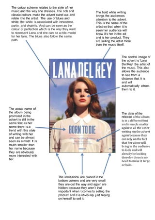
1. The colour scheme relates to the style of her
music and the way she dresses. The rich and
classic colours make the advert stand out and
relate it to the artist. The use of blues and
white; the white is associated with innocence,
purity, and virginity. And can be seen as the
colour of perfection which is the way they want
to represent Lana and she can be a role model
for her fans. The blues also follow the same
path.
The bold white writing
brings the audiences
attention to the advert.
This is the name of the
artist so that when it is
seen her audience will
know it’s her in the ad
and is her product. They
are selling the artist more
than the music itself.
The central image of
the advert is ‘Lana
Del Rey’ the artist of
the music. This also
allows the audience
to see from a
distance that it is
and will
automatically attract
them to it.
The actual name of
the album being
promoted in the
advert is still in the
same font as her
name there is a
trend with this style
of writing with her
and can be almost
seen as a motif. It is
much smaller than
her name because
they are obviously
more interested with
her.
The date of the
release of the album
is in a different font
and is much smaller
again to all the other
writing on the advert
again because they
can rely on the fact
that her alone will
bring in the audience
to look and will
already be looking
therefor there is no
need to make it large
or bold.
The institutions are placed in the
bottom corners and are very small
they are out the way and again are
hidden because they aren’t that
important when t comes to selling the
product and it is obviously just relying
on herself to sell it.