
Recommended
More Related Content
What's hot
What's hot (19)
Similar to Task ten
Similar to Task ten (20)
More from asmediad14
More from asmediad14 (20)
Recently uploaded
Recently uploaded (20)
Task ten
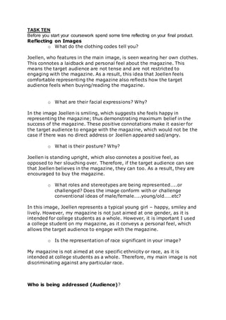
- 1. TASK TEN Before you start your coursework spend some time reflecting on your final product. Reflecting on Images o What do the clothing codes tell you? Joellen, who features in the main image, is seen wearing her own clothes. This connotes a laidback and personal feel about the magazine. This means the target audience are not tense and are not restricted to engaging with the magazine. As a result, this idea that Joellen feels comfortable representing the magazine also reflects how the target audience feels when buying/reading the magazine. o What are their facial expressions? Why? In the image Joellen is smiling, which suggests she feels happy in representing the magazine; thus demonstrating maximum belief in the success of the magazine. These positive connotations make it easier for the target audience to engage with the magazine, which would not be the case if there was no direct address or Joellen appeared sad/angry. o What is their posture? Why? Joellen is standing upright, which also connotes a positive feel, as opposed to her slouching over. Therefore, if the target audience can see that Joellen believes in the magazine, they can too. As a result, they are encouraged to buy the magazine. o What roles and stereotypes are being represented…..or challenged? Does the image conform with or challenge conventional ideas of male/female…..young/old……etc? In this image, Joellen represents a typical young girl – happy, smiley and lively. However, my magazine is not just aimed at one gender, as it is intended for college students as a whole. However, it is important I used a college student on my magazine, as it conveys a personal feel, which allows the target audience to engage with the magazine. o Is the representation of race significant in your image? My magazine is not aimed at one specific ethnicity or race, as it is intended at college students as a whole. Therefore, my main image is not discriminating against any particular race. Who is being addressed (Audience)?
- 2. - Who is the magazine aimed at? How do we know? Because my magazine is a college magazine, it is aimed at college students. I have featured a student in my main image, so that it is clear this is a personal magazine, as opposed to using a model that would not be recognised in relation to Solihull College. - What have you done to attract the target audience? Throughout my magazine I have used a clear colour scheme, purple and green, which associates itself with the college colours. By using clear colours it demonstrates a consistency, so that the magazine may develop a house style. Once this house style becomes recognisable, the magazine may become branded. - How have you made use of both text and image to address that intended audience. Throughout both the contents and cover I have used images/graphics and text. However, I have not overused them as this can appear childish and deter from the intended target audience. Even so, by having an imbalance of text, it can appear unappealing. In addition, I included a cover mount, which encourages more students to purchase the magazine.