SlideShare a Scribd company logo
1 of 7
Jacob Brown
Task 2- Media Coursework

Genre of Magazine: Pop
Magazine analysed: Top of the Pops

Front Page:

Typography& Colour- The masthead of the magazine is in a sans-serif, they used this font to show
the magazine is informal but also fun at the same time. The colours they used for the magazine are
mainly a mixture of light blue, pink and yellow. These colours they used connote femininity to attract
a target audience of mainly girls. All the text used on the front cover is in bold so it draws the
attention of the reader, the reader will be drawn into the most important aspects of the magazine
first with the bold especially being drawn into coverlines on the magazine such as ‘The Wanted’ and
‘Rita Ora’. Highlighting the text in bold and larger font attracts more readers to the magazine such as
The Wanted and Rita Ora fans, expanding the target audience. The overall text is bright, fun and
stylish to match the genre of pop.
Imagery: The images on the front cover of the magazine are used to draw attention to the eye of the
target audience. They enlarged the big pop stars to ‘sell’ the magazine more to the reader. The
Editor used a large image of One Direction on the front to invite One Direction fans into buying the
magazine. There are other big name stars on the magazine such as:
-

The Wanted
Rita Ora
Little Mix
Rihanna
Taylor Swift

These celebrities are used to expand the target audience to a range of fans following fans across the
pop business, from a range of age’saswell. Many of the shot types are close up images to draw
attention of the audience straight away to the celebrity on show. There is one picture which is a long
shot and that is of One Direction, who is the main image on the cover. The long shot image highlights
the clothing of the members of One Direction who look very fashionable which also reaches out to
the target audience because they look good and appealing. The celebrities on the cover all perform
or promote pop music which attracts a young audience; because of this the images on the cover are
conventional for the genre of pop.

Layout:

The magazine uses the route of the eye to encourage and attract the reader to buy the magazine.
They firstly use the route of the eye to highlight the masthead of the magazine to make the reader
aware of magazines name and initial content. It then progresses though to the cover artist, One
Direction, to attract the audience to purchase the magazine. Finally, it promotes through smaller
items displayed on the cover to increase the range of audience, due to there being a number of
globally famed artist on thecover. The layout of the cover is very cluttered and disorganised to
attract a younger audience because it’s eccentric, fun and energetic which appeals to the younger
audience. This makes it conventional to its genre as pop is also fun and energetic. The principle of
three is also used to highlight the number and range of items in the magazine, in the centre third is
the cover artist which is used to attract the reader because the route of the eye means the reader’s
eye goes straight through the centre of the page. The left third promotes three coverlines which is
conventional as the reader always needs to be drawn into the magazine from first glance and this
occurs in the third left following the route of the eye.

Language/Mode of address:The mode of address used on the cover is very informal and this appeals
to the younger audience as the magazine use words and phase such as ‘Wahey’ and Blipp It’. The
magazine connects with its target audience by using language that they can relate to. The language
is also exciting, young, fresh and ‘in your face’. This is conventional because it’s what the audience
wants to see and it also follows the genre of magazine, as pop is exciting, young, fresh and ‘in your
face’. They also use many coverlines scattered across the page with exciting language such as ‘guess
who’, ‘cute’ and ‘blimey’. All three of these stand out and shout to the target audience as it allows
the teenagers to connect with the magazine because it relates to their language. The magazine is
also very relaxed about its message to its readers because they know a teenager’s free time will be
spent relaxing reading the magazine. So they want to the audience to feel relaxed when reading the
magazine. The mode of address is a key convention for this magazine because it will have a massive
influence on the target audience and this will be key to make sure the target audience is interested
in the magazine.

Contents:
Typography & Colour: The fonts on the contents are all sans-serif; this shows the reader the
magazine is funky and energetic. It is also relaxing and easy to read so it meets the targets
audiences’ ability level. The contents page and the front cover both bring across the feeling of fun
and enjoyment, reflecting the genre of the magazine. The font is bright, bold and exciting to grab the
attention of the target audience and encourages them to buy the magazine. They have also
numbered images so it’s quick and easy to reach the targets audiences needs and also it makes it
stylish. Images are also used because there is not enough space to write everything what’s in the
magazine, so they use images to still promote what else is in the magazine in a new energetic way.
The font they use for the headline represents a young girl’s handwriting, this connotes youth and it
reminds them that the magazine is a good way to relax. The colours used in the contents page are
mainly white, pink and yellow. These colours follow the overall colour scheme of the magazine and
this is conventional in attracting the target audience. The three colours could be associated with girls
and femininity. They use the pink to attract the reader at first glance and they use it as page
numbers to draw attention to the important information. They would use white because it’s simple
but elegant and it helps the two other colours stand out more. The yellow is used to highlight the
key important areas to draw the audience’s attention to.

Imagery:The images used on the contents are used to draw attention to the reader and promote the
magazine and also other products on sale. They place an image of the front cover of the magazine
on the top left of the contents page to promote the product and keep the reader ‘hooked’. The
route of the eye means the reader’s first glance at the page will be at this front cover on the
contents page. The reader also can match up what interested them on the front cover to where it
would be situated in the magazine, e.g. - if they were interested in Little Mix they can see it’s
situated on page 24. They place a large image of Louis Tomlinson at the bottom right hand side of
the contents so the last piece of information the reader will see is the image of him because of the
route of the eye. This image will stick in the memory of the reader so they can remember to read the
article about him. He also is a big pop star so he is enlarged to promote the product, draw attention
to the reader and also keep to the conventional theme. They also place many smaller images of
beauty products which are able to be won in their competition or brought from business partners.
These images keep the reader drawn in and also it encourages the reader to enter the competition
or purchase the items. Using beauty products helps to relate to the target audience as these are
items which interest them and they find it relaxing and fun. This is conventional because it keeps to
the overall theme of the magazine.
Layout:The layout of the contents is both cluttered but organised at the same time. They have
crammed a lot of information on one page and with the various image and number sizes the
contents looks overcrowded. They have also placed the information in the magazine into sections so
the audience can find what they want quickly and easily.However, this mixed layout could appeal to
the target audience as it is stylish but elegant and young people can relate to this. The content page
also uses the route of the eye to draw attention to the reader and make sure they still motivated
and interested to read the magazine. It firstly starts with an image of the front cover of the magazine
in the top left. This is there to remind the reader why they possibly brought the magazine. It then
starts to highlight the relevant information in the magazine and where to find it, so the reader can
easily see where they need to find the relevant information they brought the magazine for. It finally
ends with showing a picture of Louis Tomlinson, a big name pop star who readers are automatically
drawn to.

Language/Mode of Address: The language used is informal, this is used to relate with the target
audience, as they want quick, easy information rather than big chunks of text. They have changed
the word ‘love’ into a love heart itself to relate to the target audience again, as the heart is fun and
exciting rather than all bland and plain. This addresses the younger audience as its arty and eye
catching. This is conventional because it attracts the audience and also keeps within the genre of the
magazine. The contents is also very relaxing for the reader to understand, it’s easy, simple but fun
and exciting at the same time. This is just what the target audience would want from the page. The
mode of address for the contents is conventional because it’s key to keeping the reader fixed and it
does that well while keeping to its genre
Double Page Spread:

Typography & Colour:The font they used is sans-serif and it’s bold, they don’t use much text in the
double page spread because he reader would be attracted to the magazine due to the vast images of
the group, One Direction. The fonts also make the reader feel excited about reading the magazine, it
also is fun and energetic, and this is conventional because it matches the front cover and contents
which reflects the genre of the magazine. The purpose of the whole of the typography is to attract
the target audience into buying the product. They use pink and white a lot throughout the magazine
and also on this double page spread; this again is feminine so the target audience automatically
relates to the article. They use this colour green to show ambition and his ambition is conventional
because the group, One Direction, themselves are ambitious in their career. The colour yellow is
used a little bit on the magazine, highlighting the App they are promoting so the audience
automatically relates the colour to the App.

Imagery:The magazine uses many images across the double page spread to draw the attention of
the target audience to the article as the audience would be attracted to the vast range of pictures on
the page. The double page spread uses route of the eye, and they use a big image of 3 members of
the group in the bottom left of the corner to keep the reader attracted. They also use 4 close up
shots of the group to keep the reader drawn on the magazine. There are a variety of images of other
magazines highlighting One Direction; this is done to promote the magazine itself and also the
group. The magazine shows many different long, mid and close up shots of the group so the reader
can see the group as a whole and individually close up. This is done so the target audience, One
Direction fans and teenage girls, are fully attracted and drawn into the magazine.

Layout:
The magazine uses route of the eye to attract readers to the article about One Direction. They firstly
highlight what the article is about by using a headline and a standfirst; his is where the audience’s
eye is first drawn to. Then the audience’s eye makes its way right across the page to a series of
images of previous magazines with One Direction on it. Then they have placed a big image of One
Direction in the bottom left of the page, this is where the audiences eye goes next and this is key to
keep the audience drawn. Finally they carefully place 4 individual pictures of the members across
the bottom of the page, so the reader will individual look at one after the other. Again the layout of
the double page spread is structured but cluttered at the same time, they have selected specific
areas to place images and text in, however, the overall presentation of the page is overcrowded.
This is conventional because it matches and follows the style of the magazine and it keeps to the
overall house style. This layout also attracts the reader to the article as it’s relates to the target
audience and this will allow the magazine to sell.

Language & Mode of Address:The language and mode of address are both informal on this page and
this is relevant in attracting the target audience. The magazine uses a phrases such as ‘1D’ and ‘Blipp
It’ these are phrases the magazines target audience could relate to and this would encourage them
to buy the magazine. Also the double page spread reflects emotions such as fun, energetic but
relaxing at the same time. This is conventional as the magazine as a whole also reflects these
emotions towards the reader. The target audience also don’t want big chunks of text to read so the
magazine uses more images than text so it’s quick and easy for the target audience to read. This is
also a good way of attracting and drawing the reader to the page because you are giving them what
they want and relate to. The page as a whole is conventional because it follows the house style of
the magazine and keeps the reader fixed to the magazine. These are key to the magazine staying to
the genre of the music and also making sure the target audience is happy.

More Related Content

What's hot

Evaluation on music magazine...
Evaluation on music magazine...Evaluation on music magazine...
Evaluation on music magazine...MoniDeol
 
Emma Gregory Magazine Evaluation
Emma Gregory Magazine EvaluationEmma Gregory Magazine Evaluation
Emma Gregory Magazine Evaluationguest986f9f
 
Magazine Evaluation
Magazine EvaluationMagazine Evaluation
Magazine Evaluationguest04a5fa
 
Evaluation on music magazine
Evaluation on music magazineEvaluation on music magazine
Evaluation on music magazineMoniDeol
 
Evaluation question 5
Evaluation question 5Evaluation question 5
Evaluation question 5asmediae15
 
Evaluation notes
Evaluation notesEvaluation notes
Evaluation notesbryony23
 
G321 media studies evaluation Gowsy
G321 media studies evaluation GowsyG321 media studies evaluation Gowsy
G321 media studies evaluation GowsyGowsigan Mathankanna
 
Music magazine research
Music magazine researchMusic magazine research
Music magazine researchbroganlan
 
As media foundation research into existing magazine products
As media foundation research into existing magazine productsAs media foundation research into existing magazine products
As media foundation research into existing magazine productsGeorginaMediaStudies
 
In what ways does your media product use, develop or challenge forms and conv...
In what ways does your media product use, develop or challenge forms and conv...In what ways does your media product use, develop or challenge forms and conv...
In what ways does your media product use, develop or challenge forms and conv...charlotte_abbott
 
Critical reflection
Critical reflectionCritical reflection
Critical reflectionlilshahi
 

What's hot (17)

Evaluation on music magazine...
Evaluation on music magazine...Evaluation on music magazine...
Evaluation on music magazine...
 
Emma Gregory Magazine Evaluation
Emma Gregory Magazine EvaluationEmma Gregory Magazine Evaluation
Emma Gregory Magazine Evaluation
 
Magazine Evaluation
Magazine EvaluationMagazine Evaluation
Magazine Evaluation
 
Evaluation on music magazine
Evaluation on music magazineEvaluation on music magazine
Evaluation on music magazine
 
Evaluation question 5
Evaluation question 5Evaluation question 5
Evaluation question 5
 
My evaluation
My evaluationMy evaluation
My evaluation
 
Evaluation notes
Evaluation notesEvaluation notes
Evaluation notes
 
Evaluating my music magazine
Evaluating my music magazineEvaluating my music magazine
Evaluating my music magazine
 
Evaluation 1
Evaluation 1Evaluation 1
Evaluation 1
 
G321 media studies evaluation Gowsy
G321 media studies evaluation GowsyG321 media studies evaluation Gowsy
G321 media studies evaluation Gowsy
 
Research and Planning
Research and Planning Research and Planning
Research and Planning
 
Music magazine research
Music magazine researchMusic magazine research
Music magazine research
 
As media foundation research into existing magazine products
As media foundation research into existing magazine productsAs media foundation research into existing magazine products
As media foundation research into existing magazine products
 
Question 1
Question 1Question 1
Question 1
 
In what ways does your media product use, develop or challenge forms and conv...
In what ways does your media product use, develop or challenge forms and conv...In what ways does your media product use, develop or challenge forms and conv...
In what ways does your media product use, develop or challenge forms and conv...
 
Magazine anaylisis
Magazine anaylisisMagazine anaylisis
Magazine anaylisis
 
Critical reflection
Critical reflectionCritical reflection
Critical reflection
 

Viewers also liked

Sorin psatta smsc
Sorin psatta smscSorin psatta smsc
Sorin psatta smscRevistaBiz
 
transcrip pg 1
transcrip pg 1transcrip pg 1
transcrip pg 1Alan Hall
 
Piano aria sicilia capitolo 7 da pag 219 a pag 233 piano direttore ass.to t...
Piano aria sicilia capitolo 7  da pag 219 a pag 233  piano direttore ass.to t...Piano aria sicilia capitolo 7  da pag 219 a pag 233  piano direttore ass.to t...
Piano aria sicilia capitolo 7 da pag 219 a pag 233 piano direttore ass.to t...Pino Ciampolillo
 
Turks & Caicos Islands Community College Transcript
Turks & Caicos Islands Community College TranscriptTurks & Caicos Islands Community College Transcript
Turks & Caicos Islands Community College TranscriptMr. Larry Lamard Garland
 
Ontario Life Loan Intermediaries registration
Ontario Life Loan Intermediaries registrationOntario Life Loan Intermediaries registration
Ontario Life Loan Intermediaries registrationdankahan
 
Sms biz camp cora mdd 2
Sms biz camp   cora mdd 2Sms biz camp   cora mdd 2
Sms biz camp cora mdd 2RevistaBiz
 
Red Bull Batalla de los Gallos
Red Bull Batalla de los GallosRed Bull Batalla de los Gallos
Red Bull Batalla de los GallosMilder Ferreira
 
Manafu groparu-presentation sm snow camp 2013 - humor
Manafu groparu-presentation sm snow camp 2013 - humorManafu groparu-presentation sm snow camp 2013 - humor
Manafu groparu-presentation sm snow camp 2013 - humorRevistaBiz
 

Viewers also liked (13)

Numeros Enteros
Numeros EnterosNumeros Enteros
Numeros Enteros
 
Sorin psatta smsc
Sorin psatta smscSorin psatta smsc
Sorin psatta smsc
 
transcrip pg 1
transcrip pg 1transcrip pg 1
transcrip pg 1
 
Piano aria sicilia capitolo 7 da pag 219 a pag 233 piano direttore ass.to t...
Piano aria sicilia capitolo 7  da pag 219 a pag 233  piano direttore ass.to t...Piano aria sicilia capitolo 7  da pag 219 a pag 233  piano direttore ass.to t...
Piano aria sicilia capitolo 7 da pag 219 a pag 233 piano direttore ass.to t...
 
El brief
El briefEl brief
El brief
 
Գրողներ
ԳրողներԳրողներ
Գրողներ
 
Turks & Caicos Islands Community College Transcript
Turks & Caicos Islands Community College TranscriptTurks & Caicos Islands Community College Transcript
Turks & Caicos Islands Community College Transcript
 
Ontario Life Loan Intermediaries registration
Ontario Life Loan Intermediaries registrationOntario Life Loan Intermediaries registration
Ontario Life Loan Intermediaries registration
 
4 eso teachertips_lesson5
4 eso teachertips_lesson54 eso teachertips_lesson5
4 eso teachertips_lesson5
 
Epidemologi tifoid
Epidemologi tifoidEpidemologi tifoid
Epidemologi tifoid
 
Sms biz camp cora mdd 2
Sms biz camp   cora mdd 2Sms biz camp   cora mdd 2
Sms biz camp cora mdd 2
 
Red Bull Batalla de los Gallos
Red Bull Batalla de los GallosRed Bull Batalla de los Gallos
Red Bull Batalla de los Gallos
 
Manafu groparu-presentation sm snow camp 2013 - humor
Manafu groparu-presentation sm snow camp 2013 - humorManafu groparu-presentation sm snow camp 2013 - humor
Manafu groparu-presentation sm snow camp 2013 - humor
 

Similar to Research Into Similar Products

College Media Evaluation
College Media EvaluationCollege Media Evaluation
College Media Evaluationgueste0c63f
 
Media Evaluation
Media EvaluationMedia Evaluation
Media Evaluationfitton92
 
AS Level Media Fashion Magazine Production Treatment
AS Level Media Fashion Magazine Production TreatmentAS Level Media Fashion Magazine Production Treatment
AS Level Media Fashion Magazine Production TreatmentPetramediastudies
 
Front cover ana
Front cover anaFront cover ana
Front cover analjsergh
 
Music magazine research
Music magazine researchMusic magazine research
Music magazine researchbroganl4
 
Front Cover Analysis Top of the Pops
Front Cover Analysis Top of the PopsFront Cover Analysis Top of the Pops
Front Cover Analysis Top of the Popsclaudiaionescu8
 
Uptown evaluation
Uptown   evaluationUptown   evaluation
Uptown evaluationfitton92
 
Unit 13 media final version
Unit 13  media final versionUnit 13  media final version
Unit 13 media final versionkeirahibbert
 
As media studies evaluation
As media studies evaluationAs media studies evaluation
As media studies evaluationftallett03
 
Question 1 - Media Evaluation
Question 1 - Media EvaluationQuestion 1 - Media Evaluation
Question 1 - Media Evaluationbeckiemcconnell
 
Pop magazine anaysis
Pop magazine anaysisPop magazine anaysis
Pop magazine anaysishamidahr
 
Media Evaluation
Media EvaluationMedia Evaluation
Media Evaluationgeorgiai
 
Textual Analysis
Textual Analysis Textual Analysis
Textual Analysis 048600
 

Similar to Research Into Similar Products (20)

College Media Evaluation
College Media EvaluationCollege Media Evaluation
College Media Evaluation
 
1
11
1
 
Q2
Q2Q2
Q2
 
Media Evaluation
Media EvaluationMedia Evaluation
Media Evaluation
 
AS Level Media Fashion Magazine Production Treatment
AS Level Media Fashion Magazine Production TreatmentAS Level Media Fashion Magazine Production Treatment
AS Level Media Fashion Magazine Production Treatment
 
Front cover ana
Front cover anaFront cover ana
Front cover ana
 
Music magazine research
Music magazine researchMusic magazine research
Music magazine research
 
Unit 13 - L02
Unit 13 - L02 Unit 13 - L02
Unit 13 - L02
 
Front Cover Analysis Top of the Pops
Front Cover Analysis Top of the PopsFront Cover Analysis Top of the Pops
Front Cover Analysis Top of the Pops
 
Uptown evaluation
Uptown   evaluationUptown   evaluation
Uptown evaluation
 
Unit 13 media final version
Unit 13  media final versionUnit 13  media final version
Unit 13 media final version
 
As media studies evaluation
As media studies evaluationAs media studies evaluation
As media studies evaluation
 
Evaluation q 2 new
Evaluation q 2 newEvaluation q 2 new
Evaluation q 2 new
 
Question 1 - Media Evaluation
Question 1 - Media EvaluationQuestion 1 - Media Evaluation
Question 1 - Media Evaluation
 
Pop magazine anaysis
Pop magazine anaysisPop magazine anaysis
Pop magazine anaysis
 
C1 a2
C1 a2C1 a2
C1 a2
 
Task 2
Task 2Task 2
Task 2
 
Media Evaluation
Media EvaluationMedia Evaluation
Media Evaluation
 
Question 1
Question 1Question 1
Question 1
 
Textual Analysis
Textual Analysis Textual Analysis
Textual Analysis
 

More from jwab14

Production Diary
Production DiaryProduction Diary
Production Diaryjwab14
 
Audience Feedback on Planning
Audience Feedback on PlanningAudience Feedback on Planning
Audience Feedback on Planningjwab14
 
Audience Feedback Results
Audience Feedback ResultsAudience Feedback Results
Audience Feedback Resultsjwab14
 
Casting, Location & Test Shots
Casting, Location & Test ShotsCasting, Location & Test Shots
Casting, Location & Test Shotsjwab14
 
Casting, Location & Test Shots 2
Casting, Location & Test Shots 2Casting, Location & Test Shots 2
Casting, Location & Test Shots 2jwab14
 
Media Pitch
Media PitchMedia Pitch
Media Pitchjwab14
 
Casting, Location & Test Shots
Casting, Location & Test ShotsCasting, Location & Test Shots
Casting, Location & Test Shotsjwab14
 
Production Schedule
Production ScheduleProduction Schedule
Production Schedulejwab14
 
Risk Assessment
Risk AssessmentRisk Assessment
Risk Assessmentjwab14
 
Production Schedule
Production ScheduleProduction Schedule
Production Schedulejwab14
 
Lullaby Script
Lullaby ScriptLullaby Script
Lullaby Scriptjwab14
 
Production Concepts
Production ConceptsProduction Concepts
Production Conceptsjwab14
 
Still Image Analysis
Still Image AnalysisStill Image Analysis
Still Image Analysisjwab14
 
Detailed analysis- Media Coursework
Detailed analysis- Media CourseworkDetailed analysis- Media Coursework
Detailed analysis- Media Courseworkjwab14
 
Effective video production
Effective video productionEffective video production
Effective video productionjwab14
 
Specific examples q6
Specific examples q6Specific examples q6
Specific examples q6jwab14
 
Specific examples q6
Specific examples q6Specific examples q6
Specific examples q6jwab14
 
Question 7
Question 7Question 7
Question 7jwab14
 
Question 7- Progression
Question 7- ProgressionQuestion 7- Progression
Question 7- Progressionjwab14
 
Question 1- Conventions
Question 1- ConventionsQuestion 1- Conventions
Question 1- Conventionsjwab14
 

More from jwab14 (20)

Production Diary
Production DiaryProduction Diary
Production Diary
 
Audience Feedback on Planning
Audience Feedback on PlanningAudience Feedback on Planning
Audience Feedback on Planning
 
Audience Feedback Results
Audience Feedback ResultsAudience Feedback Results
Audience Feedback Results
 
Casting, Location & Test Shots
Casting, Location & Test ShotsCasting, Location & Test Shots
Casting, Location & Test Shots
 
Casting, Location & Test Shots 2
Casting, Location & Test Shots 2Casting, Location & Test Shots 2
Casting, Location & Test Shots 2
 
Media Pitch
Media PitchMedia Pitch
Media Pitch
 
Casting, Location & Test Shots
Casting, Location & Test ShotsCasting, Location & Test Shots
Casting, Location & Test Shots
 
Production Schedule
Production ScheduleProduction Schedule
Production Schedule
 
Risk Assessment
Risk AssessmentRisk Assessment
Risk Assessment
 
Production Schedule
Production ScheduleProduction Schedule
Production Schedule
 
Lullaby Script
Lullaby ScriptLullaby Script
Lullaby Script
 
Production Concepts
Production ConceptsProduction Concepts
Production Concepts
 
Still Image Analysis
Still Image AnalysisStill Image Analysis
Still Image Analysis
 
Detailed analysis- Media Coursework
Detailed analysis- Media CourseworkDetailed analysis- Media Coursework
Detailed analysis- Media Coursework
 
Effective video production
Effective video productionEffective video production
Effective video production
 
Specific examples q6
Specific examples q6Specific examples q6
Specific examples q6
 
Specific examples q6
Specific examples q6Specific examples q6
Specific examples q6
 
Question 7
Question 7Question 7
Question 7
 
Question 7- Progression
Question 7- ProgressionQuestion 7- Progression
Question 7- Progression
 
Question 1- Conventions
Question 1- ConventionsQuestion 1- Conventions
Question 1- Conventions
 

Recently uploaded

Organic Name Reactions for the students and aspirants of Chemistry12th.pptx
Organic Name Reactions  for the students and aspirants of Chemistry12th.pptxOrganic Name Reactions  for the students and aspirants of Chemistry12th.pptx
Organic Name Reactions for the students and aspirants of Chemistry12th.pptxVS Mahajan Coaching Centre
 
Final demo Grade 9 for demo Plan dessert.pptx
Final demo Grade 9 for demo Plan dessert.pptxFinal demo Grade 9 for demo Plan dessert.pptx
Final demo Grade 9 for demo Plan dessert.pptxAvyJaneVismanos
 
Capitol Tech U Doctoral Presentation - April 2024.pptx
Capitol Tech U Doctoral Presentation - April 2024.pptxCapitol Tech U Doctoral Presentation - April 2024.pptx
Capitol Tech U Doctoral Presentation - April 2024.pptxCapitolTechU
 
“Oh GOSH! Reflecting on Hackteria's Collaborative Practices in a Global Do-It...
“Oh GOSH! Reflecting on Hackteria's Collaborative Practices in a Global Do-It...“Oh GOSH! Reflecting on Hackteria's Collaborative Practices in a Global Do-It...
“Oh GOSH! Reflecting on Hackteria's Collaborative Practices in a Global Do-It...Marc Dusseiller Dusjagr
 
Computed Fields and api Depends in the Odoo 17
Computed Fields and api Depends in the Odoo 17Computed Fields and api Depends in the Odoo 17
Computed Fields and api Depends in the Odoo 17Celine George
 
How to Configure Email Server in Odoo 17
How to Configure Email Server in Odoo 17How to Configure Email Server in Odoo 17
How to Configure Email Server in Odoo 17Celine George
 
Types of Journalistic Writing Grade 8.pptx
Types of Journalistic Writing Grade 8.pptxTypes of Journalistic Writing Grade 8.pptx
Types of Journalistic Writing Grade 8.pptxEyham Joco
 
MARGINALIZATION (Different learners in Marginalized Group
MARGINALIZATION (Different learners in Marginalized GroupMARGINALIZATION (Different learners in Marginalized Group
MARGINALIZATION (Different learners in Marginalized GroupJonathanParaisoCruz
 
Presiding Officer Training module 2024 lok sabha elections
Presiding Officer Training module 2024 lok sabha electionsPresiding Officer Training module 2024 lok sabha elections
Presiding Officer Training module 2024 lok sabha electionsanshu789521
 
CELL CYCLE Division Science 8 quarter IV.pptx
CELL CYCLE Division Science 8 quarter IV.pptxCELL CYCLE Division Science 8 quarter IV.pptx
CELL CYCLE Division Science 8 quarter IV.pptxJiesonDelaCerna
 
Interactive Powerpoint_How to Master effective communication
Interactive Powerpoint_How to Master effective communicationInteractive Powerpoint_How to Master effective communication
Interactive Powerpoint_How to Master effective communicationnomboosow
 
Solving Puzzles Benefits Everyone (English).pptx
Solving Puzzles Benefits Everyone (English).pptxSolving Puzzles Benefits Everyone (English).pptx
Solving Puzzles Benefits Everyone (English).pptxOH TEIK BIN
 
Enzyme, Pharmaceutical Aids, Miscellaneous Last Part of Chapter no 5th.pdf
Enzyme, Pharmaceutical Aids, Miscellaneous Last Part of Chapter no 5th.pdfEnzyme, Pharmaceutical Aids, Miscellaneous Last Part of Chapter no 5th.pdf
Enzyme, Pharmaceutical Aids, Miscellaneous Last Part of Chapter no 5th.pdfSumit Tiwari
 
Biting mechanism of poisonous snakes.pdf
Biting mechanism of poisonous snakes.pdfBiting mechanism of poisonous snakes.pdf
Biting mechanism of poisonous snakes.pdfadityarao40181
 
Roles & Responsibilities in Pharmacovigilance
Roles & Responsibilities in PharmacovigilanceRoles & Responsibilities in Pharmacovigilance
Roles & Responsibilities in PharmacovigilanceSamikshaHamane
 
Proudly South Africa powerpoint Thorisha.pptx
Proudly South Africa powerpoint Thorisha.pptxProudly South Africa powerpoint Thorisha.pptx
Proudly South Africa powerpoint Thorisha.pptxthorishapillay1
 
Incoming and Outgoing Shipments in 1 STEP Using Odoo 17
Incoming and Outgoing Shipments in 1 STEP Using Odoo 17Incoming and Outgoing Shipments in 1 STEP Using Odoo 17
Incoming and Outgoing Shipments in 1 STEP Using Odoo 17Celine George
 
DATA STRUCTURE AND ALGORITHM for beginners
DATA STRUCTURE AND ALGORITHM for beginnersDATA STRUCTURE AND ALGORITHM for beginners
DATA STRUCTURE AND ALGORITHM for beginnersSabitha Banu
 

Recently uploaded (20)

Organic Name Reactions for the students and aspirants of Chemistry12th.pptx
Organic Name Reactions  for the students and aspirants of Chemistry12th.pptxOrganic Name Reactions  for the students and aspirants of Chemistry12th.pptx
Organic Name Reactions for the students and aspirants of Chemistry12th.pptx
 
Final demo Grade 9 for demo Plan dessert.pptx
Final demo Grade 9 for demo Plan dessert.pptxFinal demo Grade 9 for demo Plan dessert.pptx
Final demo Grade 9 for demo Plan dessert.pptx
 
Model Call Girl in Tilak Nagar Delhi reach out to us at 🔝9953056974🔝
Model Call Girl in Tilak Nagar Delhi reach out to us at 🔝9953056974🔝Model Call Girl in Tilak Nagar Delhi reach out to us at 🔝9953056974🔝
Model Call Girl in Tilak Nagar Delhi reach out to us at 🔝9953056974🔝
 
Capitol Tech U Doctoral Presentation - April 2024.pptx
Capitol Tech U Doctoral Presentation - April 2024.pptxCapitol Tech U Doctoral Presentation - April 2024.pptx
Capitol Tech U Doctoral Presentation - April 2024.pptx
 
“Oh GOSH! Reflecting on Hackteria's Collaborative Practices in a Global Do-It...
“Oh GOSH! Reflecting on Hackteria's Collaborative Practices in a Global Do-It...“Oh GOSH! Reflecting on Hackteria's Collaborative Practices in a Global Do-It...
“Oh GOSH! Reflecting on Hackteria's Collaborative Practices in a Global Do-It...
 
Computed Fields and api Depends in the Odoo 17
Computed Fields and api Depends in the Odoo 17Computed Fields and api Depends in the Odoo 17
Computed Fields and api Depends in the Odoo 17
 
How to Configure Email Server in Odoo 17
How to Configure Email Server in Odoo 17How to Configure Email Server in Odoo 17
How to Configure Email Server in Odoo 17
 
Types of Journalistic Writing Grade 8.pptx
Types of Journalistic Writing Grade 8.pptxTypes of Journalistic Writing Grade 8.pptx
Types of Journalistic Writing Grade 8.pptx
 
MARGINALIZATION (Different learners in Marginalized Group
MARGINALIZATION (Different learners in Marginalized GroupMARGINALIZATION (Different learners in Marginalized Group
MARGINALIZATION (Different learners in Marginalized Group
 
Presiding Officer Training module 2024 lok sabha elections
Presiding Officer Training module 2024 lok sabha electionsPresiding Officer Training module 2024 lok sabha elections
Presiding Officer Training module 2024 lok sabha elections
 
CELL CYCLE Division Science 8 quarter IV.pptx
CELL CYCLE Division Science 8 quarter IV.pptxCELL CYCLE Division Science 8 quarter IV.pptx
CELL CYCLE Division Science 8 quarter IV.pptx
 
Interactive Powerpoint_How to Master effective communication
Interactive Powerpoint_How to Master effective communicationInteractive Powerpoint_How to Master effective communication
Interactive Powerpoint_How to Master effective communication
 
Solving Puzzles Benefits Everyone (English).pptx
Solving Puzzles Benefits Everyone (English).pptxSolving Puzzles Benefits Everyone (English).pptx
Solving Puzzles Benefits Everyone (English).pptx
 
Enzyme, Pharmaceutical Aids, Miscellaneous Last Part of Chapter no 5th.pdf
Enzyme, Pharmaceutical Aids, Miscellaneous Last Part of Chapter no 5th.pdfEnzyme, Pharmaceutical Aids, Miscellaneous Last Part of Chapter no 5th.pdf
Enzyme, Pharmaceutical Aids, Miscellaneous Last Part of Chapter no 5th.pdf
 
Biting mechanism of poisonous snakes.pdf
Biting mechanism of poisonous snakes.pdfBiting mechanism of poisonous snakes.pdf
Biting mechanism of poisonous snakes.pdf
 
Roles & Responsibilities in Pharmacovigilance
Roles & Responsibilities in PharmacovigilanceRoles & Responsibilities in Pharmacovigilance
Roles & Responsibilities in Pharmacovigilance
 
ESSENTIAL of (CS/IT/IS) class 06 (database)
ESSENTIAL of (CS/IT/IS) class 06 (database)ESSENTIAL of (CS/IT/IS) class 06 (database)
ESSENTIAL of (CS/IT/IS) class 06 (database)
 
Proudly South Africa powerpoint Thorisha.pptx
Proudly South Africa powerpoint Thorisha.pptxProudly South Africa powerpoint Thorisha.pptx
Proudly South Africa powerpoint Thorisha.pptx
 
Incoming and Outgoing Shipments in 1 STEP Using Odoo 17
Incoming and Outgoing Shipments in 1 STEP Using Odoo 17Incoming and Outgoing Shipments in 1 STEP Using Odoo 17
Incoming and Outgoing Shipments in 1 STEP Using Odoo 17
 
DATA STRUCTURE AND ALGORITHM for beginners
DATA STRUCTURE AND ALGORITHM for beginnersDATA STRUCTURE AND ALGORITHM for beginners
DATA STRUCTURE AND ALGORITHM for beginners
 

Research Into Similar Products

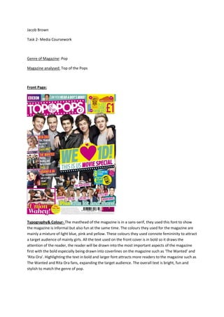
  • 1. Jacob Brown Task 2- Media Coursework Genre of Magazine: Pop Magazine analysed: Top of the Pops Front Page: Typography& Colour- The masthead of the magazine is in a sans-serif, they used this font to show the magazine is informal but also fun at the same time. The colours they used for the magazine are mainly a mixture of light blue, pink and yellow. These colours they used connote femininity to attract a target audience of mainly girls. All the text used on the front cover is in bold so it draws the attention of the reader, the reader will be drawn into the most important aspects of the magazine first with the bold especially being drawn into coverlines on the magazine such as ‘The Wanted’ and ‘Rita Ora’. Highlighting the text in bold and larger font attracts more readers to the magazine such as The Wanted and Rita Ora fans, expanding the target audience. The overall text is bright, fun and stylish to match the genre of pop.
  • 2. Imagery: The images on the front cover of the magazine are used to draw attention to the eye of the target audience. They enlarged the big pop stars to ‘sell’ the magazine more to the reader. The Editor used a large image of One Direction on the front to invite One Direction fans into buying the magazine. There are other big name stars on the magazine such as: - The Wanted Rita Ora Little Mix Rihanna Taylor Swift These celebrities are used to expand the target audience to a range of fans following fans across the pop business, from a range of age’saswell. Many of the shot types are close up images to draw attention of the audience straight away to the celebrity on show. There is one picture which is a long shot and that is of One Direction, who is the main image on the cover. The long shot image highlights the clothing of the members of One Direction who look very fashionable which also reaches out to the target audience because they look good and appealing. The celebrities on the cover all perform or promote pop music which attracts a young audience; because of this the images on the cover are conventional for the genre of pop. Layout: The magazine uses the route of the eye to encourage and attract the reader to buy the magazine. They firstly use the route of the eye to highlight the masthead of the magazine to make the reader aware of magazines name and initial content. It then progresses though to the cover artist, One Direction, to attract the audience to purchase the magazine. Finally, it promotes through smaller items displayed on the cover to increase the range of audience, due to there being a number of globally famed artist on thecover. The layout of the cover is very cluttered and disorganised to attract a younger audience because it’s eccentric, fun and energetic which appeals to the younger audience. This makes it conventional to its genre as pop is also fun and energetic. The principle of
  • 3. three is also used to highlight the number and range of items in the magazine, in the centre third is the cover artist which is used to attract the reader because the route of the eye means the reader’s eye goes straight through the centre of the page. The left third promotes three coverlines which is conventional as the reader always needs to be drawn into the magazine from first glance and this occurs in the third left following the route of the eye. Language/Mode of address:The mode of address used on the cover is very informal and this appeals to the younger audience as the magazine use words and phase such as ‘Wahey’ and Blipp It’. The magazine connects with its target audience by using language that they can relate to. The language is also exciting, young, fresh and ‘in your face’. This is conventional because it’s what the audience wants to see and it also follows the genre of magazine, as pop is exciting, young, fresh and ‘in your face’. They also use many coverlines scattered across the page with exciting language such as ‘guess who’, ‘cute’ and ‘blimey’. All three of these stand out and shout to the target audience as it allows the teenagers to connect with the magazine because it relates to their language. The magazine is also very relaxed about its message to its readers because they know a teenager’s free time will be spent relaxing reading the magazine. So they want to the audience to feel relaxed when reading the magazine. The mode of address is a key convention for this magazine because it will have a massive influence on the target audience and this will be key to make sure the target audience is interested in the magazine. Contents:
  • 4. Typography & Colour: The fonts on the contents are all sans-serif; this shows the reader the magazine is funky and energetic. It is also relaxing and easy to read so it meets the targets audiences’ ability level. The contents page and the front cover both bring across the feeling of fun and enjoyment, reflecting the genre of the magazine. The font is bright, bold and exciting to grab the attention of the target audience and encourages them to buy the magazine. They have also numbered images so it’s quick and easy to reach the targets audiences needs and also it makes it stylish. Images are also used because there is not enough space to write everything what’s in the magazine, so they use images to still promote what else is in the magazine in a new energetic way. The font they use for the headline represents a young girl’s handwriting, this connotes youth and it reminds them that the magazine is a good way to relax. The colours used in the contents page are mainly white, pink and yellow. These colours follow the overall colour scheme of the magazine and this is conventional in attracting the target audience. The three colours could be associated with girls and femininity. They use the pink to attract the reader at first glance and they use it as page numbers to draw attention to the important information. They would use white because it’s simple but elegant and it helps the two other colours stand out more. The yellow is used to highlight the key important areas to draw the audience’s attention to. Imagery:The images used on the contents are used to draw attention to the reader and promote the magazine and also other products on sale. They place an image of the front cover of the magazine on the top left of the contents page to promote the product and keep the reader ‘hooked’. The route of the eye means the reader’s first glance at the page will be at this front cover on the contents page. The reader also can match up what interested them on the front cover to where it would be situated in the magazine, e.g. - if they were interested in Little Mix they can see it’s situated on page 24. They place a large image of Louis Tomlinson at the bottom right hand side of the contents so the last piece of information the reader will see is the image of him because of the route of the eye. This image will stick in the memory of the reader so they can remember to read the article about him. He also is a big pop star so he is enlarged to promote the product, draw attention to the reader and also keep to the conventional theme. They also place many smaller images of beauty products which are able to be won in their competition or brought from business partners. These images keep the reader drawn in and also it encourages the reader to enter the competition or purchase the items. Using beauty products helps to relate to the target audience as these are items which interest them and they find it relaxing and fun. This is conventional because it keeps to the overall theme of the magazine.
  • 5. Layout:The layout of the contents is both cluttered but organised at the same time. They have crammed a lot of information on one page and with the various image and number sizes the contents looks overcrowded. They have also placed the information in the magazine into sections so the audience can find what they want quickly and easily.However, this mixed layout could appeal to the target audience as it is stylish but elegant and young people can relate to this. The content page also uses the route of the eye to draw attention to the reader and make sure they still motivated and interested to read the magazine. It firstly starts with an image of the front cover of the magazine in the top left. This is there to remind the reader why they possibly brought the magazine. It then starts to highlight the relevant information in the magazine and where to find it, so the reader can easily see where they need to find the relevant information they brought the magazine for. It finally ends with showing a picture of Louis Tomlinson, a big name pop star who readers are automatically drawn to. Language/Mode of Address: The language used is informal, this is used to relate with the target audience, as they want quick, easy information rather than big chunks of text. They have changed the word ‘love’ into a love heart itself to relate to the target audience again, as the heart is fun and exciting rather than all bland and plain. This addresses the younger audience as its arty and eye catching. This is conventional because it attracts the audience and also keeps within the genre of the magazine. The contents is also very relaxing for the reader to understand, it’s easy, simple but fun and exciting at the same time. This is just what the target audience would want from the page. The mode of address for the contents is conventional because it’s key to keeping the reader fixed and it does that well while keeping to its genre
  • 6. Double Page Spread: Typography & Colour:The font they used is sans-serif and it’s bold, they don’t use much text in the double page spread because he reader would be attracted to the magazine due to the vast images of the group, One Direction. The fonts also make the reader feel excited about reading the magazine, it also is fun and energetic, and this is conventional because it matches the front cover and contents which reflects the genre of the magazine. The purpose of the whole of the typography is to attract the target audience into buying the product. They use pink and white a lot throughout the magazine and also on this double page spread; this again is feminine so the target audience automatically relates to the article. They use this colour green to show ambition and his ambition is conventional because the group, One Direction, themselves are ambitious in their career. The colour yellow is used a little bit on the magazine, highlighting the App they are promoting so the audience automatically relates the colour to the App. Imagery:The magazine uses many images across the double page spread to draw the attention of the target audience to the article as the audience would be attracted to the vast range of pictures on the page. The double page spread uses route of the eye, and they use a big image of 3 members of the group in the bottom left of the corner to keep the reader attracted. They also use 4 close up shots of the group to keep the reader drawn on the magazine. There are a variety of images of other magazines highlighting One Direction; this is done to promote the magazine itself and also the group. The magazine shows many different long, mid and close up shots of the group so the reader can see the group as a whole and individually close up. This is done so the target audience, One Direction fans and teenage girls, are fully attracted and drawn into the magazine. Layout:
  • 7. The magazine uses route of the eye to attract readers to the article about One Direction. They firstly highlight what the article is about by using a headline and a standfirst; his is where the audience’s eye is first drawn to. Then the audience’s eye makes its way right across the page to a series of images of previous magazines with One Direction on it. Then they have placed a big image of One Direction in the bottom left of the page, this is where the audiences eye goes next and this is key to keep the audience drawn. Finally they carefully place 4 individual pictures of the members across the bottom of the page, so the reader will individual look at one after the other. Again the layout of the double page spread is structured but cluttered at the same time, they have selected specific areas to place images and text in, however, the overall presentation of the page is overcrowded. This is conventional because it matches and follows the style of the magazine and it keeps to the overall house style. This layout also attracts the reader to the article as it’s relates to the target audience and this will allow the magazine to sell. Language & Mode of Address:The language and mode of address are both informal on this page and this is relevant in attracting the target audience. The magazine uses a phrases such as ‘1D’ and ‘Blipp It’ these are phrases the magazines target audience could relate to and this would encourage them to buy the magazine. Also the double page spread reflects emotions such as fun, energetic but relaxing at the same time. This is conventional as the magazine as a whole also reflects these emotions towards the reader. The target audience also don’t want big chunks of text to read so the magazine uses more images than text so it’s quick and easy for the target audience to read. This is also a good way of attracting and drawing the reader to the page because you are giving them what they want and relate to. The page as a whole is conventional because it follows the house style of the magazine and keeps the reader fixed to the magazine. These are key to the magazine staying to the genre of the music and also making sure the target audience is happy.