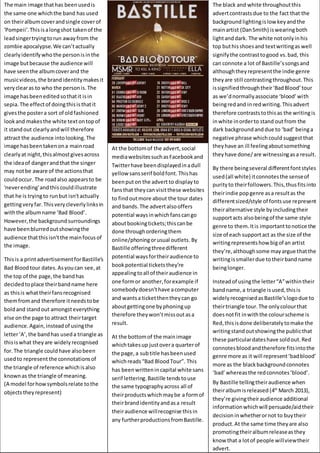
1. The black and white throughoutthis
advertcontrastsdue to the fact that the
background lightingislowkeyandthe
mainartist (DanSmith) iswearingboth
lightanddark. The white notonlyinhis
top buthisshoesand textwritingas well
signifythe contrasttogood vs.bad, this
can connote a lot of Bastille’ssongsand
althoughtheyrepresentthe indie genre
theyare still contrastingthroughout.This
issignifiedthroughtheir‘BadBlood’tour
as we’dnormallyassociate ‘blood’with
beingredand inredwriting.Thisadvert
therefore contraststothisas the writingis
inwhite inorderto stand outfrom the
dark backgroundand due to ‘bad’ beinga
negative phrase whichcould suggestthat
theyhave an ill feelingaboutsomething
theyhave done/are witnessingasa result.
By there beingseveral differentfontstyles
used(all white) itconnotesthe senseof
purityto theirfollowers.This,thusfitsinto
theirindie popgenre asa resultas the
differentsized/style of fontsuse represent
theiralternative style byincludingtheir
supportacts alsobeingof the same style
genre to them.Itis importanttonotice the
size of each supportact as the size of the
writingrepresentshow bigof an artist
they’re,althoughsome mayargue thatthe
writingissmallerdue totheirbandname
beinglonger.
Insteadof usingthe letter“A”withintheir
bandname,a triangle isused,thisis
widelyrecognisedasBastille’slogodue to
theirtriangle tour.The onlycolourthat
doesnotfit inwiththe colourscheme is
Red,thisisdone deliberatelytomake the
writingstandoutshowingthe publicthat
these particulardateshave soldout.Red
connotesbloodandtherefore fitsintothe
genre more as it will represent‘badblood’
more as the blackbackgroundconnotes
‘bad’whereasthe redconnotes‘blood’.
By Bastille tellingtheiraudience when
theiralbumisreleased (4th
March 2013),
they’re givingtheiraudience additional
informationwhichwill persuade/aidtheir
decisioninwhetherornot to buytheir
product.At the same time theyare also
promotingtheiralbumreleaseasthey
know that a lotof people willviewtheir
advert.
The main image thathas beenusedis
the same one whichthe band has used
on theiralbumcoverandsingle coverof
'Pompeii'.Thisisalongshot takenof the
leadsingertryingtorun awayfrom the
zombie apocalypse.We can’tactually
clearlyidentifywho the personisinthe
image butbecause the audience will
have seenthe albumcoverand the
musicvideos,the brandidentitymakesit
veryclearas to who the personis.The
image hasbeeneditedsothatit isin
sepia.The effectof doingthisisthatit
givesthe postera sort of oldfashioned
lookand makesthe white textontopof
it standout clearlyandwill therefore
attract the audience intolooking.The
image hasbeentakenona mainroad
clearlyat night,thisalmostgivesacross
the ideaof dangerandthat the singer
may notbe aware of the actionsthat
couldoccur. The roadalso appearsto be
'neverending'andthiscouldillustrate
that he is tryingto runbut isn'tactually
gettingveryfar.Thisverycleverlylinksin
withthe albumname ‘Bad Blood’.
However,the backgroundsurroundings
have beenblurredoutshowingthe
audience thatthisisn'tthe mainfocusof
the image.
Thisis a printadvertisementforBastille's
Bad Bloodtour dates.Asyoucan see,at
the top of the page,the bandhas
decidedtoplace theirbandname here
as thisis whattheirfansrecognised
themfromand therefore itneedstobe
boldand standout amongsteverything
else onthe page to attract theirtarget
audience.Again,insteadof usingthe
letter‘A’,the bandhas useda triangle as
thisiswhat theyare widelyrecognised
for.The triangle couldhave alsobeen
usedto represent the connotationsof
the triangle of reference whichisalso
knownas the triangle of meaning.
(A model forhowsymbolsrelate tothe
objectstheyrepresent)
At the bottomof the advert,social
mediawebsitessuchasFacebookand
Twitterhave beendisplayedinadull
yellowsansserif boldfont. Thishas
beenputon the advert to displayto
fansthat theycan visitthese websites
to findoutmore about the tour dates
and bands.The advertalsooffers
potential waysinwhichfanscango
aboutbookingtickets;thiscanbe
done throughorderingthem
online/phoningorusual outlets.By
Bastille offeringthreedifferent
potential waysfortheiraudience to
bookpotential ticketsthey’re
appealingtoall of theiraudience in
one formor another,forexample if
somebodydoesn’thave acomputer
and wantsa ticketthentheycan go
aboutgettingone byphoningup
therefore theywon’tmissoutasa
result.
At the bottomof the mainimage
whichtakesup justovera quarterof
the page,a subtitle hasbeenused
whichreads“Bad BloodTour”. This
has beenwrittenincapital white sans
serif lettering.Bastille tends touse
the same typographyacross all of
theirproductswhichmaybe a formof
theirbrandidentityandasa result
theiraudience willrecognise thisin
any furtherproductionsfromBastille.