1. General Conventions
● The image fills the frame, to create interest for the audience.
●
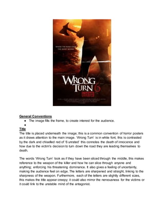
Title
The title is placed underneath the image; this is a common convention of horror posters
as it draws attention to the main image. ‘Wrong Turn’ is in white font, this is contrasted
by the dark and chiselled red of ‘6 unrated’ this connotes the death of innocence and
how due to the victim's decision to turn down the road they are leading themselves to
death.
The words ‘Wrong Turn’ look as if they have been sliced through the middle, this makes
reference to the weapon of the killer and how he can slice through anyone and
anything; enforcing his threatening dominance. It also gives a feeling of uncertainty,
making the audience feel on edge. The letters are sharpened and straight, linking to the
sharpness of the weapon. Furthermore, each of the letters are slightly different sizes,
this makes the title appear creepy; it could also mirror the nervousness for the victims or
it could link to the unstable mind of the antagonist.
2. The red part of the title is chipped, with a rusty effect this symbolises the evil behind the
blood shed. The number 6 is also associated with the devil and again links to the idea of
evil and brutal hell on earth.
Tagline
‘Where the road ends the hunt begins’ this emphasises the conventional cat and mouse
chase portrayed in slashers. The word ‘hunt’ makes the characters sound like
vulnerable animals, highlighting the thin line between life and death. It also sounds
brutal and vicious, highlighting the power the antagonist has over its
victims.Furthermore, the idea of the road ending could symbolise the end of their lives
and also the idea of the characters being taken away from any source of help,
reinforcing the feeling of fear and isolation. The contrast of ‘end’ and ‘begin’ could mirror
the twisted mind set of the antagonist and how he can begin his brutality once the
victims wonder into his trap.
The fact the tagline sits in front of a tree could highlight how the setting is where the
hunt begins. Again, reinforcing the idea of isolation and how the surrounding trees will
swallow up the victims just as the antagonist will. It also shows how, no matter how loud
the characters scream, no one will be able to hear them. The font is white, highlighting
the vulnerability of the victims, the contrast to the red font shows the amount of blood
shed and the evil which will overcome the characters.
Image; Costume
From the costume in the poster we can assume the antagonist is a male; a convention
of slasher horrors. His costume is dark and baggy, the dark costume allows him to
blend into the night, making it harder for him to be seen by the other victims. It could
also mirror his dark soul and twisted mind.
Lighting;
The back lighting creates a silhouette on the antagonist, this allows us to see his
muscular physique and outlines his dominance. The black silhouette highlights the
darkness of the slasher and the evil which lies in the forest. As the lighting comes from
a sunset, it highlights how as the day falls, the antagonist comes out to kill. It also
makes the frame have an orange tint, this reminds the audience of fire, commonly
associated with the devil and death, the beam of the sunset almost leads into the forest,
highlighting how many will fall victim to the forest and follow the evil.
Image: Weapon
The weapon used in Wrong Turn is an axe. However, this axe is larger than an ordinary
axe; it is pointed at both sides, this adds to the excitement for the audience and
increases the threatening look to both the weapon and to the antagonist as he is able to
3. use such a powerful weapon. It almost looks as if he has carved it like that on purpose,
adding to his twisted mind and love for brutality. The back lighting from the sun also
highlights the sharpness of the blade, making it appear sharper and attention grabbing.
Image: Setting
The road appears isolated and empty as the antagonist holds his dominance in the
centre. This could symbolise how whoever journeys through the road will not be able to
escape or turn around. The forest appears eerie and hidden, highlighting how no one
knows what lies beneath the trees. The tree appears large and threatening, symbolising
how even the nature here is evil and powerful, the forest is so large it swallows up the
screams of the victims. The isolation also adds feat to the audience as it highlights how
no one will make it out of the setting alive.
Institutional Info
Conventionally it appears central at the bottom. The last place the audiences eyes will be led to,
highlighting its lack of importance.