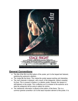
Separation of Lanthanides/ Lanthanides and Actinides
Poster Analysis 2
1. General Conventions
● The title of the film is at the bottom of the poster, yet it is the largest text featured,
grabbing the audience's attention.
● The image fills the frame. This makes the poster appear exciting and interesting
● The main character is featured, with a touch of the antagonist; without revealing
his face. This is unusual to feature in a slasher poster, however the weapon is
still featured on the poster. This is effective as it is a teaser to the audience as to
what the antagonist will be using to attack his victims.
● The institutional information is placed at the bottom of the frame. This is a
common general convention as it is the least important element of the poster. It is
2. also a large piece of text, therefore it would make the poster appear more
visually appealing to an audience as they would be more attracted by the image.
Title
The title is placed underneath the image. This is so the audiences eyes are drawn to the
image first and to highlight the symbiosis to the film's narrative and the setting of the
image to its title. The title ‘Stage Fright’ makes a link to the genre of horror and is a play
on words to the idea of being nervous on stage. However, the cause of the fright in this
horror is the antagonist killing his victims in the spotlight. This is effective as it stands
out from the typical slasher narrative and is something the crazed slasher fans have not
seen before.
The colour red triggers connotations of blood and gore. It is common for the title to be
highlighted in red as it connotates danger and death, perfect for a slasher horror. It also
makes the title stand out, allowing the audience to understand there is a new upcoming
slasher film, creating anticipation and excitement.
The font is slender and thin, this could mirror the blade of the knife and the sharp and
quick attacks the antagonist has on his victims as he slices through their flesh. This is
just as effective as a bold text on a poster, as it creates a sinister feel, showing how the
title does not need to be big and bold and the antagonist in this film will be cunning and
quick.
Tagline
The tagline also links to the narrative and the title; ‘Sing your heart out’. This links to the
theatre and performance element to the slasher. It also foreshadows danger to those
who enter the stage, as whoever sings/performs on stage will have their heart physically
torn out. This creates a brutal and gory feel to the slasher as it is such an abrupt and
violent tagline, making it sound like an exciting and adrenaline filled slasher.
The fact is is placed just above the weapon again makes reference to what the
antagonist will be using to create such brutality and reminds the audience that the
tagline has a more sinister feeling behind it. Furthermore, the word heart is indented in
the sentence compared to the other letters; making it stand out, this again reminds the
audience of the blood and gore which will be shed throughout the film, reminding us of
the essential organs he will be ripping out of the victims. It could also symbolise how the
antagonist hasn’t got a heart, allowing him to perform such savage assaults.
The direct address used in the tagline makes it personal to the audience and also the
characters as it makes it sound like an order towards those who enter the stage, almost
3. like a threat from the antagonist; if he is not impressed with the characters performance,
their ‘heart’ is physically on the line. This is further emphasised by the exclamation
mark, making it sound fearful, threatening and demanding.
Finally, the colour white makes the tagline stand out compared to the other dark colours
surrounding it. It could also symbolise the innocence of the victims which will be killed in
the slasher and makes the blood shed seem more dark and brutal, contrasting with the
colour white.
Image; Costume
We are unable to see a lot of costume in this poster, which is unusual compared to
other slasher posters. However, just by seeing a black leather glove we can trigger fear
towards the antagonist. The colour black triggers connotations of death, darkness and
fear. Leather gloves are also usually associated with the cover up of a murder, so the
police will not be able to trace the fingerprints of the murderer. This again links back to
the idea of stripping away the human features of the killer, creating the idea of a
monster. Furthermore, we can also guess the antagonist will be male from just looking
at the leather glove as the glove is large, making the hand appear threatening and
powerful. Finally, the costume of the antagonist is all black; a common convention for a
slasher killer. This makes the antagonist appear mysterious and dark. Although we do
not see a lot of costume it is still exciting for the audience as it creates anticipation as to
who the killer is and what they look like.
Image: Weapon
The weapon is a classic knife in this horror film. It is large, and sharpened to perfection;
making it appear sinister and scary. The blade is thin, making it easy for the killer to
slice quickly and sharply. It has a black grip at the top of the knife, so that the killer has
full control with the weapon, making it easy for him to pounce and kill. The colour black
contrasts to the crisp and glistening silver, highlighting the evil of the killer and how he is
passionate about his killings.Furthermore, the reflection of the knife creates a flash
along the top of the blade. This emphasises the sharpness of the weapon and creates a
sinister effect. The cleanness of the knife is also shown through the reflection of the
audience, by showing the audience reflected on the knife could suggest the killings will
happen backstage.
Image: Setting
4. The poster is set on a stage. This creates a symbiosis between the films narrative and
to indicate to the audience a new kind of horror unlike any other slasher. The red
curtains make reference to the idea of a show, not only the show being rehearsed
throughout the film but the show for the antagonist and how he will be putting on his
own kind of mind twisted show. The colour red also reminds us of blood and gore which
will be shed on stage and the danger for the characters who enter the stage. The setting
is dark and gloomy, creating a sense of foreboding.
The image also has a cartoon esque feel to it. This again refers back to the idea of the
killings being like a show, all for a bit of fun. It also makes the slasher appear more
sinister as we associate cartoons with younger children: this could further tie into the
idea that the main protagonist featured is weak and naive, a common convention used
for females in slashers.
Creating a symbiosis:
A theatrical themed borderis used to surround the title and institutional
information. This is effective as it adds extra detail to the poster, making it
stand out and appear original. It furthermore, ties in with the narrative of the
film, linking it to the horror behind the theatrical show.
Institutional Info
This is placed in its conventional position, at the bottom of the frame. This is because it
is the least important element of the poster, it is also a large piece of text therefore, it
would make sense to put it out of sight for the audience so that the image mainly
dominates the frame.
Overall, this slasher poster is effective as it stands out compared to other typical slasher
posters such as Friday The 13th and Halloween. It shows how slasher posters can
appear detailed and break the usual narrative conventions which are shown through
typical posters.