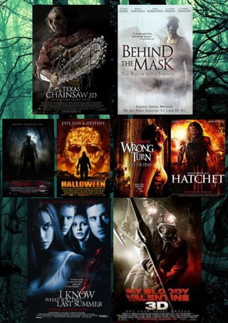
The eight posters have been designed to successfully promote films within the 
slasher sub genre. Through carrying out an investigation of them and by comparing 
them to each other, it is possible to identify shared features within them and to 
establish repeated patterns. 
All eight posters feature typical film poster conventions. We expected general 
conventions in all, such as a title, always the largest and most significant text in the 
frame, an image that dominates the frame and that signals something important 
about the films narrative, a slogan to anchor the image and, as expected of a horror 
film poster, horrific imagery. 
In addition to this, we see other repeated patterns. Interestingly enough, almost all of 
the posters feature the villain, which is either portrayed to be somebody that is a 
lunatic or that has suffered from a traumatising life changing experience that has 
made that person want, crave and chase revenge. Each villain that is shown to the 
public in these posters has a mask on. This is a convention is used to bring 
suspense to the audience as they, like the protagonist, would like to know the 
identity of the killer. 
The main colours used on the Hatchet and Halloween film posters differ from the 
others, as the popular combination of red, white and black are replaced with shades 
of red, orange and black. These colours have been used as connotations of the 
annual Halloween event itself, as well as the burning inferno that we associate hell 
with. The red is signifying the blood that will be heavily pictured in both films and the 
black signifies the darkness of the main characters soul as he (Michael Myers and 
Victor Crowley) nonchalantly hunt down and kills his victims. Horror genre 
conventions that are shown in this poster are the visual dark colours of black and red 
which link to evil and blood and danger. In “My Bloody Valentine” the setting is a 
slightly eerie one, 3 men who are believed to be the villains in this movie due to their 
mysterious costumes and sharp weapons, are all passing through a tunnel. This may 
show the audience or give away to the audience that this film is set below ground. 
The dark may suggest the dark evil lurking in the sewers as well as the public’s 
awareness of the happenings going on down there too; as they do not know of 
what’s taking place. It is also a very unconventional location as many horrors do not 
take place underground. The darkness is a typical convention of the horror film genre 
as it relates to the childhood fear that people have of the dark. Texas Chainsaw 
Massacre, I know What You Did Last Summer and Friday The 13th also share this 
convention. The gas masks also help to create an eerie feel as they conceal the 
three men’s faces, perhaps suggesting that they are not people with consciences 
and as such are capable of committing brutal and horrific acts, suggesting that this 
film is a slasher movie. Also the three colour combination of red, white and red 
appear on the poster, similar to posters like ‘Friday the 13th’ and ‘I Know What You 
Did Last Summer. The fact that the audience are oblivious to whom the killer may be 
is actually pretty common in slasher movies. As we can see in these six posters, 
each killers identity is pretty hidden either via mask or by them being “soldiers of the
night” and don’t make their moves until darkness falls. The mask and costume that 
the main characters are seen to be wearing is also a typical genre convention as the 
antagonist would usually hide their identity throughout the film whereas i n “Friday the 
13th” the use of the lighting conforms to creating a juxtaposed feeling of tension, 
suspense and fear for the audience’s poster. This use of low key lighting 
foreshadows that the appearance of an evil, darkness and a villain will be portrayed. 
This conveys a sense of fear, dread and anxiety for the audience. The background of 
the poster denotes a stereotypical codes and conventions that are associated with 
the film. For example, the indication of a forest woods and low key lighting signifies 
that the setting of the film is in an isolated location. This establishes that audiences 
convey a sense of fear, dread and anxiety creating an enigma of audiences 
questioning ‘what are in those woods?’ Just like ‘My Bloody Valentine’, the text for 
Friday the 13th is written in red, this establishes that red connotes to danger, warning 
and death whereas the title “Halloween” shouts to the audience that the film is going 
to be about something horrific, hence the name Halloween. The red, white and black 
foreshadow that blood, gore and violence will happen throughout the film. The title of 
the film creates an enigma questioning audiences to think what is going to happen 
on Friday the 13th. This therefore leads audiences wanting to watch the film and find 
out what exactly happens. Whereas on the “I Know What You Did Last Summer” 
poster the title of the film ‘I Know’ is larger than other words and it connotes that it 
something not to be known by others, something bad they’ve done last summer. The 
text and colours connote stereotypical codes and conventions of iconography that 
are associated with the film. For example the colours such as red, black and grey 
signifies a visual picture of horror, darkness and terror. This establishes that the film 
has various use of binary opposition for instance, dark vs. light and good vs. evil. 
This is linked to Levi-Strauss’ binary opposition theory. The position of the villain in 
the middle of this poster his body language and position signifies that he is a strong 
and vicious. This connotes that the film is challenging the stereotypes of a slasher 
horror because a villain is portrayed as a strong and intimidating. This heightens the 
sensation of fear, dread and anxiety for audiences. 
The use of a weapon that the Jason is holding in “Friday the 13th” is a machete; this 
demonstrates that this film is associated with blood, gore, violence and terror. This 
also foreshadows that the film will involve a heavy amount of gore, blood and not for 
the feint hearted murders. This therefore conforms to the challenges of horror film 
conventions because weapons are phallic symbol which cause harm and damage to 
victims which are stereotypical conventions portrayed in sub-genre ‘slasher’. One 
main symbol in Halloween film poster is the mask the man is holding in his left hand 
and the kitchen knife that the man is holding in his right hand, this is significant as it 
is the main weapons he uses to kill, his victims, whilst the main symbol in Hatchet 
would be the Hatchet in his left hand; the importance of the mask is that it is used 
throughout the whole film as we are shown both killers wear it in the trailer.
Attention is gained by the collection of pictures that build the face of Michael Myers; 
it builds interest as the pictures are scenes from throughout the film itself. The main 
figures/objects in the background of the poster are a collection of screen grabs from 
throughout the film and made into the face of the famous “Michael Myers”. The 
house on the bottom right is another main figure/object in the background of the 
poster which is actually the house that he grew up in and returns to in the end of the 
film. The red glow on the wall in the “My Bloody Valentine” poster may be there to 
suggest that the people in the film will die violent deaths. The red in the title has 
connotations of blood and is a generic convention of the horror genre. The pick axe 
that the man at the front is holding takes centre stage, cutting through the title of the 
film, which is probably there to illustrate that the film is in 3D. 
The movie posters to “I Know What You Did Last Summer” and “Wrong Turn” differ 
from the others. Unlike the others these two posters the protagonist or perhaps the 
final girl takes up more space on the poster than anything else. In the “I Know What 
You Did Last Summer” poster, all 4 main characters of the film are in the poster, as 
well as the killer which is different to Hatchet and the rest that only show the killer. 
This may show the audience that these characters are more iconic than the killer and 
that at the end of the film, the final girl may prevail over her villain. The mise-en-scene 
for the “Wrong Turn” poster presents an image of a female, believed to be the 
main character or final girl, hiding behind a large poplar tree; gasping for air after 
running away from her killer.

Poster overview

  • 2.
    The eight postershave been designed to successfully promote films within the slasher sub genre. Through carrying out an investigation of them and by comparing them to each other, it is possible to identify shared features within them and to establish repeated patterns. All eight posters feature typical film poster conventions. We expected general conventions in all, such as a title, always the largest and most significant text in the frame, an image that dominates the frame and that signals something important about the films narrative, a slogan to anchor the image and, as expected of a horror film poster, horrific imagery. In addition to this, we see other repeated patterns. Interestingly enough, almost all of the posters feature the villain, which is either portrayed to be somebody that is a lunatic or that has suffered from a traumatising life changing experience that has made that person want, crave and chase revenge. Each villain that is shown to the public in these posters has a mask on. This is a convention is used to bring suspense to the audience as they, like the protagonist, would like to know the identity of the killer. The main colours used on the Hatchet and Halloween film posters differ from the others, as the popular combination of red, white and black are replaced with shades of red, orange and black. These colours have been used as connotations of the annual Halloween event itself, as well as the burning inferno that we associate hell with. The red is signifying the blood that will be heavily pictured in both films and the black signifies the darkness of the main characters soul as he (Michael Myers and Victor Crowley) nonchalantly hunt down and kills his victims. Horror genre conventions that are shown in this poster are the visual dark colours of black and red which link to evil and blood and danger. In “My Bloody Valentine” the setting is a slightly eerie one, 3 men who are believed to be the villains in this movie due to their mysterious costumes and sharp weapons, are all passing through a tunnel. This may show the audience or give away to the audience that this film is set below ground. The dark may suggest the dark evil lurking in the sewers as well as the public’s awareness of the happenings going on down there too; as they do not know of what’s taking place. It is also a very unconventional location as many horrors do not take place underground. The darkness is a typical convention of the horror film genre as it relates to the childhood fear that people have of the dark. Texas Chainsaw Massacre, I know What You Did Last Summer and Friday The 13th also share this convention. The gas masks also help to create an eerie feel as they conceal the three men’s faces, perhaps suggesting that they are not people with consciences and as such are capable of committing brutal and horrific acts, suggesting that this film is a slasher movie. Also the three colour combination of red, white and red appear on the poster, similar to posters like ‘Friday the 13th’ and ‘I Know What You Did Last Summer. The fact that the audience are oblivious to whom the killer may be is actually pretty common in slasher movies. As we can see in these six posters, each killers identity is pretty hidden either via mask or by them being “soldiers of the
  • 3.
    night” and don’tmake their moves until darkness falls. The mask and costume that the main characters are seen to be wearing is also a typical genre convention as the antagonist would usually hide their identity throughout the film whereas i n “Friday the 13th” the use of the lighting conforms to creating a juxtaposed feeling of tension, suspense and fear for the audience’s poster. This use of low key lighting foreshadows that the appearance of an evil, darkness and a villain will be portrayed. This conveys a sense of fear, dread and anxiety for the audience. The background of the poster denotes a stereotypical codes and conventions that are associated with the film. For example, the indication of a forest woods and low key lighting signifies that the setting of the film is in an isolated location. This establishes that audiences convey a sense of fear, dread and anxiety creating an enigma of audiences questioning ‘what are in those woods?’ Just like ‘My Bloody Valentine’, the text for Friday the 13th is written in red, this establishes that red connotes to danger, warning and death whereas the title “Halloween” shouts to the audience that the film is going to be about something horrific, hence the name Halloween. The red, white and black foreshadow that blood, gore and violence will happen throughout the film. The title of the film creates an enigma questioning audiences to think what is going to happen on Friday the 13th. This therefore leads audiences wanting to watch the film and find out what exactly happens. Whereas on the “I Know What You Did Last Summer” poster the title of the film ‘I Know’ is larger than other words and it connotes that it something not to be known by others, something bad they’ve done last summer. The text and colours connote stereotypical codes and conventions of iconography that are associated with the film. For example the colours such as red, black and grey signifies a visual picture of horror, darkness and terror. This establishes that the film has various use of binary opposition for instance, dark vs. light and good vs. evil. This is linked to Levi-Strauss’ binary opposition theory. The position of the villain in the middle of this poster his body language and position signifies that he is a strong and vicious. This connotes that the film is challenging the stereotypes of a slasher horror because a villain is portrayed as a strong and intimidating. This heightens the sensation of fear, dread and anxiety for audiences. The use of a weapon that the Jason is holding in “Friday the 13th” is a machete; this demonstrates that this film is associated with blood, gore, violence and terror. This also foreshadows that the film will involve a heavy amount of gore, blood and not for the feint hearted murders. This therefore conforms to the challenges of horror film conventions because weapons are phallic symbol which cause harm and damage to victims which are stereotypical conventions portrayed in sub-genre ‘slasher’. One main symbol in Halloween film poster is the mask the man is holding in his left hand and the kitchen knife that the man is holding in his right hand, this is significant as it is the main weapons he uses to kill, his victims, whilst the main symbol in Hatchet would be the Hatchet in his left hand; the importance of the mask is that it is used throughout the whole film as we are shown both killers wear it in the trailer.
  • 4.
    Attention is gainedby the collection of pictures that build the face of Michael Myers; it builds interest as the pictures are scenes from throughout the film itself. The main figures/objects in the background of the poster are a collection of screen grabs from throughout the film and made into the face of the famous “Michael Myers”. The house on the bottom right is another main figure/object in the background of the poster which is actually the house that he grew up in and returns to in the end of the film. The red glow on the wall in the “My Bloody Valentine” poster may be there to suggest that the people in the film will die violent deaths. The red in the title has connotations of blood and is a generic convention of the horror genre. The pick axe that the man at the front is holding takes centre stage, cutting through the title of the film, which is probably there to illustrate that the film is in 3D. The movie posters to “I Know What You Did Last Summer” and “Wrong Turn” differ from the others. Unlike the others these two posters the protagonist or perhaps the final girl takes up more space on the poster than anything else. In the “I Know What You Did Last Summer” poster, all 4 main characters of the film are in the poster, as well as the killer which is different to Hatchet and the rest that only show the killer. This may show the audience that these characters are more iconic than the killer and that at the end of the film, the final girl may prevail over her villain. The mise-en-scene for the “Wrong Turn” poster presents an image of a female, believed to be the main character or final girl, hiding behind a large poplar tree; gasping for air after running away from her killer.