
Recommended
More Related Content
What's hot
What's hot (16)
Viewers also liked
Viewers also liked (14)
Similar to We Love Pop Overview
Similar to We Love Pop Overview (20)
Recently uploaded
Recently uploaded (20)
We Love Pop Overview
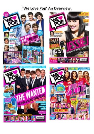
- 1. ‘We Love Pop’ An Overview.
- 2. ‘We Love Pop’ An Overview. All three of these are frontcoversof popmagazine ‘We Love Pop’.Theyall share manysimilarities and differences,these similaritiesallow asymbioticlinktobe portrayedmakingthe magazine look professionaland recognisable.Eachof the mastheadsare placedinthe top lefthandcornerin signature displayfont.Eachof the mastheadsare writteninthe exactsame colouran fontto ensure the magazinesbrandidentityisshownperfectlyandsothe readercan easily findthe magazine on the shelf,thiswill preventtheirattentionbeingswayedbyrival publications,astheireye willbe instantlydrawntothe magazine theyare loyal to . Asit iswritteninboldblackfont the masthead will catchthe reader’sattentionquicklyandtodraw themintoreadingthe magazine.Astheyare all inthe top lefthandcorner itis the firstthingthe readerseeswhentheylookat the frontcover,as the westerneye movesfromlefttoright. Each magazine’smastheadreplacesthe word‘love’witha‘ shape.All of the heartsare a bright,vibrantpinkcolouragain,makingsure the magazinesfun,bright,highenergybrandidentity isshownthroughoutas the colourpinkisgirlyand exciting. The use of aheart shape ismore visual, creative,unique andfunthana simple wordandthisservestobothattract and reflectthe target audience. Italsocreatesa familiarfeeltothe magazine aswe can recognise thisbrightpinkheart and wouldmake usthinkof pop.The readercan alsoeasilyspotthishearton a magazine shelf and straightaway understanditisa ‘We Love Pop’magazine. The mastheadsitsinside aspeechbubble ineachof the three magazines,whichagainisanother similarity,the speechbubble islookscartoon-like tocreate ayoungand funkyeffect.Itisoutlinedin black,againto make sure eachof the mastheadsstandoutand grab attentionandto highlightthat thisisthe masthead.Thisspeechbubbleisinthe same positiononeachmagazine tocreate continuitythroughout.The bottomof the speechbubblesitsnexttoanimage of one of the additional artistphotographs,tomake itlookasif that certainartist issaying‘We Love Pop’ making it more excitingforthe readerandmore personal andprovidingthe ideathatthe celebritygivesthe magazine theirapproval.Byusingaspeechbubble itisas if the magazine isspeakingouttothe
- 3. ‘We Love Pop’ An Overview. reader,like afriend.Italsomakesthe mastheadsoundasif it isbeingspokentothem.Thiswould create effectonthe readeras it givesafriendlyapproach. The speechbubble sitsontopof a rectangularblockof colour,intwo of the frontcoversthe colour isa familiarbrightpink,the same pinkwhichthe heartshape isfilledwith,againtocreate a continuous,neatandprofessional look.However,unlike twoof the frontcovers,one of themsitson a blue background.Yet,thisisbecause the same colourblue isfeature inotherelementsof the magazine.Forexample,the fashionsectioninthe bottomrighthandcornersitson a blockof blue colour,to ensure there are nottoo manycoloursbeingusedonthe magazine,thiswouldmake the magazine appearmessyandunprofessional.Therefore,inthe similarothertwofrontcoversthe colourpinkisusedfor boththe main sell line andadditional sell lines.Similarly,the final frontcover magazine usesthe colourpinktosurroundthe mainsell line. Anothersimilaritybetweenthe three magazinesisthe slogansused,whichsitabove andbelow the masthead.The firstsloganstates‘Gossip.Fashion.Boys.Uncensored!’byhavingthese sortsnappy wordssittingabove the masthead,itstatestothe readerwhat the magazine consistsof andby keepingitshortandsweet,itiseasyfor the targetaudience toreadquicklyandgrabs there attentionenoughtomake themwantto readmore,as too much informationonthe frontcoveris boringand time consuming.Also,the wordsusedare commontosee on a pop magazine asthisis everythingwe wouldexpecttosee inside apopmagazine.Byeachof the magazinesincludingthese wordsit wouldmake itfamiliarforthe reader,sotheyknow thatall of theirmagazinesinclude everythingtheywanttoreadaboutand alwayswill.Eachof the magazinesinclude thesewordsin the exactsame font to ensure itiseasyto readand familiartothe reader.Theyare all alsowrittenin blackto make the magazine lookprofessional andeye catching.The word‘uncensored!’iswrittenin white unlike the otherwordswritteninblack.Thismakesthe wordstandout,makingit seemmore interestingandexcitingasthe readerwouldbe excitedaboutwhyit’suncensoredandwouldfeel exitedtogetultimate gossip. The ideathatthe informationis‘uncensored’ isalsoalure,as it suggeststhatnothingwill be heldback. Also,the exclamationmarkappearsoneach cover to ensure the readerknowseachmagazine will feature outstanding,excellentgossipandtogenerate asense of anticipationandexcitement. However,the full stopsall appearindifferentcolourssuchas,white and yellow,tomake sure thatalthougheachmagazine will alwaysfeature thisamountof gossip, fashionandboys,all of the issueswillhave differentinformationanditwill alwaysbe funand interesting. Each of the magazinesinclude astrapline underneath the masthead.Itstates‘Don’tbore us.Getto the chorus’ thiscatchy sloganismemorable asitappearsoneach of the magazines,asitrhymesand it isshort andsnappy.Aseach of the magazinesincludeit,itsuggeststhatthe magazine will never be boring,itis full of excitingnewsandgossip.Also,the word‘chorusremindsusthatitisa music magazine. There issignificance inthe ideathat,ina popsong,the chorus isthe bestbit,the catchiestandgreatestbit.Thisreflectshow the magazine constantlyprovidesonlythe bestbitsof popnewsand gossip. Inthe final frontcover,The Wantedseemtocover the slogan,however,loyal membersof the audience wouldstill be able toknow whatthe slogansaysas itfeaturesonevery single issue of the magazine.Italsoremindsusof how catch andmemorable the sloganis.This wouldbe effective asitgivesthe magazine afunand friendlyfeel,asthe readerfeelsasif itknows the magazine. Unlike the firsttwofrontcovers,the final coverincludesa turquoise headline withthe text‘DAPPY VSGRANNY:WHO WILL WIN?’writteninwhite.Thiscapitalisedskyline grabsintrigueanattention, as ‘We Love Pop’doesnotalwaysinclude askyline,makingthisparticularissuestandoutfromthe rest.It still however,fitsinwiththe magazine andlooksfunandvibrantwhichisaconventionof pop
- 4. ‘We Love Pop’ An Overview. magazines.Notice thatthe artistusedisagaina pop artisttherefore Dappyfitswiththe pop magazine genre. Notonlydoesthe final frontcoverinclude askyline,it alsoincludesasmall photographinthe top leftcorner,similartothe secondfrontcoverwithJessie J. One of the imagesisof a pugdog witha fun,colourful collaronanda speechbubble comingoutof itsmouth.Similarly, the finalfrontcover includesasmall feature article photograph of SimonCowellwithasmall speechbubble comingout of itsmouth.The use of thisaddsa touchof funto the magazines.Asitiscommon for‘We Love Pop’ to include thissmall image itcreatesanticipationtowhowill be onthe nextissue.Althoughthe first frontcover doesnotinclude thisimage,itincludesapuff instead,inthe same place,toensure this funelementwill notbe missed. Puffsare usuallyincludedonmagazinesingeneral.Yet,the puffsusedinpop magazinesare usually filledwithvibrantcoloursandexciting,chattygossip. Thiswas takenfroman issue of ‘We Love Pop’magazine andas we can see the puff isa vibrantfuchsiapinkto grab the reader’sattentiontothe gossipinside. In thisexample,the magazine istalkingtothe readeras a friend,remindingus of the chatty tone a popmagazine has,therefore,the readercanfeel asif the magazine isa friendtothemas the magazine revealssecretstothem. However,itisunusual that one of the three of these magazinesdoesnotincludeapuff asthisis a conventionof popmagazines. But,the firstfrontcoverwithOne Directionfeaturestwocircular puffs,one filledwithpinkandthe otherinblue.Thisstickstothe colourscheme of thismagazine to make it appearprofessional,alsoastheyare bothcircular itmakesthe magazine appeartidyand professional.The writinginsidethe puff iswhite toensure there isacontinuouslook.The finalimage includes afunky,spikedshape asthe puff.Itisbrightyellow makingthe shape lookalmostlikeasun shape,toadd to the happy,brightbrand identity. Anothercommonfeature of these frontcoversisthe use of a fashionsection.Thisfashionsectionis commonlyusedinall popmagazines asnot onlydoesthe magazine focusonmusic,theyusually include severalpagesof clothesandfashionasthe targetaudience isforyoungfemale teens,and theywouldbe excitedbythis. Eachmagazine includesseveral itemsof clothingtograbtheir attentionandto make sure that theyknow exactlywhattype of fashionisincludedandwhatthey shouldbe wearing. Thisindicatesthe factthat popmagazinescovera range of subjectmatterthat will be of interesttothe targetaudience,notjustmusic.Thisremindsusthatthe interestsand requirementsof ayoungteenage girl are unlike those of amale fanof indie rock.She needstoknow the magazine will coverarange of herfavourite things- thiswill persuade hertobuyit.
- 5. ‘We Love Pop’ An Overview. In eachof the magazines,the mainsell likeiscentre of the frame andwouldsitinfrontof the main artistas the sell line wouldusuallybe aboutthe mainartistfeatured. Theyare all bold,capitalised and eye catchingto ensure the readerisdrawninto the main sell line.Eachof the sell linesfeatured on these particularfrontcoversare diagonal tomake it lookinteresting,funkyandfun,addingtothe excitingbrandidentityandmaking‘We Love Pop’standoutfrom normal musicmagazines.Ineach of these magazinesthe colourpinkisusedforthe sell line,oritisusedforthe sell line tositinfront of.Pinkisusedthroughouteachof the magazinesasit isa typical feminine colourandmakesthe magazine lookbright,vibrantandgirly,whichwouldbe adoredbythe targetaudience. The topicin mostof the mainsell-linesisgossipridden. In all three of these examples,we canclearlysee how the mainsell linesare full of chatand exclusiveinformationaboutcelebrities. The coloursusedin all three of these frontcoversare similar.Theyall seemtofeature onlyfouror five maincolourstouse for the textand to highlightkeyareasof the magazine.The maincolours usedare black,white,turquoise-blue,yellowandpink.These coloursrepresentthe pop genre brilliantlyastheyare funand nice to lookat, whilsttheyalsoreflectthe fun,vibrantpersonaof the target audience. Theyfill the coverswithexcitementandmake themlookintriguing,yetthe black and white keepitformal andprofessional as toomanycolourscan become messyanduntidy,taking away the professionalismof the magazine. The artists usedinall three magazinesare popartists,barringone whoisTaylor Launterhowever,it iscommon to see handsome youngmenonthe frontcoveras it isexcitingforthe feminine teen audience,astheywouldfindhimappealingtolookatand wouldthenwanttoread and buythe magazine. Theyare likelytobe fansof the ‘Twilight’franchise andwouldhave acrushon him. All of the artistsbeingpop artistswouldshowthe genre of the magazine clearlysoitis easyto grab their target audience’sattention.Asitwouldbe unusual tofeature abandsuch as ‘The Killers’onapop magazine astheywouldusuallybe featuredonarock magazine.All of the imagesfeaturedonthe magazines,the artistappearssmiley,happyandenjoyinglife.Whichaddstothe funbrand identity of the magazine.Theyall use directaddresstogive afriendlyapproachtoreaderas itmakesit more
- 6. ‘We Love Pop’ An Overview. personal,asif theirartistislookingat them, invitingthemtoreadthe magazine.Considering patternsinrelationtoothermise-en-scene elementsforexample,costume,bodylanguage,hairand make-up.Considercompositionof andtype of shottoo. The mode of addressusedthroughoutall three frontcoversisformal andchatty.Thisgivesa friendly and humorousfeel tothe magazine.Theyall use buzzwordssuchas ‘Exclusive’‘New’and‘Shock’ grabbingour attentionandmakingusexcitedbythis.Theyalsouse funandmemorable language techniquesforexample,the onamatapiaof ‘GULP!’isfunnyforthe reader.One of the magazines alsousesa PUN such as ‘DAMN GLAM STYLE’ nexttoan image on PYI,referringtohisupbeat memorable song‘gangnamstyle’.All the chattylanguage gives aninformal approachtothe magazine.Andastheyall include thistype of addresswe feel asif the magazine isafriendtothe readeras it usestermsa youngaudience wouldunderstand,ratherthanthe language beingtoo formal and difficulttounderstand.Byusingshortsnappysentencesandwords,the readercanbe drawnintoreadingthe magazine asit makesitappear funand easyto read. These are all examplesof howthe language usedinpopmagazine issimilartohow tenage girls wouldtalkto theirfriends,highlightinghow the readercanrelate tothe magazine makingitsound humorousandinteresing. Finally,the pugfeaturedinall three magazinessitsinthe same place (the bottomrightcorner),as the pug includesthe leastimportantinformationsuchasthe barcode and the price. The magazine wouldwantto presentthe price of the magazine here asthe westerneye movesfromlefttoright, therefore,the readerwouldbe able tosee all of the informationfeaturedinside the magazine before seeingthe price.Thisiseffective asthe readerwouldbe tooexcitedaboutall the gossip inside thattheywouldnothesitate tobuyit. Froman aestheticperspective,itisalsoa part f the frontcover thatis not goingtoenhance itin anyway. In conclusion,fromcarryingoutmyoverview ithasallowedme to,indepth,getawider understandingof popmagazines.Ithasshownme how theysuccessfullyaddresstheirtarget audience byusingchattyvocabularyandinformal language.How the use of colouris usedto attract itsaudience andfill themwithenthusiasmandexcitement.The use of puffsare insertedtograb attentionandgive a sneakpeaktoultimate gossipof what’sinside.Therefore,overall,‘We Love Pop’ isa brilliantpopmagazine whichincludessuccessfulfeaturesof how tocreate an attentiongrabbing, gossipfilledmagazine whichitsloyal audience see,asa friend.