SlideShare a Scribd company logo
1 of 4
These five posters have been successfully designed to promote films within the sub genre of slasher. 
Through personally examining the posters and comparing them to one another, I have successfully 
identified shared features and repeated patterns. 
Each of the five posters have a typical poster look about them with the conventions that you would 
expect to see on a film poster such as a title, this is always the largest and most significant text on 
the poster. Each has a main image that dominates the frame and signals something important and 
gives away a small part of the films narrative. The posters contain a tagline that anchors the image. 
We also see other repeated patterns. Interestingly enough, four out of the five posters contain an 
unusual character or imagery we might associate with a dangerous villain. The use of mise en scene 
has made it clear to us that these characters are the antagonist. For example, in the ‘Friday The 13Th’ 
poster, the mask that the audience expects the protagonist to wear has features of red on it 
highlighting blood, especially around the teeth; the audience are made aware that this character is 
bad. These images suggest that the slasher sub genre is focused around the antagonist and someone 
that the audience should fear. 
Weapons are often shown with in the film posters. In the ‘Texas Chainsaw Massacre’ film poster we 
see a chainsaw. In ‘A Nightmare on Elm Street’ film poster we see the antagonist holding some type 
of blade. Although the weapon is not the most obvious focal point in the image we can still see it. 
The weapon on the film poster gives the audience an idea on what the narrative will hold and this 
will help audiences work out whether will enjoy the narrative. On the poster for ‘Texas Chainsaw 
Massacre’ the weapons and the costume on the posters shows a dehumanised antagonist. On the 
poster for ‘Friday The 13TH’ we are shown a mask as the only image on the poster. This makes the 
antagonist seem unknown and creepy and shows the antagonist is yet to be revealed, unlike the 
‘Texas Chainsaw Massacre’ poster where the antagonist is the main image and it is made obvious to 
the audience who the killer is and this is not to be revealed. In the ‘Hatchet’ and ‘Wrong Turn’ film 
posters, weapons are also visible. In the ‘Hatchet’ poster, the weapon and the film title are the only 
images in the frame; this tells the audience that the film will be based around the weapon and the 
gruesome murders of the victims. The poster that stands out the most is the ‘Hallo ween’ poster. This 
is because the clenched fist holding the knife is merged in with a pumpkin to link with the films 
theme of Halloween. The pumpkin stands out in the poster because the colour is bright, and is an 
orange merged in with red that links to the idea of blood and gore. Three of the film posters are set 
against a black backdrop which makes the image powerful enough to make the audience have 
expectations that the film will be scary. The ‘Texas Chainsaw Massacre’ film poster is set in front of a 
dark foggy setting. Although you cannot see any of the background clearly, it is evident that leather 
face is outside at night time. The fog in the image gives him a terrifying effect as well as the low 
angle that the image is taken at. The ‘Wrong turn’ film poster is set in a forest. This is a conventional 
setting for a horror film and audiences will have expectations of the horror that is to come. ‘My 
bloody Valentine’ shows the antagonist in what appears to be a minors costume, so we can link this 
setting as to being underground or in a mine, this will give the audience the idea that the victims will 
be trapped for much of the film. The masks that are used in the ‘Texas Chainsaw Massacre’ and 
‘Friday the 13th’ show none of the antagonist’s face, making the audience unaware of who is 
underneath. These masks are also iconic of not only the slasher genre but also of horror in general,
the hockey mask and the leather face mask worn in the two films are two of the most famous pieces 
of costume linked to slasher. In contrast, the ‘Nightmare on Elm Street’ poster shows Freddy Kruger 
with his back to the camera, in a dark shadow, without a mask but a big hat to shield his identity. In 
the ‘My Bloody Valentine’ poster, the masks that are worn is not iconic or strikes fear, but is linked 
to an every day job where in which the wearer is used to being alone and having to work in darkness 
and silence away from the outside world. All seven posters share the same colour scheme, dark 
colours with reds to indicate fire and blood are used. This is conventional of a horror film poster and 
the majority of the films are set at night in darkness to maximise fear. All posters except ‘Halloween’ 
and ‘Hatches’ show the antagonist in some form. This is because these characters are the most 
iconic of this genre and audiences expect to see them. 
The typography in the posters are similar. ‘Halloween’, ‘Texas Chainsaw massacre’, ‘wrong turn’, and 
‘hatchet’ are all white. The white text is bold on the plain black background and stands out the 
audience. In ‘Nightmare on Elm Street’ the text has a different effect. The text is red and does not 
stand out as much as the image does. By having the text less bold makes the poster look more like a 
photograph, than a film poster, giving the audience added fear that Freddy Kruger is a real person 
and not a character in a film. The colour red reminds the audience of the iconic antagonist’s red 
jumper and the burns across his face, the colour red also reminds the audience of blood and that 
this film will be gory. 
The typography on the film posters are all similar in their effect. The colours red and white are used 
often relating to the connotations and expectations of horror such as blood and death. The white 
text looks bold on the black background and makes the text noticeable. The colour red works well to 
relate to the slasher genre and how we expect the victims to die. The typography also links to the 
narrative of all of the films giving us clues as to what will happen and what we should expect. Fore 
example, my bloody valentine is in bold and bright red drawing links between not only the gruesome 
murders of the victim but also the theme of Valentine’s Day that runs through the film. The wrong 
turn poster provides a tag line that adds effect to the film title as it suggests turning left is the wrong 
way to go. This is also enforced by the three slashes next to the title. Again linking to the idea of it 
being a slasher film. The ‘Texas Chainsaw Massacre’ text looks as though it could be in metal, 
relating the film and the use of a chainsaw. This makes the text stand out and draws a symbiosis 
between weapon and film title. In the ‘Friday the 13th’ poster, ‘Friday the’ is in the same colour as 
the mask that is shown on the poster, and the ‘13th’ is written in a dripping red colour that relates 
and reminds the audience of blood. 
Across six of the seven posters, taglines are used effectively to emphasize the narrative of the film. 
The taglines used are ‘Halloween’ and ‘Texas Chainsaw Massacre’ specifically draw focus onto the 
antagonist. “The night he came home!” suggests that this film is about a returning killer expected 
across Halloween. “Evil wears many faces” directly links to the masks worn by leather face the killer 
in the film ‘Texas Chainsaw Massacre”. The taglines used on three of the other posters use direct 
address where in which they speak directly to the audience. “You are do omed” “Welcome to your 
new nightmare” “Get your heart broken”, warn the audience that they should be scared of what will 
happen in the films. This language device is successful in building a relationship between the 
antagonist and the audience. Keeping their attention and provoking excitement.
The typography design of either ghostly white to resemble death or gory blood to remind the 
audience of the painful death are both pieces of iconography we expect to see on a horror film 
poster. All seven of the film posters are showing pieces of iconography. This comes in the form of 
colour and lighting, reflecting darkness and fear hidden identities with the use of props such at 
marks and hats and sharp utensils used as weapons to inflict maximum pain. Within the posters 
‘Texas Chainsaw Massacre’ ‘Nightmare on Elm Street’ and ‘Wrong Turn’ a low angle is used, this 
gives the effect of the antagonist being bigger and extremely powerful. The other camera angle that 
is used often is a close up used of ‘Hatchet’ ‘Friday The 13th’ and ‘Halloween’. The purpose of this 
camera angle is to show the antagonist or weapon at close range reminding the audience of what 
they should be fearful of. The ‘Nightmare On Elm Street’ film poster stands out as being different 
because we just see the silhouette of Freddy Kruger. This is done to emphasize the iconic antagonist 
and contrast with the original posters which show his burns and costume at close range. The 
audience now know his character well and it is more effective to conceal the characters identity on 
the film poster. The lighting used on the majority of the poster sis low key. As to make sure that the 
film posters are dark provoking fear in the audience, we also see spotlights being used on ‘Friday The 
13th’ ‘Hatchet’ and ‘Wrong Turn’ to emphasize the weapon or antagonist. For ‘My Bloody Valentine’ 
and ‘Nightmare on Elm Street’ a backlight is used to create a silhouette on the antagonist.

More Related Content

What's hot

Mise en-scene analysis
Mise en-scene analysisMise en-scene analysis
Mise en-scene analysisrachaeldrake_
 
Film poster analysis three
Film poster analysis threeFilm poster analysis three
Film poster analysis threerachaeldrake_
 
Film Poster Analysis - Friday the 13th
Film Poster Analysis - Friday the 13thFilm Poster Analysis - Friday the 13th
Film Poster Analysis - Friday the 13thrachaeldrake_
 
Horror research
Horror researchHorror research
Horror researchcassieli
 
20.Poster Analysis - Friday the 13th
20.Poster Analysis - Friday the 13th 20.Poster Analysis - Friday the 13th
20.Poster Analysis - Friday the 13th Bradley22
 
Film poster analysis
Film poster analysisFilm poster analysis
Film poster analysismedialuva
 
21.Poster Analysis 2
21.Poster Analysis 221.Poster Analysis 2
21.Poster Analysis 2Bradley22
 
Film trailer analysis
Film trailer analysis Film trailer analysis
Film trailer analysis rachaeldrake_
 
Film poster analysis two
Film poster analysis twoFilm poster analysis two
Film poster analysis tworachaeldrake_
 
9.Conventions of Slasher
9.Conventions of Slasher9.Conventions of Slasher
9.Conventions of SlasherBradley22
 
Evaluation question three
Evaluation question three Evaluation question three
Evaluation question three rachaeldrake_
 
20.Poster Analysis 1
20.Poster Analysis 120.Poster Analysis 1
20.Poster Analysis 1Bradley22
 

What's hot (18)

Horror sub genres
Horror sub genres Horror sub genres
Horror sub genres
 
Location analysis
Location analysisLocation analysis
Location analysis
 
Slasher conventions
Slasher conventionsSlasher conventions
Slasher conventions
 
Poster overview
Poster overviewPoster overview
Poster overview
 
Mise en-scene analysis
Mise en-scene analysisMise en-scene analysis
Mise en-scene analysis
 
Film poster analysis three
Film poster analysis threeFilm poster analysis three
Film poster analysis three
 
Film Poster Analysis - Friday the 13th
Film Poster Analysis - Friday the 13thFilm Poster Analysis - Friday the 13th
Film Poster Analysis - Friday the 13th
 
Horror research
Horror researchHorror research
Horror research
 
20.Poster Analysis - Friday the 13th
20.Poster Analysis - Friday the 13th 20.Poster Analysis - Friday the 13th
20.Poster Analysis - Friday the 13th
 
Film poster analysis
Film poster analysisFilm poster analysis
Film poster analysis
 
21.Poster Analysis 2
21.Poster Analysis 221.Poster Analysis 2
21.Poster Analysis 2
 
Trailer overview
Trailer overviewTrailer overview
Trailer overview
 
Poster overview
Poster overviewPoster overview
Poster overview
 
Film trailer analysis
Film trailer analysis Film trailer analysis
Film trailer analysis
 
Film poster analysis two
Film poster analysis twoFilm poster analysis two
Film poster analysis two
 
9.Conventions of Slasher
9.Conventions of Slasher9.Conventions of Slasher
9.Conventions of Slasher
 
Evaluation question three
Evaluation question three Evaluation question three
Evaluation question three
 
20.Poster Analysis 1
20.Poster Analysis 120.Poster Analysis 1
20.Poster Analysis 1
 

Similar to Poster annalysis

Slasher film poster overview
Slasher film poster overviewSlasher film poster overview
Slasher film poster overviewrachaeldrake_
 
Mise en-scene Analysis
Mise en-scene AnalysisMise en-scene Analysis
Mise en-scene Analysisrachaeldrake_
 
Analyse existing media texts
Analyse existing media textsAnalyse existing media texts
Analyse existing media textstonym17
 
Poster analysis friday the 13th
Poster analysis friday the 13thPoster analysis friday the 13th
Poster analysis friday the 13thShauna-Mullen
 
Horror Film Poster Analysis
Horror Film Poster AnalysisHorror Film Poster Analysis
Horror Film Poster Analysis08beguma
 
Analysis Of 3 Ancillary Products
Analysis Of 3 Ancillary ProductsAnalysis Of 3 Ancillary Products
Analysis Of 3 Ancillary Productsalltimejas
 
poster analysis texas chainsaw 3D
poster analysis texas chainsaw 3Dposter analysis texas chainsaw 3D
poster analysis texas chainsaw 3DShauna-Mullen
 
Film poster analysis
Film poster analysisFilm poster analysis
Film poster analysismaureen97
 
Poster Overview
Poster OverviewPoster Overview
Poster OverviewKalgani
 
Film Poster Analysis - Texas Chainsaw 3D
Film Poster Analysis - Texas Chainsaw 3DFilm Poster Analysis - Texas Chainsaw 3D
Film Poster Analysis - Texas Chainsaw 3Drachaeldrake_
 

Similar to Poster annalysis (20)

Poster overview
Poster overview Poster overview
Poster overview
 
Slasher film poster overview
Slasher film poster overviewSlasher film poster overview
Slasher film poster overview
 
Mise en-scene Analysis
Mise en-scene AnalysisMise en-scene Analysis
Mise en-scene Analysis
 
Analyse existing media texts
Analyse existing media textsAnalyse existing media texts
Analyse existing media texts
 
Film Poster Overview
Film Poster Overview Film Poster Overview
Film Poster Overview
 
Poster Overview
Poster OverviewPoster Overview
Poster Overview
 
Poster Overview
Poster OverviewPoster Overview
Poster Overview
 
Poster analysis 2
Poster analysis 2Poster analysis 2
Poster analysis 2
 
Poster analysis friday the 13th
Poster analysis friday the 13thPoster analysis friday the 13th
Poster analysis friday the 13th
 
Film Poster Overview
Film Poster Overview Film Poster Overview
Film Poster Overview
 
Poster Analysis 2
Poster Analysis 2Poster Analysis 2
Poster Analysis 2
 
Poster Analysis 2
Poster Analysis 2Poster Analysis 2
Poster Analysis 2
 
Horror Film Poster Analysis
Horror Film Poster AnalysisHorror Film Poster Analysis
Horror Film Poster Analysis
 
Analysis Of 3 Ancillary Products
Analysis Of 3 Ancillary ProductsAnalysis Of 3 Ancillary Products
Analysis Of 3 Ancillary Products
 
poster analysis texas chainsaw 3D
poster analysis texas chainsaw 3Dposter analysis texas chainsaw 3D
poster analysis texas chainsaw 3D
 
Analysing Horror Posters
Analysing Horror PostersAnalysing Horror Posters
Analysing Horror Posters
 
Film poster analysis
Film poster analysisFilm poster analysis
Film poster analysis
 
Poster Overview
Poster OverviewPoster Overview
Poster Overview
 
Film Poster Analysis - Texas Chainsaw 3D
Film Poster Analysis - Texas Chainsaw 3DFilm Poster Analysis - Texas Chainsaw 3D
Film Poster Analysis - Texas Chainsaw 3D
 
Horror poster research
Horror poster researchHorror poster research
Horror poster research
 

More from lolliefrier

Pitch presentation
Pitch presentationPitch presentation
Pitch presentationlolliefrier
 
Target audience profile
Target audience profileTarget audience profile
Target audience profilelolliefrier
 
Slasher research
Slasher researchSlasher research
Slasher researchlolliefrier
 
Focus group presentation
Focus group presentationFocus group presentation
Focus group presentationlolliefrier
 
Costume hair and makeup
Costume hair and makeupCostume hair and makeup
Costume hair and makeuplolliefrier
 
Focus group presentation
Focus group presentationFocus group presentation
Focus group presentationlolliefrier
 
Director case study
Director case studyDirector case study
Director case studylolliefrier
 
A Horror film questionnaire
A Horror film questionnaireA Horror film questionnaire
A Horror film questionnairelolliefrier
 
Film trailor analysis
Film trailor analysisFilm trailor analysis
Film trailor analysislolliefrier
 
Film trailer analysis
Film trailer analysisFilm trailer analysis
Film trailer analysislolliefrier
 
Introduction to artist
Introduction to artistIntroduction to artist
Introduction to artistlolliefrier
 
Contents page analysis 2
Contents page analysis 2Contents page analysis 2
Contents page analysis 2lolliefrier
 

More from lolliefrier (18)

Original breif
Original breifOriginal breif
Original breif
 
Pitch presentation
Pitch presentationPitch presentation
Pitch presentation
 
Target audience profile
Target audience profileTarget audience profile
Target audience profile
 
Slasher research
Slasher researchSlasher research
Slasher research
 
Movie ideas
Movie ideasMovie ideas
Movie ideas
 
Focus group presentation
Focus group presentationFocus group presentation
Focus group presentation
 
Call sheet
Call sheetCall sheet
Call sheet
 
Costume hair and makeup
Costume hair and makeupCostume hair and makeup
Costume hair and makeup
 
Focus group presentation
Focus group presentationFocus group presentation
Focus group presentation
 
Director case study
Director case studyDirector case study
Director case study
 
Case study
Case studyCase study
Case study
 
A Horror film questionnaire
A Horror film questionnaireA Horror film questionnaire
A Horror film questionnaire
 
Film trailor analysis
Film trailor analysisFilm trailor analysis
Film trailor analysis
 
Film trailer analysis
Film trailer analysisFilm trailer analysis
Film trailer analysis
 
Poster overview
Poster overviewPoster overview
Poster overview
 
Poster Overview
Poster OverviewPoster Overview
Poster Overview
 
Introduction to artist
Introduction to artistIntroduction to artist
Introduction to artist
 
Contents page analysis 2
Contents page analysis 2Contents page analysis 2
Contents page analysis 2
 

Poster annalysis

  • 1.
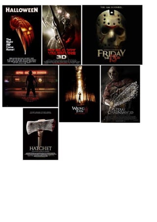
  • 2. These five posters have been successfully designed to promote films within the sub genre of slasher. Through personally examining the posters and comparing them to one another, I have successfully identified shared features and repeated patterns. Each of the five posters have a typical poster look about them with the conventions that you would expect to see on a film poster such as a title, this is always the largest and most significant text on the poster. Each has a main image that dominates the frame and signals something important and gives away a small part of the films narrative. The posters contain a tagline that anchors the image. We also see other repeated patterns. Interestingly enough, four out of the five posters contain an unusual character or imagery we might associate with a dangerous villain. The use of mise en scene has made it clear to us that these characters are the antagonist. For example, in the ‘Friday The 13Th’ poster, the mask that the audience expects the protagonist to wear has features of red on it highlighting blood, especially around the teeth; the audience are made aware that this character is bad. These images suggest that the slasher sub genre is focused around the antagonist and someone that the audience should fear. Weapons are often shown with in the film posters. In the ‘Texas Chainsaw Massacre’ film poster we see a chainsaw. In ‘A Nightmare on Elm Street’ film poster we see the antagonist holding some type of blade. Although the weapon is not the most obvious focal point in the image we can still see it. The weapon on the film poster gives the audience an idea on what the narrative will hold and this will help audiences work out whether will enjoy the narrative. On the poster for ‘Texas Chainsaw Massacre’ the weapons and the costume on the posters shows a dehumanised antagonist. On the poster for ‘Friday The 13TH’ we are shown a mask as the only image on the poster. This makes the antagonist seem unknown and creepy and shows the antagonist is yet to be revealed, unlike the ‘Texas Chainsaw Massacre’ poster where the antagonist is the main image and it is made obvious to the audience who the killer is and this is not to be revealed. In the ‘Hatchet’ and ‘Wrong Turn’ film posters, weapons are also visible. In the ‘Hatchet’ poster, the weapon and the film title are the only images in the frame; this tells the audience that the film will be based around the weapon and the gruesome murders of the victims. The poster that stands out the most is the ‘Hallo ween’ poster. This is because the clenched fist holding the knife is merged in with a pumpkin to link with the films theme of Halloween. The pumpkin stands out in the poster because the colour is bright, and is an orange merged in with red that links to the idea of blood and gore. Three of the film posters are set against a black backdrop which makes the image powerful enough to make the audience have expectations that the film will be scary. The ‘Texas Chainsaw Massacre’ film poster is set in front of a dark foggy setting. Although you cannot see any of the background clearly, it is evident that leather face is outside at night time. The fog in the image gives him a terrifying effect as well as the low angle that the image is taken at. The ‘Wrong turn’ film poster is set in a forest. This is a conventional setting for a horror film and audiences will have expectations of the horror that is to come. ‘My bloody Valentine’ shows the antagonist in what appears to be a minors costume, so we can link this setting as to being underground or in a mine, this will give the audience the idea that the victims will be trapped for much of the film. The masks that are used in the ‘Texas Chainsaw Massacre’ and ‘Friday the 13th’ show none of the antagonist’s face, making the audience unaware of who is underneath. These masks are also iconic of not only the slasher genre but also of horror in general,
  • 3. the hockey mask and the leather face mask worn in the two films are two of the most famous pieces of costume linked to slasher. In contrast, the ‘Nightmare on Elm Street’ poster shows Freddy Kruger with his back to the camera, in a dark shadow, without a mask but a big hat to shield his identity. In the ‘My Bloody Valentine’ poster, the masks that are worn is not iconic or strikes fear, but is linked to an every day job where in which the wearer is used to being alone and having to work in darkness and silence away from the outside world. All seven posters share the same colour scheme, dark colours with reds to indicate fire and blood are used. This is conventional of a horror film poster and the majority of the films are set at night in darkness to maximise fear. All posters except ‘Halloween’ and ‘Hatches’ show the antagonist in some form. This is because these characters are the most iconic of this genre and audiences expect to see them. The typography in the posters are similar. ‘Halloween’, ‘Texas Chainsaw massacre’, ‘wrong turn’, and ‘hatchet’ are all white. The white text is bold on the plain black background and stands out the audience. In ‘Nightmare on Elm Street’ the text has a different effect. The text is red and does not stand out as much as the image does. By having the text less bold makes the poster look more like a photograph, than a film poster, giving the audience added fear that Freddy Kruger is a real person and not a character in a film. The colour red reminds the audience of the iconic antagonist’s red jumper and the burns across his face, the colour red also reminds the audience of blood and that this film will be gory. The typography on the film posters are all similar in their effect. The colours red and white are used often relating to the connotations and expectations of horror such as blood and death. The white text looks bold on the black background and makes the text noticeable. The colour red works well to relate to the slasher genre and how we expect the victims to die. The typography also links to the narrative of all of the films giving us clues as to what will happen and what we should expect. Fore example, my bloody valentine is in bold and bright red drawing links between not only the gruesome murders of the victim but also the theme of Valentine’s Day that runs through the film. The wrong turn poster provides a tag line that adds effect to the film title as it suggests turning left is the wrong way to go. This is also enforced by the three slashes next to the title. Again linking to the idea of it being a slasher film. The ‘Texas Chainsaw Massacre’ text looks as though it could be in metal, relating the film and the use of a chainsaw. This makes the text stand out and draws a symbiosis between weapon and film title. In the ‘Friday the 13th’ poster, ‘Friday the’ is in the same colour as the mask that is shown on the poster, and the ‘13th’ is written in a dripping red colour that relates and reminds the audience of blood. Across six of the seven posters, taglines are used effectively to emphasize the narrative of the film. The taglines used are ‘Halloween’ and ‘Texas Chainsaw Massacre’ specifically draw focus onto the antagonist. “The night he came home!” suggests that this film is about a returning killer expected across Halloween. “Evil wears many faces” directly links to the masks worn by leather face the killer in the film ‘Texas Chainsaw Massacre”. The taglines used on three of the other posters use direct address where in which they speak directly to the audience. “You are do omed” “Welcome to your new nightmare” “Get your heart broken”, warn the audience that they should be scared of what will happen in the films. This language device is successful in building a relationship between the antagonist and the audience. Keeping their attention and provoking excitement.
  • 4. The typography design of either ghostly white to resemble death or gory blood to remind the audience of the painful death are both pieces of iconography we expect to see on a horror film poster. All seven of the film posters are showing pieces of iconography. This comes in the form of colour and lighting, reflecting darkness and fear hidden identities with the use of props such at marks and hats and sharp utensils used as weapons to inflict maximum pain. Within the posters ‘Texas Chainsaw Massacre’ ‘Nightmare on Elm Street’ and ‘Wrong Turn’ a low angle is used, this gives the effect of the antagonist being bigger and extremely powerful. The other camera angle that is used often is a close up used of ‘Hatchet’ ‘Friday The 13th’ and ‘Halloween’. The purpose of this camera angle is to show the antagonist or weapon at close range reminding the audience of what they should be fearful of. The ‘Nightmare On Elm Street’ film poster stands out as being different because we just see the silhouette of Freddy Kruger. This is done to emphasize the iconic antagonist and contrast with the original posters which show his burns and costume at close range. The audience now know his character well and it is more effective to conceal the characters identity on the film poster. The lighting used on the majority of the poster sis low key. As to make sure that the film posters are dark provoking fear in the audience, we also see spotlights being used on ‘Friday The 13th’ ‘Hatchet’ and ‘Wrong Turn’ to emphasize the weapon or antagonist. For ‘My Bloody Valentine’ and ‘Nightmare on Elm Street’ a backlight is used to create a silhouette on the antagonist.