Web & Social Media Analytics Previous Year Question Paper.pdf
Twilight magazine
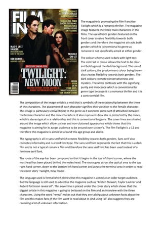
1. The magazine is promoting the film franchise
Twilight which is a romantic thriller. The magazine
image features the three main characters in the
films. The use of both genders featured on the
front cover creates flexibility towards both
genders and therefore the magazine attracts both
genders which is conventional to genre as
romance is not specifically aimed at either gender.
The colour scheme used is dark with light text.
The contrast in colour allows the text to be clear
and bold against the dark background. The use of
dark colours, the predominant colour being brown
also creates flexibility towards both genders. The
dark colours connote conservativeness and
mystery. The white contrasts with this signifying
purity and innocence which is conventional to
genre type because it is a romance thriller and it is
a controversial film.
The composition of the image which is a mid shot is symbolic of the relationship between the three
of the characters. The placement of each character signifies their position to the female character.
This image is particularly conventional to the genre as it connotes some sort of attraction between
the female character and the male characters. It also represents how she is protected by the males,
which is stereotypical in a relationship and this is conventional to genre. The cover lines are situated
around the image which allows a clear and non-cluttered appearance which shows that this
magazine is aiming for its target audience to be around over sixteen’s. The film Twilight is a 12 and
therefore this magazine is aimed at around this age group and above.
The typography is all in sans serif which creates flexibility towards both genders. Sans serif also
connotes informality and is a bold font type. The sans serif font represents the fact that this is a dark
film and is not a typical romance film and therefore the sans serif font has been used instead of a
feminine serif font.
The route of the eye has been composed so that it begins in the top left hand corner, where the
masthead has been placed behind the males head. The route goes across the optical area to the top
right hand corner, down to the bottom left hand corner and across the terminal area in order to read
the cover story ‘Twilight, New moon’.
The language used is formal which shows that this magazine is aimed at an older target audience.
But the language is still used to advertise the magazine such as “Kristen Stewart, Taylor Lautner and
Robert Pattinson reveal all”. This cover line is placed under the cover story which shows that the
biggest article in this magazine is going to be based on the film and an interview with the three
characters. Using the word ‘reveal’ makes out that they are talking about unknown facts about the
film and this makes fans of the film want to read about it. And using ‘all’ also suggests they are
revealing a lot of unknown information.