
Recommended
More Related Content
What's hot
What's hot (19)
Viewers also liked
Viewers also liked (17)
Similar to (In case the vlog is illegible) Comparing one music magazine to two other genres
Similar to (In case the vlog is illegible) Comparing one music magazine to two other genres (20)
Recently uploaded
Recently uploaded (20)
(In case the vlog is illegible) Comparing one music magazine to two other genres
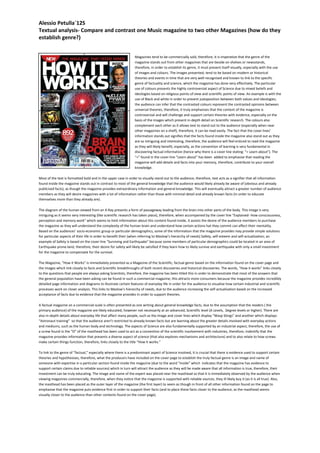
- 1. Alessio Petulla`12S Textual analysis- Compare and contrast one Music magazine to two other Magazines (how do they establish genre?) Magazines tend to be commercially sold, therefore, it is imperative that the genre of the magazine stands out from other magazines that are beside on shelves or newsstands, therefore, in order to establish its genre, it must present itself visually, especially with the use of images and colours. The images presented, tend to be based on modern or historical theories and events in time that are very well-recognised and known to link to the specific genre of factuality and science, which the magazine has done very effectively. The particular use of colours presents the highly controversial aspect of Science due to mixed beliefs and ideologies based on religious points of view and scientific points of view. An example is with the use of Black and white in order to present juxtaposition between both values and ideologies; the audience can infer that the contrasted colours represent the contrasted opinions between universal theories, therefore, it truly emphasises that the content of the magazine is controversial and will challenge and support certain theories with evidence, especially on the basis of the images which present in-depth detail on Scientific research. The colours also complement each other as it allows text to stand out to the audience (especially when near other magazines on a shelf), therefore, it can be read easily. The fact that the cover lines’ information stands out signifies that the facts found inside the magazine also stand out as they are so intriguing and interesting, therefore, the audience will feel enticed to read the magazine as they will likely benefit, especially, as the convention of learning is very fundamental in discovering factual information (hence why there is a cover line stating: “+ Learn about”). The “+” found in the cover line “Learn about” has been added to emphasise that reading the magazine will add details and facts into your memory, therefore, contribute to your overall knowledge. Most of the text is formatted bold and in the upper case in order to visually stand out to the audience, therefore, text acts as a signifier that all information found inside the magazine stands out in contrast to most of the general knowledge that the audience would likely already be aware of (obvious and already publicised facts), as though the magazine provides extraordinary information and general knowledge. This will eventually attract a greater number of audience members as they will desire magazines with a lot of information rather than those with minimal detail and already known facts (in order to educate themselves more than they already are). The diagram of the human viewed from an X-Ray presents a form of passageway leading from the brain into other parts of the body. This image is very intriguing as it seems very interesting (like scientific research has taken place), therefore, when accompanied by the cover line “Explained- How consciousness, perception and memory work” which seems to limit information about this content found inside, it assists the desire of the audience members to purchase the magazine as they will understand the complexity of the human brain and understand how certain actions hat they commit can affect their mentality. Based on the audiences’ socio-economic group or particular demographics, some of the information that the magazine provides may provide simple solutions for particular aspects of their life in order to benefit their (when referring to Maslow’s hierarchy of needs) Safety, self-esteem and self-actualisation; an example of Safety is based on the cover line “Surviving and Earthquake” because some members of particular demographics could be located in an area of Earthquake prone-land, therefore, their desire for safety will likely be satisfied if they learn how to likely survive and earthquake with only a small investment for the magazine to compensate for the survival. The Magazine, “How it Works” is immediately presented as a Magazine of the Scientific, factual genre based on the information found on the cover page and the images which link closely to facts and Scientific breakthroughs of both recent discoveries and historical discoveries. The words, “How it works” links closely to the questions that people are always asking Scientists, therefore, the magazine has been titled this in order to demonstrate that most of the answers that the general population have been asking can be found in such a commercial magazine; this attracts more consumers because the magazine provides incredibly detailed page information and diagrams to illustrate certain features of everyday life in order for the audience to visualise how certain industrial and scientific processes work on closer analysis. This links to Maslow’s hierarchy of needs, due to the audience increasing the self-actualisation based on the increased acceptance of facts due to evidence that the magazine provides in order to support theories. A factual magazine on a commercial-scale is often presented as one writing about general knowledge facts, due to the assumption that the readers ( the primary audience) of the magazine are likely educated, however not necessarily at an advanced, Scientific level (A Levels, Degree levels or higher). There are also in-depth details about everyday life that affect many people, such as the image and cover lines which display “Wasp Stings” and another which displays “Astronaut training” so that the audience aren’t restricted to already known facts but are learning about the greater details involved with everyday actions and mediums, such as the human body and technology. The aspects of Science are also fundamentally supported by an industrial aspect, therefore, the use of a screw found in the “O” of the masthead has been used to act as a convention of the scientific involvement with industries, therefore, indentify that the magazine provides information that presents a diverse aspect of science (that also explores mechanisms and architecture) and to also relate to how screws make certain things function, therefore, links closely to the title “How it works.” To link to the genre of “factual,” especially where there is a predominant aspect of Science involved, it is crucial that there is evidence used to support certain theories and hypothesises, therefore, what the producers have included on the cover page to establish the truly factual genre is an image and name of someone with expertise in a particular section found inside the magazine (due to the word “inside” which indicates that the magazine has evidence to support certain claims due to reliable sources) which in turn will attract the audience as they will be made aware that all information is true, therefore, their investment can be truly educating. The image and name of the expert was placed near the masthead so that it is immediately observed by the audience when viewing magazines commercially, therefore, when they notice that the magazine is supported with reliable sources, they ill likely buy it (as it is all true). Also, the masthead has been placed as the outer layer of the magazine (the first layer) to seem as though in front of all other information found on the page to emphasise that the magazine puts evidence first in order to support their facts (and to place these facts closer to the audience, as the masthead seems visually closer to the audience than other contents found on the cover page).
- 2. Alessio Petulla`12S Textual analysis- Compare and contrast one Music magazine to two other Magazines (how do they establish genre?) This magazine is of the music genre. This is easily identifiable due to the conventional use of a solo artist (named “Taylor Swift”). The reason why the production company decided to use her in particular as the model for the cover page was to attract the music-loving audience of the modern era, based on Taylor Swift being an icon for a younger target audience; her music career began rather recently, therefore, in order to attract predominantly a teenage primary audience, she was used as the model as her music links closely to what this audience listens to. Her age is also very young, therefore, she can link closely to her target audience more than if the model selected was a singer well-known by an older target audience. In order to entice the target audience to purchase the magazine, such an iconic and inspirational figure was used as the model in order to promote sales as it is very likely that those aiming to pursue music-based careers or lifestyles will compare themselves to their icons in order to discover how success is achievable and whether or not their approaches to music can be influenced by the advice given by celebrities (which is likely found inside the double-page spread, accompanied by questions, answers and their past experiences which got them closer to reaching their success). The most apparent convention of the magazine is the presentation of a guitar. This has been deliberately included so that if there were some audience members unaware of the artist shown, they would be able to link her to the music industry, based on her holding the guitar as though recently playing it. The guitar also seems as though slightly damaged, therefore, what the audience can assume is that the artist has been playing the guitar for a long time, possibly even before her music career began. This will entice the audience as they may well be in the current position of practicing how to learn a certain instrument, therefore, as the guitar in the image seems slightly damaged, it suggests that the model has been practicing for a long time for her success, which will likely entice the audience to buy the magazine to discover whether or not: if they practice very frequently, can they become as successful as the artist shown. It also suggests that music isn’t only about singing, therefore, a career in music can involve instruments as well, if singing isn’t preferable. The clothing of any artist is very important in terms of relating their visual presentation to the music they produce. Clothing establishes that the music is of the music genre because music is all about presenting inner feelings and passions vocally, therefore, the fact that the artist is presented as not over the top and very genuine, readers can infer that the music sung is very calm, peaceful and down-to-earth. The fact that the artist is wearing contrasting coloured clothing establishes the genre of music, based on music being all about interpretation, therefore, the audience can infer that based on the contrasting colours used, the music produced can be interpreted in various ways based on individual opinions. It also suggests that within all songs produced, they can all be contrasted in terms of the rhythms and moral messages, therefore, the genre of music is established as being one which focuses on various experiences and human emotions, i.e. cheerful songs tend to be fast and up-beat, whereas, sadder songs which link to possible past experiences of artists tend to be slower with a lower-beat. The variation of text fonts emphasises that music itself has varied genres and approaches, especially based on all artists’ presentations; the contrasting presentation of fonts emphasises that there are various presentations of artists throughout the music industry, therefore, a cross-link between visual representation of text and media-orientated presentation was made. What is also used to establish the music genre is the mentioning of successful and well-known music celebrities, such as “Eminem” and “50 Cent” shown o the left of the page. This establishes that the magazine focuses on a variety of genres and isn’t restricted to the single artist on the cover page. What was cleverly done by the editors was how the size of the text for “Kendrick” and “Lamar” in contrast to other text on screen was presented; the fact that the text was bold and larger sized than other text on screen suggests that these artists are literally big in terms of the music industry, therefore, the presentation of size links closely as a representation of how large these particular artists are recognised in the music-society. Similarly, in the name “Taylor Swift,” the “W” has a more elegant font in contrast to the rest of the name’s text, therefore, this acts as a signifier that She isn’t repetitive in terms of the type of music she produces, therefore, she presents great innovation as she can produce things which seem out of the ordinary (ordinary being the presentation of her name, therefore, the contrasted format of “W” establishes that she can sometimes display out of the ordinary music which is quite literally recognised under her name). The masthead displays varied colours which fill the holes of certain letters. The colours stand out from the plain background, therefore, the audience can infer that the artists’ music stands out from society (which the background represents). This establishes the genre of music, as music is all about trying to stand out of society with certain messages. Some might argue that the varied colours also represent music itself, therefore, music can contrast based on the genre of music and the presentations of music made by a large variety of artists. The colours can also signify that music is about displaying your true colours, therefore, presenting yourself the way you want to be presented, accompanied by your lyrics which project true inner feelings. The colours are also similar to a traffic light with Red, Amber and Green. These colour can also present the stages of success in life, therefore, as red and amber represent being stationary and beginning to accelerate, which happen to be on the left side of the artist, it presents them as being in the past, therefore, as green is on the right side of her which represents GO, the audience can interpret that her success has been reached and is literally at full speed (the peak).
- 3. Alessio Petulla`12S Textual analysis- Compare and contrast one Music magazine to two other Magazines (how do they establish genre?) This magazine is of the gaming genre. This is identifiable due to the magazine being one-of many media platforms for “Playstation,” which happens to be one of the world’s best-selling games consoles of the modern era. Based on this, the genre was established immediately due to the masthead using this multi game-platform name (as the word “Playstation” is found in all game consoles produced by Sony, therefore, as there are some which are played by a younger audience such as the Playstation Portable, and some played by a teenage and older generation such as the Playstation 3, the marketing recognition of Playstation is hugely known across a varied target audiences). The fact that “Playstation” also have an official magazine that has been used to promote upcoming games, facts about the gaming industry and general gaming knowledge, a synergy has been created (between television advertisements for new games, internet advertisement and blog pages, etc.) in order to attract a greater audience whichever platform of media they use regularly (to promote sales and keep their audiences up to date). The cover page presents a hyper-realistic image of character found in the listed game of “Uncharted 4” due to this particular cover line being of a considerably larger text size in contrast to the other text found on the page. The only text similar to this is the Playstation logo/ masthead, therefore, the audience can infer that: as the game title is as large as the masthead, it suggests that it is literally a big game for the Playstation market, therefore, it will impact the console greatly in terms of customer sales and popularity. When new games are introduced into the market through the use of advertisement, the advertisement campaigners tend to display gameplay as though being performed by real people similar to a trailer for a movie (on internet and television platforms). This attracts a greater quantity of the target audience as the uses and gratifications theory is embraced in terms of pleasure; the game is presented as though it is something that occurs in the real-life, therefore, as many of the target audience members are not willing to experience most of the actions that the protagonist of the game is committing, such as murder or intense action missions, they can experience these events in comfort when playing it, however, can still experience some of the visual displays based on hyper-realistic graphics which seem as though the game is set in reality. What the magazine has done to establish the gaming genre is: portray a hyper-realistic mid-shot of the protagonist character in order to establish who the main character is, yet present how the game seems as though a real-life person so that the audience can relate to the protagonist based on humanity, in contrast t if the protagonist were a monster or alien, etc. The mid-shot was used to present how the character is standing in the centre of the cover page, therefore, signified as the centre of attention in terms of the game (as he is the protagonist). A weapon was placed in his hand to connote that the game is of a violent nature, especially as the protagonist’s head s bleeding, therefore emphasising that there is action involved. Based on this, the protagonist is also represented as someone of danger due to his circumstances of injury. The background also suggests that, metaphorically, the protagonist is surrounded by darkness which represents evil (as darkness seems very negative which links to the negative circumstances that the protagonist has likely encountered). Game magazines also try to make certain characters seem mysterious so that the target audience can only understand who they are truly playing as when the game has been bought (hence why the protagonist’s face, therefore, identity, has been partially covered by a shadow which might suggest that half of his lifestyle can be positive and literally a bright one of happy circumstances, whereas, the other half is in darkness, therefore, negative and surrounded by evil circumstances). This technique is regularly done to make the audience feel uncertain about who they will be playing as, therefore, in order to find out more about the character’s context, will have to buy the game and play it. To establish the genre, the words “First look” have been used in order to emphasise that there is an upcoming game that the “Playstation” company will be publishing, therefore, the audience will feel enticed to purchase the magazine as the word “First” suggests that the magazine provides exclusive details and content about the upcoming game/s; the audience will desire greater information about upcoming events, therefore, will likely buy the magazine to understand these facts before deciding whether or not a certain game will suit their needs. The cover page displays the logos of buttons that appear on all multi-Playstation platform consoles and controllers, therefore, to establish the genre of gaming, it presented these universally recognised symbols to emphasise who the magazine was made on behalf of (Playstation) and what the magazine is based on (gaming and consoles based on the console logos presented), especially when it is displayed on shelves with magazines of completely contrasted genres, therefore, it must stand out immediately as a game magazine. The cover page also presents a list of games that aren’t the magazines main focus (such as “Uncharted 4”), however, are still explained about inside the magazine. This is in order to attract a wider range of the target market that may prefer other games rather than solely the “Unchanted” game which the magazine has decided to focus on. As not all of the target market will be aware of “Unchanted,” although the game series has reached platinum success in terms of critic acclamation and sales (hence why such a popular game has been placed on the cover page in order to attract consumers), the other game titles listed are also franchises and/ or of a game series, therefore, they will likely be known from past campaigns or gameplay which will likely attract consumers to purchase the magazine based on the popularity of the history of them; such successful games will likely influence the target audience to purchase the magazine in order to find out more information about possible upcoming releases or launch days, etc. To establish the games genre, there is a free gift section placed at the top of the cover page which is a conventional feature of games magazines. The gifts are usually: a demonstration disc and games poster which link directly to a certain game. These are used to present what is to be expected from certain games and to demonstrate whether or not the demonstration of the game is impressive and good enough to influence consumers to purchase the entire game when released. The fact that this was placed at the top of the page was in order to attract the audience immediately when observing the magazine through shelves on a commercial basis. The word “free” has been used in order to entice consumers to purchase the magazine as they feel that they are getting a physical object for the price of nothing, therefore, they haven’t had to forego income (a win-win situation for the consumers who got goods for free and a win for the magazine company who increased their sales).