
Recommended
More Related Content
What's hot
What's hot (20)
Viewers also liked
Viewers also liked (18)
Similar to Textual analysis of three, music genre magazines
Similar to Textual analysis of three, music genre magazines (20)
More from ALPETULLA
More from ALPETULLA (11)
Recently uploaded
Recently uploaded (20)
Textual analysis of three, music genre magazines
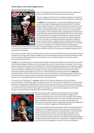
- 1. Textual analysis of three, Music Magazine genres Alessio Petulla 12S Miss Akindayini A genre is the category that a particular Media text falls under, based on the format of production and the styles and contents of production. The music magazine “Rock Sound” is immediately i dentified as a “Heavy Rock” magazine; the Masthead includes the genre that the magazine is categorized in. The lighting of the magazine cover is very dark which signifies that the artist wants to s tay hidden as though trying to conceal his identity. This hiding of i de ntity s uggests that based on “Pre ferred re ading,” the artist wants to remain hidden as society is against people of a punk nature because of such modern civi l isation which demands perfection and in some cases, is a powerful force which separates certain classes from others, especially based on those who are academic and non-academic. What re aders might i nfer is that the artist doesn’t want to get noticed as an outsider who rebels against ”political corre ctness” and laws which seem to forcefully dictate human nature. Some might argue that the colour black is very negative and s ignifies evil based on religion (as heaven is white, therefore, a symbol of peace and righteousness), therefore, the fact that the artist has a brightly portrayed face represents him as though a person who is standing out from darkness, therefore, rebelling against a moulded society; his back is toward the darkness as though all negativity is past him, in contrast to the white face which is in front of him and leading him to a more positive and happier future (as he can present his attitudes through the form of Heavy Rock to the audience). Some audience members might also infer that the black, tinted eyes also represent that most of the experiences witnessed through the a rtist’s e yes are concealed and hidden; the artist is represented as someone of a mysterious identity, possibly due to unfortunate childhood experiences, hence why there i s such a rebellious approach to music which releases compressed anger and emotions. The NCV of the character presents a very happy mood based on his excited smile. Readers can infer (based on the model’s hands being close together) that the artist was praying, possibly in order to have a successful and happier life in the future . Readers can denote that his prayers were answered as he i s presented as being extremely ecstatic. This might also suggest that: even though he i s rebellious and was in darkness (in the past), the bright Heaven-like colour on his face s ignifies his clos e relationship with a Godly figure and religion, therefore, respects religion more than the demands of society, as rel igion has helped him get through the worst of times. What the audience might also denote from the deliberately pre s ented tattoos on the artist’s arm is that he has been scarred in his lifetime, just like ta ttoos (signifiers) scar the body, therefore, he wants to present his ta ttoos and be open about his life experiences, similarly to how he clearly wants to present his true, inner feelings about his life in the form of Heavy Rock music. The camera s hot of “Rock Sound” is a close-up s i milarly to “Vi be”, because, these ge nres of music are all a bout demonstrating your inner feeling through the projection of vocal lyrics. The close-ups are signifiers of true, inner emotions, therefore, the magazines have deliberately used this type of shot so that the audience can vi sualise the facial expressions of the artists to understand how they truly feel, hence why they have chosen a particular genre to base their music feelings on, whether it be Heavy rock which releases aggression and anger, or rap which releases experiences and emotions through a calmer, yet catchy (in order to be more memorable) narrative. There is red writing on the screen which links to the obvious colour of blood and the international colour of danger, therefore, the audience can infer that a punk lifestyle i s a dangerous one, therefore, the artist bases most of his music on fear and danger. Some audience members might also infer that, based on the colour red being found on the cover page, it signifies that blood has s tained it as though the artist experienced violence in his life, therefore, reflects his experiences through loud and aggressive mus ic to l ink s imilarly to his aggressive childhood experiences. There is hand-writing found on the front page rather than computerized text. This s ignifies that the message written by the artist is personal in contrast to generic and universal, computer formatted text. Computerized text is also used by many people in modern society, therefore, the artist might be reaching out to his audience by wri ting in his own styl e rather than following society’s traits and actions (similarly to sheep following each other’s path) as though rebelling against doing all things that others do without any individuality. The large font also stands out to the audience with aggression in order to attract them (visually) into
- 2. Textual analysis of three, Music Magazine genres Alessio Petulla 12S Miss Akindayini reading the magazine, similarly to the Heavy Rock lyrics sung (in order to link to the audience by means of suggesting that the music wri tten can be represented as bold and large to translate what the aggression is like when on a paper-format and not an audio one). In comparison to “Rock Sound,” the magazine “Music” is ca tegorised in the Classical music genre based on the immediately recognisable composer’s articles of clothing (Costume). The bow-tie, smart shirt and blazer are all stereotypically worn on smart and formal events, therefore, the fact that such smart clothing is worn by the composer, presents him as a man of high elegance and s tatus based on his authority over the orchestras he conducts. Similarly to “Rock Sound,” there i s the use of red colouring, however, i t is used as a reference to the curtains found in large ha l ls where the orchestras tend to perform, s uch a s inside “The Royal Al bert Hall,” therefore, vi ol ence isn’t presented like i n “Rock Sound” as the re d colouring i s used to link to the traditional Setting of a composer. With the magazine “Vibe,” a re d background has been used i n order to present the dangerous lifestyles that many rappers have chosen to follow, such as gang violence and drug use (which is stereotypical), therefore, the redness is a symbol of danger and blood-shed through gang attacks and acts of violence. What is ironic is that the masthead’s colour ca n cha nge e very we ek, there fore, when “Vibe” decided to present a ra pper, they decide to use a red colour in order to emphasise the dangerous lifestyles that many rappers have chosen. It also suggests that the songs they rap about are based on past experiences (as there were many rappers who grew up from poverty), therefore, the music created explores the sad emotions for the audience to hear and appreciate how difficult l ife could have been for them, yet understand how l ife has improved thanks to their rapping careers. The setting of “Music” has been presented to the a udience, i n contrast to “Rock Sound” with a black background, because, Orchestras have always performed in large halls, therefore, the s cene is immediately presented to imaginatively place the audience in the environment as though they can experience (visually) what the composers witness. The Mas thead is in the lower case to present a calm and peaceful atmosphere which can be denoted as a reference to the calm and peaceful music produced by the composer (a cross-refere nce). In contrast, “Rock Sound” has an upper ca se Masthead i n order to seem more aggressive and represent loud volume as though someone were raising their voice, which l inks to the Heavy Rock genre which includes loudness and aggression. The camera-shot is a medium shot, which was used to present the articles of clothing for the composer in order to establish the genre based on the vi sual presentation which the audience can understand links to classical music. The reason a close-up wasn’t used (like the s hots for “Vibe” and “Rock Sound”) is because, ra p and Heavy rock i s all about projecting feelings vocally and through a vi sual image, such as facial expressions, whereas, classical music is a projection of emotions through instruments, rather than vocals. To appreciate the mus ic, the audience just has to listen, rather than look at the composer’s facial expressions and NVC to understand their feelings projected through composing, because rap and heavy rock require lyrics to explain certain feelings, whereas, classical music is so powe rful that lyri cs aren’t required as they can portray feelings so elegantly and so passionately due to the instruments alone. Si milarly to “Rock Sound,” “Music” used black a nd white clothing i n order to present a visual contrast which re flects two sides to someone, such as a representation of goodness and e vil. In the case of “Music,” it is goodness a nd e vil re flected through the form of sound, therefore, the contrasted colours signify how the music produced by the composer can vary and contrast dramatically ba sed on the meanings behind them. There i s golden text displayed on the cover page of “Music” to further complement the elegant approach to classical music; i t is s tereotypical that rich people can afford to attend such events, therefore, the fact that the golden colour was used, al literates how higher-classed and civilised the music is. Anothe r contrast to “Rock Sound” is the general display of the Masthead of “Vi be” and “Music”, whether it i s positioned in front of the arti st/composer or behind them. The audience can infer that when the masthead i s in front of someone, they are depicted as having a low s tatus because they have not been put first, therefore, are behind the masthead as though someone else is in front of them in society (due to their greater authority and power over them). “Vibe” a nd “Music” have positioned the Mastheads behind the a rtist/composer i n order to vi sually present that they have been placed fi rst because they are the ones the audience want to see as they are the ones of greater authority, especially for the composer who composes an orchestra (in control). Wi th the Ma gazine, “Vibe,” the ge nre of rap is immediately presented, based on the tilted cap which l inks cl osely to conve ntional ra pper’s presentation. Similarly, the use of jewellery i s a conventional feature for many rappers which links to the s lang word “bling” which is used often in lyrics for ra p songs. This visual link to the conventional l yrics “bling” allows the audience to easily interpret the genre of the magazine and relate i t to what they are expected to hear if listening to the arti st. Unfortunately, due to s tereotyping, the audience will interpret the magazine is about rap because rap was originally a form of music that originated from Africa, therefore, the black artist, jewellery and the tilted cap allow the audience to
- 3. Textual analysis of three, Music Magazine genres Alessio Petulla 12S Miss Akindayini interpret that the magazine is about ra p based on conventions a nd stereotypes. The artist in “Vibe”, similarly to the artist i n “Rock Sound,” is wearing clothes similar to the colour of the background in order to blend in. The a udience ca n depict that the blending of colours signifies that the artist wants to feel accepted in society, therefore, wants to literally blend in to society as though a normal person, especially as his eyes were edited blue (as though his eyes are signifiers of experiences, therefore, as a child, he tried to experience acceptance from others) .We as the audience can still see him very clearly which suggests that he has tried to feel accepted in society, but has been rejected due to possible raci sm,(especially in America), therefore, he is now looking forward for future success and happiness.