
Recommended
More Related Content
What's hot
What's hot (19)
Similar to Masthead Designs
Similar to Masthead Designs (20)
More from ALPETULLA
More from ALPETULLA (12)
Masthead Designs
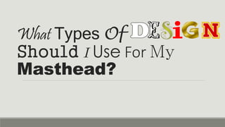
- 1. What Types Of Should I Use For My Masthead?
- 2. With this text, I feel that these could all be used due to them looking very ‘Classy’, and also very attractive when linking in with the ‘target audience’ and also the magazine’s ‘Music genre’. Some look quite old fashioned and somewhat retro in terms of the date it would appear to be set in, for example, BRASS BELL and NEW YORK. Not only do they look very attractive as a design for a Masthead, but they certainly appeal. It doesn’t look over the top and also doesn’t look so modern opposed to some including iPOCK (on the next page). Not only are the majority of the colours very suitable, but also the overall look and design of the texts used/shown. If I were to use any kind of font or design, I would focus it around the majority of these ones. They are Great.
- 3. Now, the reason why I chose these certain Designed ‘logo’/’mastheads’ was due to the fact that they either looked too ‘Bold’, too ‘Sharp and Straight’, or, due to them having no relevance in terms of the music magazines’ genre. The majority of these are ‘rock’ music magazine opposed to the classical ‘Swinging Blues’. They also tend to be in different positions, for example, ‘THRASHER’ isn’t in a straight line, and some also look very inky, i.e. INDIEITIS. Some of these also look quite ‘over-the-top’, which is fine but not for the magazine in which I intend to create. It totally contrasts what I aim to create due to the themes used within the context and also the overall music genre involved.
- 4. wing aviours wing aviours As you can see with these texts, they look quite classy and more formal, but some more than others still look quite attractive. I aim for my Masthead/Logo to look appealing like these texts, but also to include a little more character to the ones shown in the Second Page. wing aviours