
Recommended
More Related Content
What's hot
What's hot (19)
Viewers also liked
Viewers also liked (20)
Similar to Analysing a digipak
Similar to Analysing a digipak (20)
More from snipez21
More from snipez21 (13)
Recently uploaded
Recently uploaded (11)
Analysing a digipak
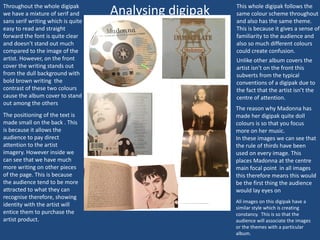
- 1. Analysing digipak This whole digipak follows the same colour scheme throughout and also has the same theme. This is because it gives a sense of familiarity to the audience and also so much different colours could create confusion. The reason why Madonna has made her digipak quite doll colours is so that you focus more on her music. In these images we can see that the rule of thirds have been used on every image. This places Madonna at the centre main focal point in all images this therefore means this would be the first thing the audience would lay eyes on Unlike other album covers the artist isn’t on the front this subverts from the typical conventions of a digipak due to the fact that the artist isn’t the centre of attention. Throughout the whole digipak we have a mixture of serif and sans serif writing which is quite easy to read and straight forward the font is quite clear and doesn’t stand out much compared to the image of the artist. However, on the front cover the writing stands out from the dull background with bold brown writing the contrast of these two colours cause the album cover to stand out among the others The positioning of the text is made small on the back . This is because it allows the audience to pay direct attention to the artist imagery. However inside we can see that we have much more writing on other pieces of the page. This is because the audience tend to be more attracted to what they can recognise therefore, showing identity with the artist will entice them to purchase the artist product. All images on this digipak have a similar style which is creating constancy. This is so that the audience will associate the images or the themes with a particular album.