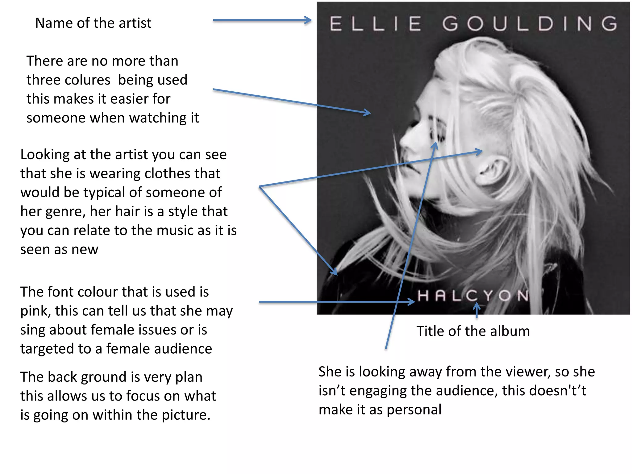
Pop Album Cover
Title of the album
Name of the artist
There are no more than
three colures being used
this makes it easier for
someone when watching it
Looking at the artist you can see
that she is wearing clothes that
would be typical of someone of
her genre, her hair is a style that
you can relate to the music as it is
seen as new
She is looking away from the viewer, so she
isn’t engaging the audience, this doesn't’t
make it as personal
The font colour that is used is
pink, this can tell us that she may
sing about female issues or is
targeted to a female audience
The back ground is very plan
this allows us to focus on what
is going on within the picture.
Name of the Artist
Name of the album
As there is only two colours used
the red stand out more over the
black. This makes it easier for
someone to see what is going on
as there isn’t a lot of things going
on within the album. The use of
red within this stands out this
could tell us that it is a sexy album
or is about love as red is
associated to that.
You can see that she is up to
date with the fashion as she is
wearing at watch and a chain
within the album cover this is
typical of this genre to be seen
with the new style.
Round the edge of the cover you can see
that it has a black border, this can tell you
that she is caught in a picture frame. The use
of the black also allow the picture to stand
out .
Name of the artist
Name of the album
The design of the the album is very
well done there is a range of different
effects that have been used on the
image to make it stand out from all
the others. For example they have put
triangles around the artist, they have
also put them in different shades.
This is typical of this genre as they are
trying out new ideas to reach new
audiences
The colours that have been used are
tying to give the feeling of space

George Hook Pop Covers

  • 1.
  • 2.
    Title of thealbum Name of the artist There are no more than three colures being used this makes it easier for someone when watching it Looking at the artist you can see that she is wearing clothes that would be typical of someone of her genre, her hair is a style that you can relate to the music as it is seen as new She is looking away from the viewer, so she isn’t engaging the audience, this doesn't’t make it as personal The font colour that is used is pink, this can tell us that she may sing about female issues or is targeted to a female audience The back ground is very plan this allows us to focus on what is going on within the picture.
  • 3.
    Name of theArtist Name of the album As there is only two colours used the red stand out more over the black. This makes it easier for someone to see what is going on as there isn’t a lot of things going on within the album. The use of red within this stands out this could tell us that it is a sexy album or is about love as red is associated to that. You can see that she is up to date with the fashion as she is wearing at watch and a chain within the album cover this is typical of this genre to be seen with the new style. Round the edge of the cover you can see that it has a black border, this can tell you that she is caught in a picture frame. The use of the black also allow the picture to stand out .
  • 4.
    Name of theartist Name of the album The design of the the album is very well done there is a range of different effects that have been used on the image to make it stand out from all the others. For example they have put triangles around the artist, they have also put them in different shades. This is typical of this genre as they are trying out new ideas to reach new audiences The colours that have been used are tying to give the feeling of space