
Recommended
More Related Content
What's hot
What's hot (18)
Similar to Nerve title design
Similar to Nerve title design (20)
More from 11rynnmol
Recently uploaded
Recently uploaded (20)
Nerve title design
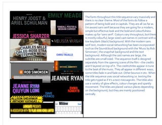
- 1. Thefonts throughout this titlesequencevary massively and there is noclear theme. Most of thefonts do follow a pattern of being bold and in capitals. They are all (as far as I’m aware) sans serif because they are going for a modern, simple but effective look andthe bold and colourfulness makes up for ‘sans serif’. Colours vary throughout, but there is mostly colourful, large sized cast names in contrast with a low key/dark (black) background. With the modern sans serif text, modern social networking has been incorporated such as theSoundcloud backgroundwith the ‘Musicby Rob Simonsen’, the snapchat background andthe text background. Although thecast names are large, the subtitles are smallsized. Thesequence itself is designed separately from the opening scene of the film –the credits aren’t layered on top of it. Thecredits/titles appear in tune tothe beat of themusic. They all appear in different ways; sometitles fade in and fade out. Otherbounce in etc. When thetitle sequence uses social networking i.e. texting the title gets typedas if it’s a text messageetc. Thetitles also usea variety of glow effects, colour changes and sparkly movement. Thetitles are placed various places depending on thebackground, but they are mainly positioned centrally.