1. Analysis of an existing product –
Album Cover.
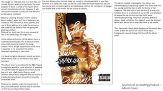
This image is a mid-shot, this is so that they can
include Rihanna and half of her body. The main
purpose of this is to show of her figure which
attracts the attention of men. However it will
attract some women as they will view Rihanna
as daring and confident.
For once Rihanna has minimal make up, usually it is flamboyant and in your face
however it is subtle, the make up she has used makes her look mysterious ash she
has used a dark red lipstick with a red eyeshadow, red has the connation's of danger
and maybe that is the reason for the choice in colours.
They have used a basic white background because it was
easier to edit the picture on, also if there was a
background it would change the focus of the album
cover.
Rihanna has a tattoo under her breast, this is
very unusual however she has used a mid-shot
so that She can show of her tattoo.
The album is called unapologetic, this means not
acknowledging or expressing regret. This shows that she
has used a word that ties in with the theme of the
magazine. The font used is serif because it is very curly
however there is an element of san serif.it is very typical
of women to use this font as they find it more
aesthetically pleasing. They have used two different
colours black and white, this makes it seem like its good
verses evil. Which ties in with the name of the album .
This album cover is considered to be R&B. Typical
iconography would be small amounts of jewellery.
This conforms to the typical conventions as she
has on 2 very small chains. One is a small
necklace which shows elegance and the second is
a body chain which goes around her breast to
accentuate them.
Rihanna is looking directly in to the camera
which makes it seem as if she is looking at her
audience. This is known as direct address, the
use of direct address is to make the consumer
feel closer to the artist as they are giving the
good eye contact.
Rihanna has short hair, this is very unusual of
her as she tends to go for longer hair.
In the bottom left corner of the album, there is
a parental warning sign, this is because of the
amount of swearing-in which the songs
contain. This is a legal requirement and if there
is swearing in my song then this will be
extremely necessary to have their.
It is black and white because it stands out more
which means that it is not hard to miss upon
purchase.