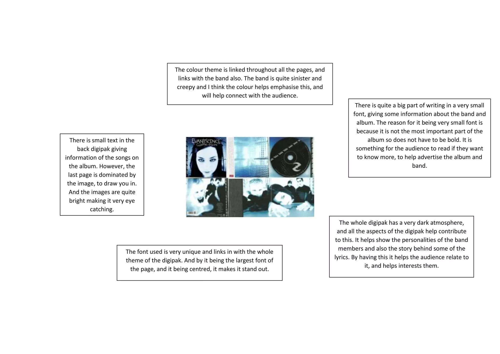
The document discusses the design of a music album digipak. It summarizes that the dark color theme is used throughout the pages and links to the sinister nature of the band. Small text in the digipak provides song information, while large bright images draw viewers in. A unique font stands out for the title and centers it on the page. Small font provides extra band and album details for interested audiences to read, helping advertise the release. The overall dark atmosphere of the digipak helps show the band's personalities and storytelling behind their lyrics, allowing audiences to relate and engage more with the release.