SlideShare a Scribd company logo
Thefonts throughout this titlesequencevary massively and
there is noclear theme. Most of thefonts do follow a
pattern of being bold and capitalised. They are all (as far as
I’m aware) sans serif because they are going for a modern,
simplisticbut effective look and the bold andcolourfulness
makes up for ‘sans serif’. Colours vary throughout, but there
is mostly colourful, large sized cast names in contrast with a
low key/dark (black) background. With the modern sans
serif text, modern social networking has been incorporated
such as theSoundcloud backgroundwith the ‘Musicby Rob
Simonsen’, the snapchat background andthe text
background. Although thecast names are large, the
subtitles are smallsized. Thesequence itself is designed
separately from the opening scene of the film –the credits
aren’t layered on top of it. Thecredits/titles appear in tune
tothe beat of themusic. They all appear in different ways;
sometitles fade in and fade out. Otherbounce in etc. When
thetitle sequence uses social networking i.e. texting the
title gets typedas if it’s a text messageetc. Thetitles also
usea variety of glow effects, colour changes and sparkly
movement. Thetitles are placed various places depending
on thebackground, but they are mainly positioned
centrally.

More Related Content

What's hot (17)

Double page spread analysis
Double page spread analysisDouble page spread analysis
Double page spread analysis
 
Temper trap album poster analysis
Temper trap album poster analysisTemper trap album poster analysis
Temper trap album poster analysis
 
Research Into Ancillary Products
Research Into Ancillary Products Research Into Ancillary Products
Research Into Ancillary Products
 
Digipak Analyses
Digipak AnalysesDigipak Analyses
Digipak Analyses
 
Contents page analysis
Contents page analysisContents page analysis
Contents page analysis
 
Contents page analysis
Contents page analysisContents page analysis
Contents page analysis
 
The Weeknd’s Digipak
The Weeknd’s DigipakThe Weeknd’s Digipak
The Weeknd’s Digipak
 
Contents page
Contents pageContents page
Contents page
 
Mumford and sons
Mumford and sonsMumford and sons
Mumford and sons
 
1A
1A1A
1A
 
Eminem CD analysis
Eminem CD analysisEminem CD analysis
Eminem CD analysis
 
Digipak Research
Digipak Research Digipak Research
Digipak Research
 
Taylor Swift Analysis
Taylor Swift AnalysisTaylor Swift Analysis
Taylor Swift Analysis
 
Media - CD digipack analysis
Media - CD digipack analysisMedia - CD digipack analysis
Media - CD digipack analysis
 
Analysis of magazine double page spread
Analysis of magazine double page spreadAnalysis of magazine double page spread
Analysis of magazine double page spread
 
Tocmmock
TocmmockTocmmock
Tocmmock
 
1B
1B1B
1B
 

Similar to Nerve title design

Contents page analysis
Contents page analysisContents page analysis
Contents page analysis
LiamKeenan
 
Contents page analysis
Contents page analysisContents page analysis
Contents page analysis
LiamKeenan
 
D:\Media\Dps\Double Page Spread
D:\Media\Dps\Double Page SpreadD:\Media\Dps\Double Page Spread
D:\Media\Dps\Double Page Spread
guest924bb5c
 
Font design (done)
Font design (done)Font design (done)
Font design (done)
elliot46
 
Double Page Spread Analysis Rollingstone
Double Page Spread Analysis RollingstoneDouble Page Spread Analysis Rollingstone
Double Page Spread Analysis Rollingstone
guest774dc26f
 
6 b magazine conventions (students) 01
6 b   magazine conventions (students) 016 b   magazine conventions (students) 01
6 b magazine conventions (students) 01
NMediaBlog
 
6 b magazine conventions (cole robinson)
6 b   magazine conventions (cole robinson)6 b   magazine conventions (cole robinson)
6 b magazine conventions (cole robinson)
Crobinson17
 

Similar to Nerve title design (20)

font practices
font practicesfont practices
font practices
 
Font Practices
Font PracticesFont Practices
Font Practices
 
Font Practices
Font PracticesFont Practices
Font Practices
 
Ancillary product font choices- Lauren and Caitlin
Ancillary product font choices- Lauren and CaitlinAncillary product font choices- Lauren and Caitlin
Ancillary product font choices- Lauren and Caitlin
 
Contents page analysis
Contents page analysisContents page analysis
Contents page analysis
 
Contents page analysis
Contents page analysisContents page analysis
Contents page analysis
 
D:\Media\Dps\Double Page Spread
D:\Media\Dps\Double Page SpreadD:\Media\Dps\Double Page Spread
D:\Media\Dps\Double Page Spread
 
Music Magazine Analyses
Music Magazine AnalysesMusic Magazine Analyses
Music Magazine Analyses
 
Font design (done)
Font design (done)Font design (done)
Font design (done)
 
Masthead Analysis
Masthead AnalysisMasthead Analysis
Masthead Analysis
 
Masthead Analysis
Masthead AnalysisMasthead Analysis
Masthead Analysis
 
Double Page Spread Analysis Rollingstone
Double Page Spread Analysis RollingstoneDouble Page Spread Analysis Rollingstone
Double Page Spread Analysis Rollingstone
 
6 b magazine conventions (students) 01
6 b   magazine conventions (students) 016 b   magazine conventions (students) 01
6 b magazine conventions (students) 01
 
Designs for Poster
Designs for PosterDesigns for Poster
Designs for Poster
 
6 b magazine conventions (cole robinson)
6 b   magazine conventions (cole robinson)6 b   magazine conventions (cole robinson)
6 b magazine conventions (cole robinson)
 
Summary of Research into Music Magazines
Summary of Research into Music MagazinesSummary of Research into Music Magazines
Summary of Research into Music Magazines
 
Ancillary task-Music Posters
Ancillary task-Music PostersAncillary task-Music Posters
Ancillary task-Music Posters
 
Fonts
FontsFonts
Fonts
 
Different indie digipacks
Different indie digipacksDifferent indie digipacks
Different indie digipacks
 
Title & Font
Title & FontTitle & Font
Title & Font
 

More from 11rynnmol (7)

Title seq analysis
Title seq analysisTitle seq analysis
Title seq analysis
 
Task 6
Task 6Task 6
Task 6
 
Snatch opening sequence
Snatch opening sequenceSnatch opening sequence
Snatch opening sequence
 
Snatch opening sequence
Snatch opening sequenceSnatch opening sequence
Snatch opening sequence
 
Warner bros
Warner brosWarner bros
Warner bros
 
The secret title seq
The secret title seqThe secret title seq
The secret title seq
 
Layercake
LayercakeLayercake
Layercake
 

Recently uploaded

Transforming Brand Perception and Boosting Profitability
Transforming Brand Perception and Boosting ProfitabilityTransforming Brand Perception and Boosting Profitability
Transforming Brand Perception and Boosting Profitability
aaryangarg12
 
National-Learning-Camp 2024 deped....pptx
National-Learning-Camp 2024 deped....pptxNational-Learning-Camp 2024 deped....pptx
National-Learning-Camp 2024 deped....pptx
AlecAnidul
 

Recently uploaded (13)

Transforming Brand Perception and Boosting Profitability
Transforming Brand Perception and Boosting ProfitabilityTransforming Brand Perception and Boosting Profitability
Transforming Brand Perception and Boosting Profitability
 
Top 5 Indian Style Modular Kitchen Designs
Top 5 Indian Style Modular Kitchen DesignsTop 5 Indian Style Modular Kitchen Designs
Top 5 Indian Style Modular Kitchen Designs
 
The Design Code Google Developer Student Club.pptx
The Design Code Google Developer Student Club.pptxThe Design Code Google Developer Student Club.pptx
The Design Code Google Developer Student Club.pptx
 
Top Israeli Products and Brands - Plan it israel.pdf
Top Israeli Products and Brands - Plan it israel.pdfTop Israeli Products and Brands - Plan it israel.pdf
Top Israeli Products and Brands - Plan it israel.pdf
 
Borys Sutkowski portfolio interior design
Borys Sutkowski portfolio interior designBorys Sutkowski portfolio interior design
Borys Sutkowski portfolio interior design
 
National-Learning-Camp 2024 deped....pptx
National-Learning-Camp 2024 deped....pptxNational-Learning-Camp 2024 deped....pptx
National-Learning-Camp 2024 deped....pptx
 
PORTFOLIO FABIANA VILLANI ARCHITECTURE.pdf
PORTFOLIO FABIANA VILLANI ARCHITECTURE.pdfPORTFOLIO FABIANA VILLANI ARCHITECTURE.pdf
PORTFOLIO FABIANA VILLANI ARCHITECTURE.pdf
 
CA OFFICE office office office _VIEWS.pdf
CA OFFICE office office office _VIEWS.pdfCA OFFICE office office office _VIEWS.pdf
CA OFFICE office office office _VIEWS.pdf
 
Book Formatting: Quality Control Checks for Designers
Book Formatting: Quality Control Checks for DesignersBook Formatting: Quality Control Checks for Designers
Book Formatting: Quality Control Checks for Designers
 
The Evolution of Fashion Trends: History to Fashion
The Evolution of Fashion Trends: History to FashionThe Evolution of Fashion Trends: History to Fashion
The Evolution of Fashion Trends: History to Fashion
 
Expert Accessory Dwelling Unit (ADU) Drafting Services
Expert Accessory Dwelling Unit (ADU) Drafting ServicesExpert Accessory Dwelling Unit (ADU) Drafting Services
Expert Accessory Dwelling Unit (ADU) Drafting Services
 
Art Nouveau Movement Presentation for Art History.
Art Nouveau Movement Presentation for Art History.Art Nouveau Movement Presentation for Art History.
Art Nouveau Movement Presentation for Art History.
 
Common Designing Mistakes and How to avoid them
Common Designing Mistakes and How to avoid themCommon Designing Mistakes and How to avoid them
Common Designing Mistakes and How to avoid them
 

Nerve title design

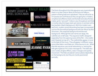
  • 1. Thefonts throughout this titlesequencevary massively and there is noclear theme. Most of thefonts do follow a pattern of being bold and capitalised. They are all (as far as I’m aware) sans serif because they are going for a modern, simplisticbut effective look and the bold andcolourfulness makes up for ‘sans serif’. Colours vary throughout, but there is mostly colourful, large sized cast names in contrast with a low key/dark (black) background. With the modern sans serif text, modern social networking has been incorporated such as theSoundcloud backgroundwith the ‘Musicby Rob Simonsen’, the snapchat background andthe text background. Although thecast names are large, the subtitles are smallsized. Thesequence itself is designed separately from the opening scene of the film –the credits aren’t layered on top of it. Thecredits/titles appear in tune tothe beat of themusic. They all appear in different ways; sometitles fade in and fade out. Otherbounce in etc. When thetitle sequence uses social networking i.e. texting the title gets typedas if it’s a text messageetc. Thetitles also usea variety of glow effects, colour changes and sparkly movement. Thetitles are placed various places depending on thebackground, but they are mainly positioned centrally.