Downloaded 1,093 times
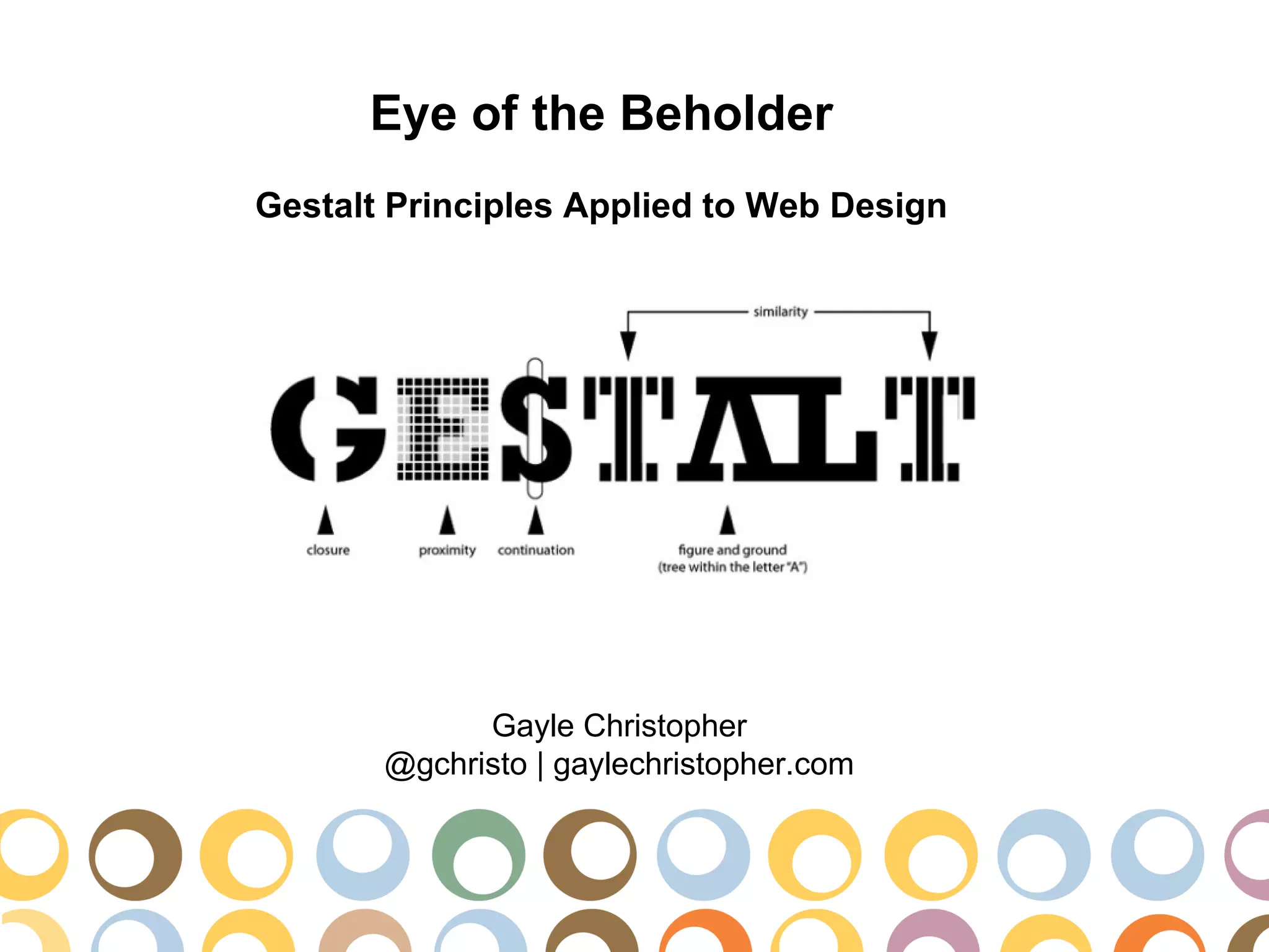
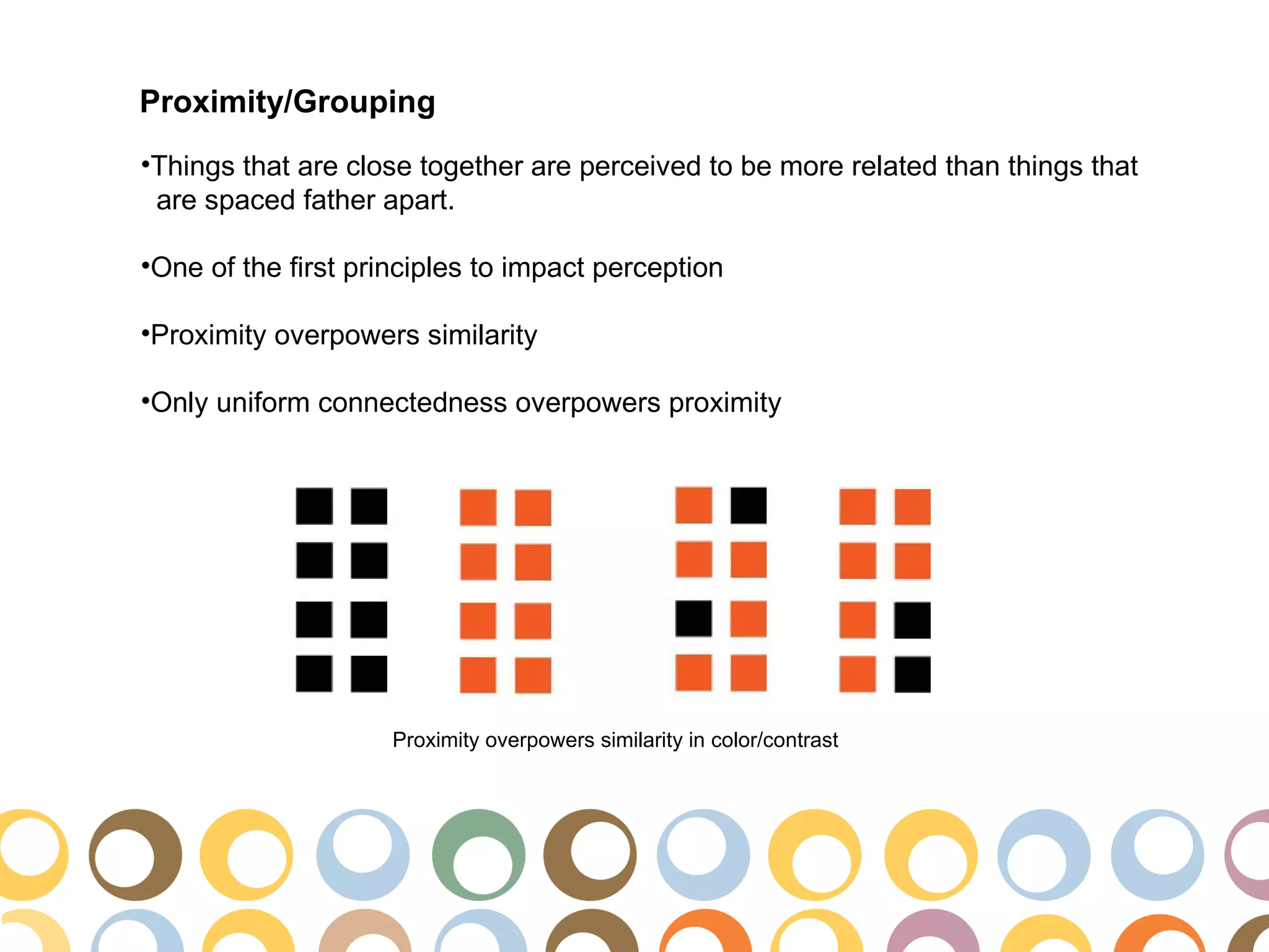
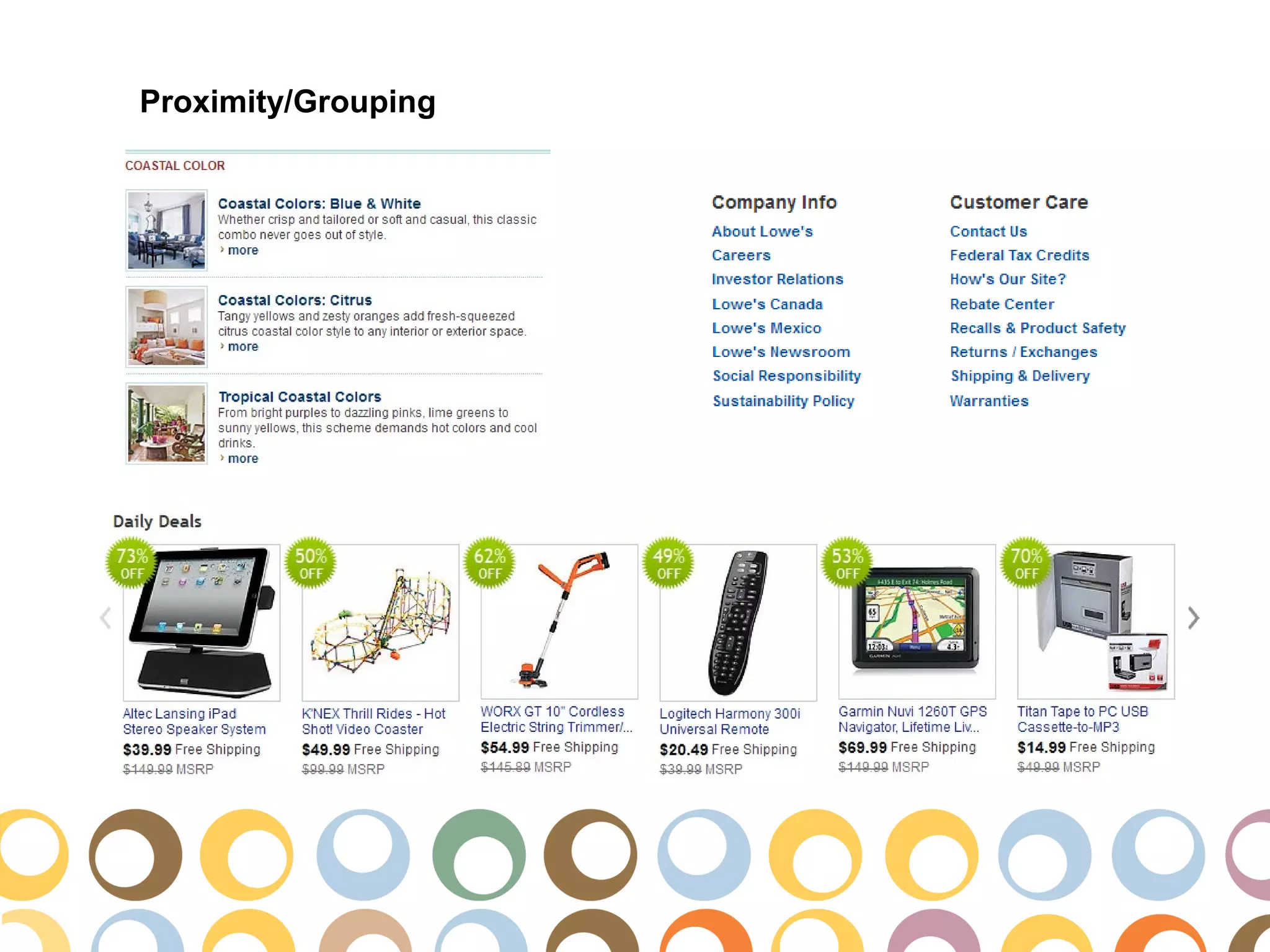
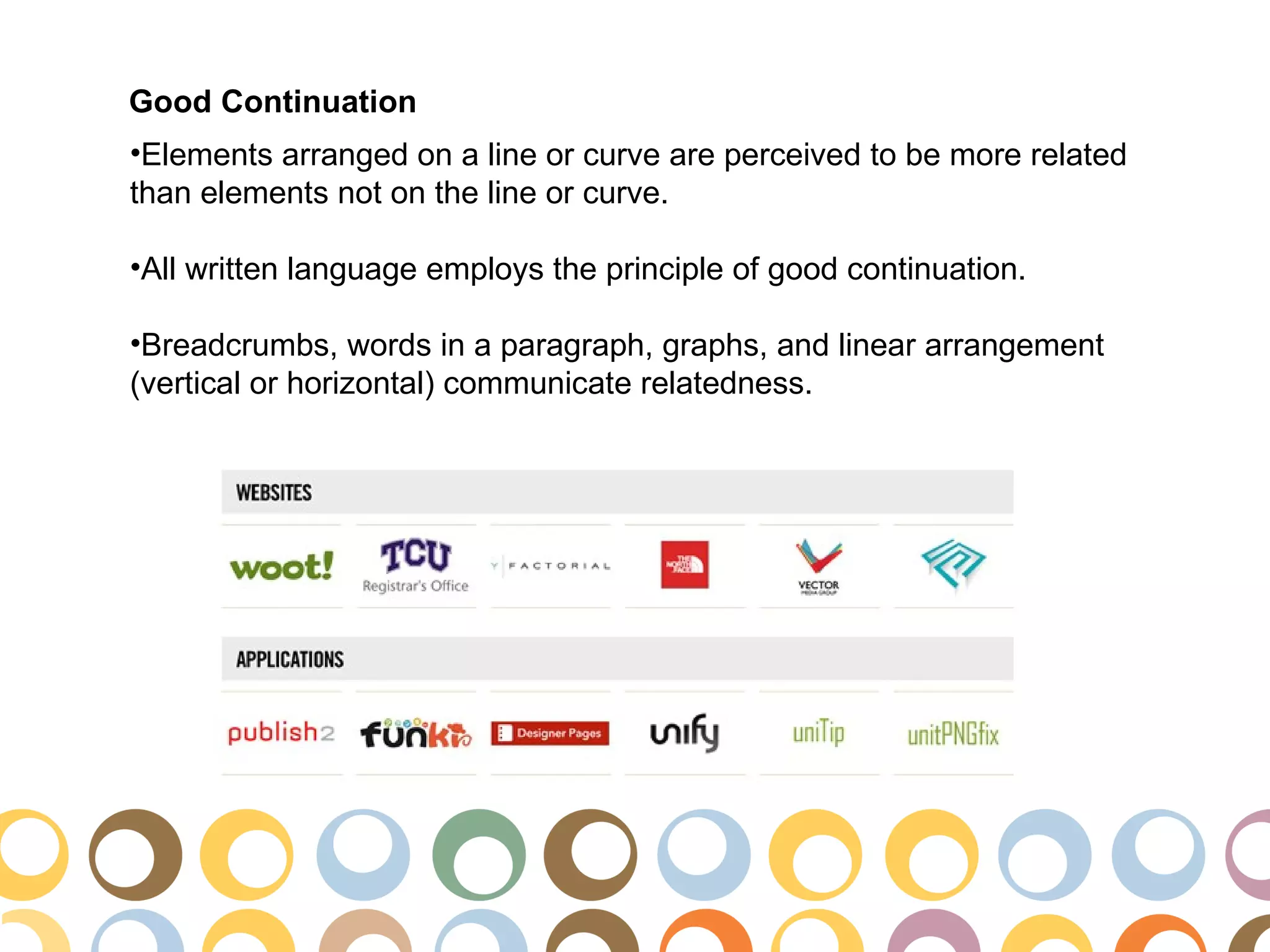
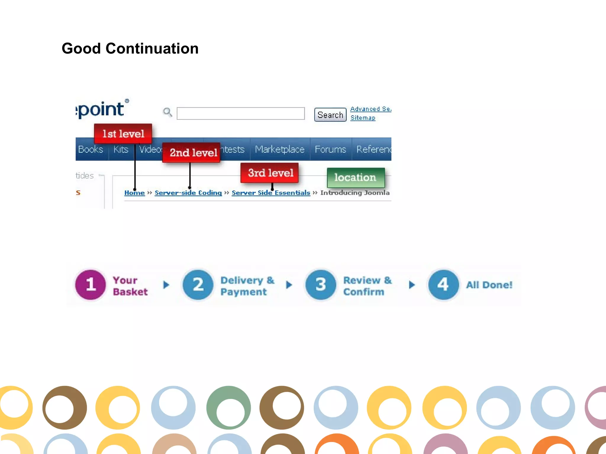
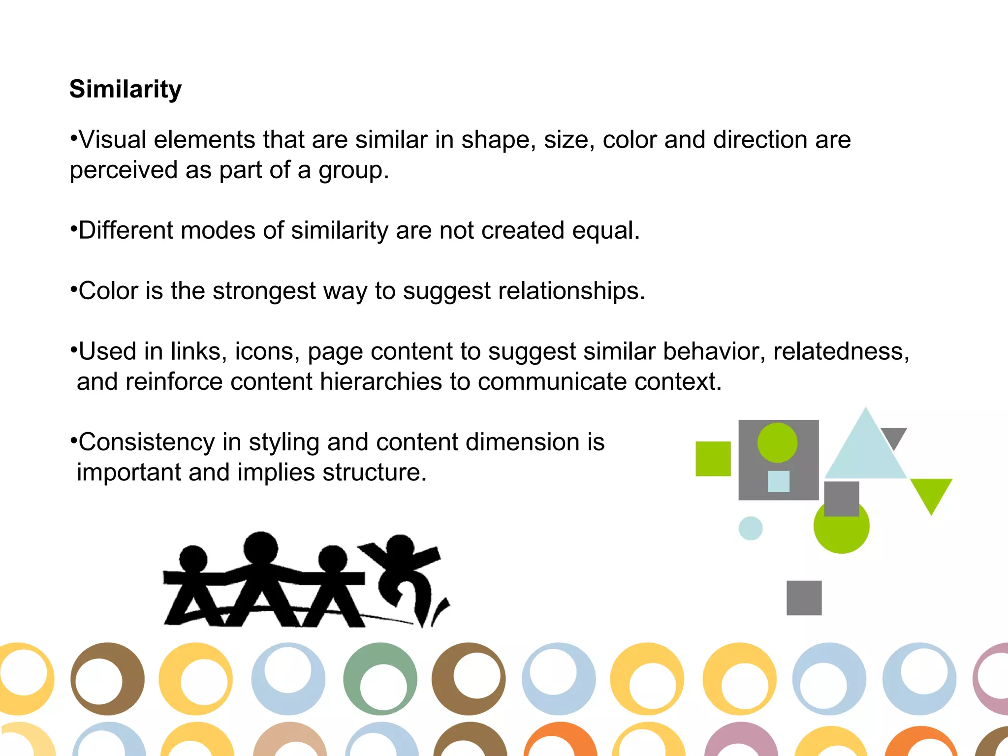
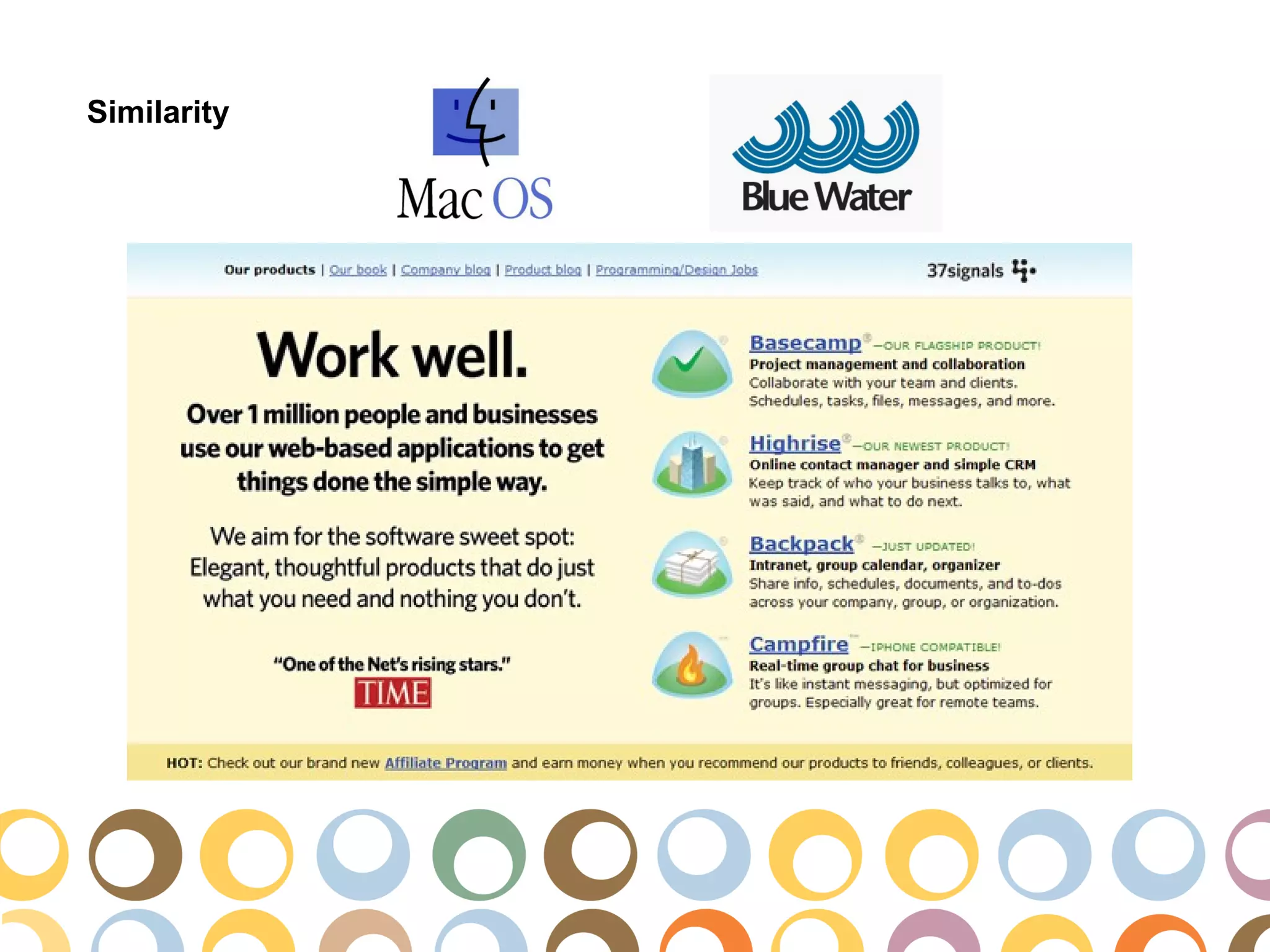
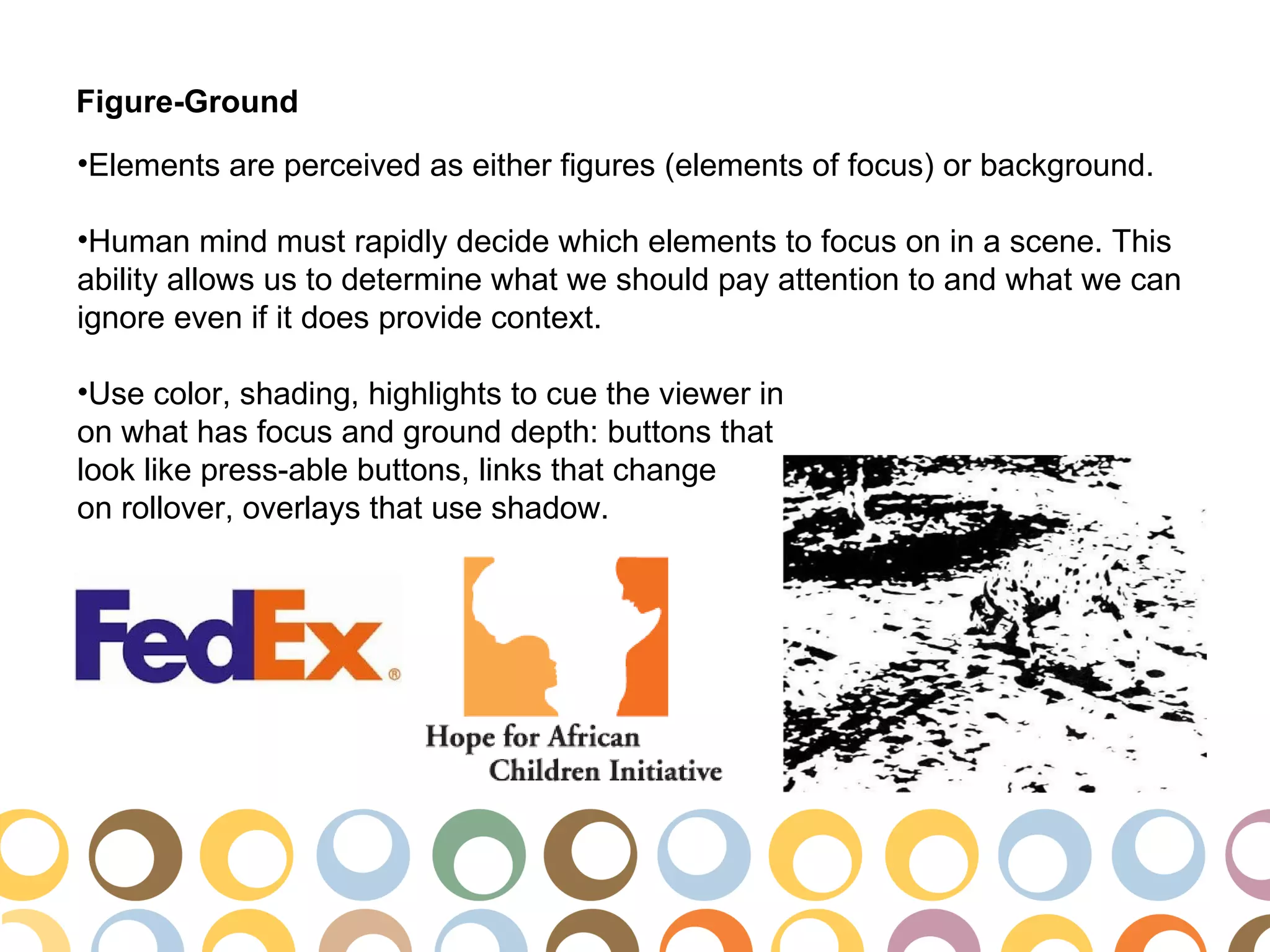
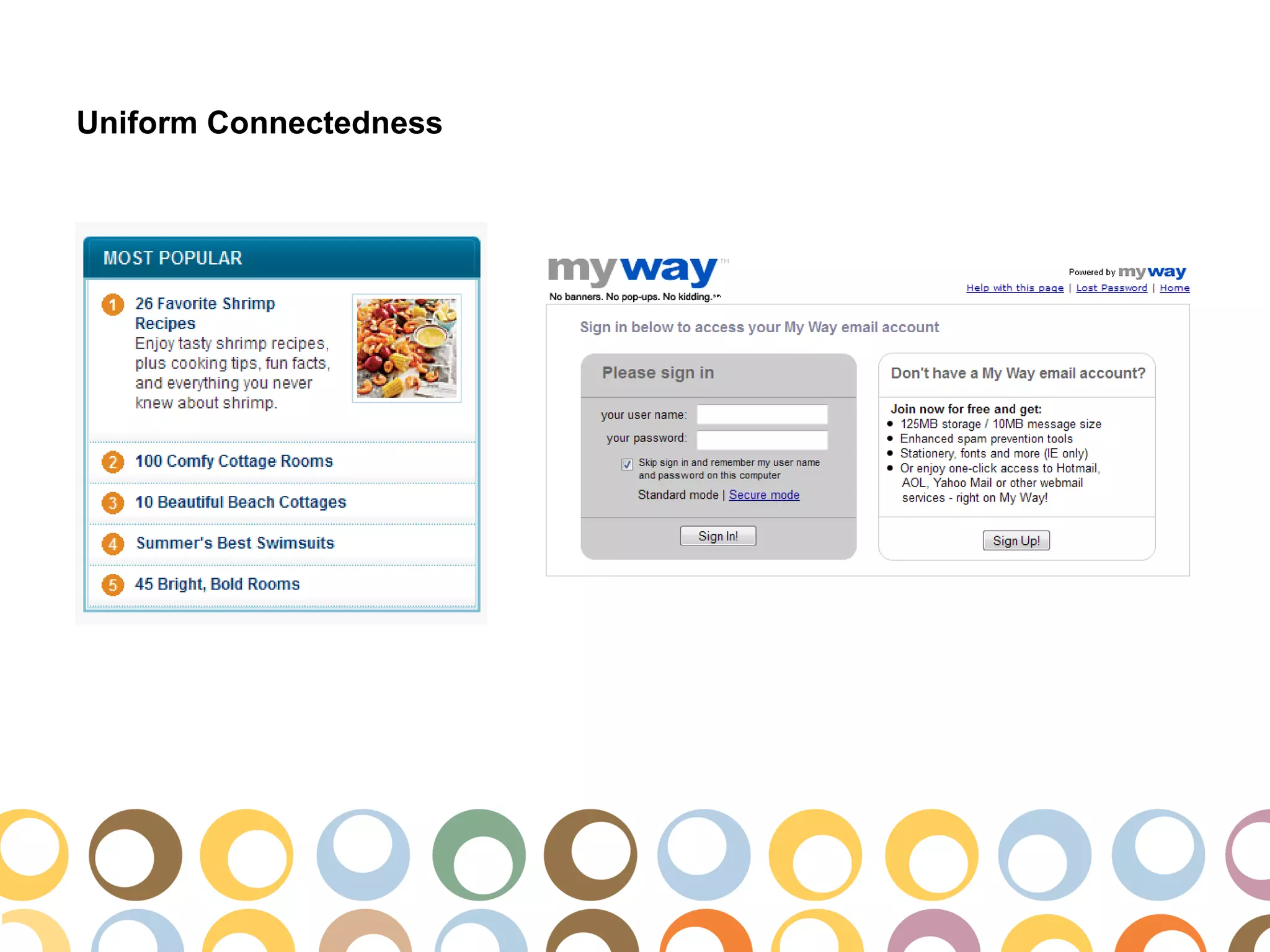
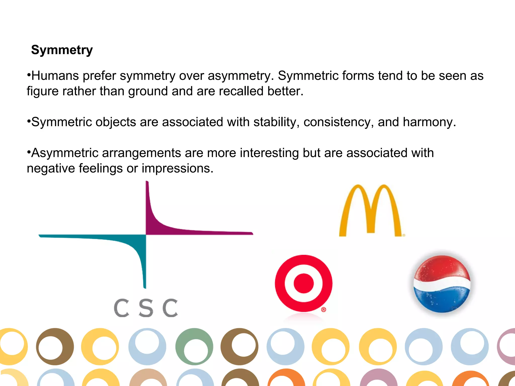
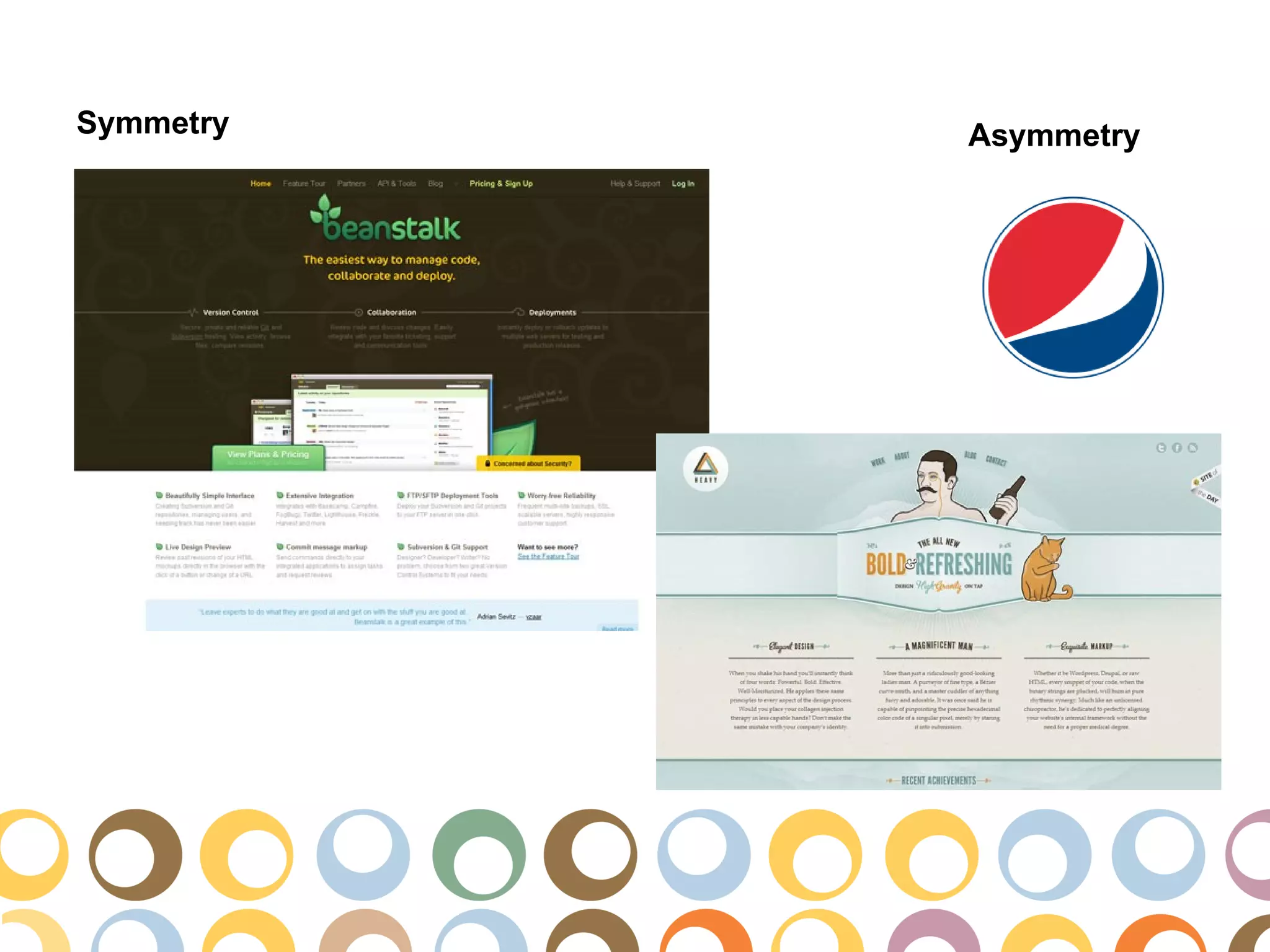
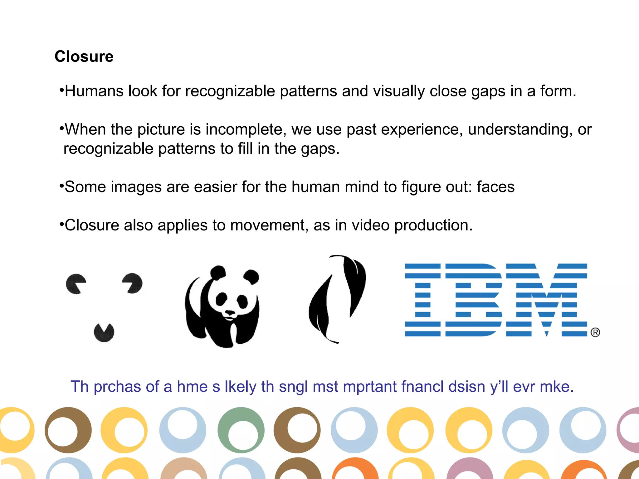


The document discusses the application of Gestalt principles in web design, outlining key concepts like proximity, grouping, similarity, and figure-ground that influence user perception. It emphasizes the importance of visual elements' arrangement, continuity, color, symmetry, and simplicity for effective communication and design hierarchy. It provides examples of how these principles can be used to enhance user experience in interactive media.


![[BROCHURE] Italy Tour Project | @SlideON](https://cdn.slidesharecdn.com/ss_thumbnails/brochure8-251215152319-2805af68-thumbnail.jpg?width=640&height=640&fit=bounds)


