1. Image Manipulation
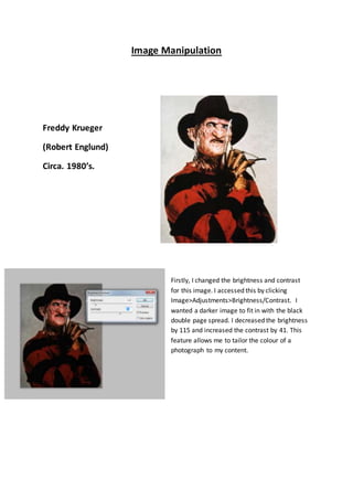
Freddy Krueger
(Robert Englund)
Circa. 1980’s.
Firstly, I changed the brightness and contrast
for this image. I accessed this by clicking
Image>Adjustments>Brightness/Contrast. I
wanted a darker image to fit in with the black
double page spread. I decreased the brightness
by 115 and increased the contrast by 41. This
feature allows me to tailor the colour of a
photograph to my content.
2. Next, I used the crop tool which can be located on the tools
bar on the left hand side. I cropped out the plain white sides
on either side of the original image. Finally I used the
sharpen tool, on the claw to make it stand out more. I
wanted to do this as it is the more iconic part of the
character.
Crop Tool
SharpenTool
The Final Image
For thisimage,Iappliedthe same
processesIusedforthe previous
one of FreddyKrueger.Firstly,I
decreasedthe brightnessand
increasedthe contrast. Secondly,I
croppedoutblankareas
surroundingthe subjectanduse the
image as that.
3. Before After
For my own image, which was also the one I
used for my front cover, I made some slight
changes to it as I felt that any more would be
unnecessary. Firstly, I cropped a part of the
left side of the photograph out, as it too blank
and made the image seem slightly uneven.
After cropping this out, I stretched the image
out slightly to make the masked, knife
wielding figure slightly more prominent and threatening. I then went to
Image>Adjustments>Shadows/Highlights. I increased the highlights amount to a high
capacity and the shadows amount to a slight percentage. This helped bring out the brick
wall in the background, which I think adds a murky, grimy dark element to the image and
helps add to the horror theme. The highlight tool also put more emphasis on the gloves the
model is wearing, which I think is a good effect.