
Recommended
More Related Content
What's hot
What's hot (20)
Viewers also liked
Viewers also liked (20)
Similar to Photoshop b&a
Similar to Photoshop b&a (20)
Recently uploaded
Recently uploaded (20)
Photoshop b&a
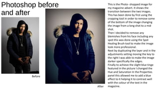
- 1. Photoshop before and after This is the Photo- shopped image for my magazine advert. It shows the transition between the two images. This has been done by first using the cropping tool in order to remove some of the bottom of the image changing the image from a long shot to a mid shot. Then I decided to remove any blemishes from his face including any spot this was done using the Spot Healing Brush tool to make the image look more professional. Next by duplicating the layer and in the adjustments setting moving the key to the right I was able to make the image darker specifically the edges. Finally to achieve the slight blue tinge featured in the picture I changed the Hue and Saturation In the Properties panel this allowed me to add a blue effect to it helping it to contrast well with the colour of the text in the magazine. Before After
- 2. Photoshop before and after Before After Finished For the front of my Digi pack the same stages were used as the ones in my magazine advert. However, there was another step needed in order to achieve the finished look. This look involves merging the two images together to allow me to present the idea of him reflecting on his past life and moving forward. The main image was first edited and then merged into an image of a city background. This was done using Photoshop by first turning on visibility for the layers that I wanted to merge with layers including a separate picture. Then by pressing Shift+Ctrl+Alt+E (Windows). Photoshop creates a new layer containing the merged content. Finally by moving the toggle key up and down I was able to find the perfect combination of the two merged images.
- 3. Photoshop Before and After Before After Similar steps were taken in the editing stage of the image for my Digi Pack: This has been done by first using the cropping tool in order to remove the light that was shown in the side of the original image. Then I decided to remove any blemishes from his face including any spot this was done using the Spot Healing Brush tool to make the image look more professional. Next by duplicating the layer and in the adjustments setting moving the key to the right I was able to make the image darker specifically the edges. Finally to achieve the slight blue tinge featured in the picture I changed the Hue and Saturation In the Properties panel this allowed me to add a blue effect to it helping it to contrast well with the colour of the text in the Digi Pack.