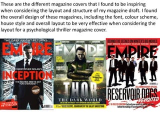
1. These are the different magazine covers that I found to be inspiring
when considering the layout and structure of my magazine draft. I found
the overall design of these magazines, including the font, colour scheme,
house style and overall layout to be very effective when considering the
layout for a psychological thriller magazine cover.
2. I began by choosing the image I wanted to use
in my magazine daft and cropped it to size with
the “crop” button.
I the turned the image from colour into black and
white by clicking “Image”, “Adjustments” then
finally “Black and White” which allowed me to
manipulate the specific shades within the image.
I then adjusted the different
colours within the “Black and
Whit application to create a more
intense image.
I then clicked “Image”, “Adjustments”
then finally “Brightness & Contrast”
which transformed the image making it
appear more dramatic.
Then I adjusted the “Exposure” of the image by
clicking “Image”, “Adjustments” then finally
“Exposure in which I adjusted the “Exposure”,
“Offset” and “Gamma Correction” levels. This
made the image appear more tonally
contrasted.
3. To add text I then clicked
“Horizontal Text Tool (T). This
allows me to type across the
page, which in this case said
“Empire”.
I then changed the colour of the text from
black to red by the use of the colour chart
on the top right corner. The bright red
links to our genre of psychological thriller
and appears striking/eye catching.
I then changed the font of the
text by highlighting the text
and clicking on the font drop
down button which allowed
me to choose from a wide
range of fonts. I chose this
font as it is the most similar to
the “Empire” magazine title.
I designed two titles with the similar
fonts used in relation to the original
magazine covers. I found both to be
very effective however, I decided to
go with “Empire” as it was the most
striking and fit the genre of our
teaser trailer more.
4. I then transferred the image from Photoshop onto
Illustrator which allowed me to manipulate the
colours and font styles more effectively. I started
writing the film title in a different font an colour to
ensure there was a clear difference between the
film title and the magazine name.
I decided to transfer this secondary image
of broken glass over the image of the main
character as it added texture and context
to the image displaying a crack in peoples
personalities, moods and behaviours as
displayed by the character John who was
mentally unstable.
By adding the broken glass image other the
models face, lowering the opacity and clicking the
“overlay” button the image appeared more
realistic and effective.
5. I then began to add cover lines
which I found inspiration from past
magazine covers. I chose to display
a variety of font sizes and styles for
different words depending on their
importance . The larger and bolder
words appear more eye catching
and striking enticing and grabbing
the audiences attention.
I then added a red circular shape with the use
of the “Ellipse Tool” which allowed me to
create and colour a circular shape. I then used
the “Magic Eraser” tool to erase the edges of
the circle shape. I then coloured the circular
shape with the use of the colour chart as red
matches the house style colour scheme.